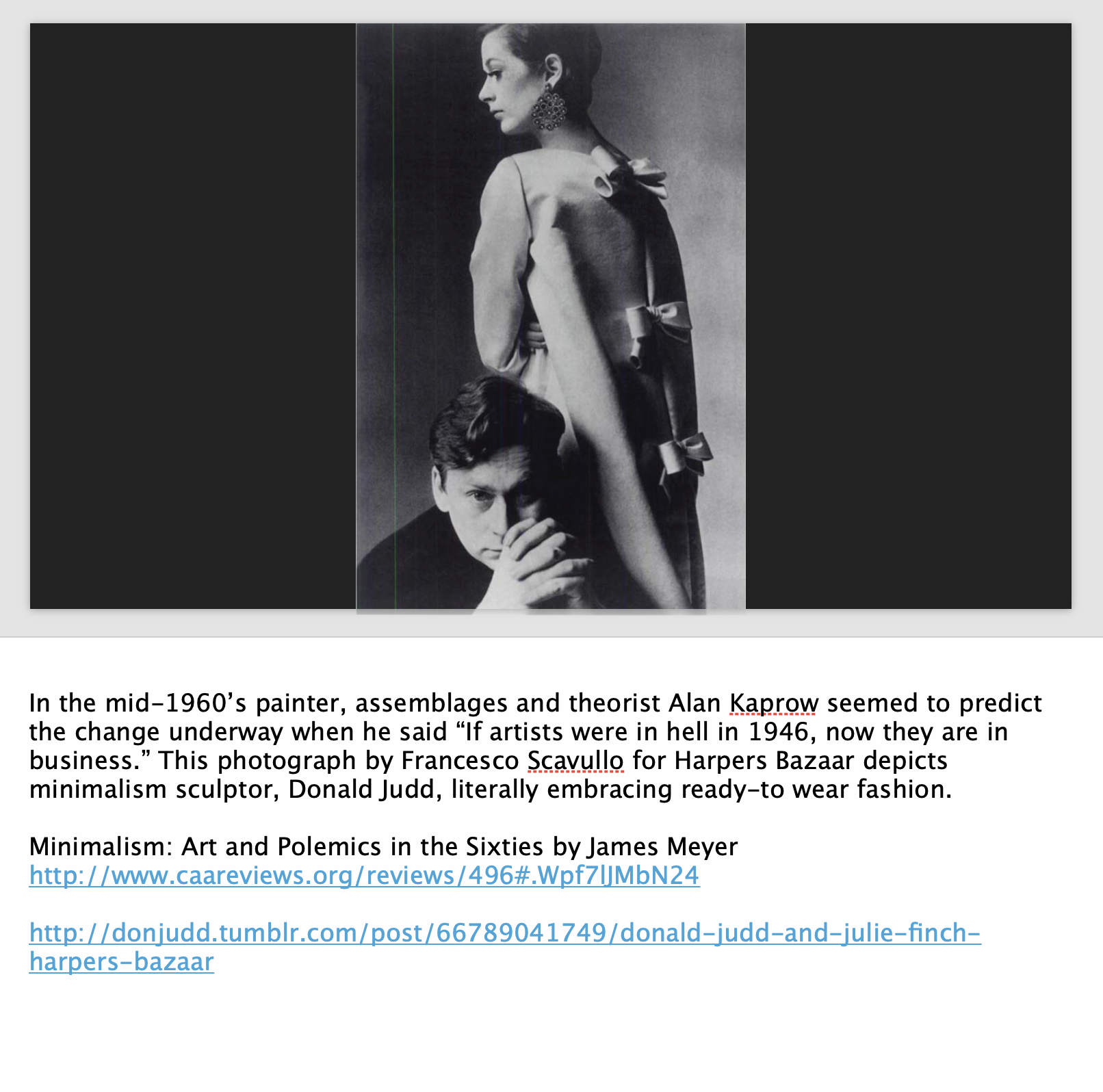
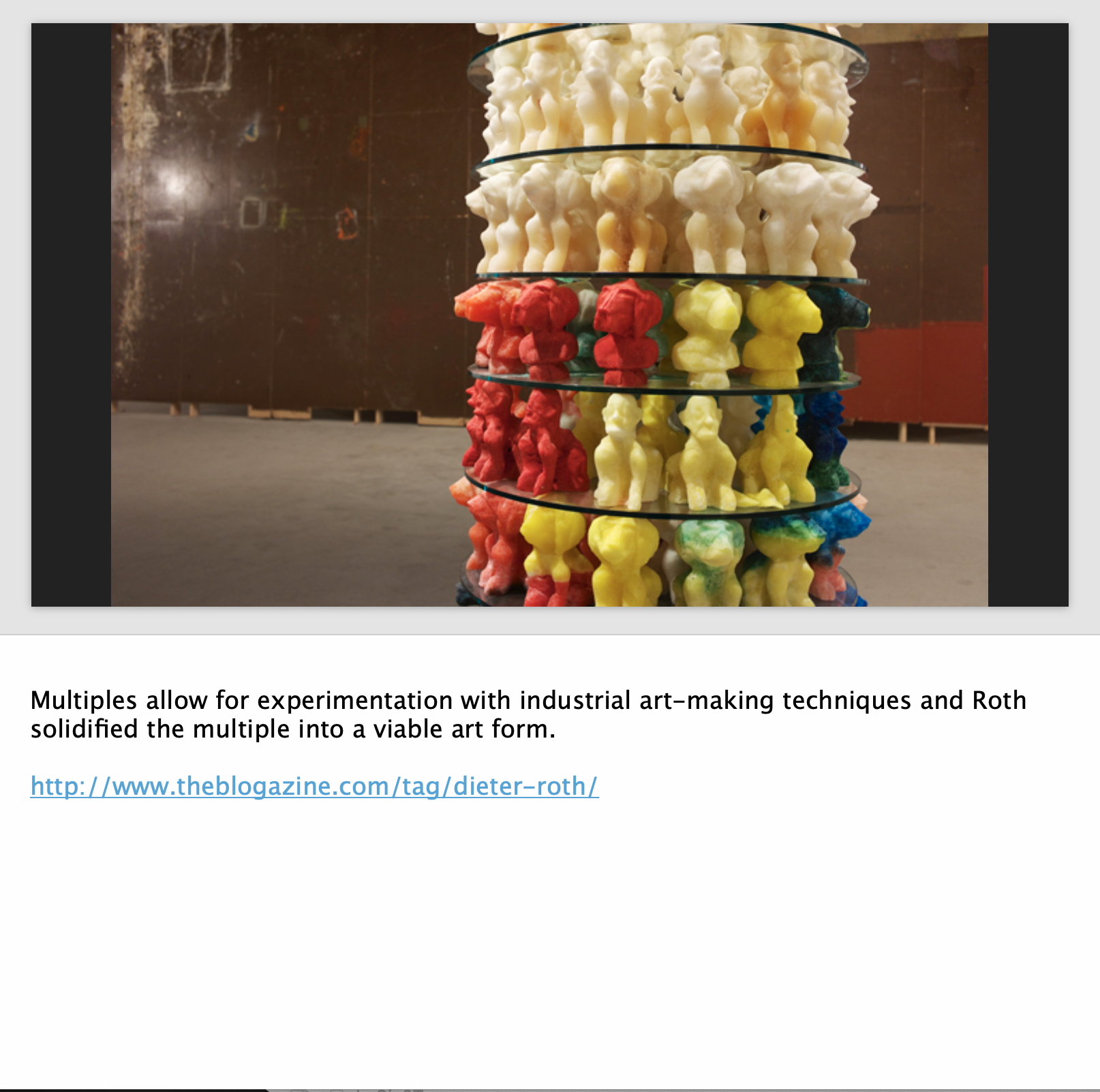
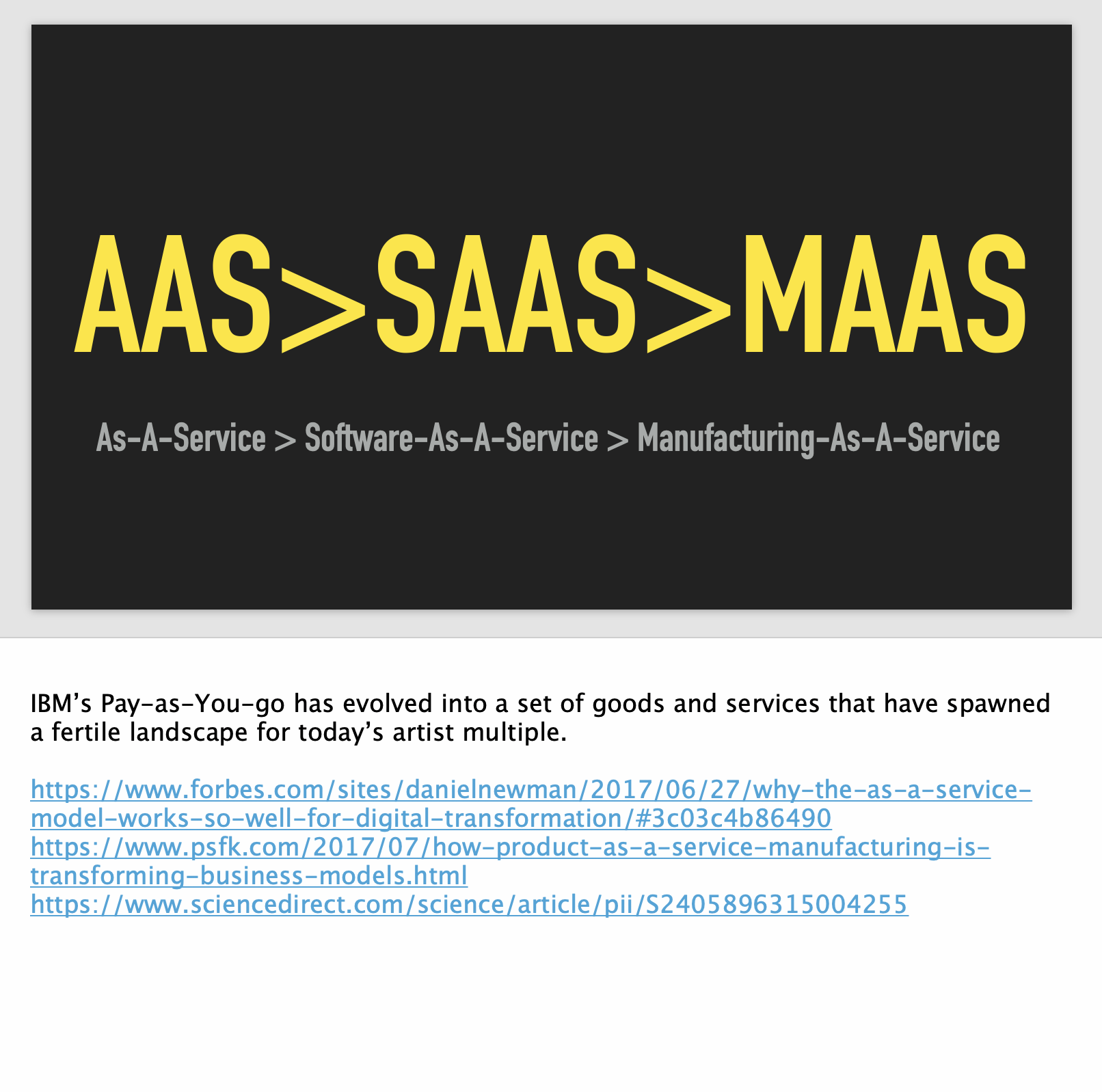
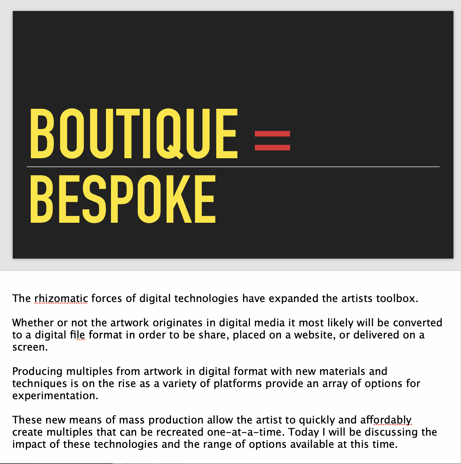
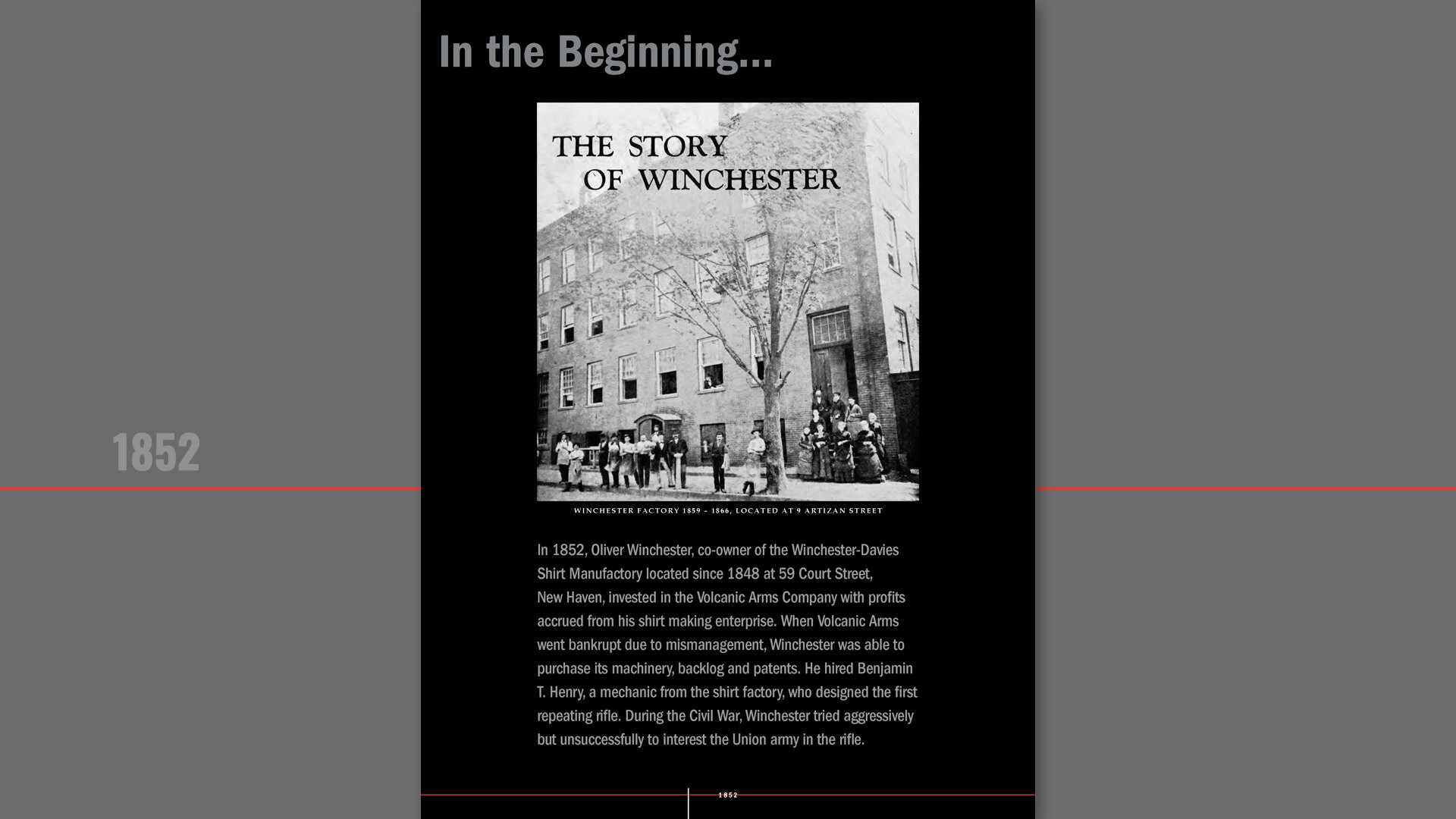
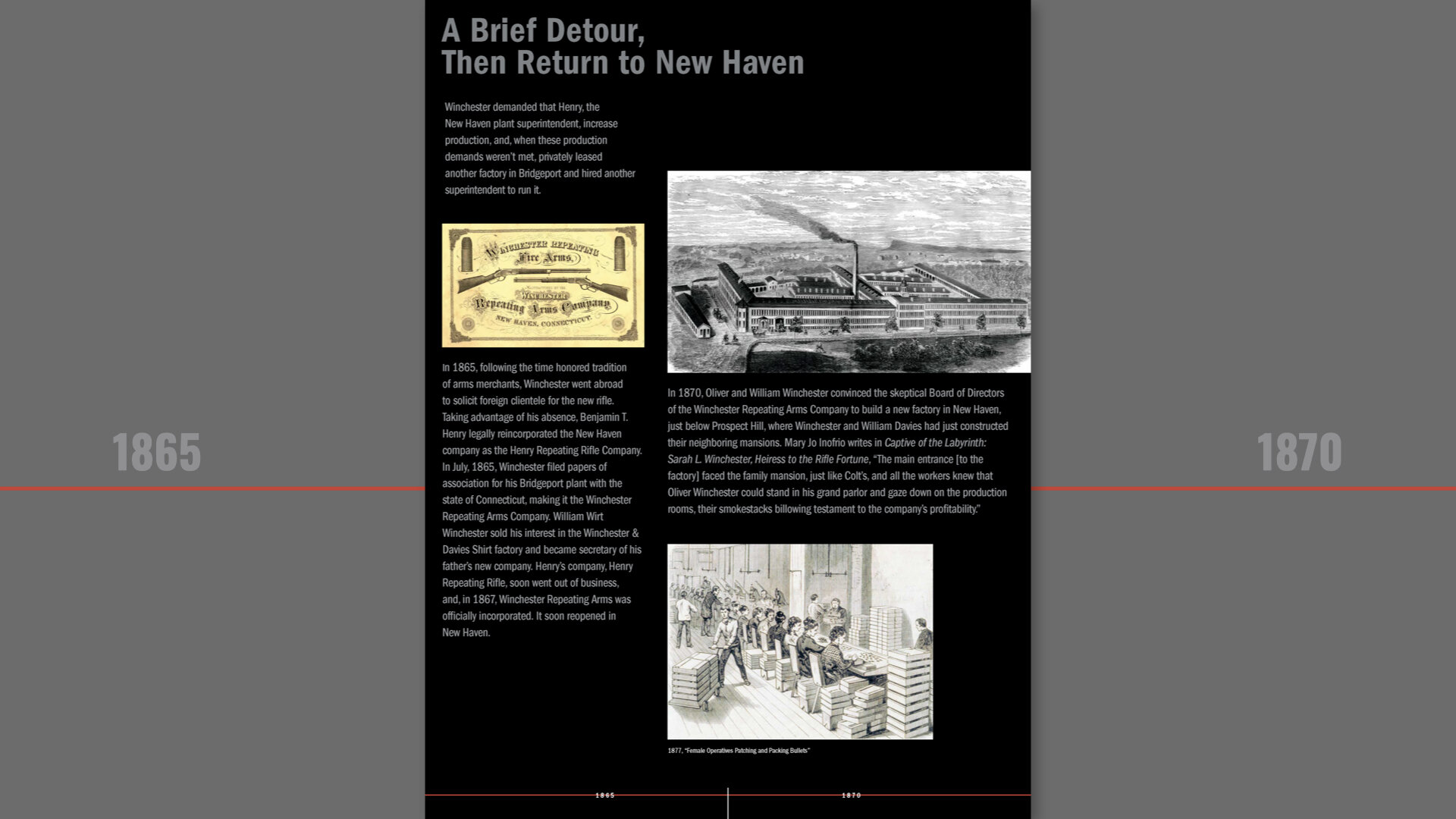
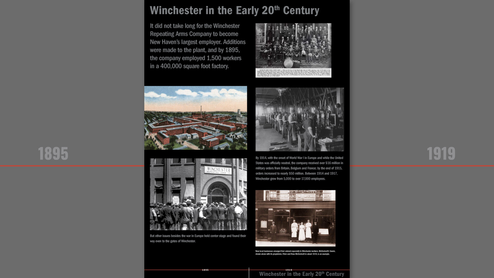
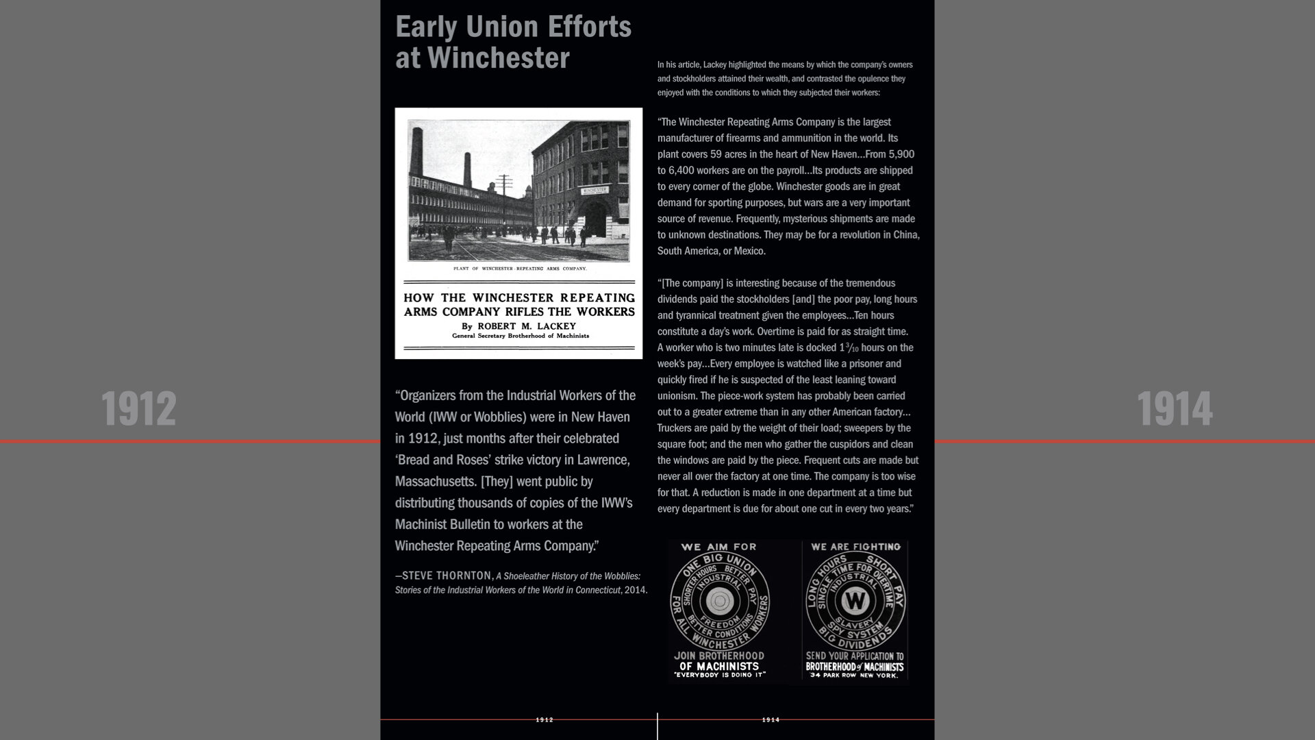
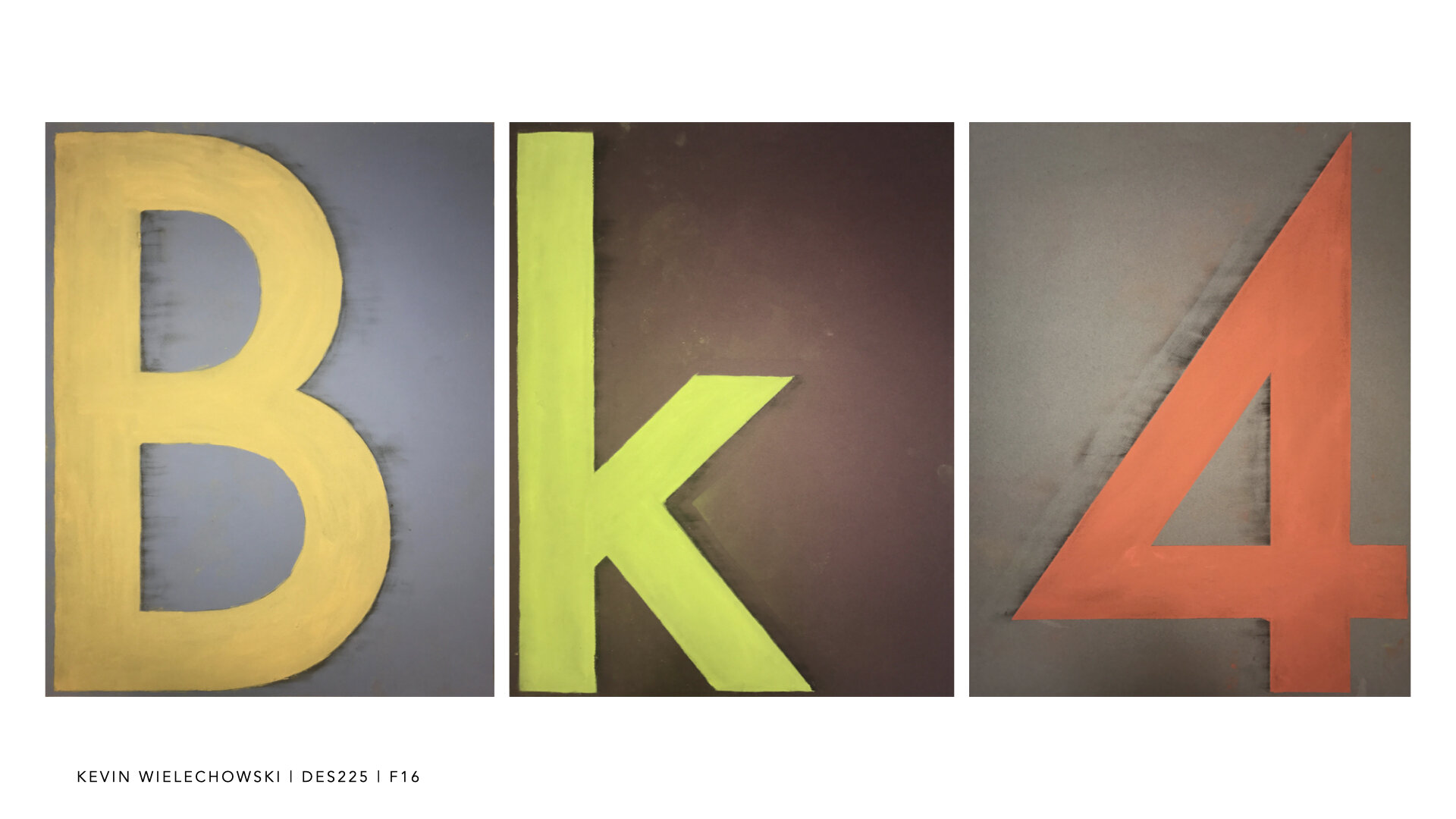
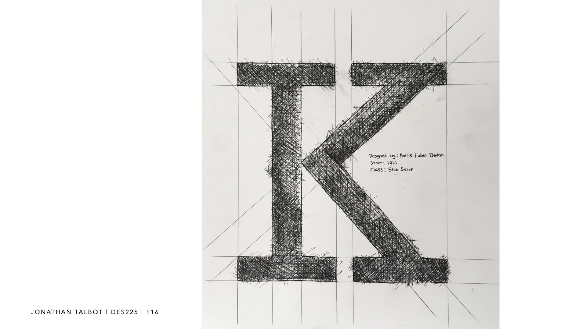
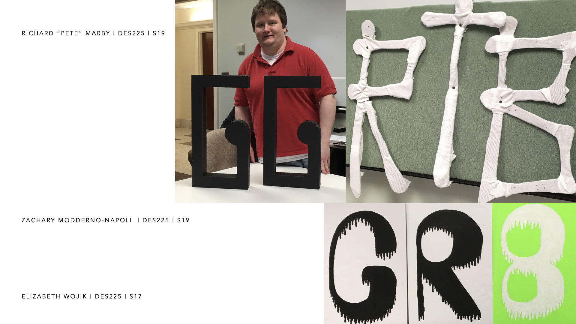
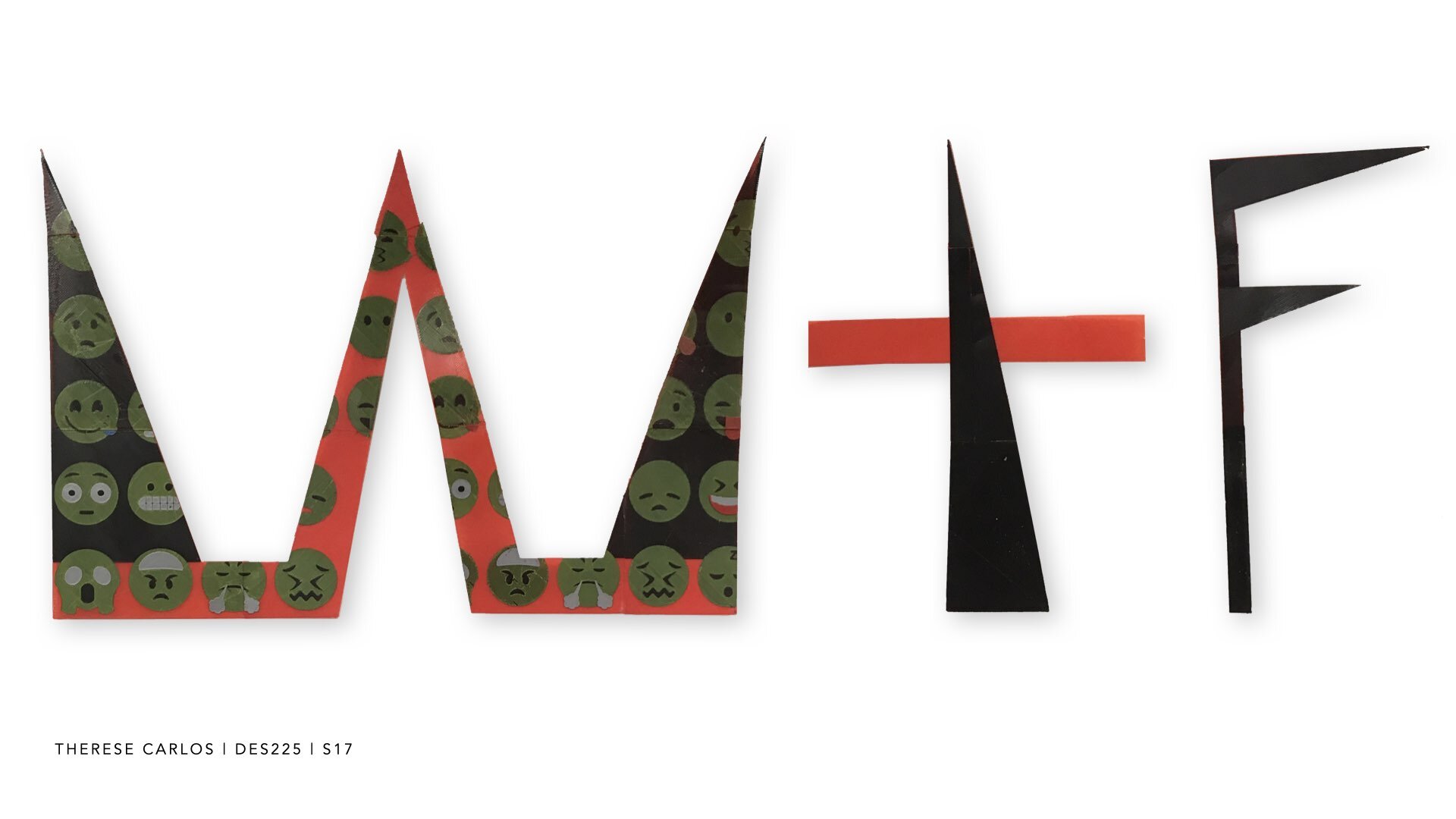
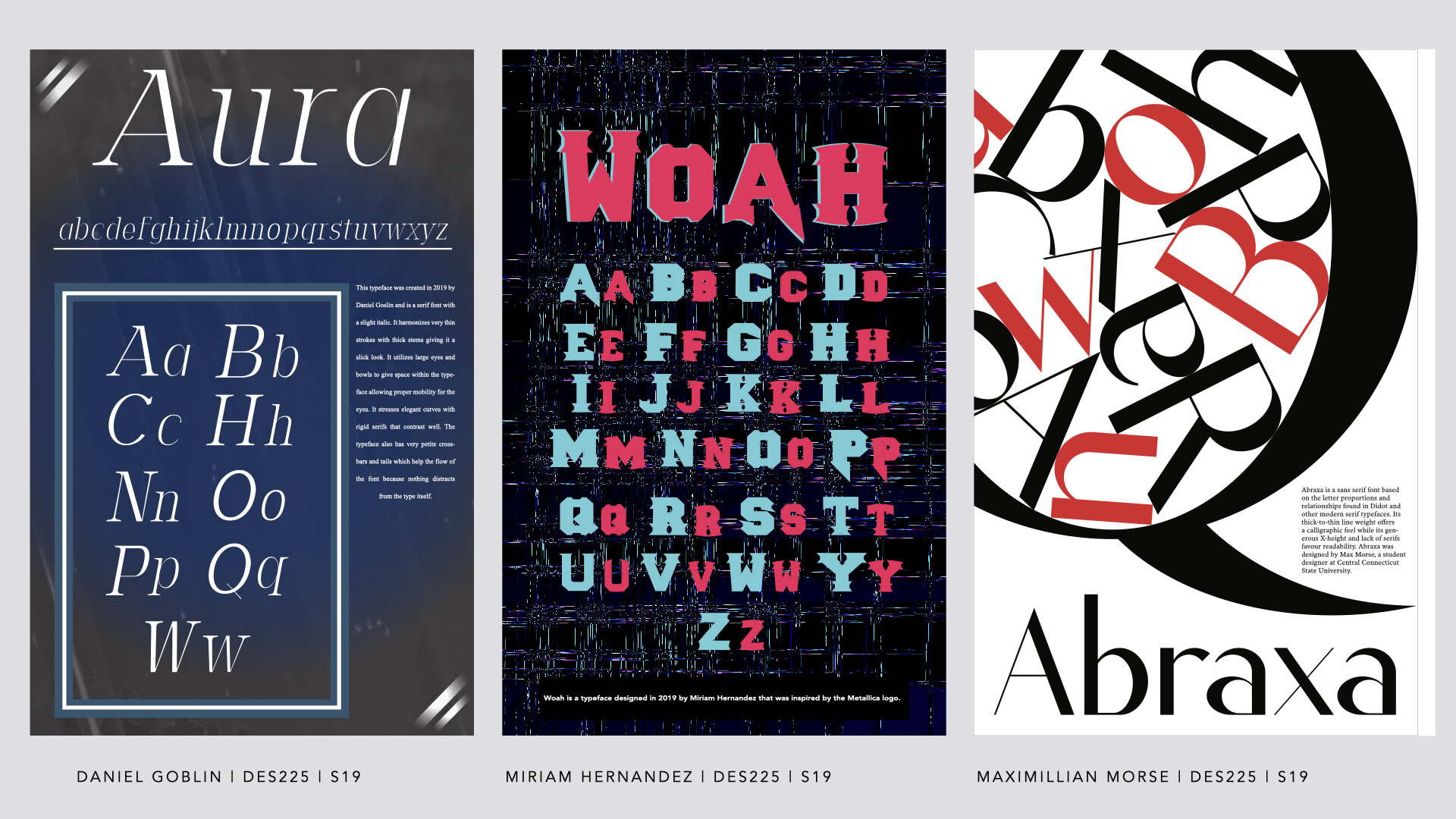
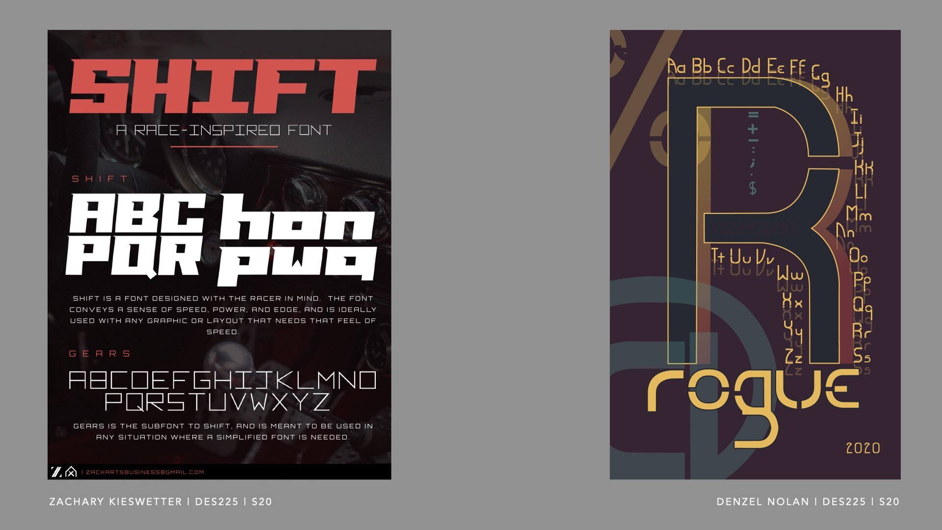
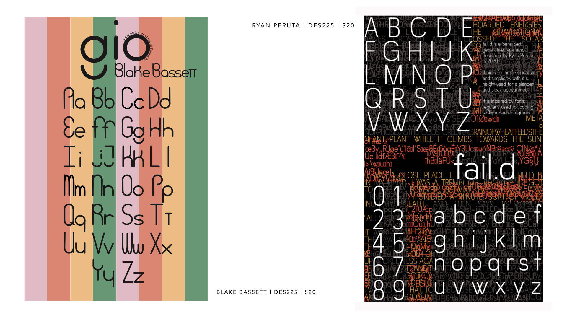
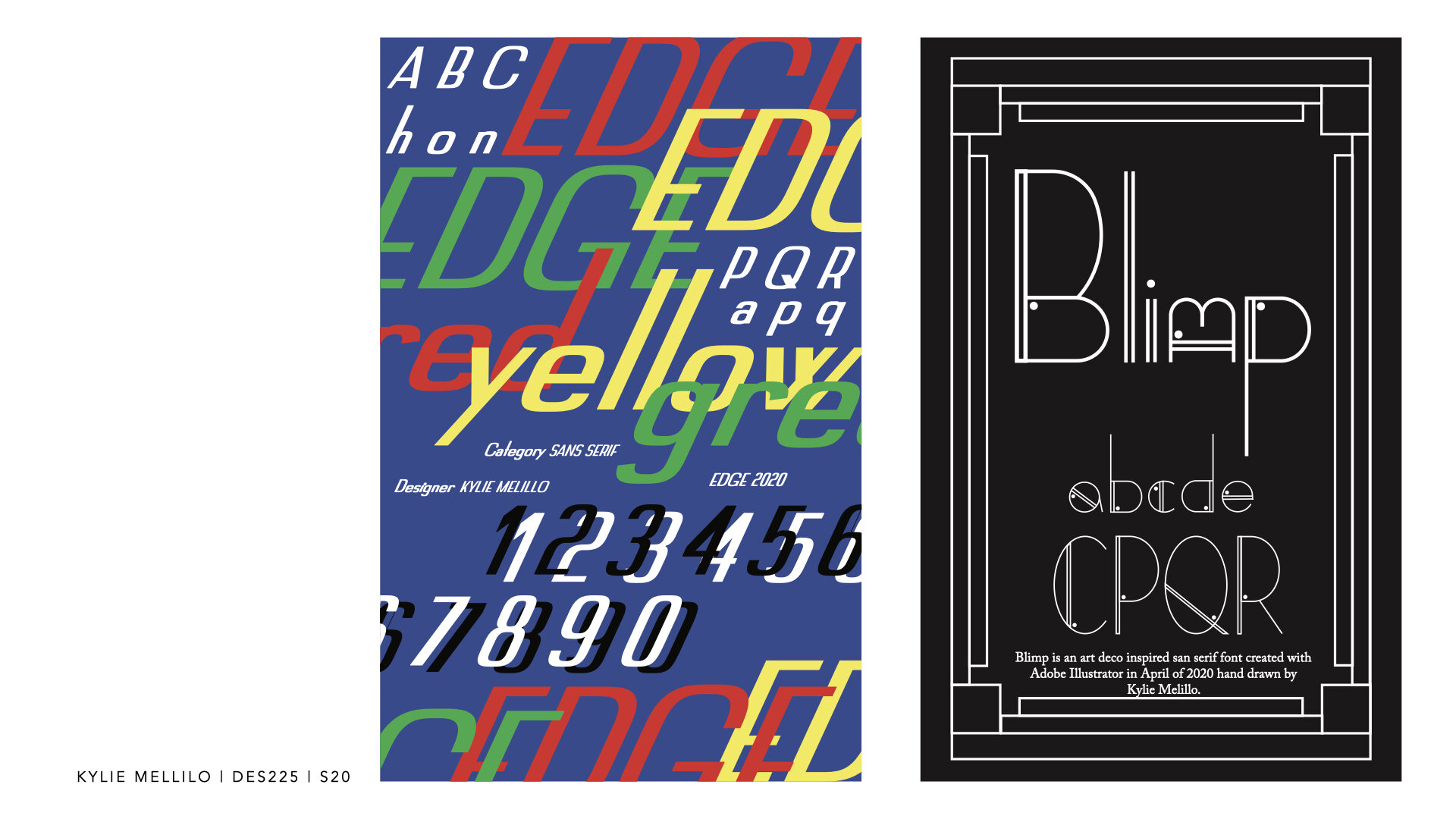
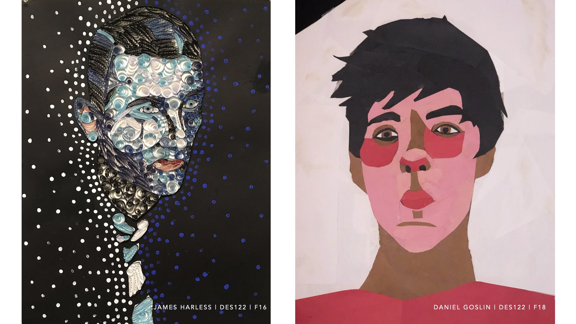
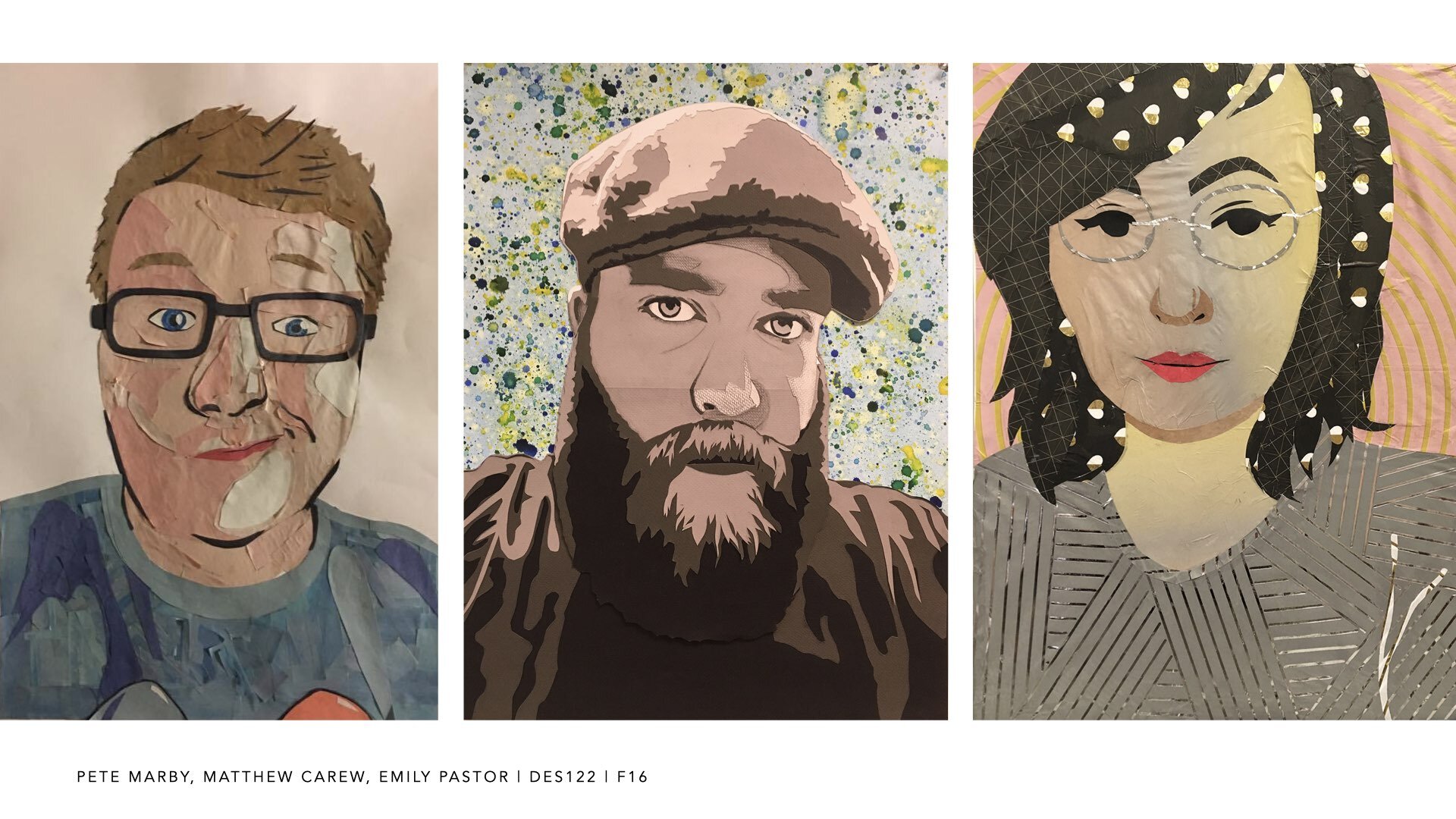
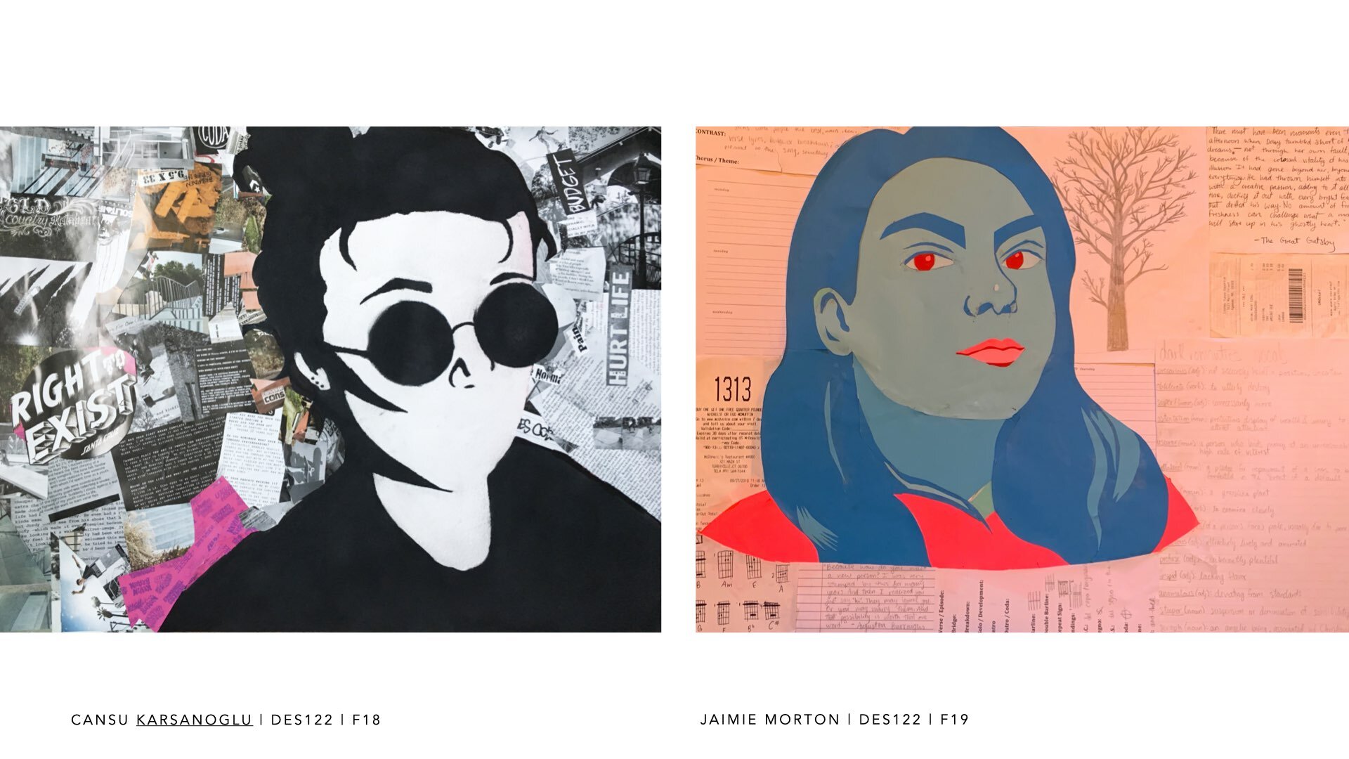
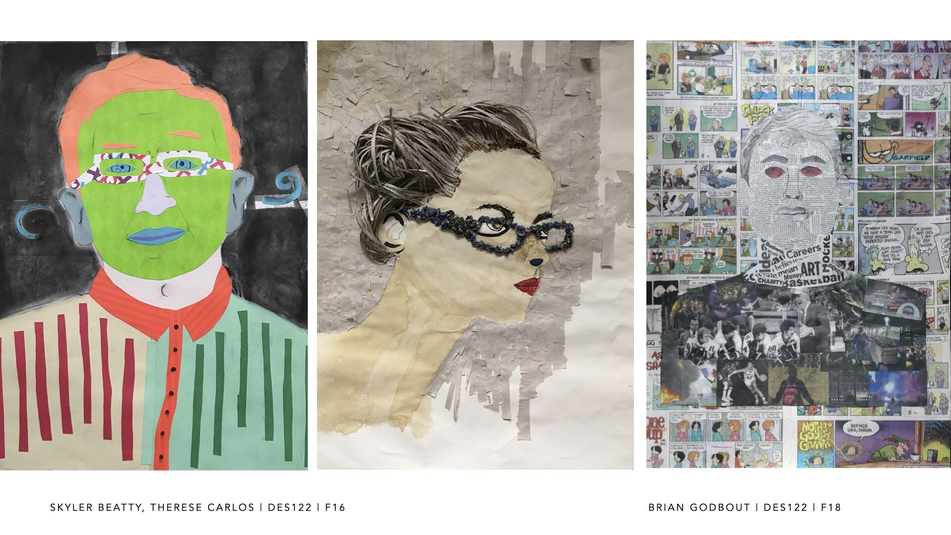
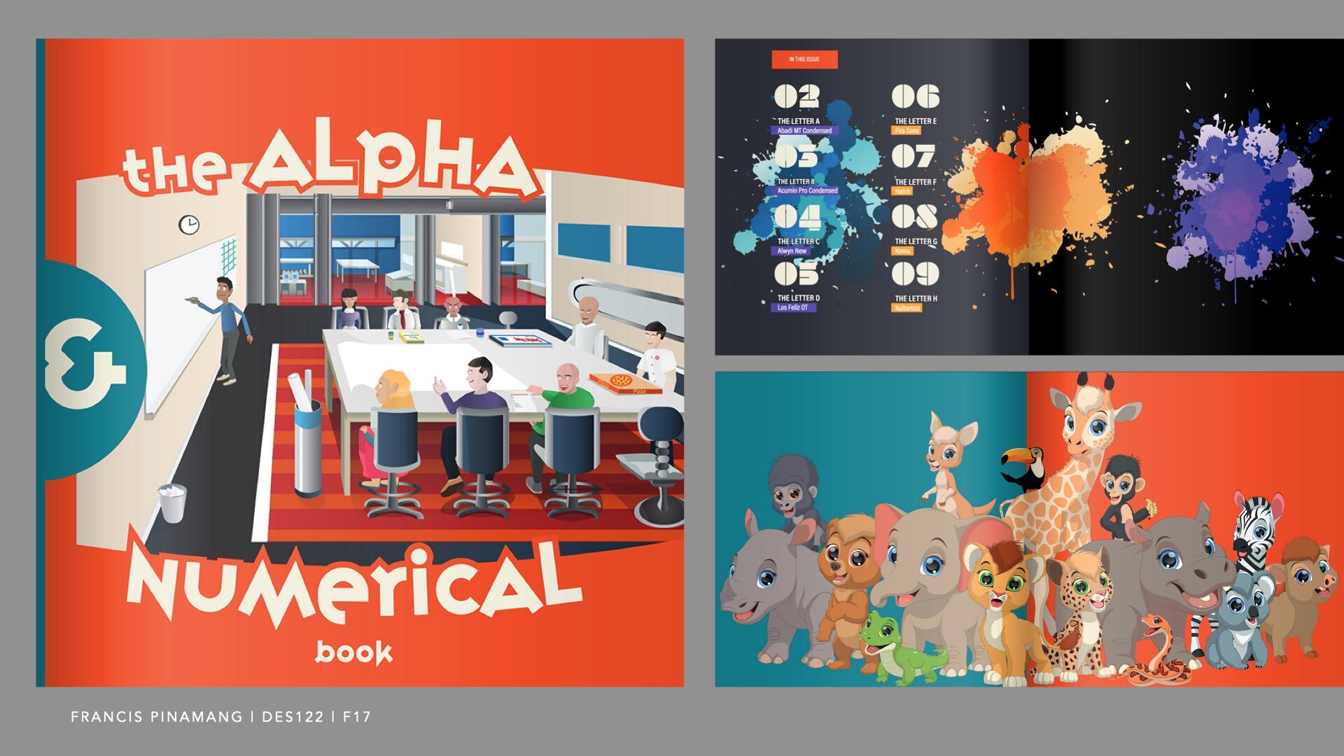
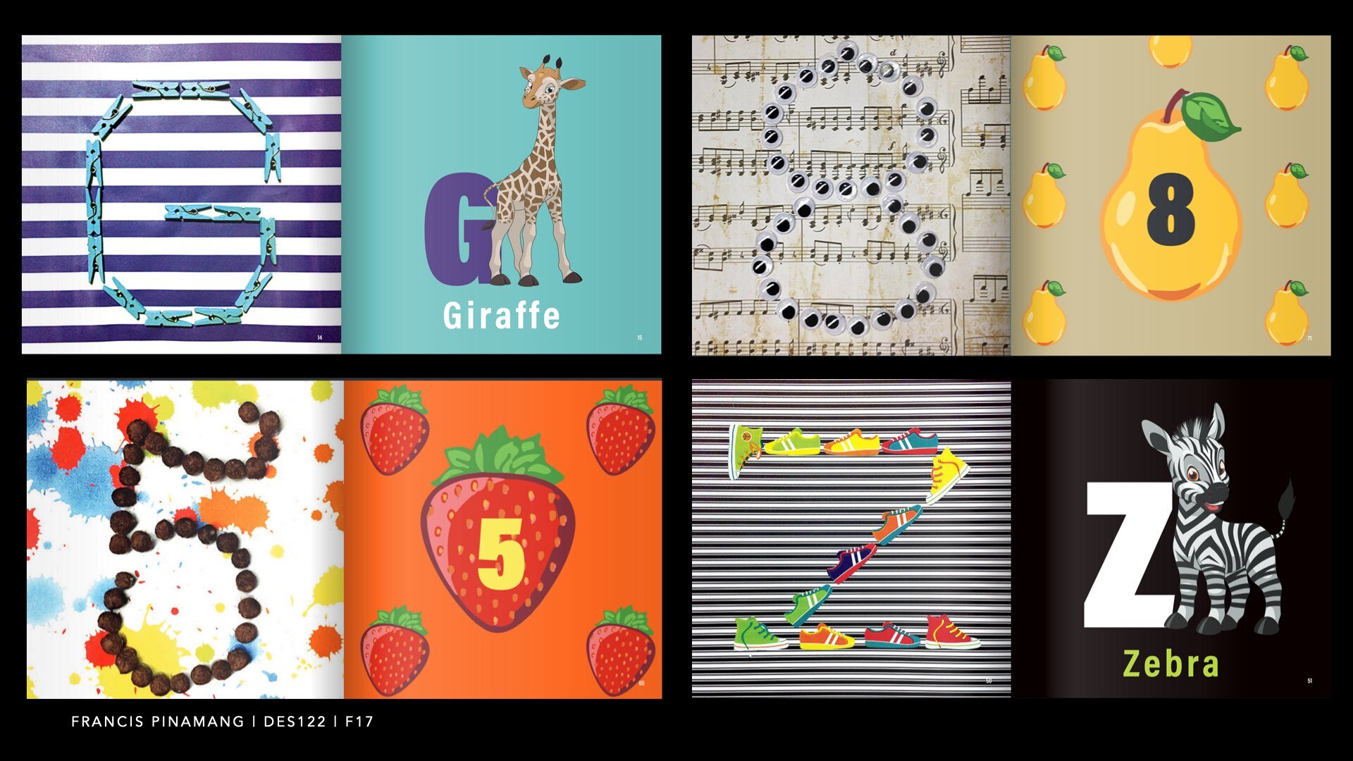
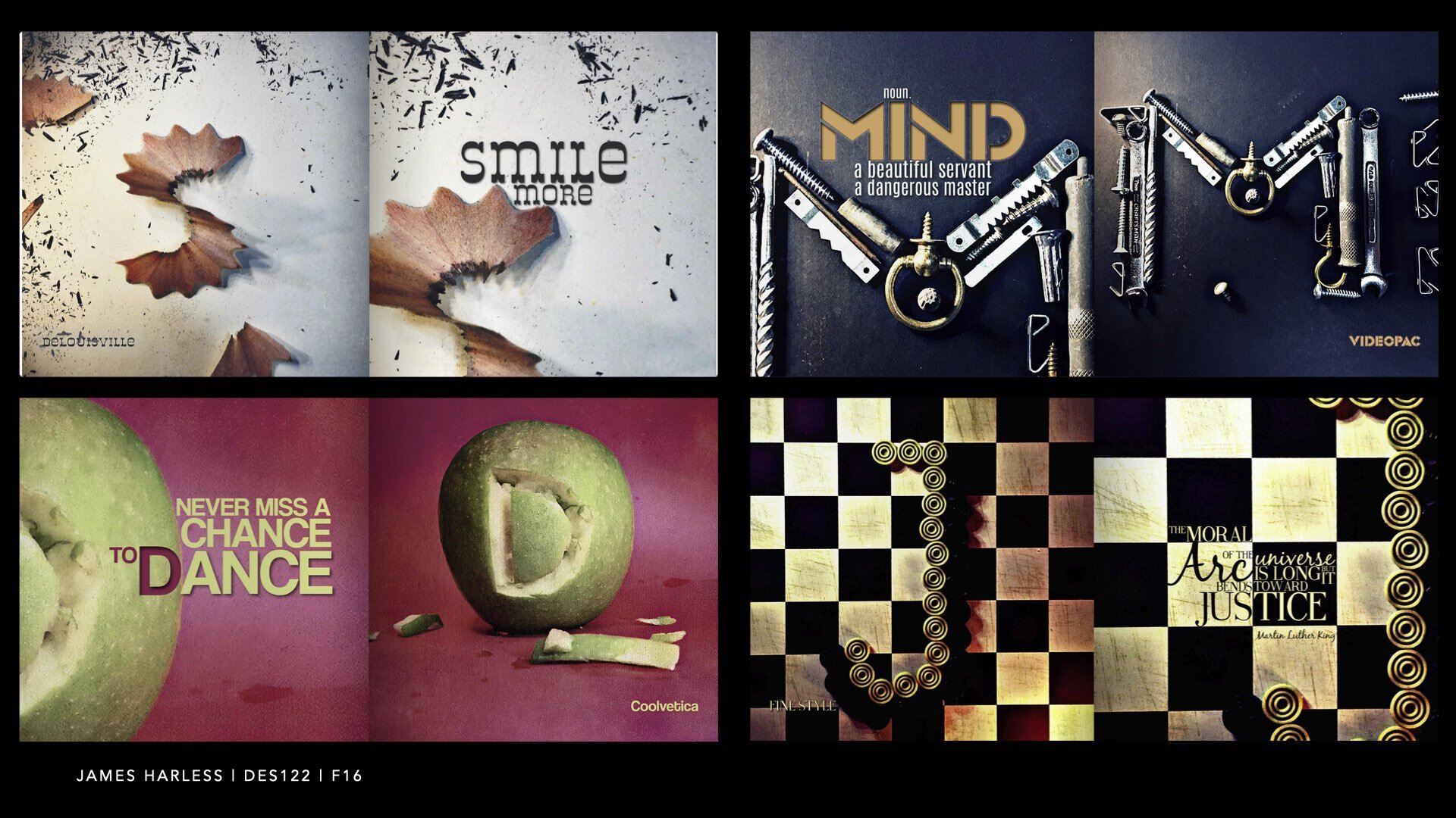
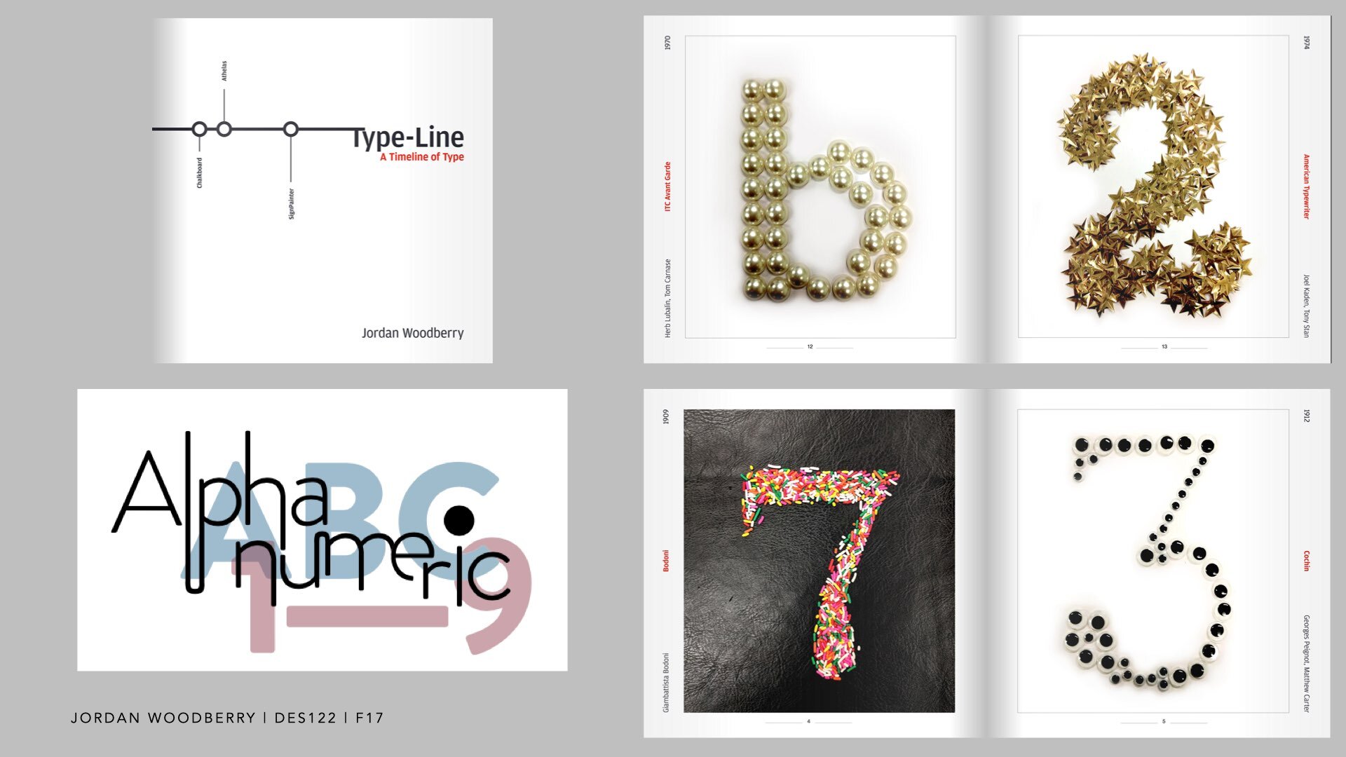
Recurate was an abstract submitted as a poster to 2021 UCDA Design Educators Summit.
This video was prepared for the virtual conference held on May 27, 2021.
The poster is downloadable here
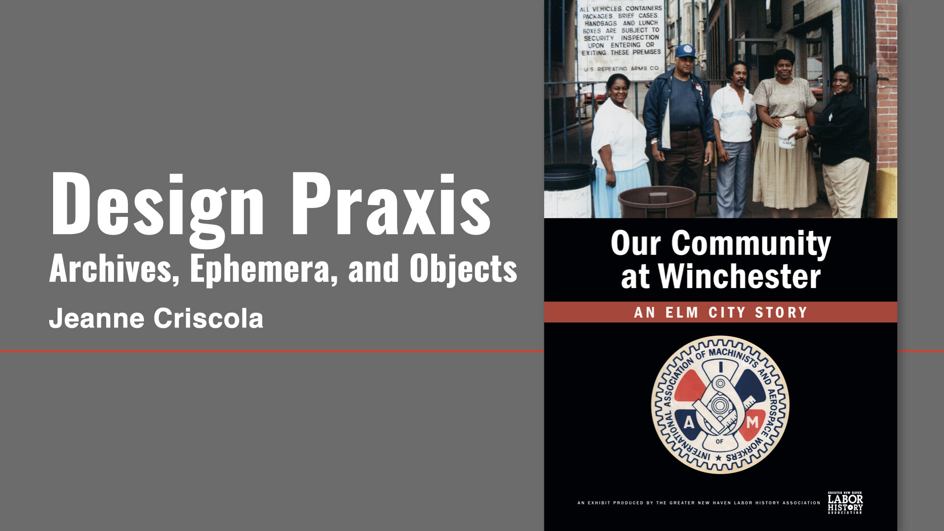
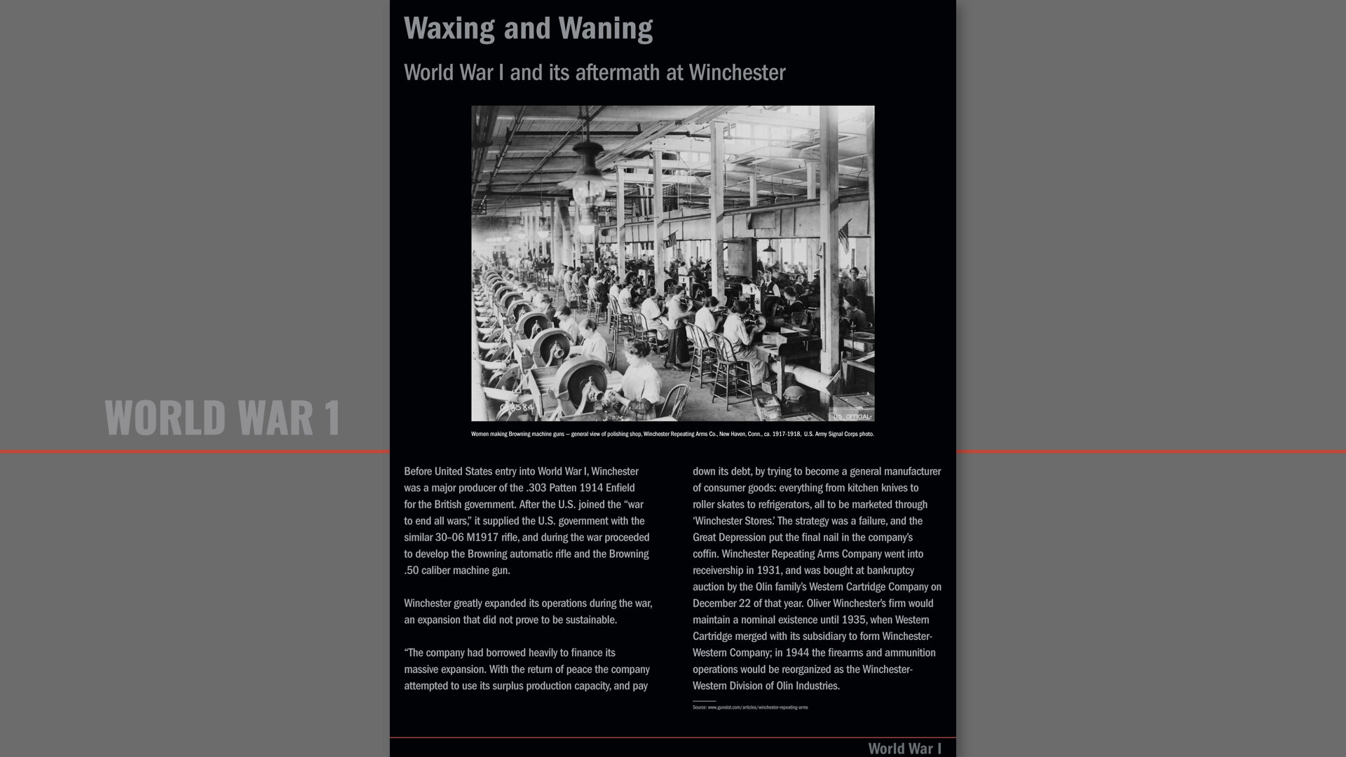
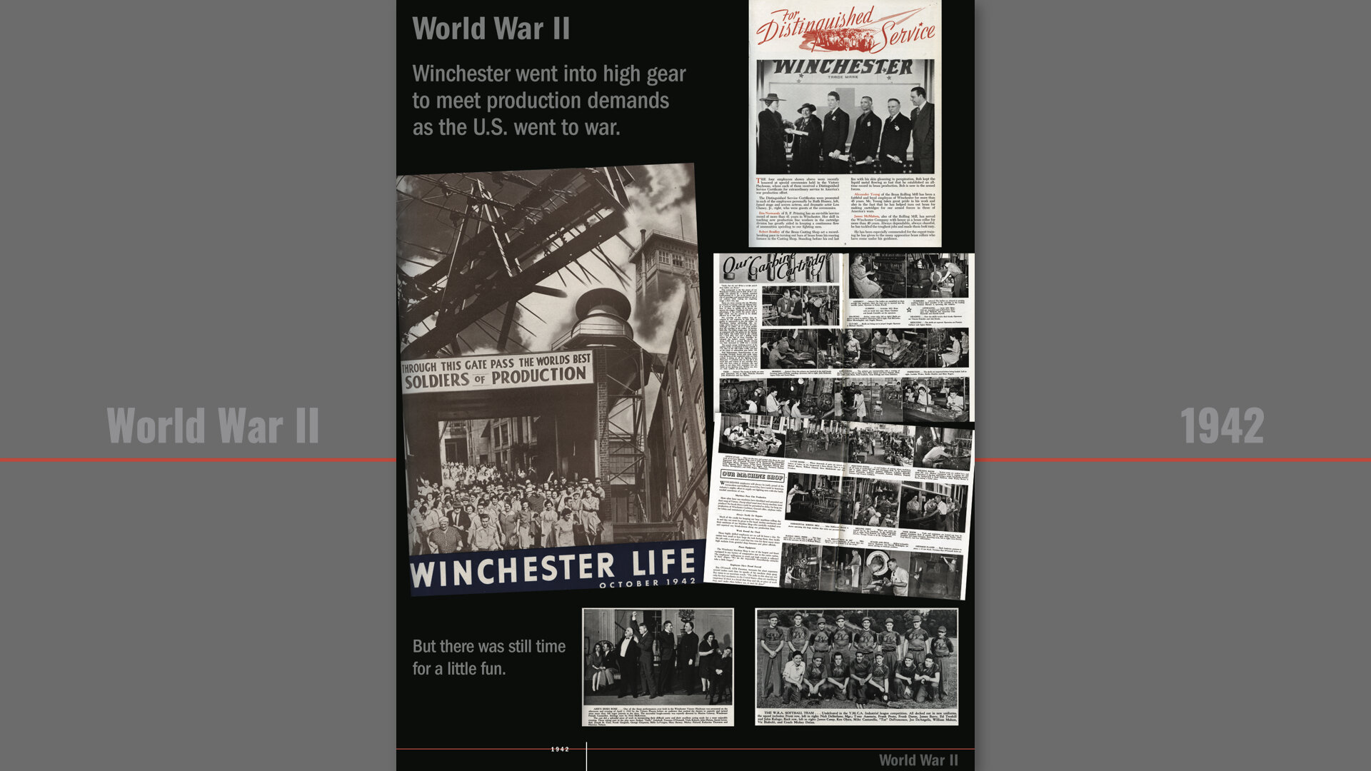
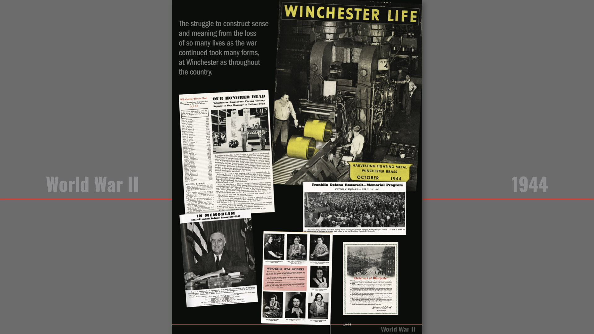
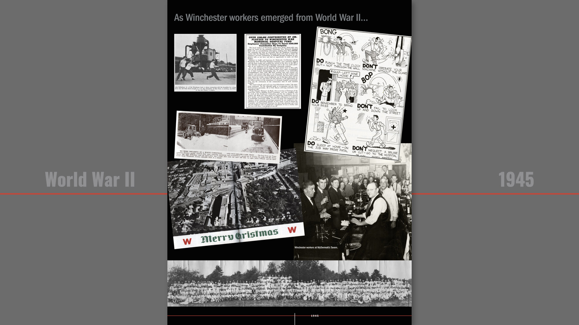
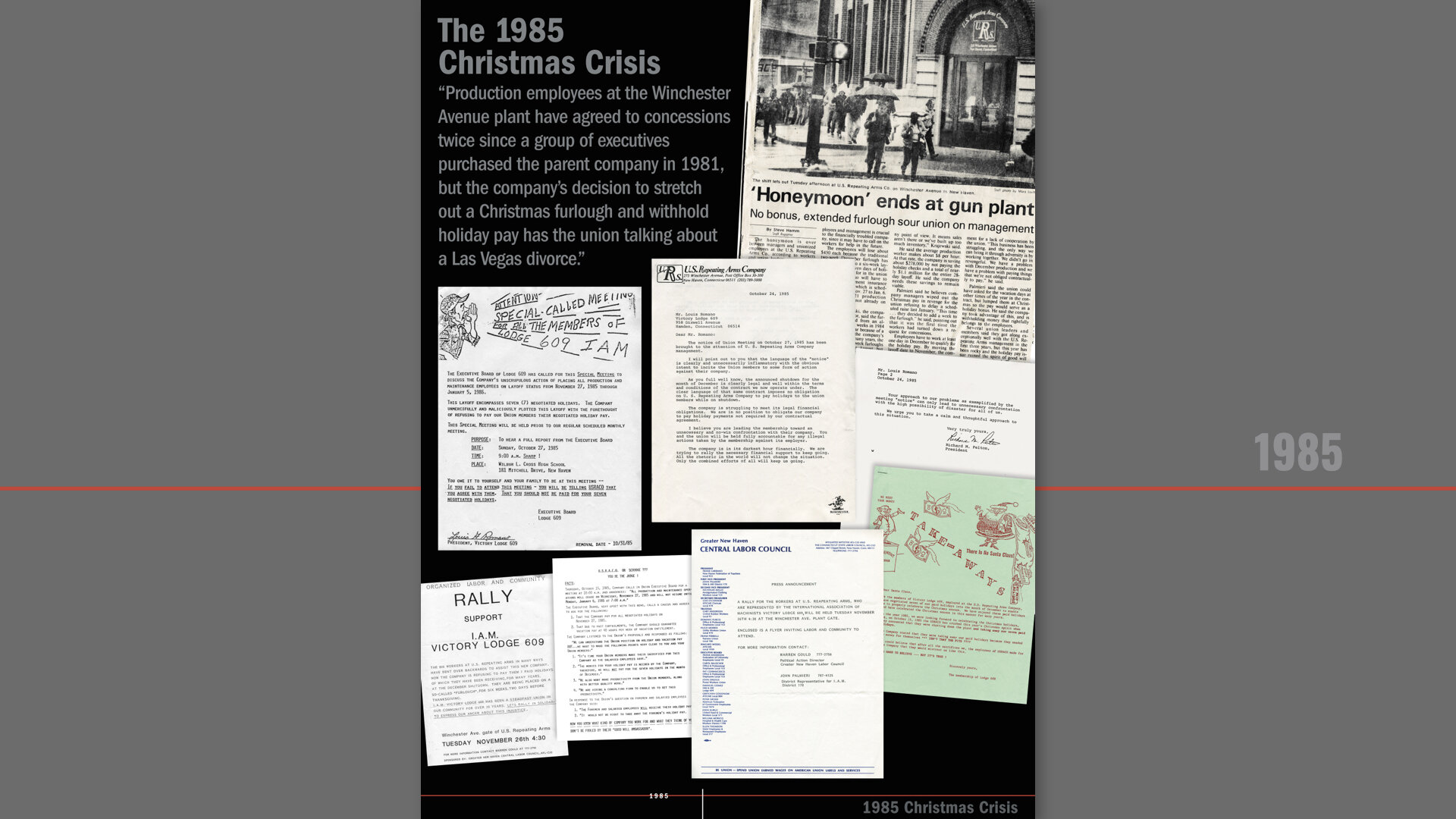
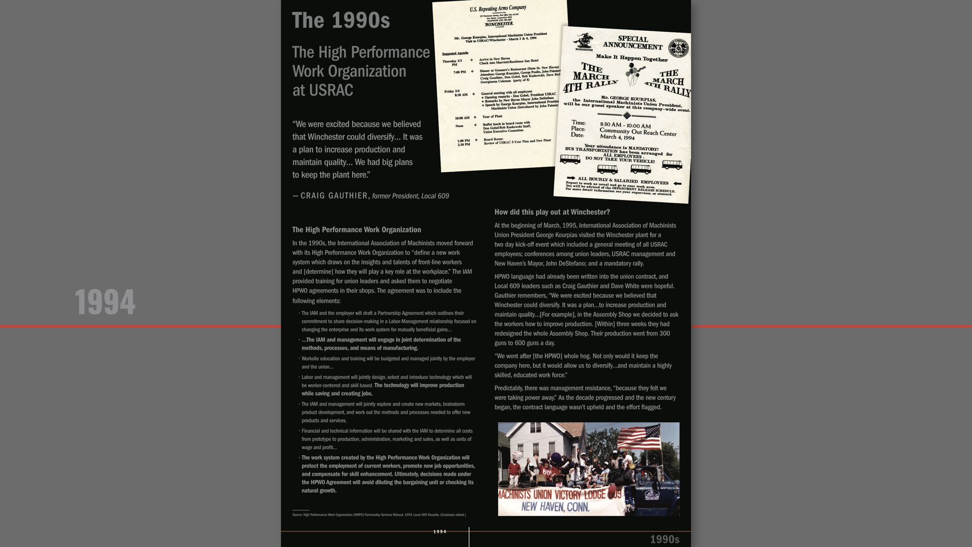
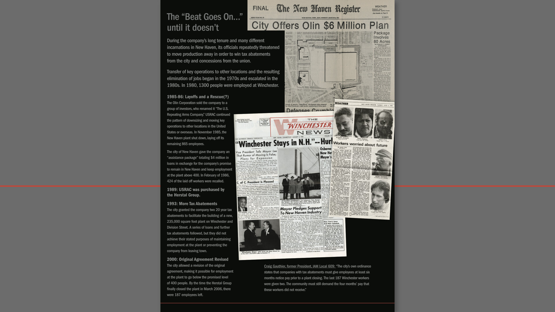
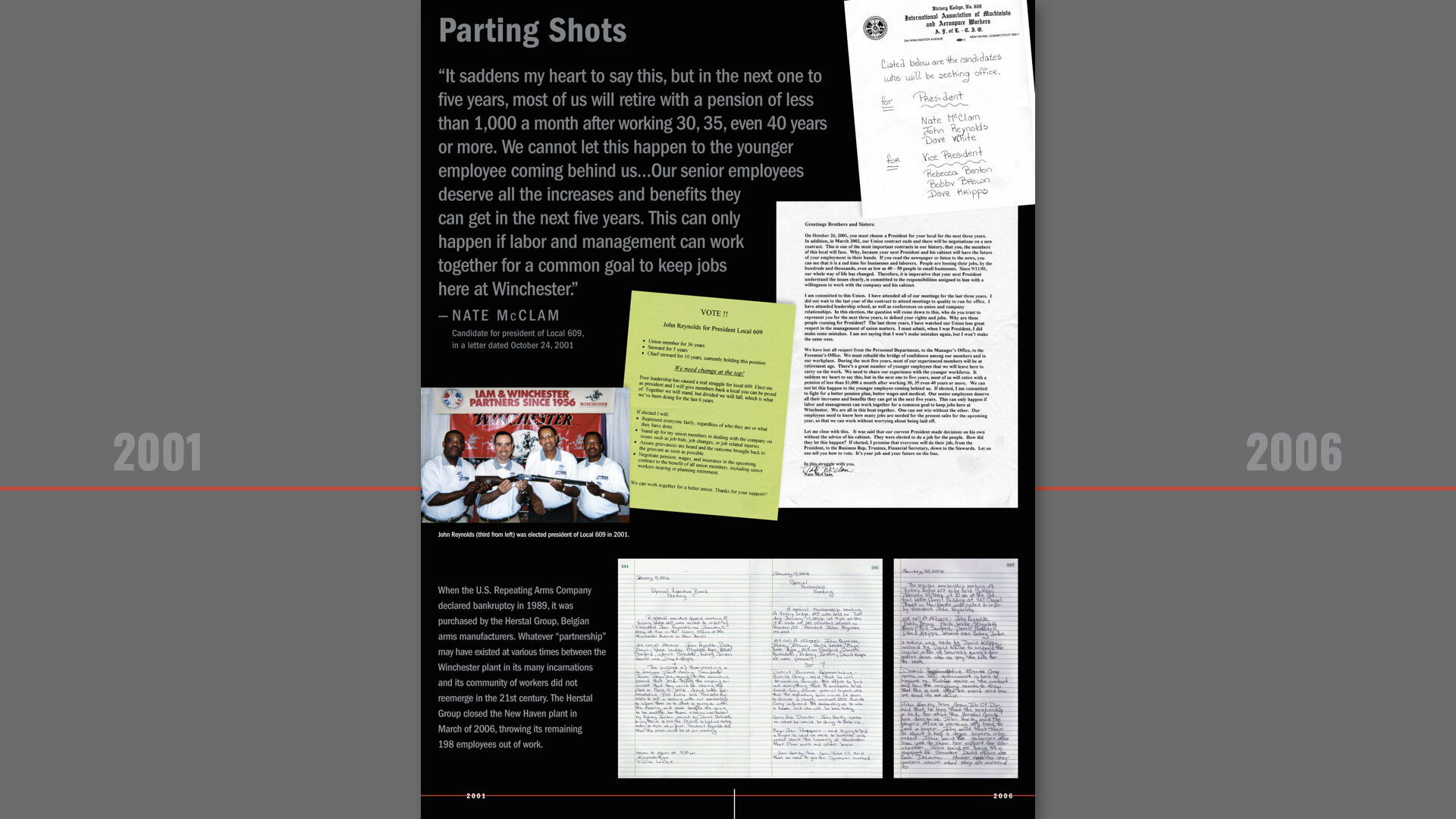
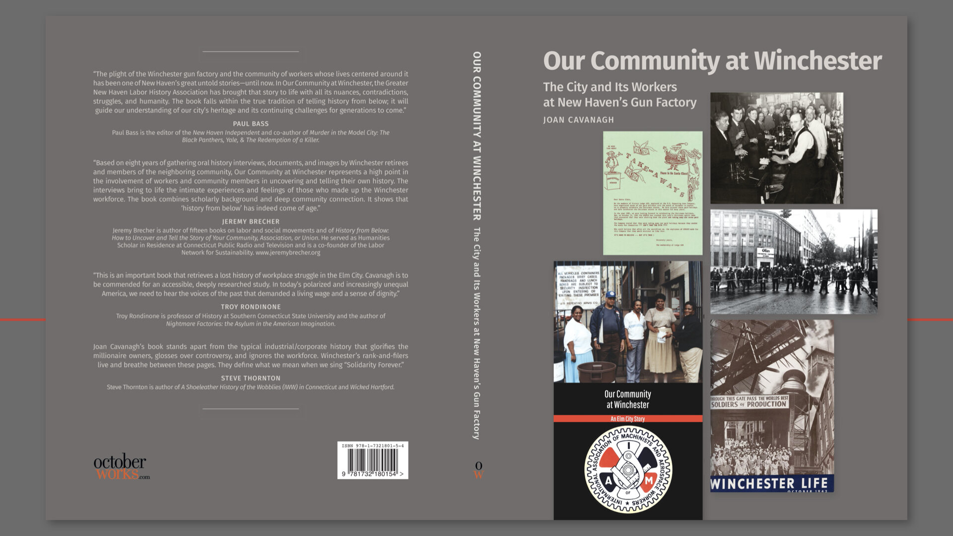
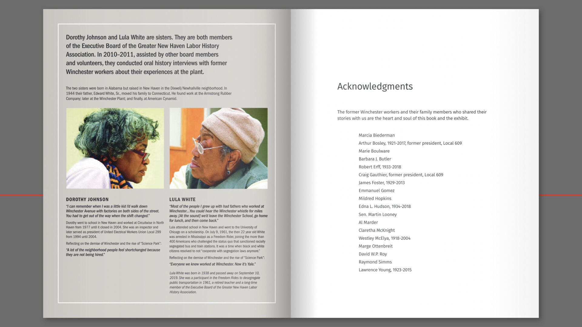
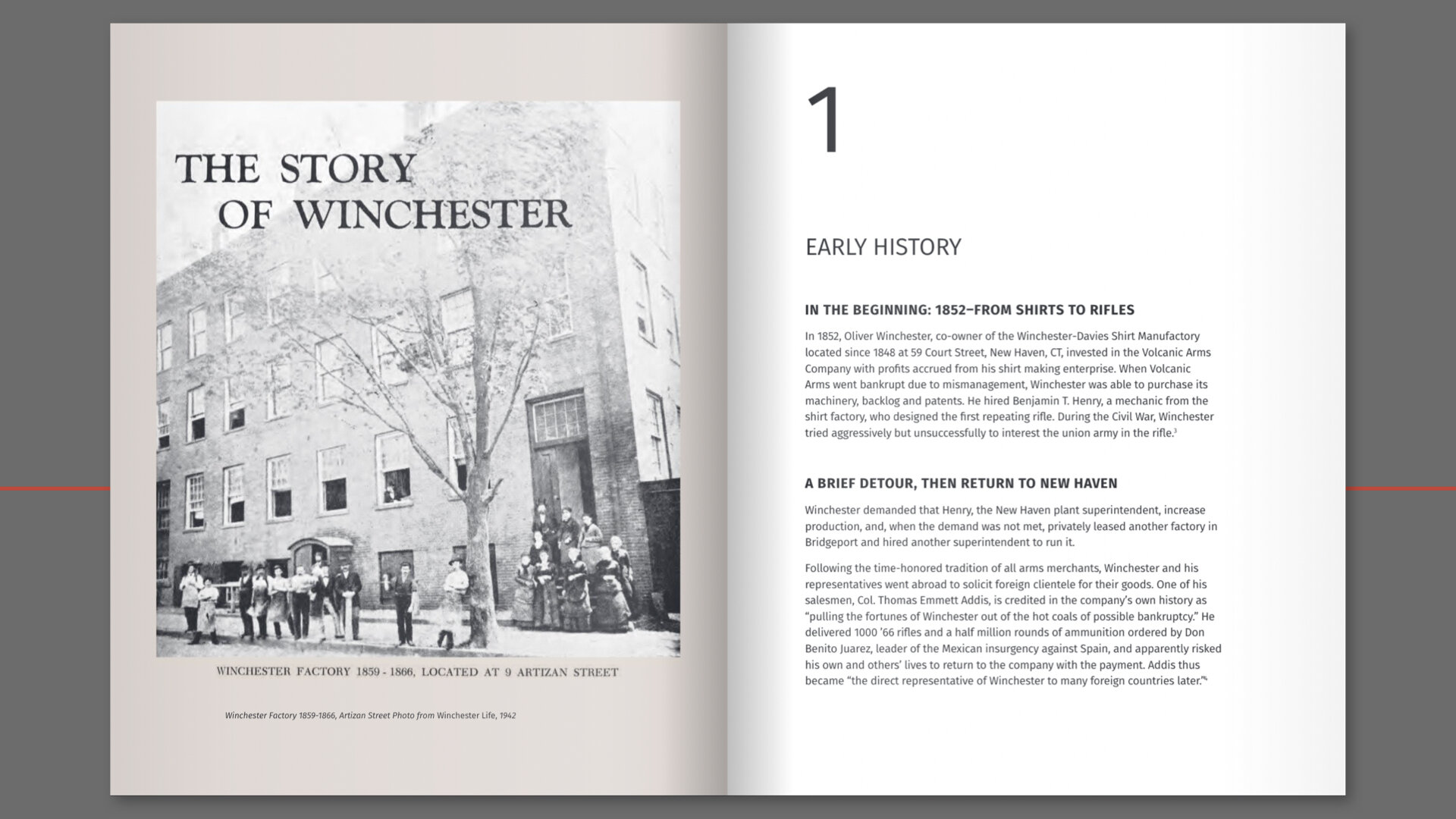
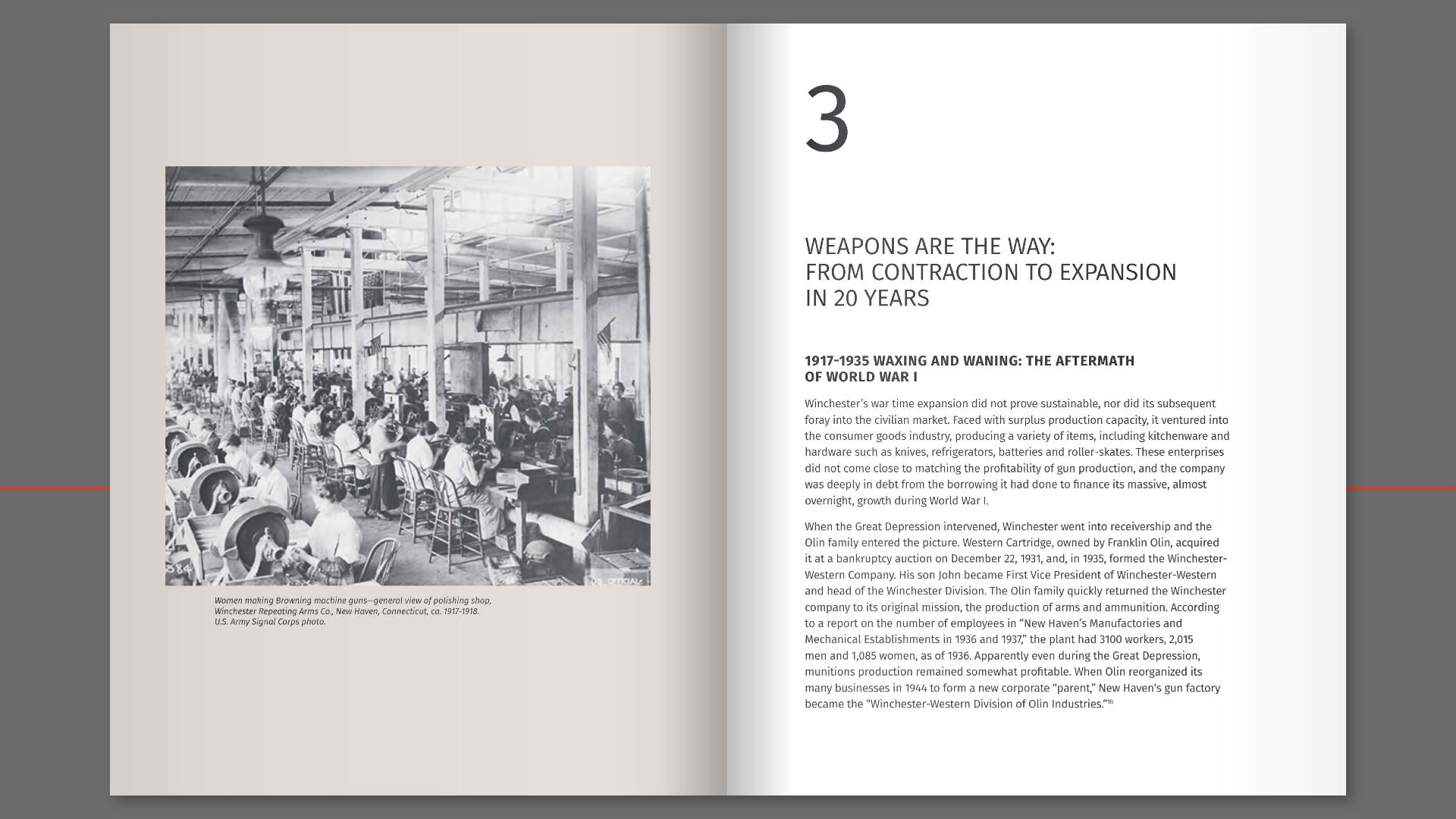
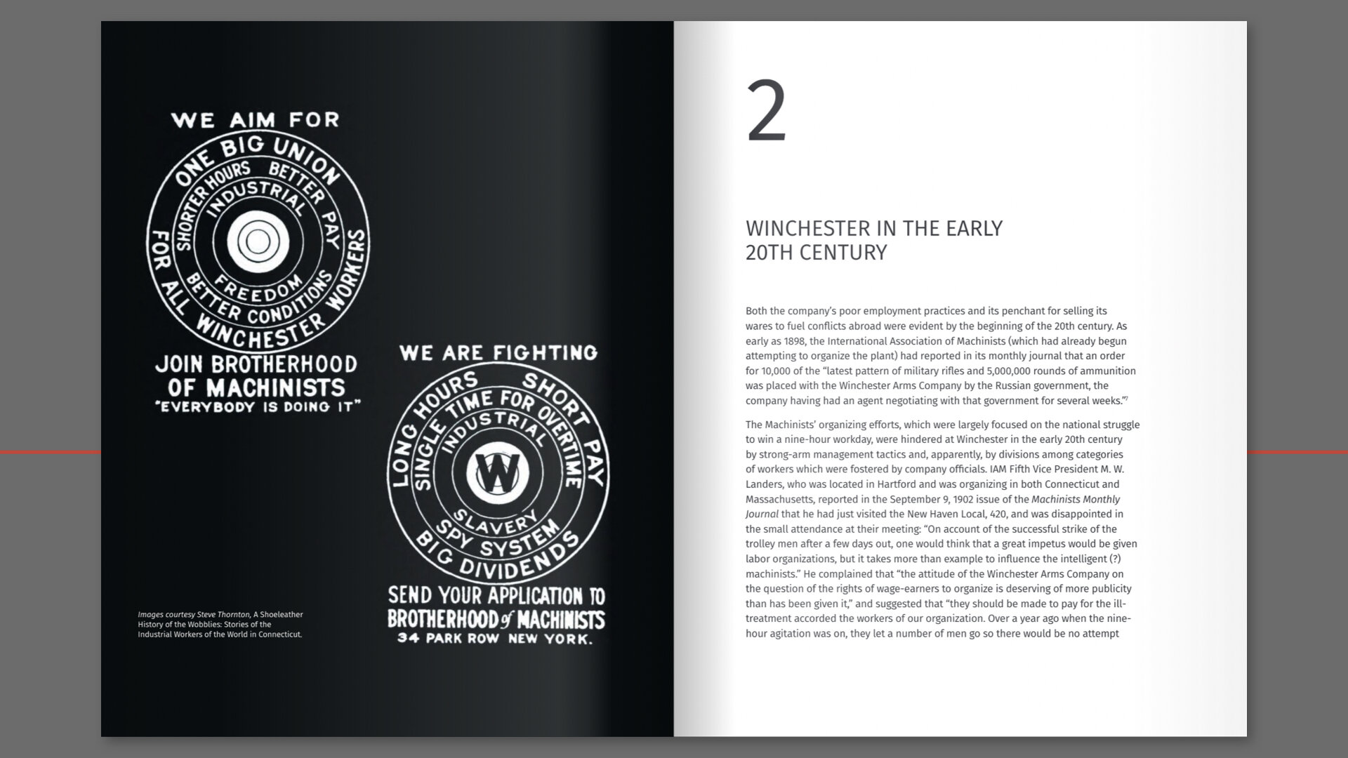
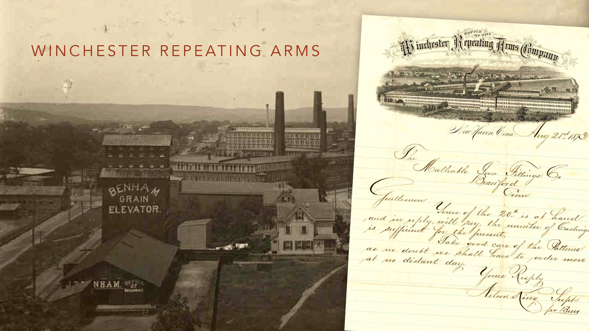
Our Community at Winchester: The City and Its Workers at New Haven’s Gun Factory
Yale Public Humanities: Democracy in America, Yale University
March 30, 2021
Good evening, I’m Jeanne Criscola and I want to thank the Democracy Project for inviting our team to talk with you today about this extraordinary project. It includes three versions: an exhibition, web version, and a book.
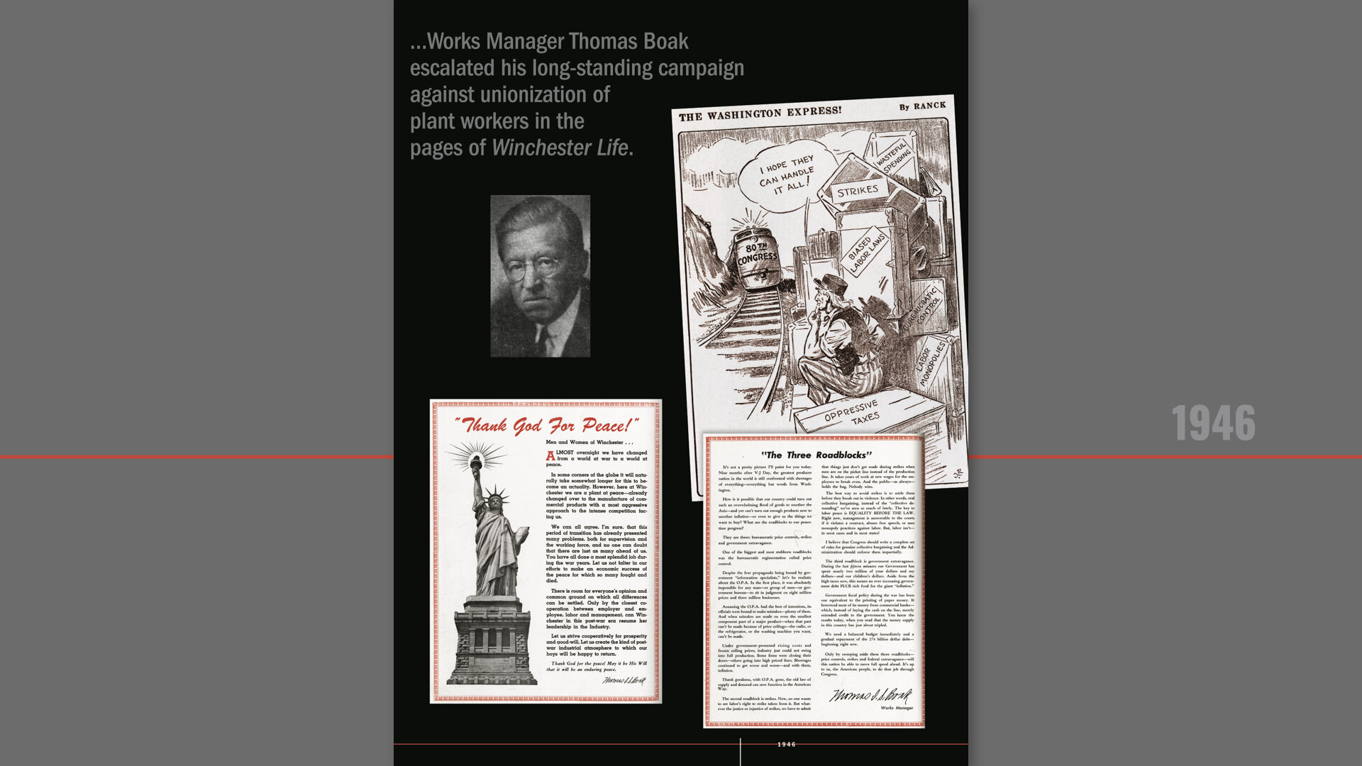
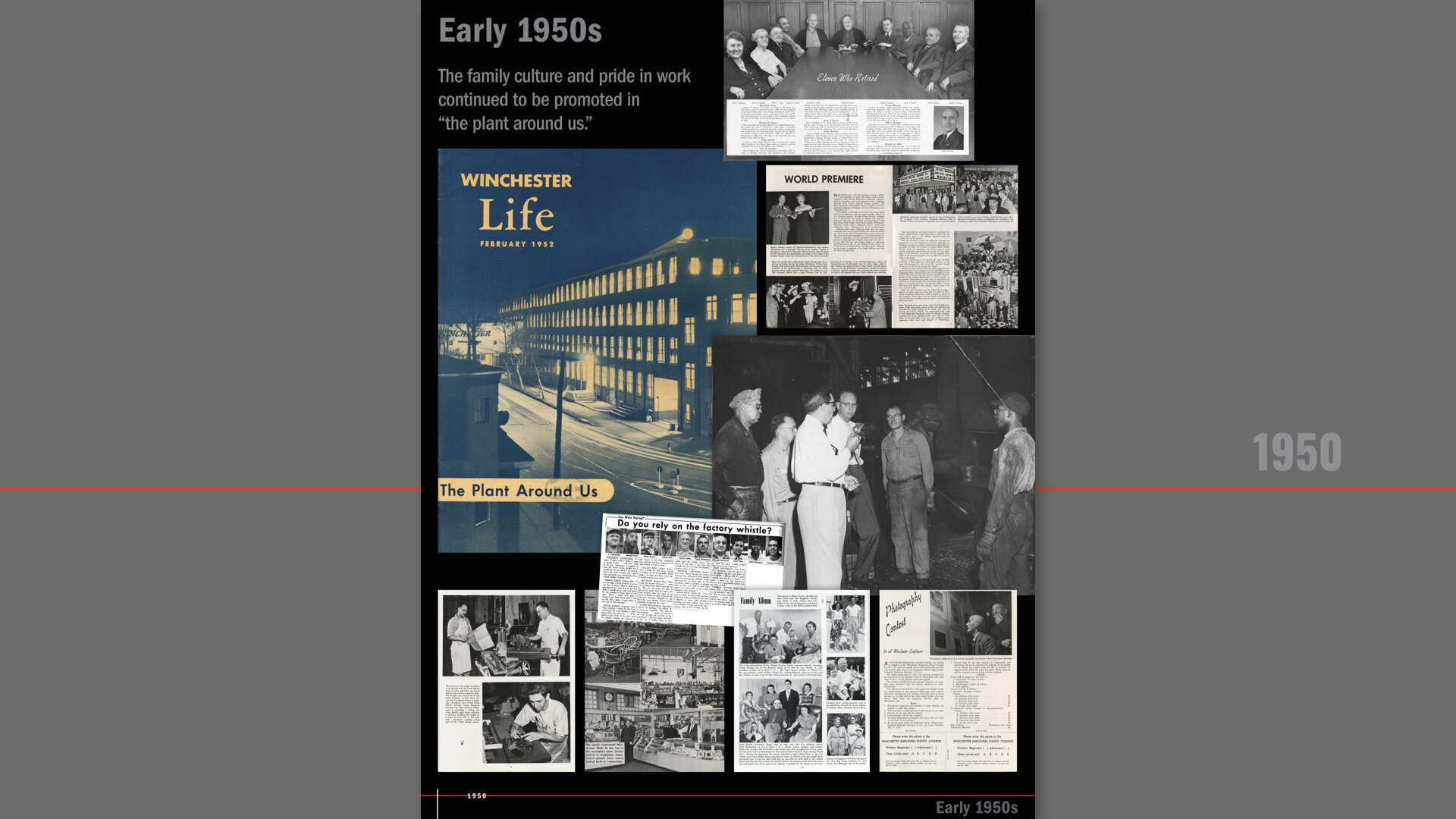
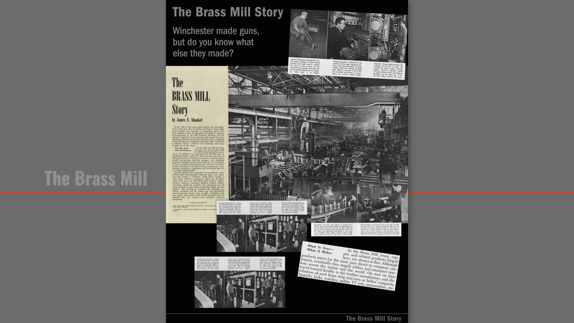
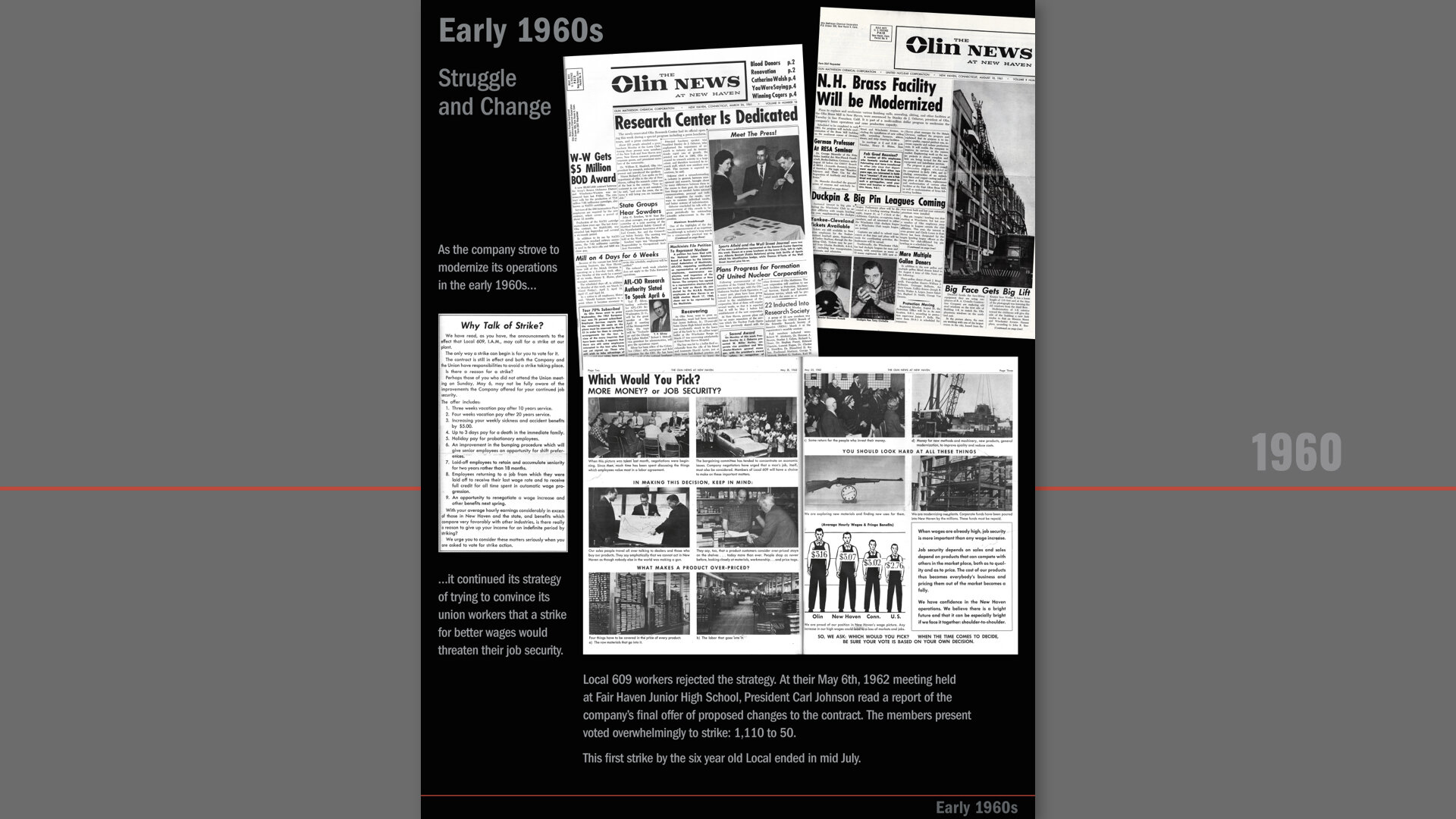
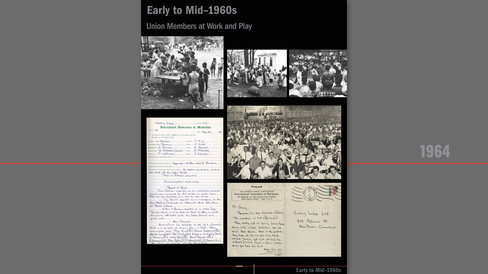
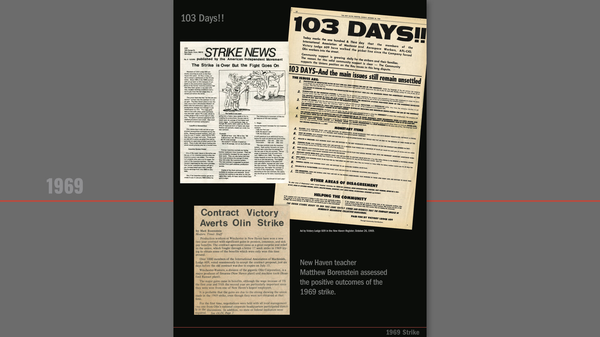
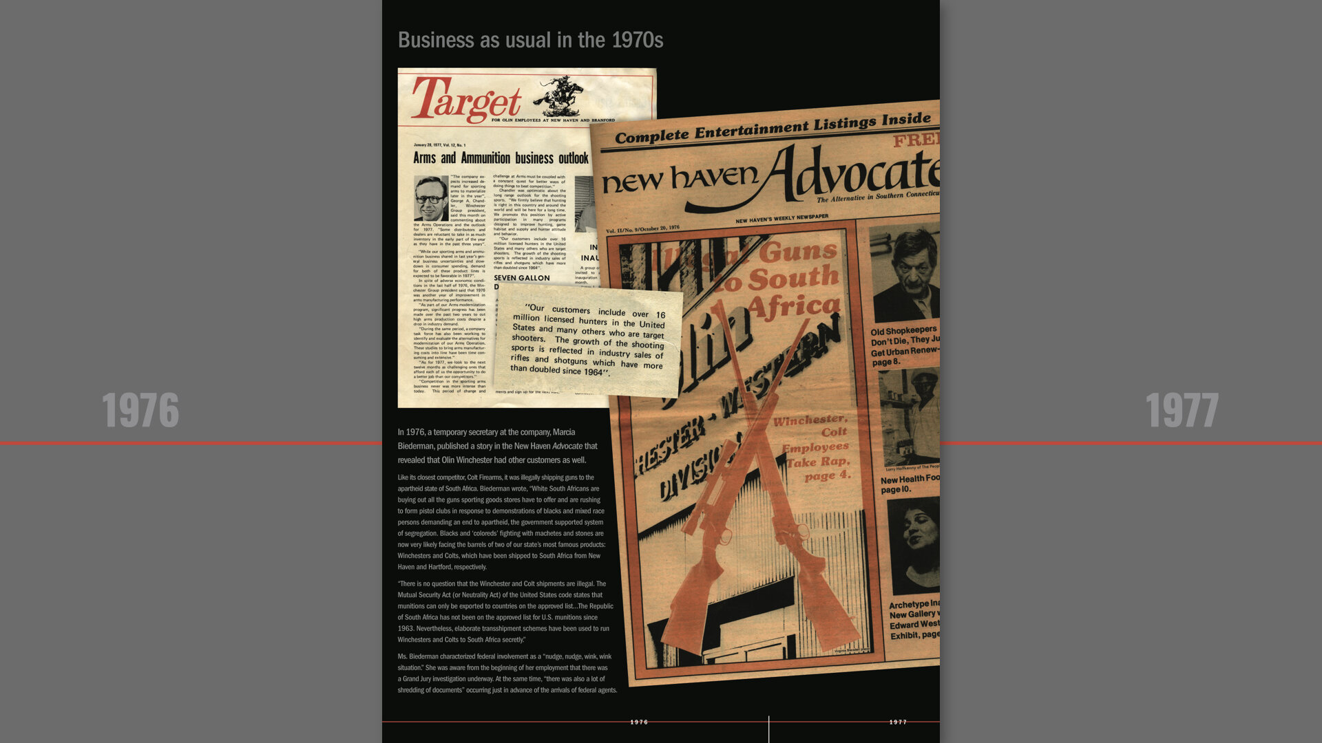
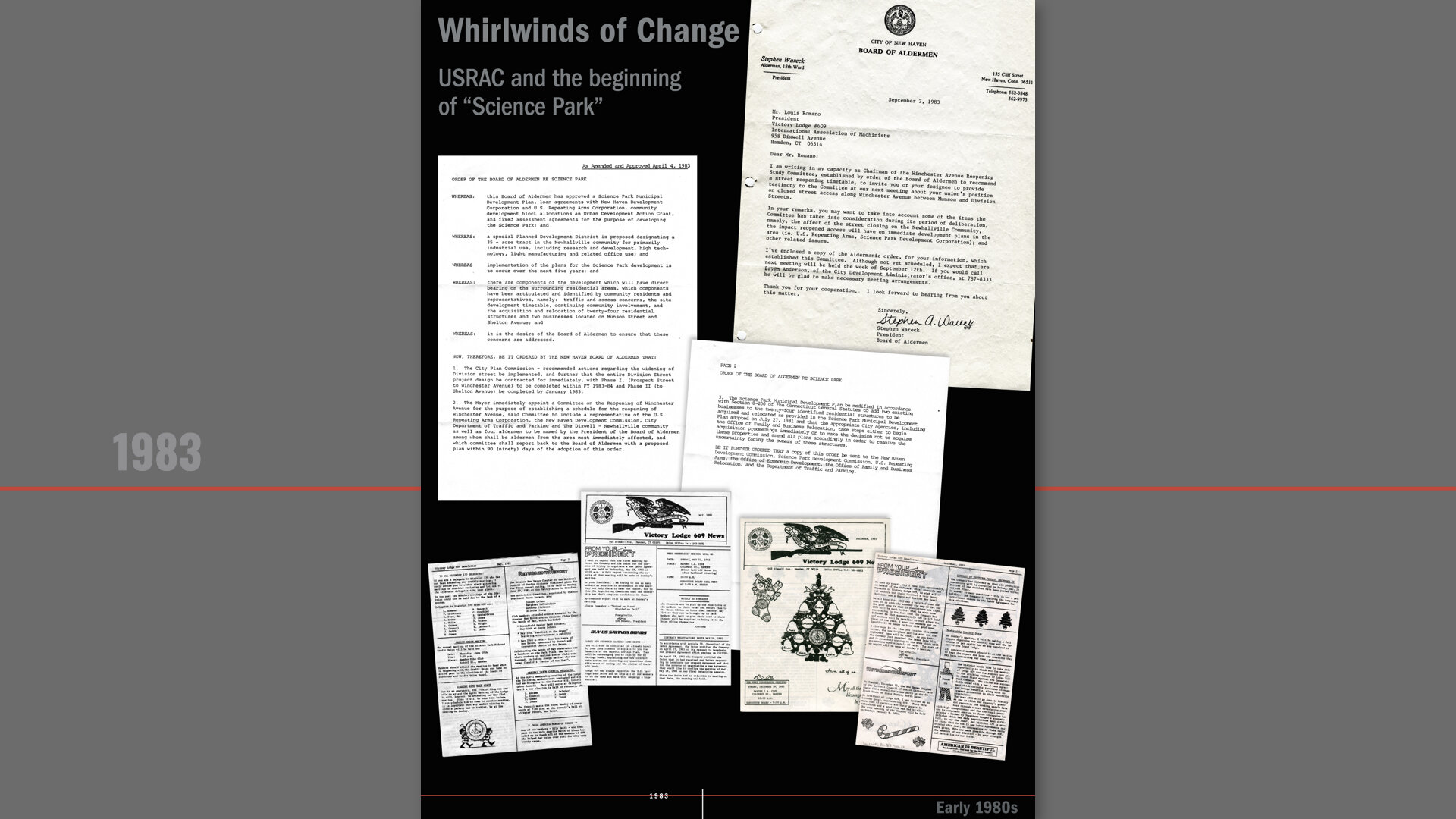
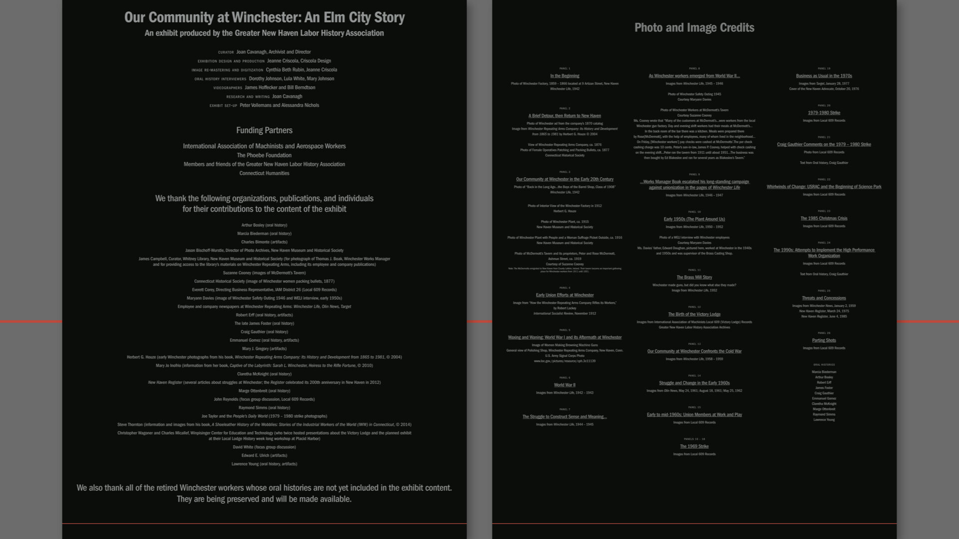
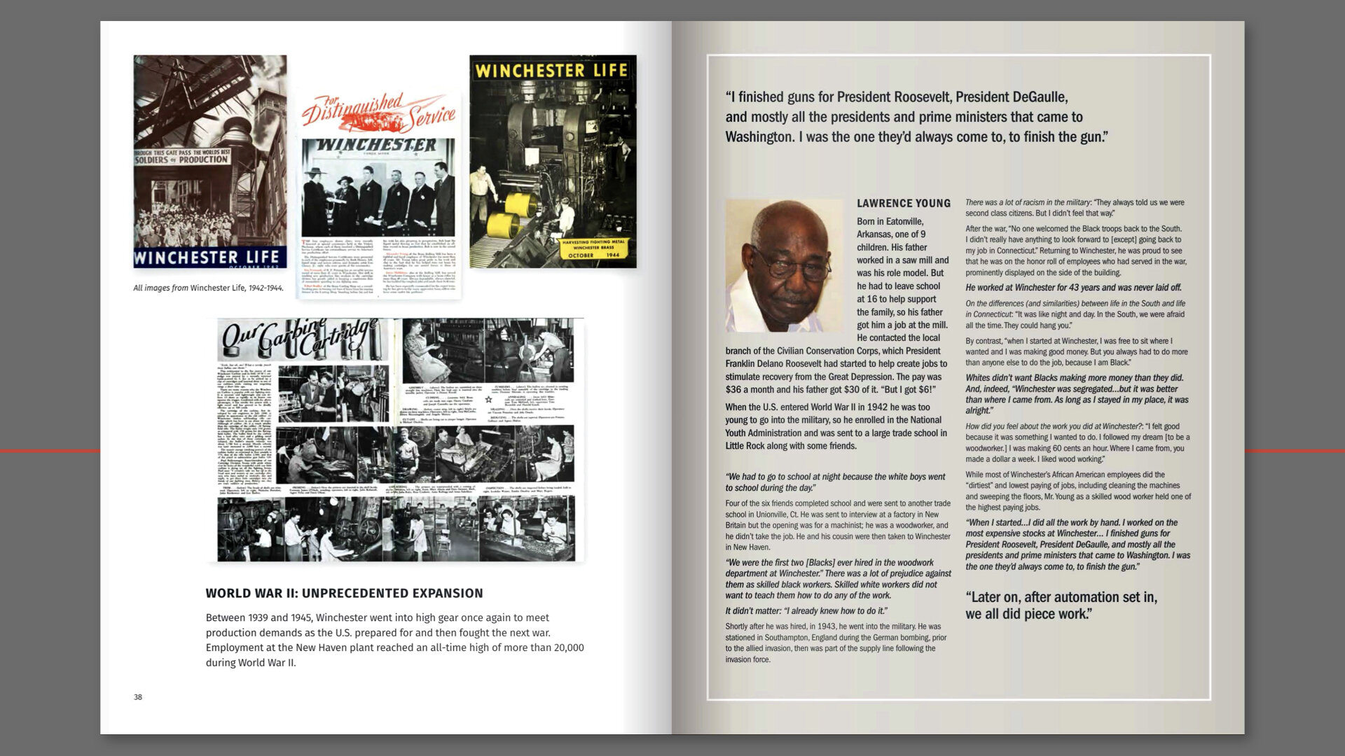
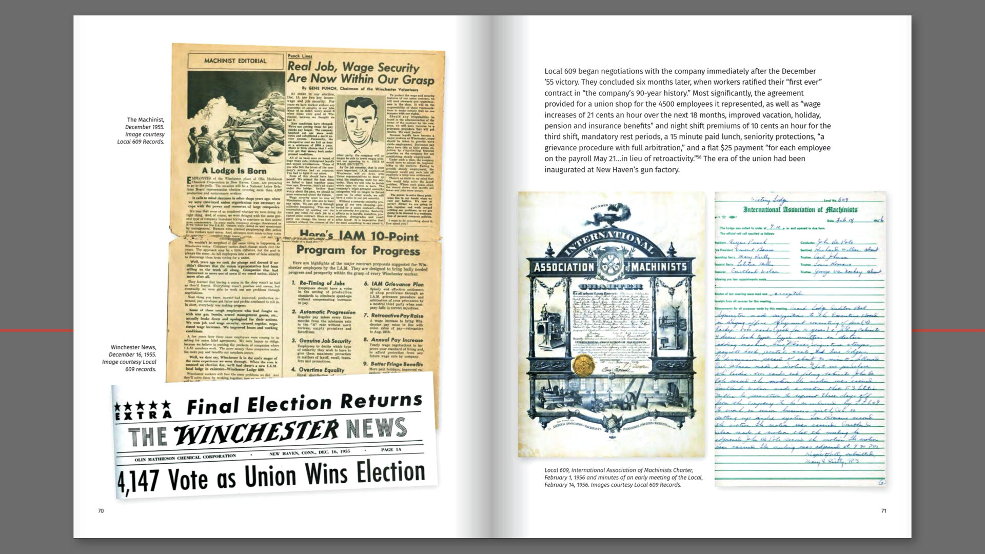
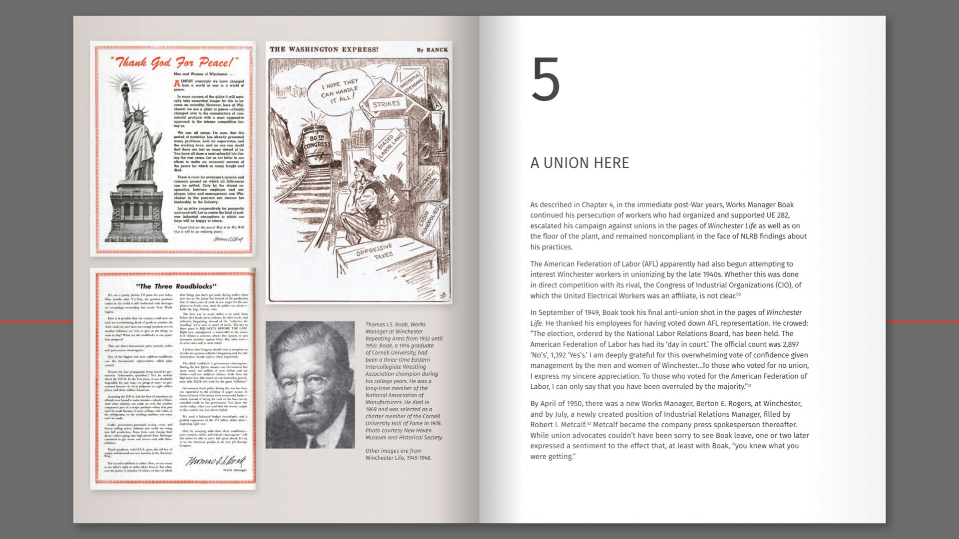
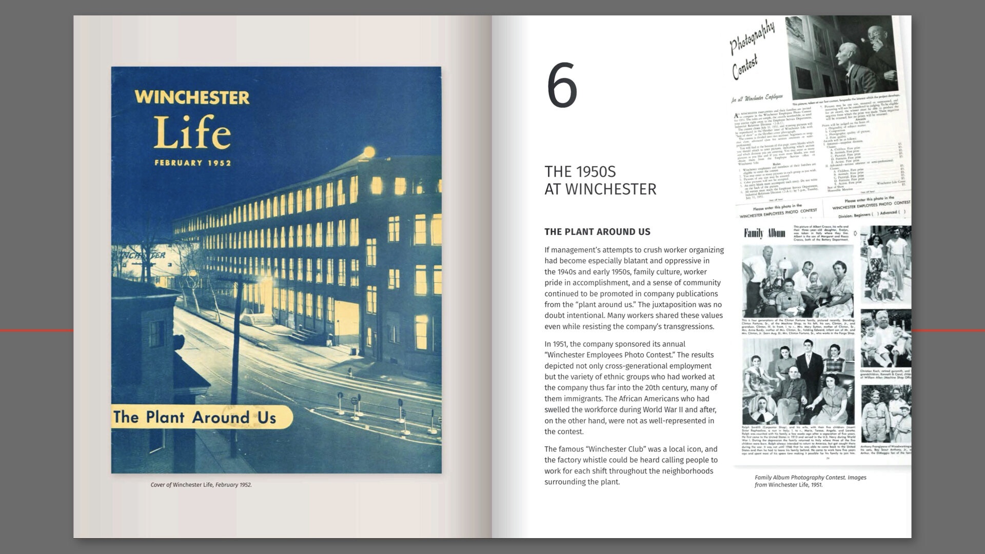
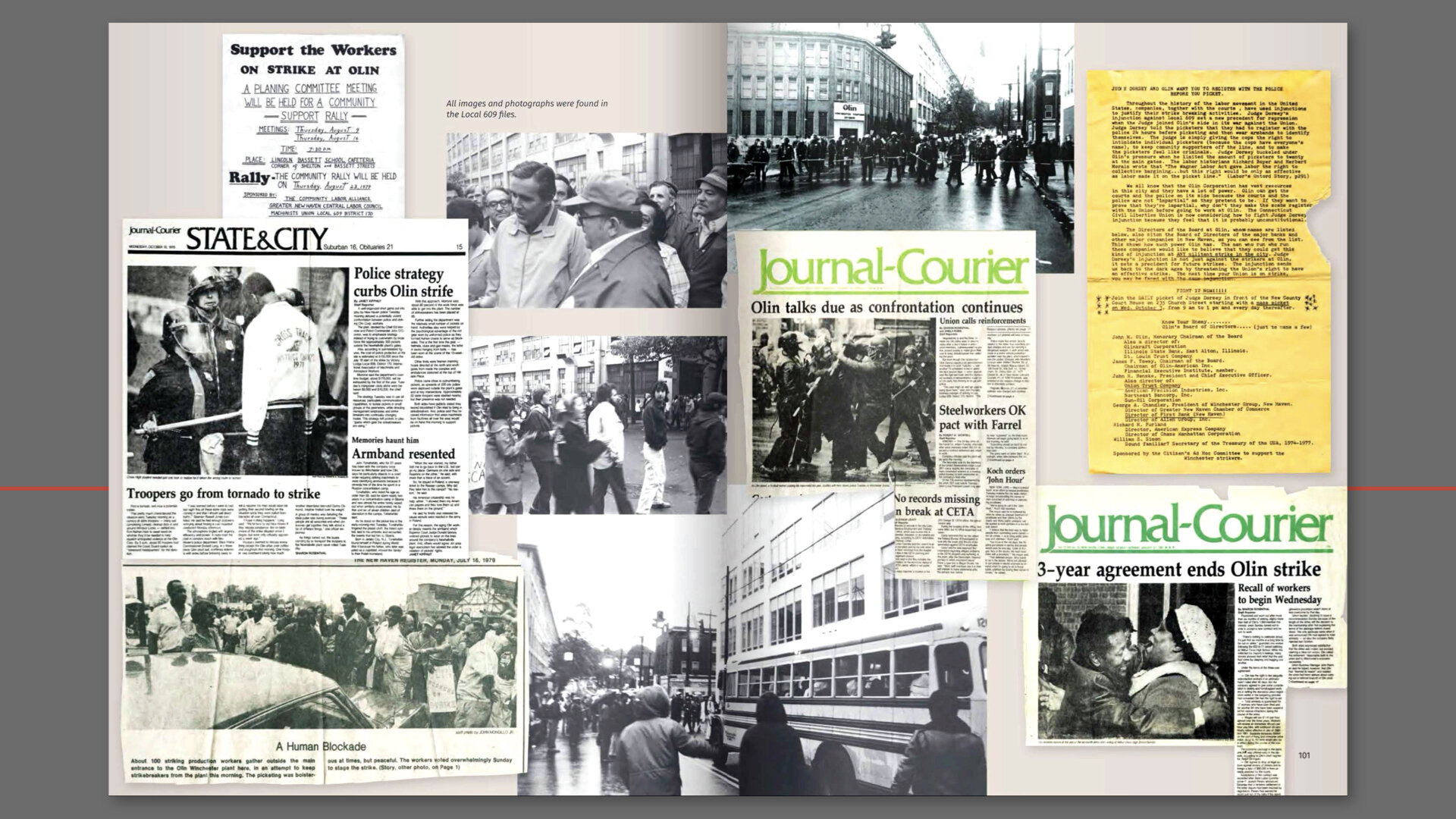
As I was preparing this presentation and trying to recall when it began, I went through my archives and found a project brief dated March of 2010. As I recall, Joan was working on grant writing while my friend and colleague, Cynthia Beth Rubin and I were flushing out the details that we had to work with. From what we knew at the time, there were photographs, newspaper clippings, flyers, and all sorts of ephemera to be digitized for the first part of the project which were to be a series of 26 exhibition panels. By 2013, the digitization, layout and production, and the manufacture of the panels were ready for exhibition. Then in 2015, the exhibit was post-produced for the web. So in between 2013 and 2015, the exhibit debuted at Gateway Community College’s Gallery. Discussions began about possible turning the exhibit into a book at the opening.
The panels you are seeing here are actually quite large at 36 x 48 inches. The challenges posed by the final size of the panels required that before we began any design or production, we needed to think through all the stages of the project and prepare a strategy and system for everyone to use and rely on. We all agreed on a naming system that would identify the object--that was easy. The naming system would allow for anyone working on the project to identify the object. At some point after the first layout were produced, a number system was employed that supported the draft layouts but in the end it was not helpful.
Once the scanning began for the design comps, we realized that the storage and sharing of the files would present a number of problems. I wanted every object to be scanned at a very large file dimension and at a very high resolution. For example, much of the ephemera was letter-size with an average type size--between 9 and 12 pt type. Scanning them at a very high resolution and larger than original size would ensure that all the ephemera would scale up in size and not lose any fidelity. When ephemera such as newspaper clippings, magazines and flyers are scanned at 1200 pixels per inch at 300 percent of the original size, the fine strokes within the letterforms are captured with enough information that allows a certain degree of enlargement without pixelation or loss of density. All of this meant that the scans was averaging between 500 mb to over a gigabyte each in size and took time to capture.
In some cases, the objects were larger than the scan bed and needed to be scanned in pieces and then reassembled in Photoshop.
Readying the art was the next step. Many of the objects needed to be handled carefully as they were old and fragile. Every time a wrinkle or dog-eared corner appears during scanning, it would need to be repaired digitally.
Once the scanning, naming and organizing stage is done, many of the digitized files were repaired in areas where the paper had worn away or was creased, printing blemishes were removed, backgrounds built out where needed, silhouetting some ephemera to reveal its shape and edges, and straightening or squaring up where needed to make the scan look as close to an original as possible. Toning the color adjusting follows.
When working with ephemera and archival content there can be hours of repair work on some originals and not much on others.
Next steps were the design, layout and production, then review, editing, and proofing. Overall the final reproductions of the panels were quite impressive and there was not one noticeable pixel or blemish that had been missed.
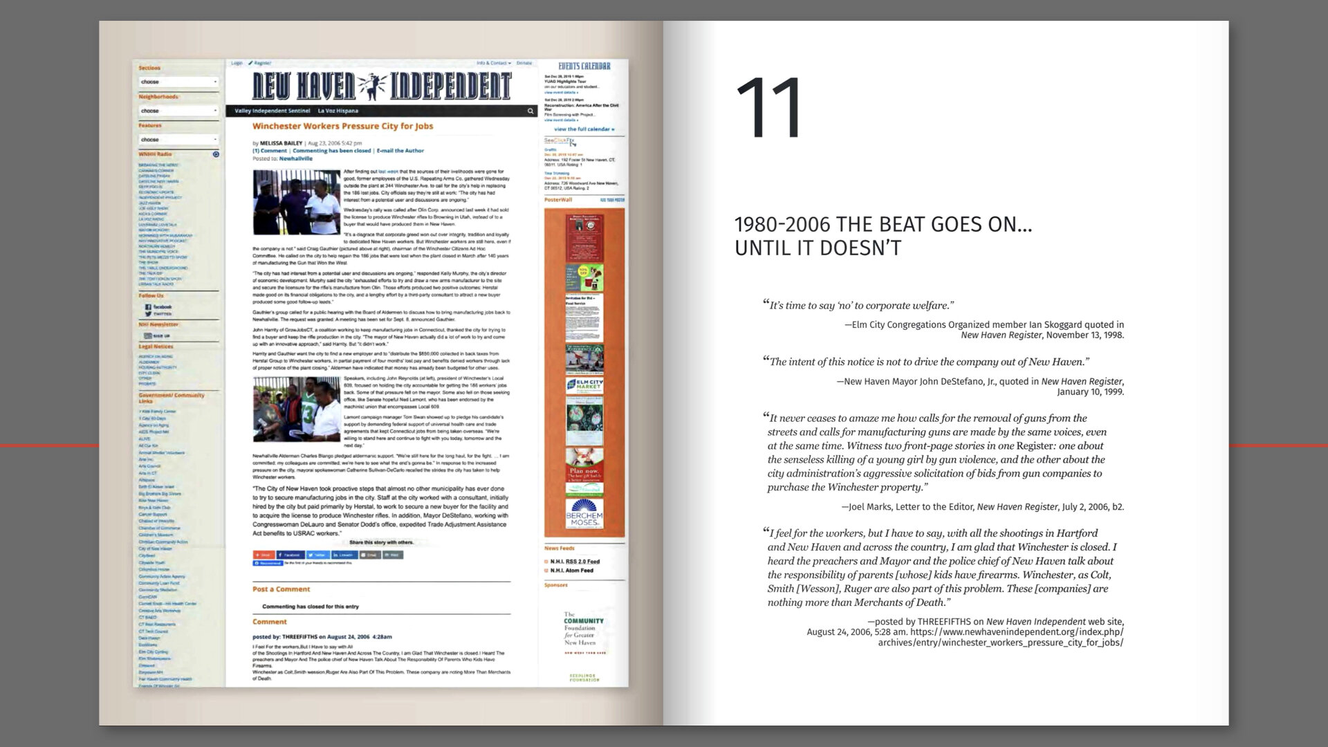
The project’s next iteration was a website. The project needed to be archived and rendered in an organized fashion for David Cirella who was building out the screen version of the exhibit panels. So now all the super sized files needed to be downsized for web. That meant every file had to be opened, and then converted from CMYK color to RGB and then reduced to 72 pixels per inch.
There was quite a bit of time that went by during which the archived files played musical chairs on various storage drives in my studio. They took up almost 50 gigs of space. And if you have ever had a hard drive fail unexpectedly of course, you know that when a request for a project’s files comes up, anxiety swells until you locate the files and get them transferred to a workable local drive or computer.
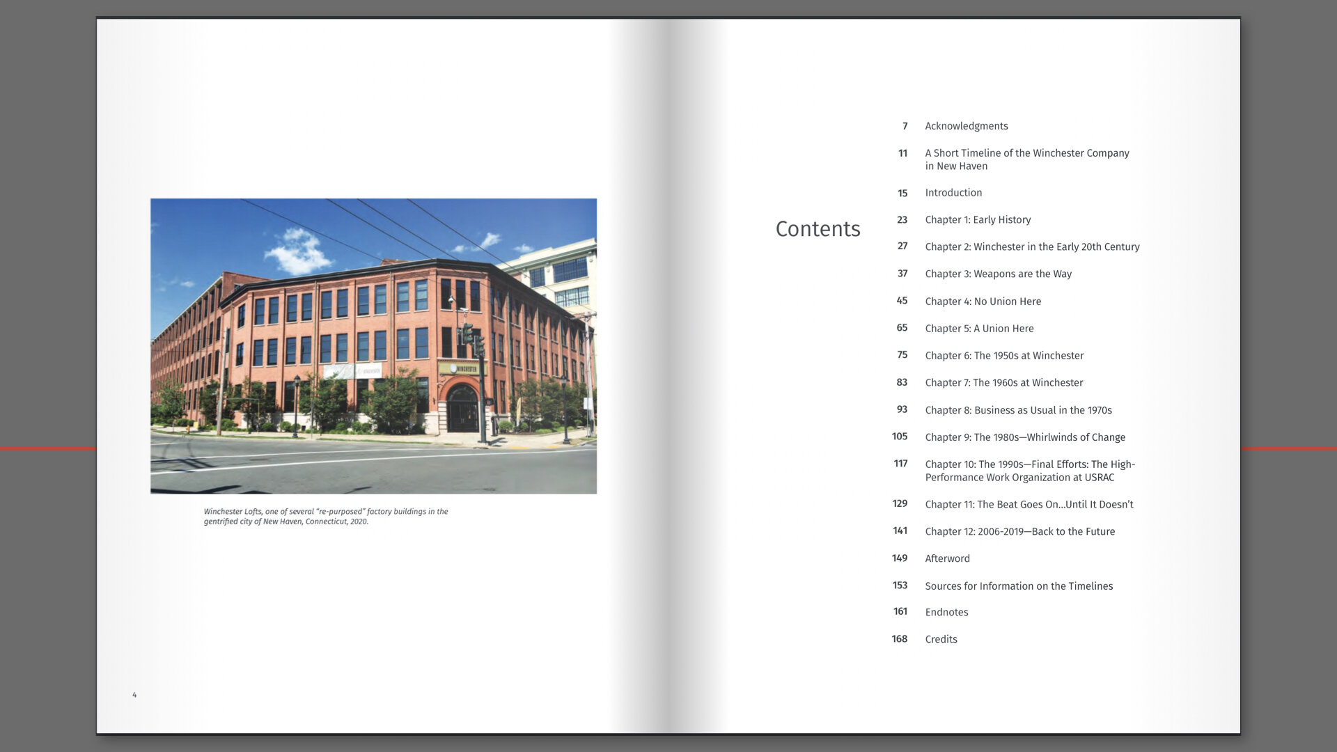
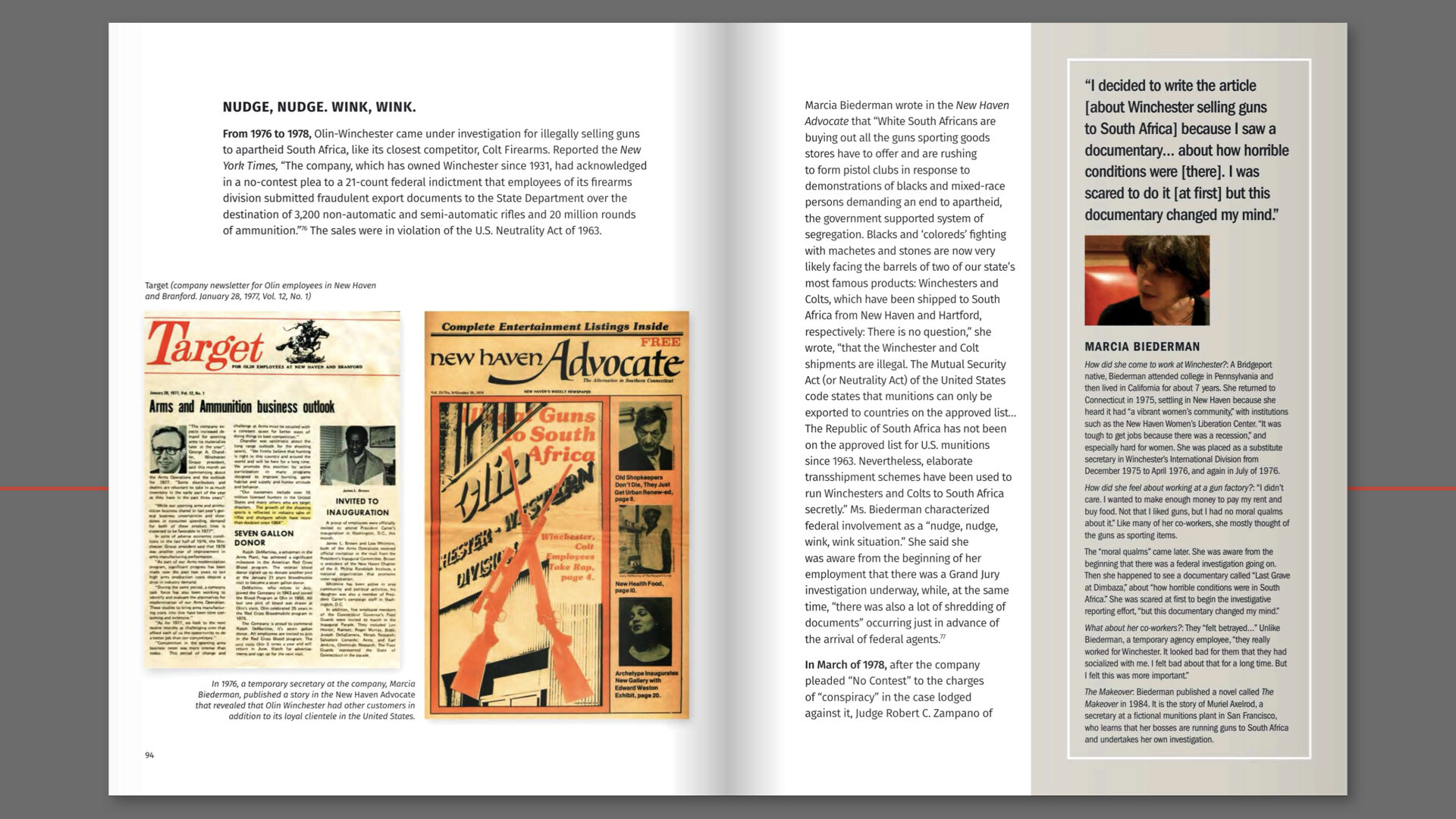
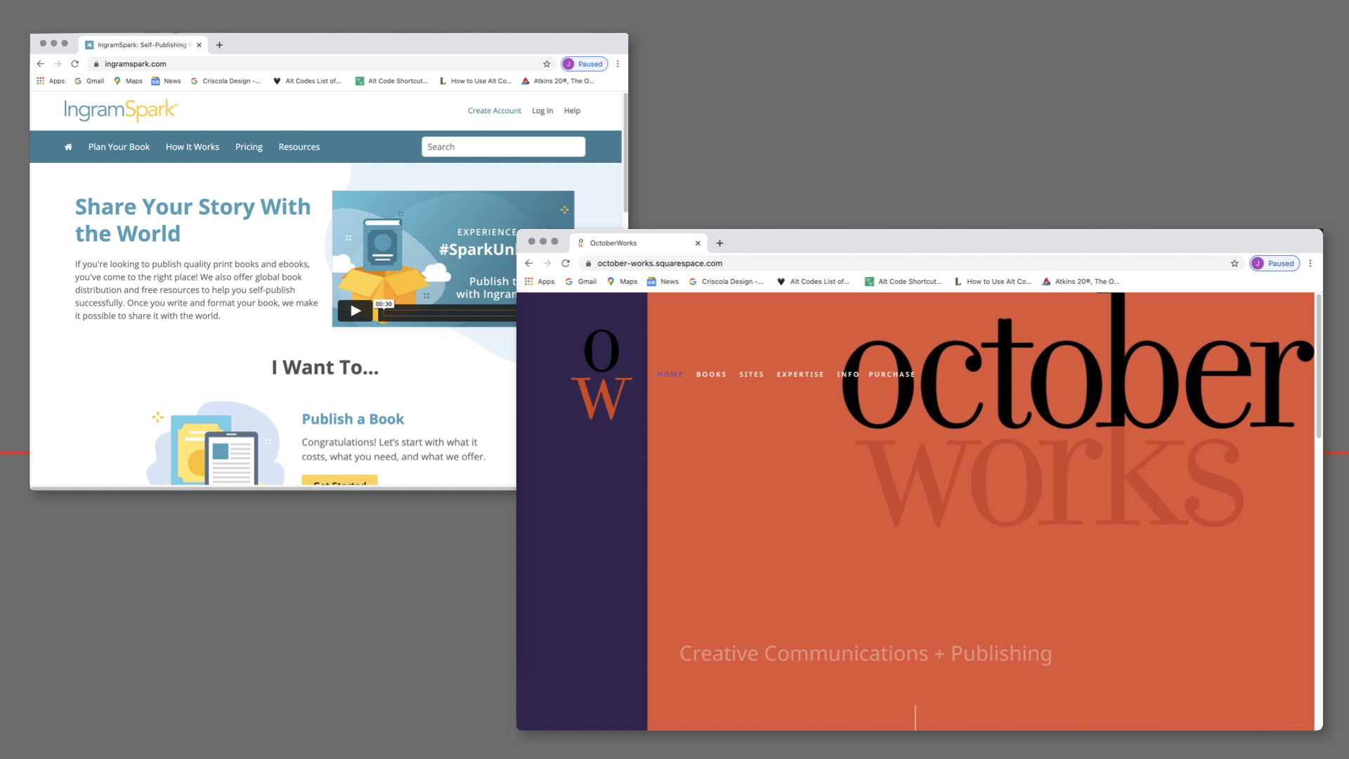
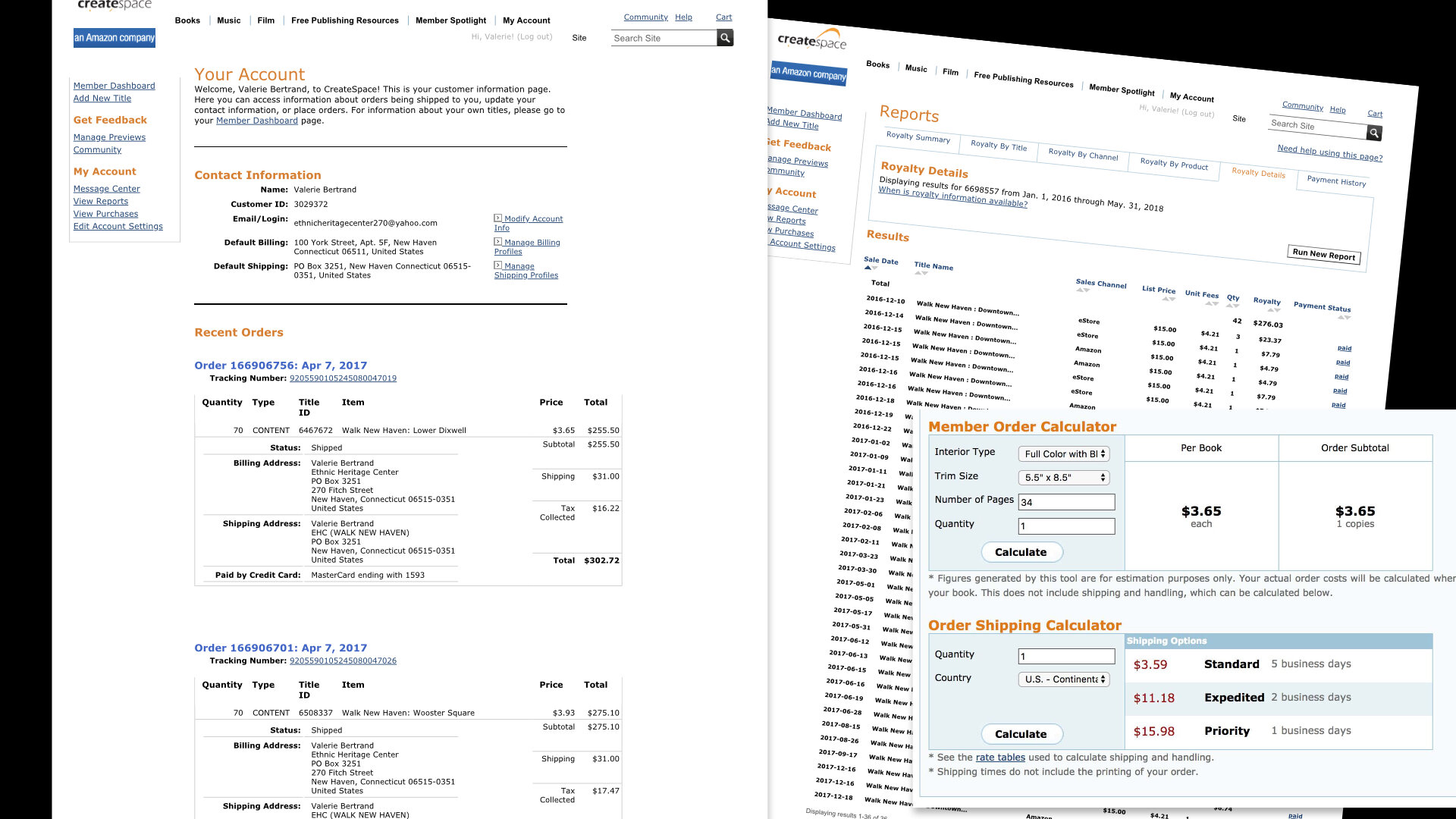
I began the book design and layout late in 2019 and by October of 2020 it was produced, finalized, proofed and ready to publish. By then we had determined to use a print-on-demand vendor and I chose to use IngramSpark and publish it through an imprint I am involved with called OctoberWorks. This is a website where you can read about the book and find ways to order it.
Projects that include ephemera have become a favorite for me and I am working on one now that includes my old portfolio of weavings.
June 18 – September 24, 2020
Announcing a free workshop supported by the Artist Respond Grant Program with funding from the DECD, Connecticut Office of the Arts, and the National Endowment for the Arts.
Jeanne will teach you what site design for art commerce entails even if you don’t consider yourself to be in the art commerce business:
• domain naming
• platforms and hosting
• design brief & business plan overview
• asset and file organization
• naming conventions
• planning / mapping
• set-up and integrations
• structure and navigation
• building out sections
• product & store setup
• implementing merchant processing
• third-party apps
• on-demand fabricators
• and more
The course carefully takes the student through each step using the Squarespace platform for web hosting and construction. Weekly 1-hour Zoom video classes run for 16 Thursdays, starting June 18 from 5–6 pm. Class time consists of lectures, demonstration, sharing, and q & a. Outside class time is for homework, browsing, readings, and viewing. Space is limited.
The fees for the Squarespace platform will depend on the services and capabilities desired. Your initial investment may range between $150–$350. Students will need the following:
• download and install Zoom
• have audio- and video-capable computers
• internet
• basic / average computer skills
• basic experience buying products from on-line sources with a variety of devices
+++
Jeanne Criscola is a creative director who has built a number of Squarespace websites for clients like you: designers, craftsmen, artists, culture makers, writers, and businesses. Her expertise is based on thirty+ plus years of practice and learning through her design studio, Criscola Design. The studio’s commissions span a wide range of industries, scale, and duration, She has worked with individuals on the development of ideas, promotion, and commerce projects as well as the concept, construction, and production of multi-layered team-based campaigns for organizations. Her teaching skills have been honed over the same time of period instructing at many institutions of higher education in Connecticut with the past 5 years as a professor in the Design Department at Central Connecticut State University.
Reading Color: Type in and on color
New Britain, Connecticut
© 2019 Jeanne Criscola
Good evening everyone! As most of you know, I’m Jeanne Criscola, faculty here in the Design Department. This is my fifth presentation about a book I’m writing on typography and color and it’s working title is Reading Color, type in and on color.
It will introduce a new pedagogy for learning typography and color in relationship to each other. It uses a synthesized, inductive, and experiential approach to help users understand the visual gestalt that letter forms and color create. Informed by Josef Albers’s book, Interaction of Color, it provides a methodology that is currently absent in design discourse: the study of color with variations of typographic dimension, scale, and proportion. I’m referring to it as a “handbook” that “places practice before theory” allowing experimentation with letter forms and color to sharpen visual perception. The handbook demonstrates this and guides the user to create samples with combinations of fonts in color set on fields of color. Through the experiments, the user learns how simple and complex negative and positive shapes interact, preparing them to realize, conceptualize, and achieve more with today’s digital tools.
My objective is to prepare users to see ways to place type and color together, arming them with a critical competency necessary for a contemporary media landscape that demands it. It initiates a new way to learn visual perception with color and letter forms, bringing together the typically separate disciplines of color theory and typography. It’s for educators, practitioners, media producers, and art and design students. I want to illuminate what I find daunting to describe—how intrinsic, inseparable, and synergistic type and color really are.
I took a course in college where color was explored using a box of color-aid paper, an Exacto knife, and Josef Albers’s’ book, Interaction of Color. It taught me a lot about how color operates through positive and negative forms, shapes, and pattern. In the early 80s, I became a practitioner of design and an academic when graphic design started to flourish with its liberation from being a subclass to the field of art. I was learning Typography on the job and some of it is now obsolete. Color theory, a fundamental and critical skill in art, was dropped from the graphic design curricula. Graphic design majors were shifted into 2-D courses where exercises explored the basics, patterning, texture, and color. Over the decade, I applied what I had learned to the root elements of graphic design: social concepts in typography and imagery with digital tools. During this time, the digital tool radically changed, print became more complex, screen design emerged, and academia started cutting costs and combining majors.
Upon my return to teaching in 2004 after raising my kids, I searched for a basic but comprehensive textbook for a class I was preparing in Media Design for communication majors. I considered the type books in my library by Robert Bringhurst, Walter Tracy, James Craig, Ellen Lupton, Rob Carter and others. I searched through graphic design books for chapters on color and typography. An internet search for typography with “look inside” features revealed many new books on the subject. I could even find older editions of books as pdfs. But none were quite what I was looking for. I wrote an outline for a book that explored typography and color theory in context and in situ and then I put it aside. In my studio and in my teaching, I continued to see a need for such a book in an environment that was rapidly changing due to technological innovations and more varied and profuse media. In 2018, I revised the proposal, expanded it, and started submitting to publishers this month.
The handbook is based on my observations and experience working with and teaching typography and its history. Through a historical lens, my premise to integrate the study of type and color is obvious and logical. I do hope this presentaion allows you to see the potential in this new field of inquiry.
The study of communication design is underpinned by the theories associated with the development of communication and language. Beginning with cave drawings, the through-line evidence shows how humans have employed the materials and technologies of their time to impact the evolution and design of written language. In 1455, Johannes Gutenberg’s technologies marked a milestone for written communication and its distribution with the mechanization of movable type and printing. Metal type was then upended by photo type around 1950. And a short time later in 1985, desktop publishing with a personal computer enabled the placement of black type and simple textures on a white field. Many innovations then lead to incremental changes that gave way to today’s digital typesetting technologies where applying color to letters, words, layers, and backgrounds came next.
In all, digital technologies have fused together typography and color to present limitless opportunities, myriad configurations of type design, fonts, size, and layouts suspended in seemingly infinite spectrum’s of color. There is even a new scalable vector format called Chromatic Type, which embeds color into a typeface design — unlike those pixelating Apple Color Emoji’s — which disappointingly only scale so far. Graphic design today shows strong evidence that technological advances are impacting and evolving communication modes and norms again. The future is colorful! Right? So, how should design education adapt for this paradigm shift?
Of course, type in color is not without historic precedent. We can see that Gutenberg’s Bible used black and other colors — same as almost every print and screen-based graphic found today. But today’s digital technologies do, in fact, present challenges for the fields of typography and color since each discipline falls short of modeling today’s digital communication technologies. For instance, in coursework and in books on the subject of typography, examples typically use letter forms in varying degrees of sizes and contrast to demonstrate colors’ influence on legibility. In books on color theory, the properties of color are often demonstrated with pie-shaped diagrams, color wheels, grids, and rainbow bands.
I’m always tweaking assignments to imbue typography with creativity—to make the indescribable—describable. Appropriating Josef Albers’s book title, Search versus Re-search (Albers, 1969), my current search and “research” sets out to find ways to study type and color together. For educators, infusing color theory into the study of typography has advantages for curriculum and course development. For the design student, methodologies that facilitate the learning of color theory with letter forms would integrate their study and practice. Testing this new approach can only be measurable within a design program where typography in and on color are practiced. Programs unaware of their essential value on communication will be reluctant to add typography courses to their curricula, let alone color theory.
So far, my questions are what would educators, professional, and students alike need in order to facilitate the study typography and color together? What would they welcome? The application of Albers’s experimental color studies and his Bauhaus mentor, Johannes Itten’s contrast of extension theory that employs area, size, and proportion to color offer a starting point to study the visual gestalt of typography. Both Albers and Itten approached color theory through color perception with positive and negative forms, shapes, and pattern.
The handbook will be written for students of graphic design and will focus on color as it is applies to message construction by mixing practical know-how and theory with digital and photographic examples in print, screen and dimensional forms. Each example will be examined for its typeface, style, orientation, and alignment—in and on color. It will be a hybrid in content and context—part reference, part inspiration—where type and color are bridged and evidenced in all media, with examples of alphanumeric characters in many languages for a more holistic approach to a global audience of designers. This component is in homage to you, my students, especially those whose first language is not English—you’re the inspiration and hopefully you will participate in the development of the handbook. I’ve also been inspired by Yale Press’ Interaction of Color app for the Ipad and I’m experimenting with software to explore interactive possibilities.
None-the-less, it’s a slow-going mission. I’m still in the gathering stage. Last week, I spent a day at the Josef and Anni Albers Foundation in Bethany, Connecticut and only came away with one example that I presented today. But it was fascinating to be there able to browse and touch the writing, sketches, copies, contracts, letters and other ephemera in the foundation’s archives.
Fall 2015 – Spring 2020
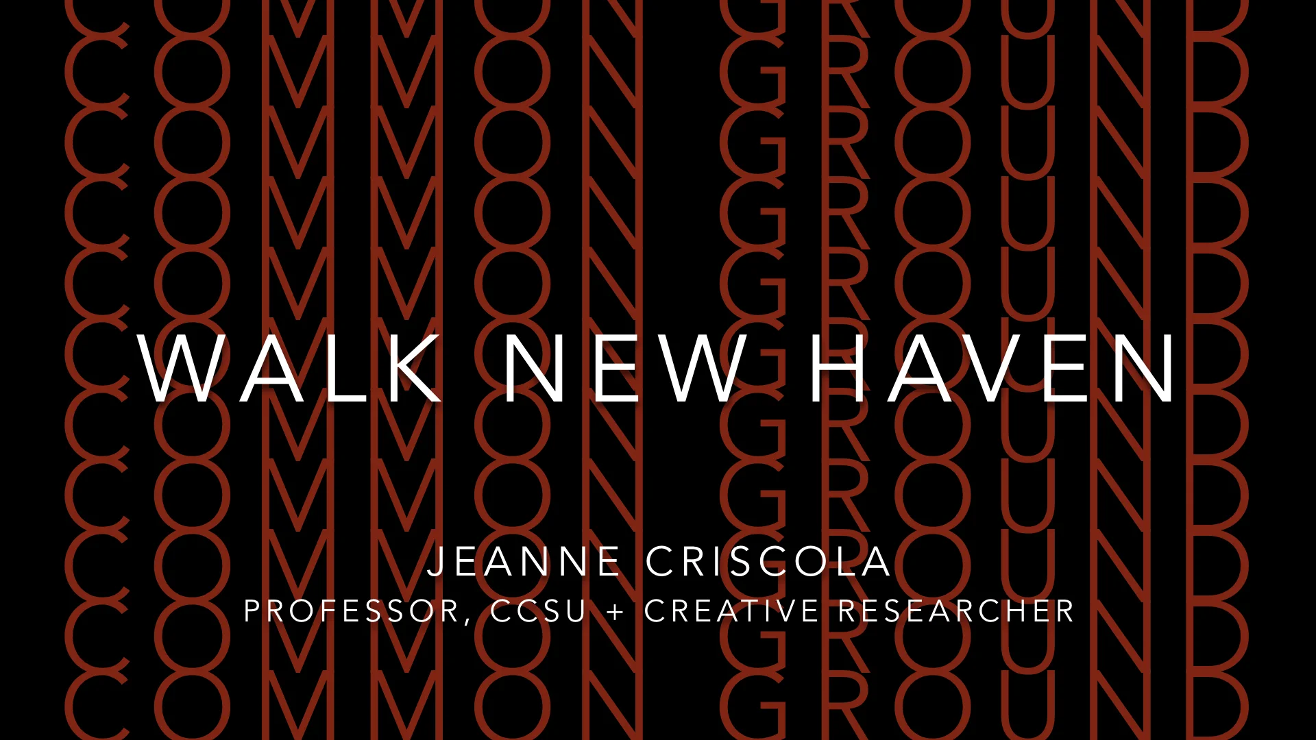
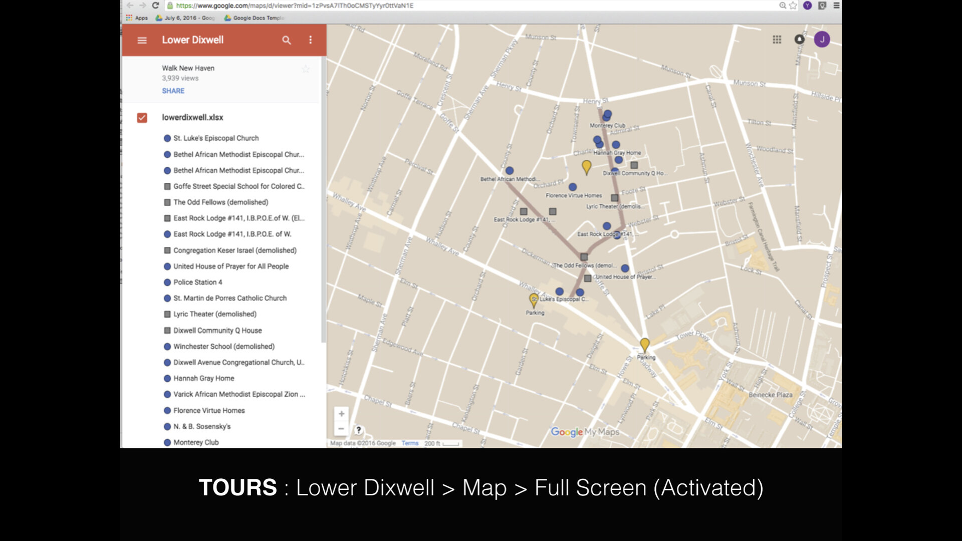
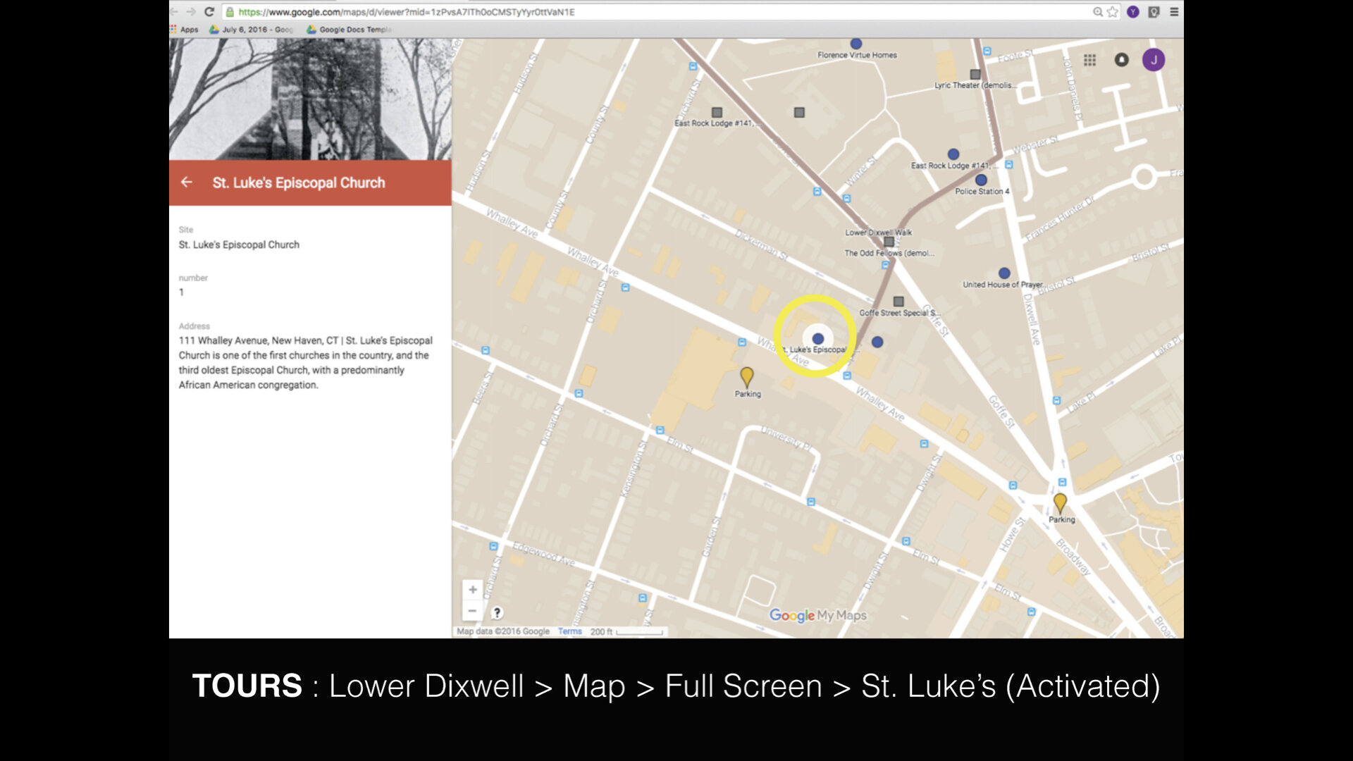
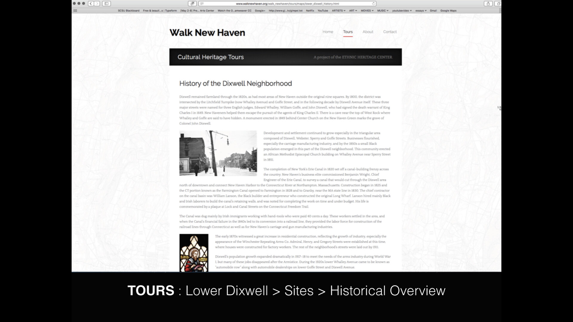
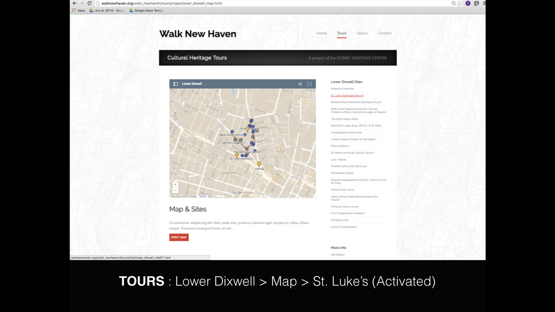
Common Ground : Walk New Haven
East Tennessee State University
Common Ground : Walk New Haven
Good morning everyone, and thank you for coming to listen to my talk about Walk New Haven, a project that engages community with itself. I’m Jeanne Criscola, Assistant Professor at Central Connecticut State University teaching in the Design Department. It is a small one — about 150 students — and I teach Typography, Fundamentals of Graphic Design, and the History of Design.
The talk I am about to give focuses on a project my studio was commissioned to design and produce in 2015 that coincided with my hire as a full-time faculty member.
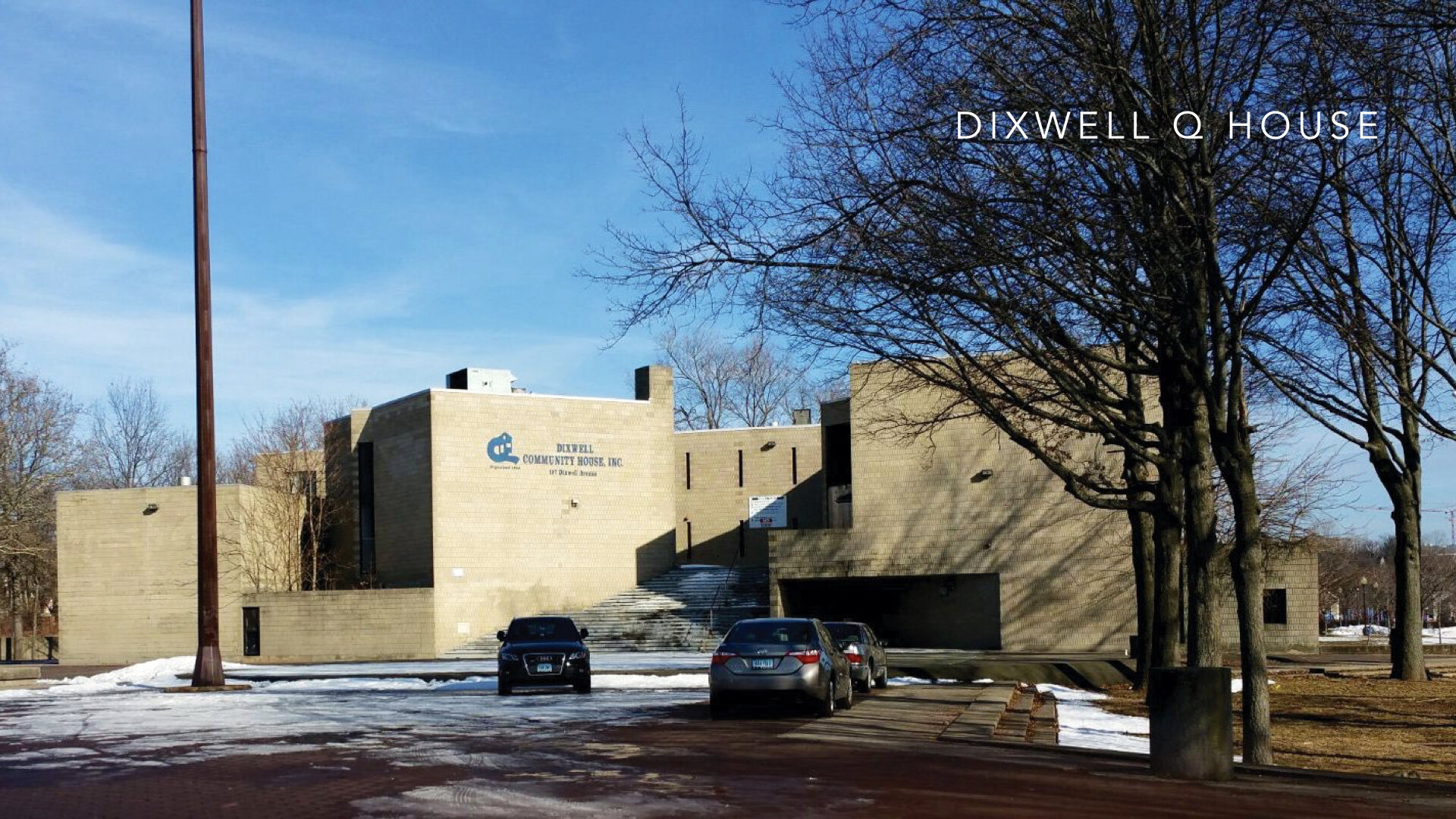
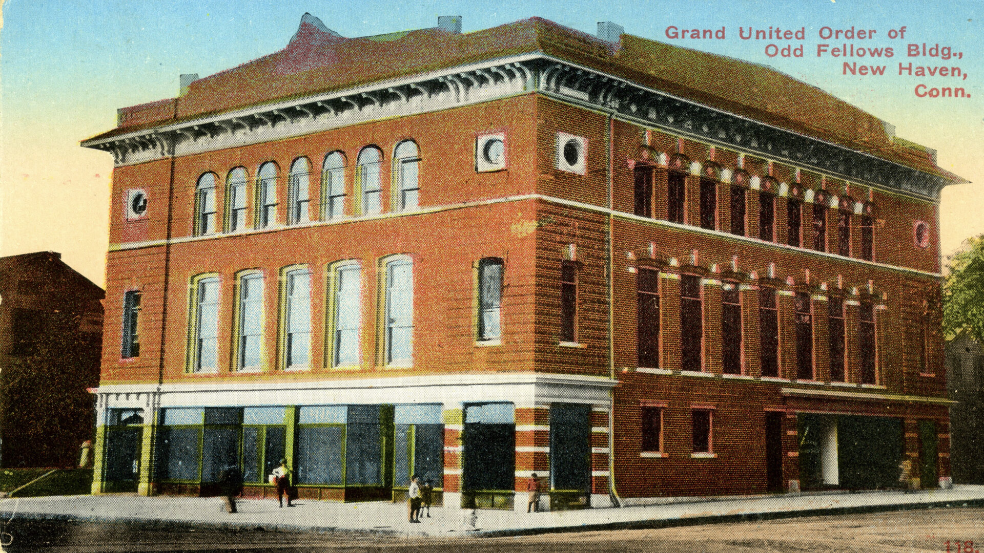
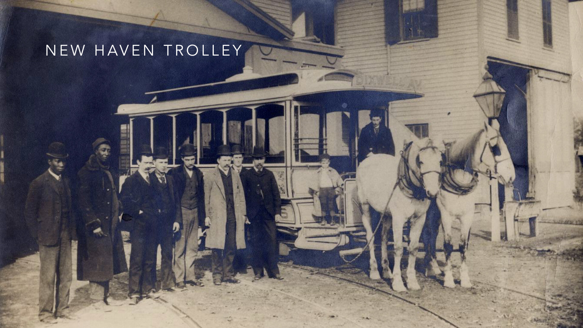
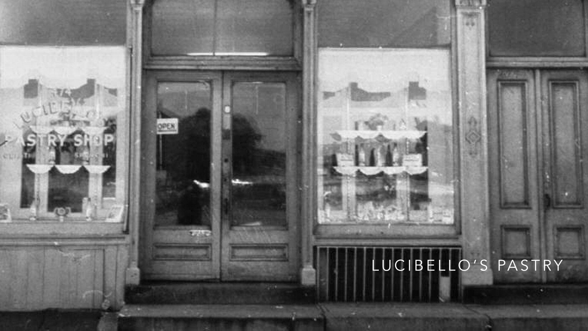
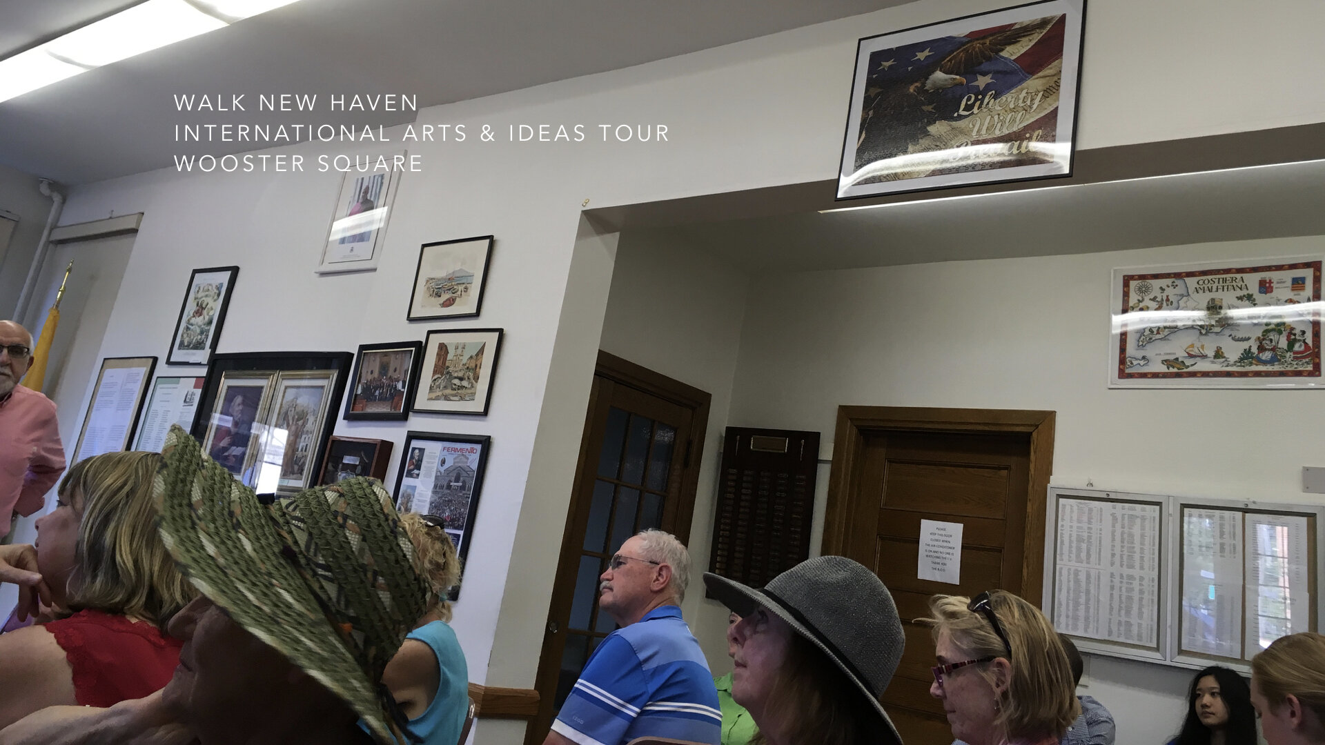
Community is a concept that needs grounding, literally. And it takes an entire community to tell its story, especially one that is rich, layered, and insightful about its past and about its future. One such community arose from the association of five ethnic societies as the Ethnic Historical Archives Center in 1988 in New Haven. They envisioned a place where the community would come to learn about the experiences and the ethnic histories of New Haven’s Jewish, Italian, Irish, African-American, and Ukrainian populations. They found common ground where they now house their archives, acquire donated artifacts, conduct research, and share their histories whenever the opportunity presents itself.
First, some background about New Haven and the Center:
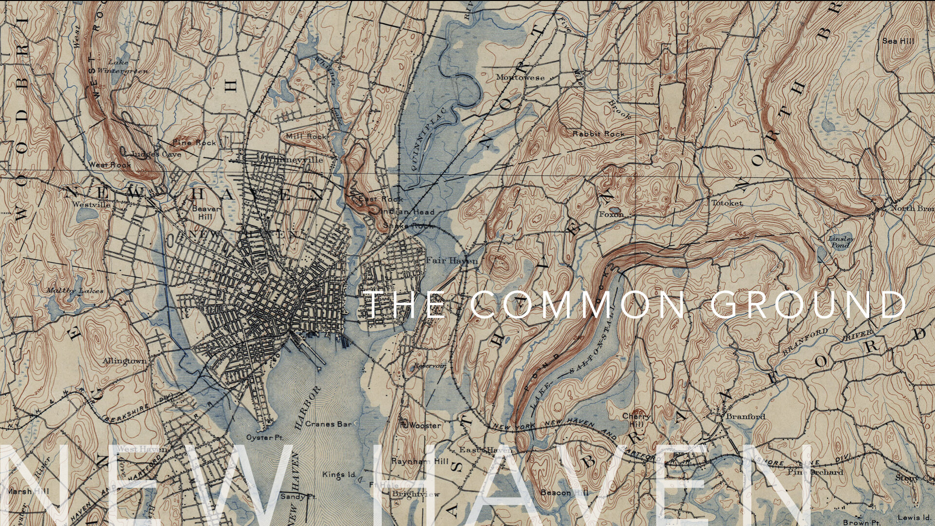
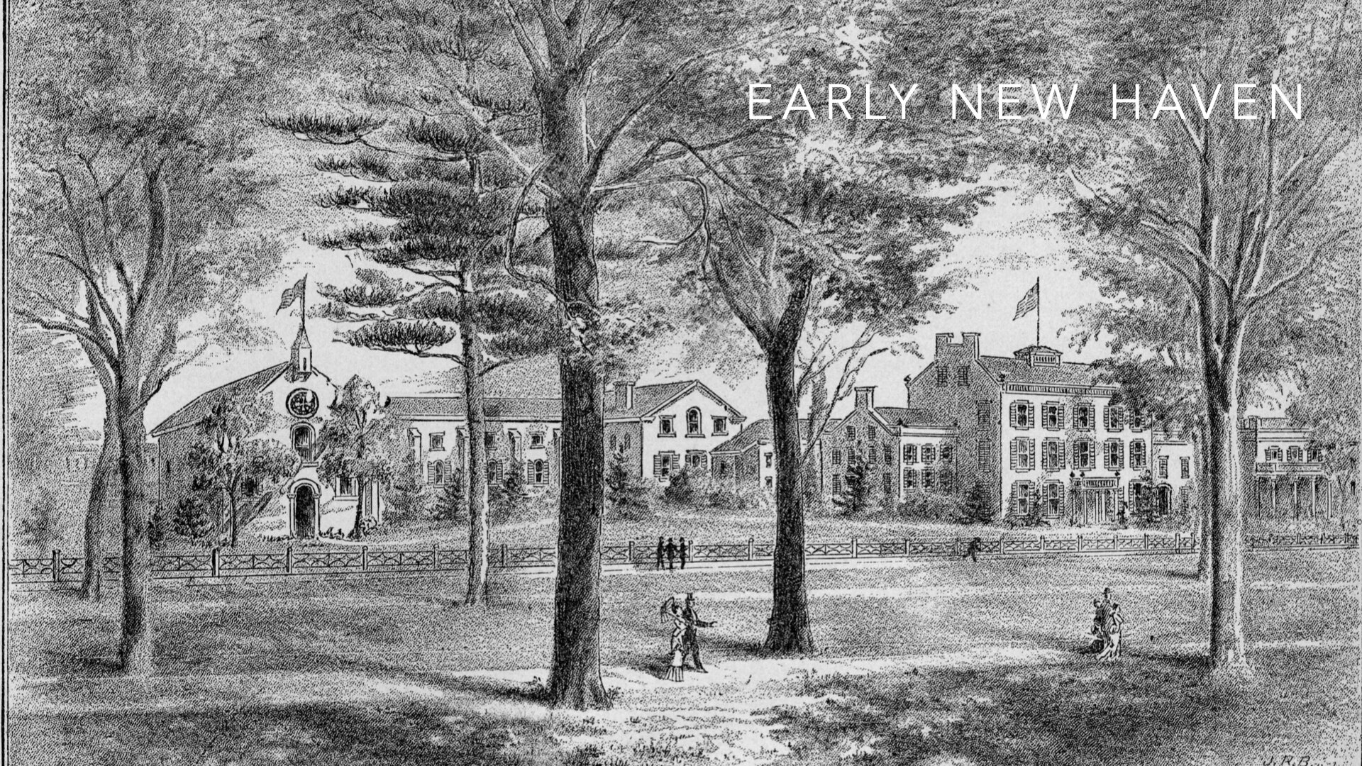
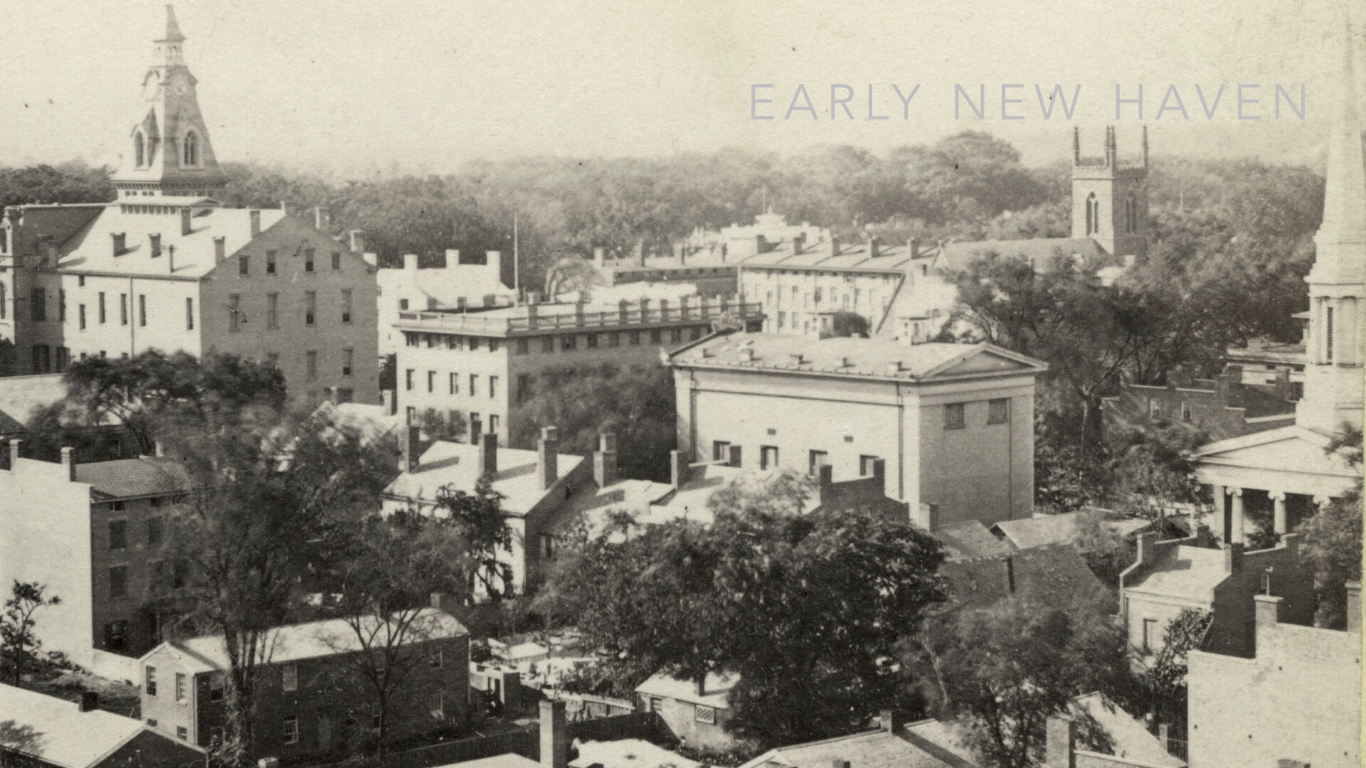
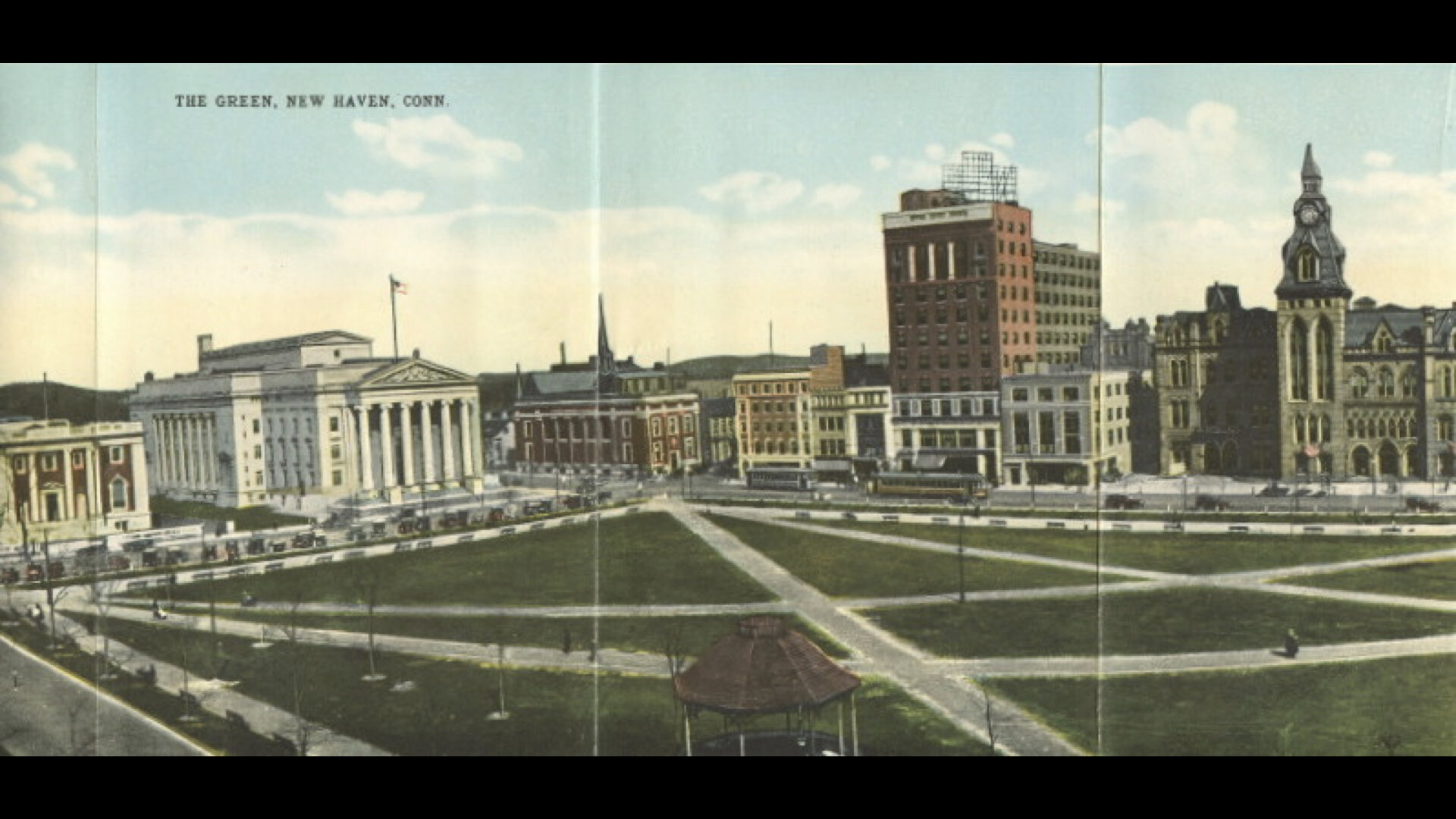
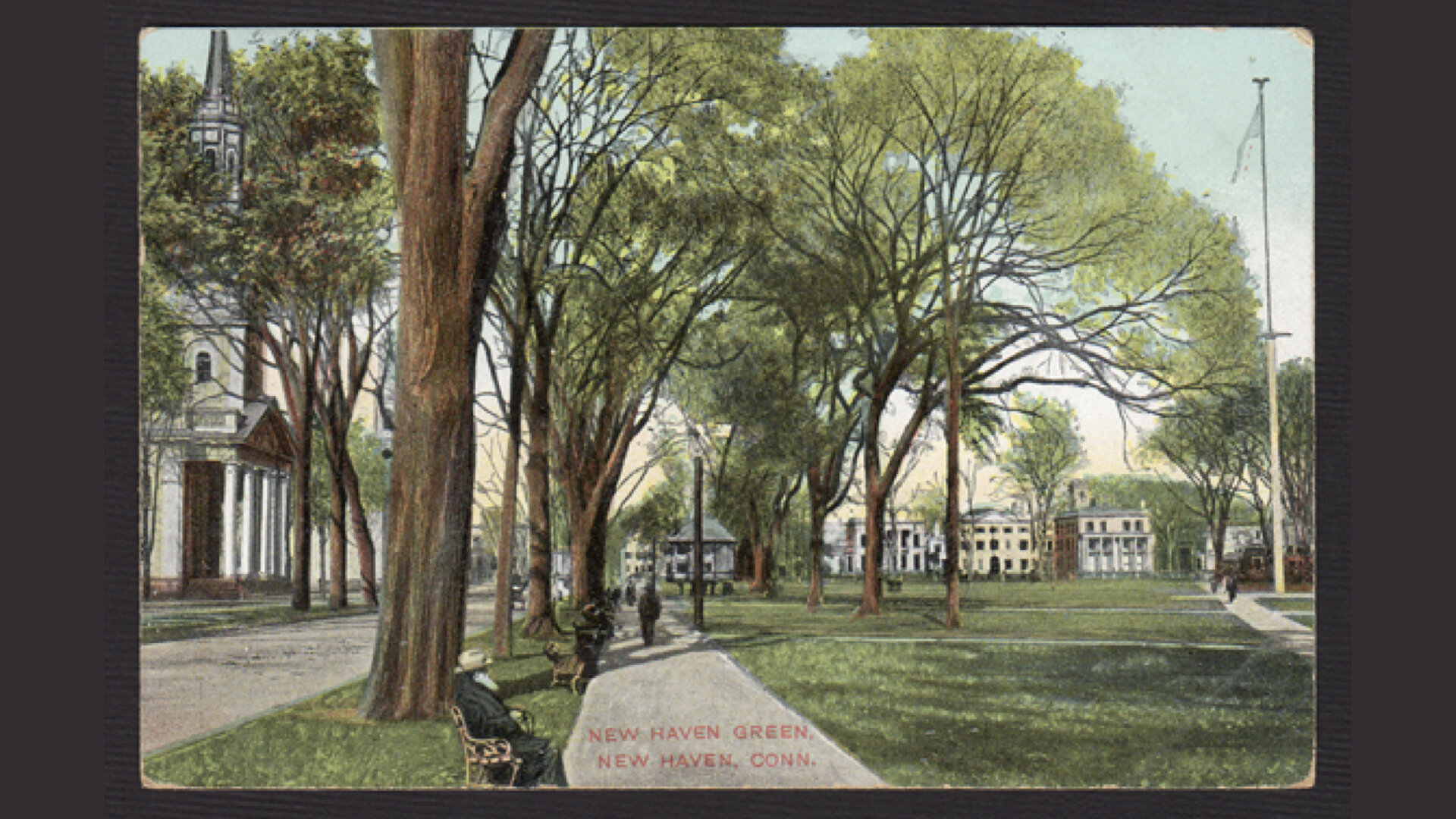
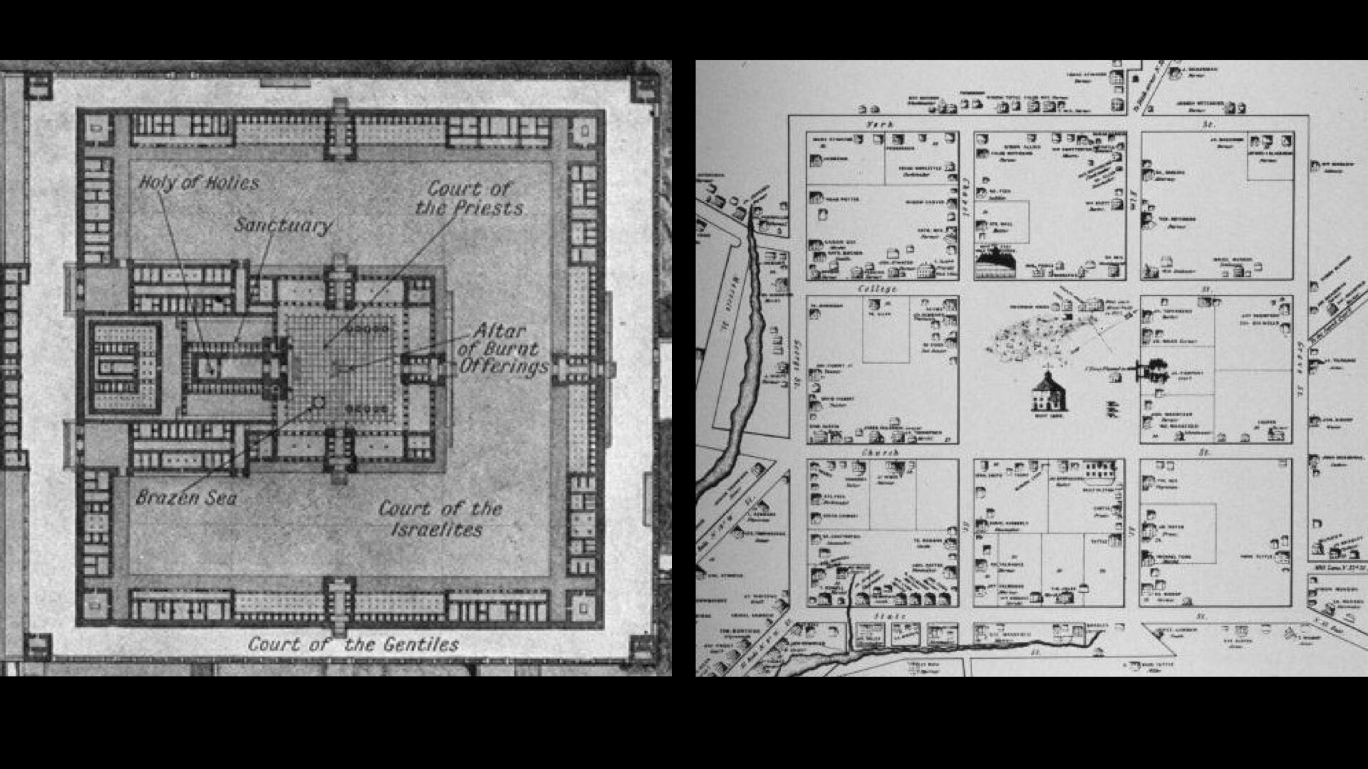
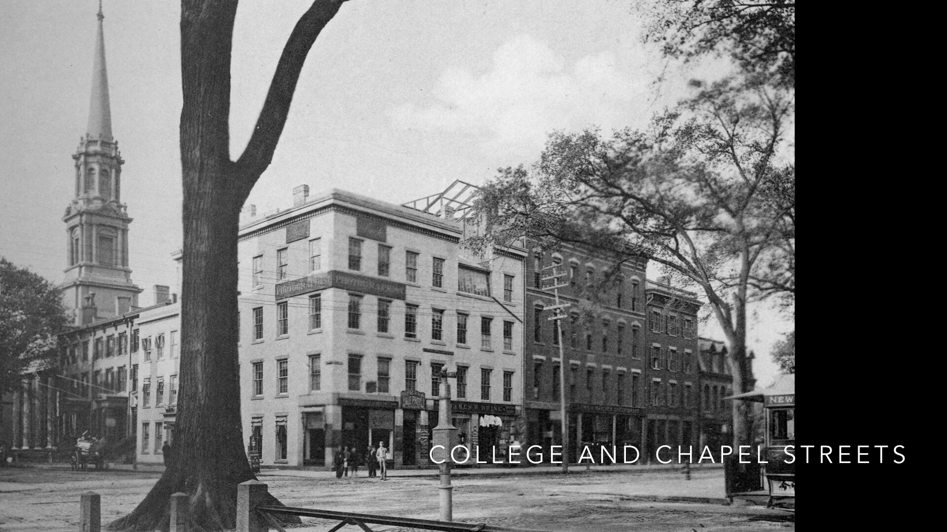
History buffs will know that the New Haven Colony was established in 1638 by Englishmen, Theophilus Eaton and the Reverend John Davenport. The two men set sail with their congregation to New Haven and laid out their town in a Nine Square Plan between two creeks as a garden in the wilderness. Bounded by hills and mountains, pierced by waterways, and having a harbor to the south, New Haven — in its form and landscape — fit the Biblical description of the Garden of Eden, the Israelite encampment in Exodus, the holy cities in Canaan, and John’s vision of the New Jerusalem from Revelations.
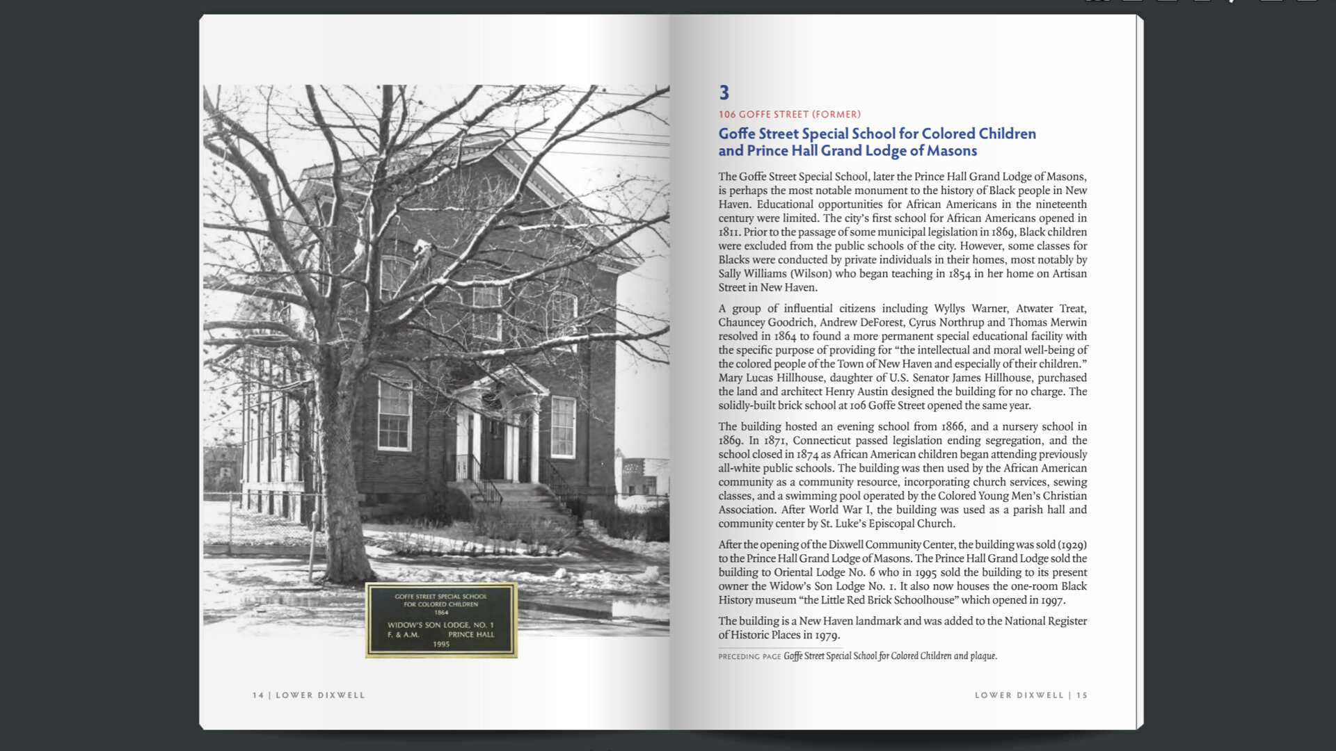
Other events and agreements had direct impact on New Haven none more important than when the two judges who ordered the execution of King Charles I, fled England for New England in 1661. Colonel Edward Whalley and Colonel William Goffe were secretly sheltered in the “Judges Cave” on West Rock. A third judge, named Colonel Dixwell later joined Whalley and Goffe.
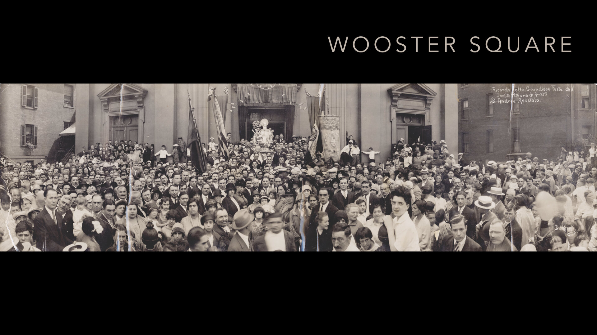
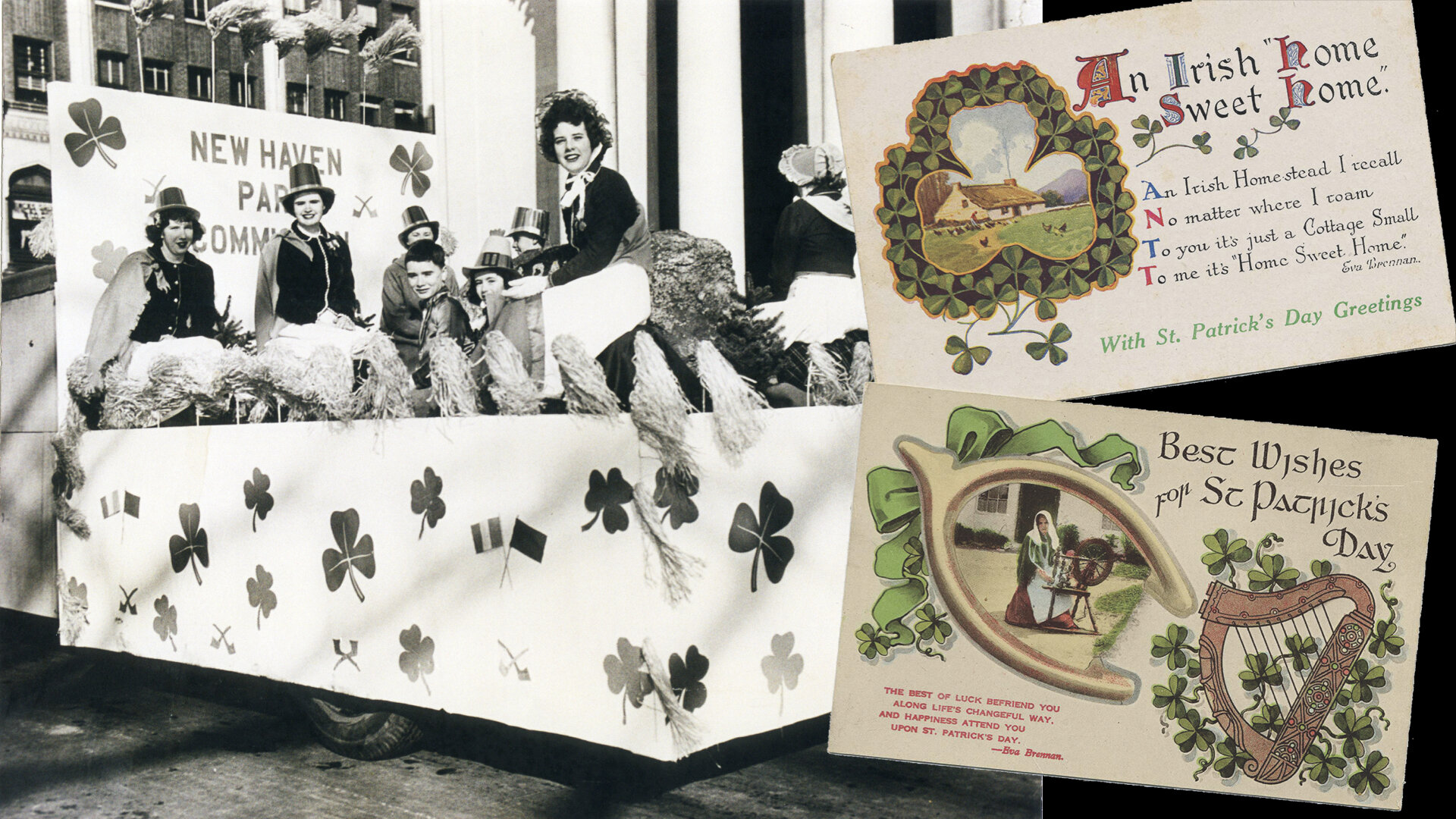
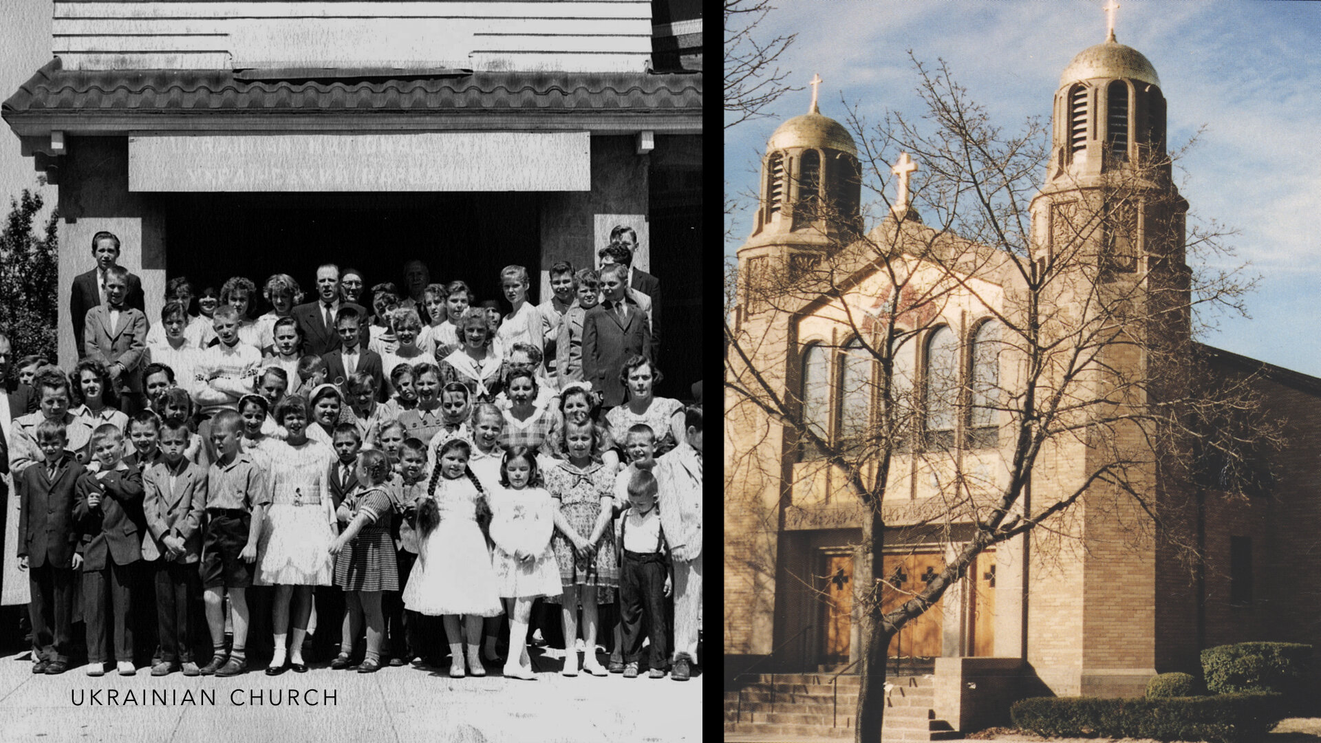
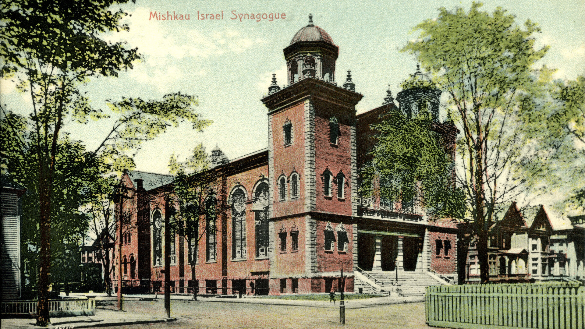
The five member-organized societies are known as the Ethnic Heritage Center today and include the Jewish Historical Society of Greater New Haven, founded in 1976; the Italian-American Historical Society of Connecticut, founded in 1979; the Connecticut Ukrainian-American Historical Society, founded in 1983; the Connecticut Irish-American Historical Society, founded in 1988; and finally the Greater New Haven African-American Historical Society, founded in 2003.
By 1999, the Ethnic Heritage Center had been located on Southern Connecticut State University’s campus for about 7 years when several representatives from Southern were selected by then President Michael Adanti to travel to San Antonio, Texas with EHC Board members to visit the Institute of Texan Culture where the Institute plays a role in the University of Texas at San Antonio’s community engagement initiatives to develop quality, accessible resources for educators and lifelong learners on topics of cultural heritage. The collaboration struck everyone as an approach they could learn from and perhaps use as a model for something similar in Connecticut. President Adanti was very supportive of the EHC and made arrangements with the University and Institute for tours and discussions with their administration and staff. For EHC, the Institute offered a lesson in diversity and inclusion showcasing the uniqueness and beauty of the many cultures that call Texas home and would serve as an example of the ways to celebrate the many populations who have defined New Haven’s character, traditions, and ways of life.
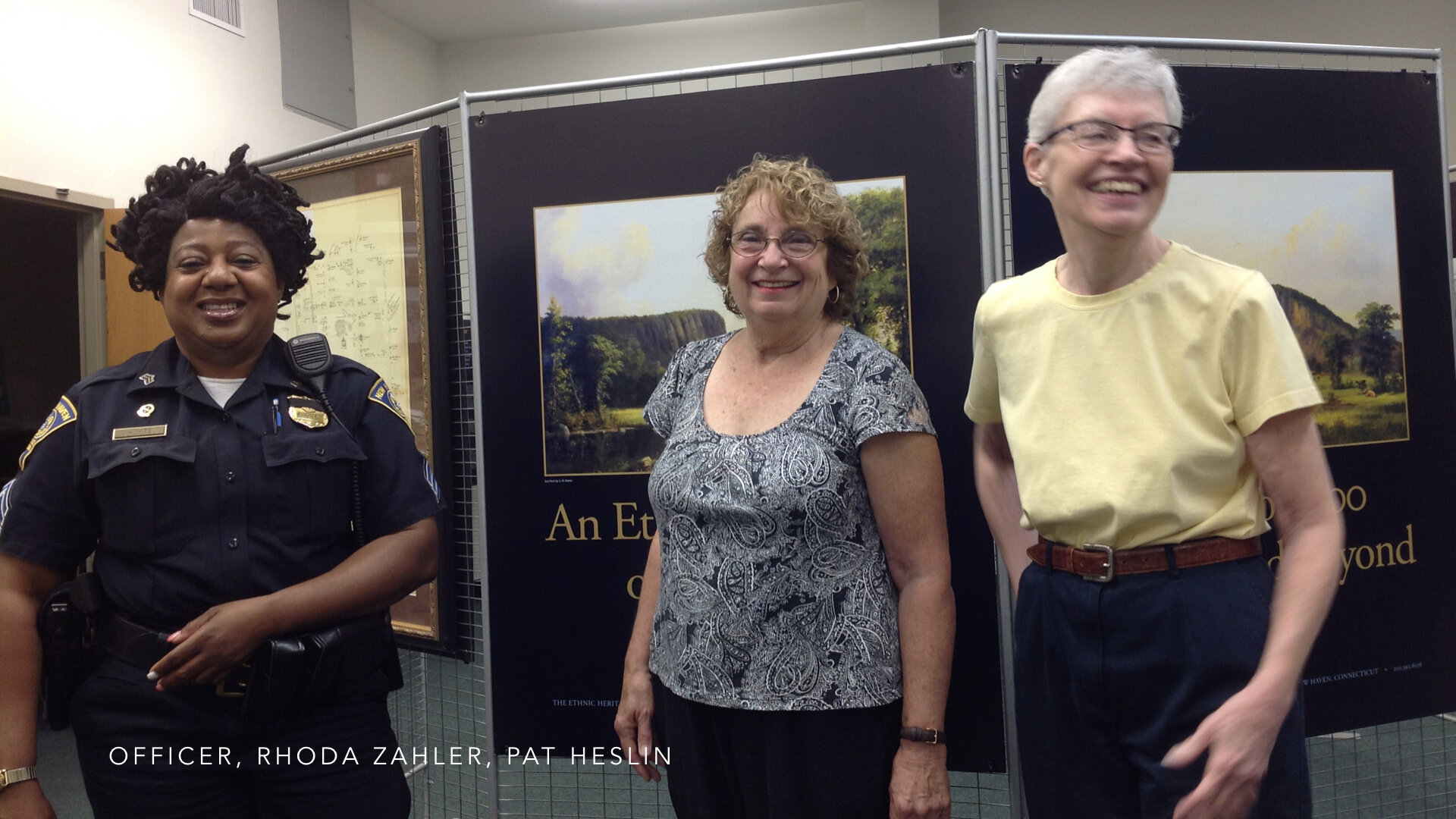
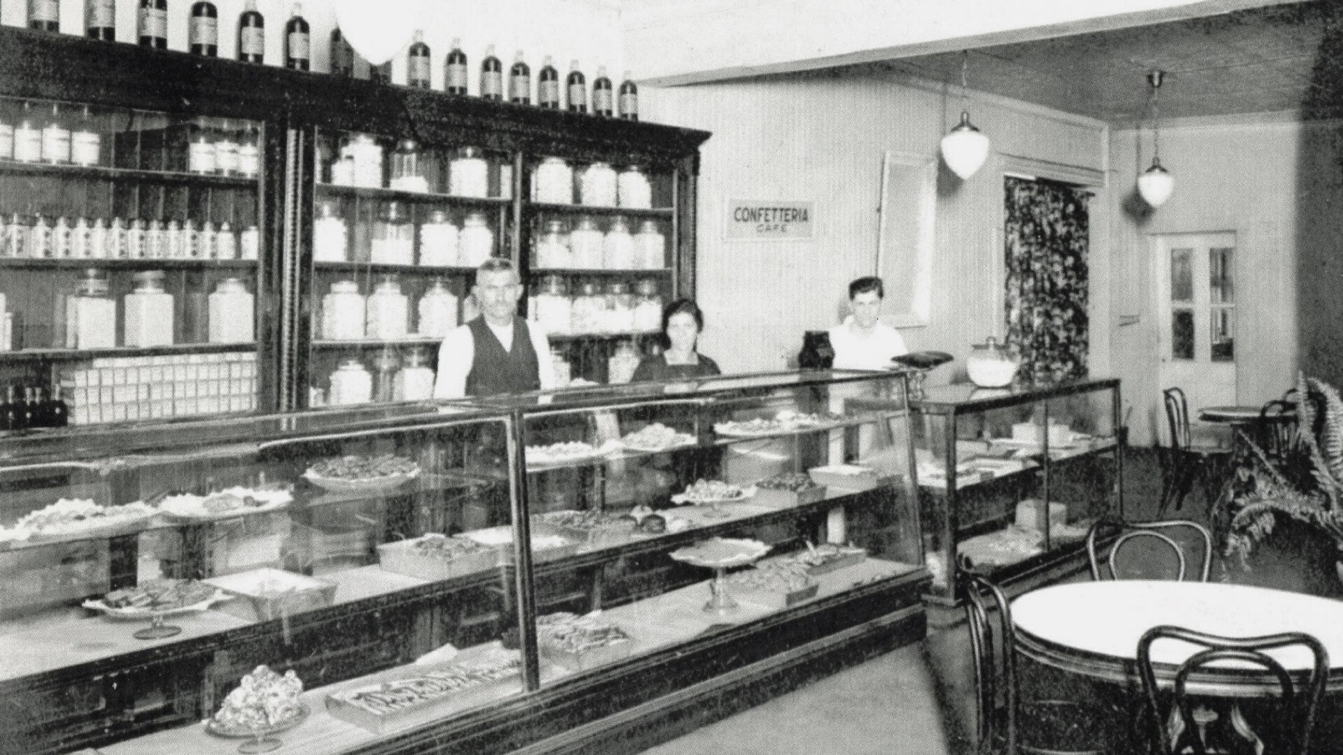
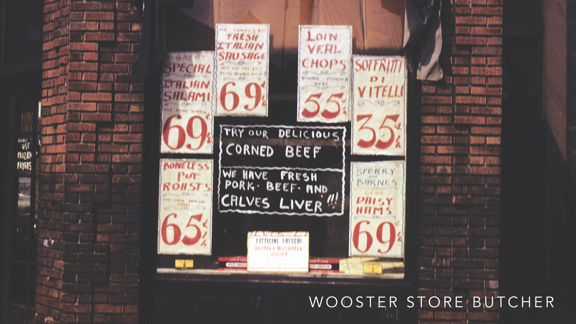
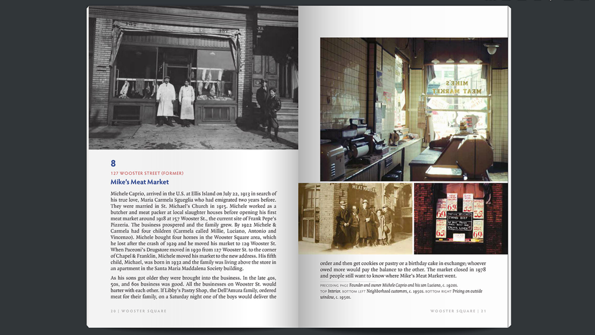
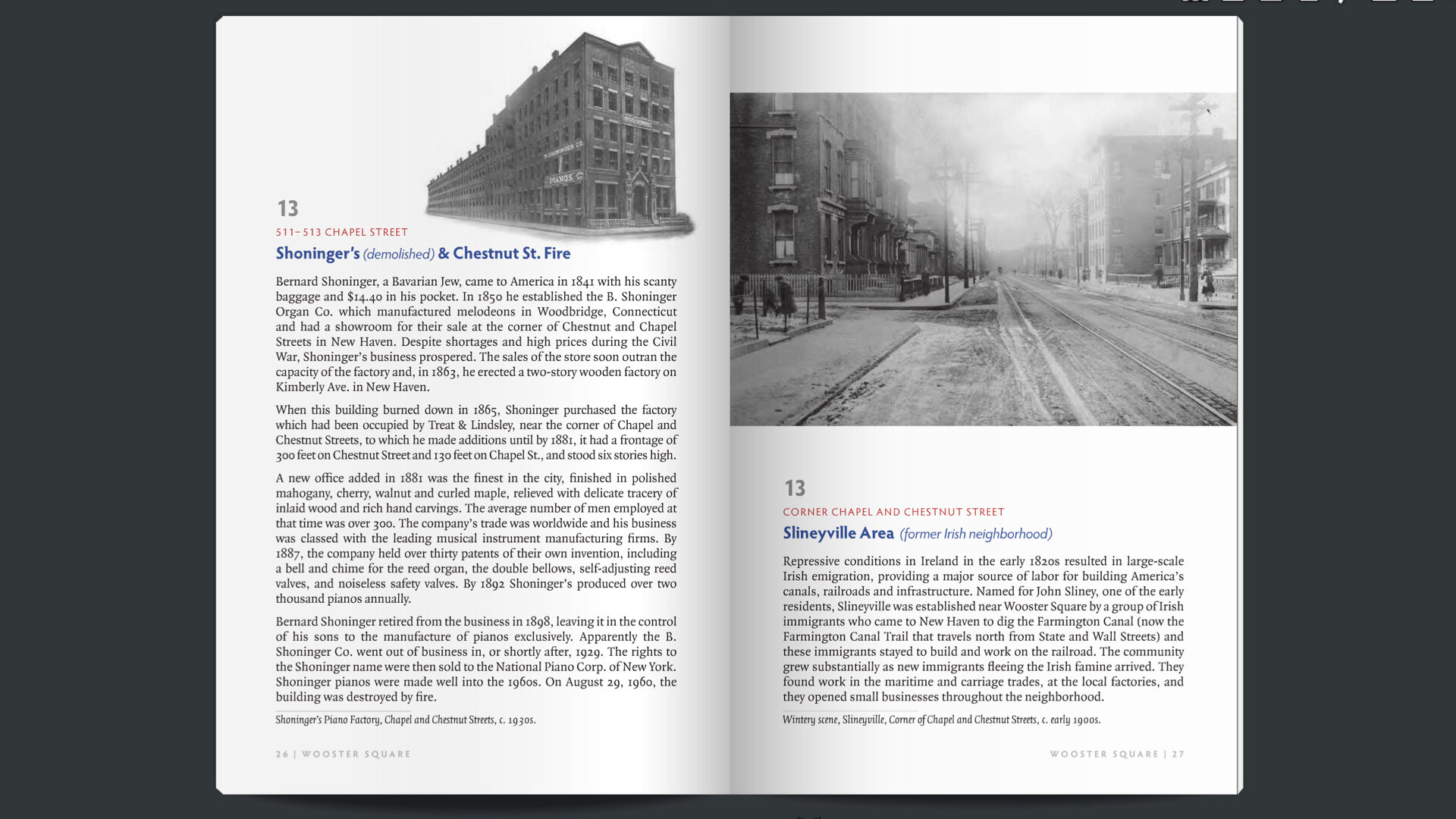
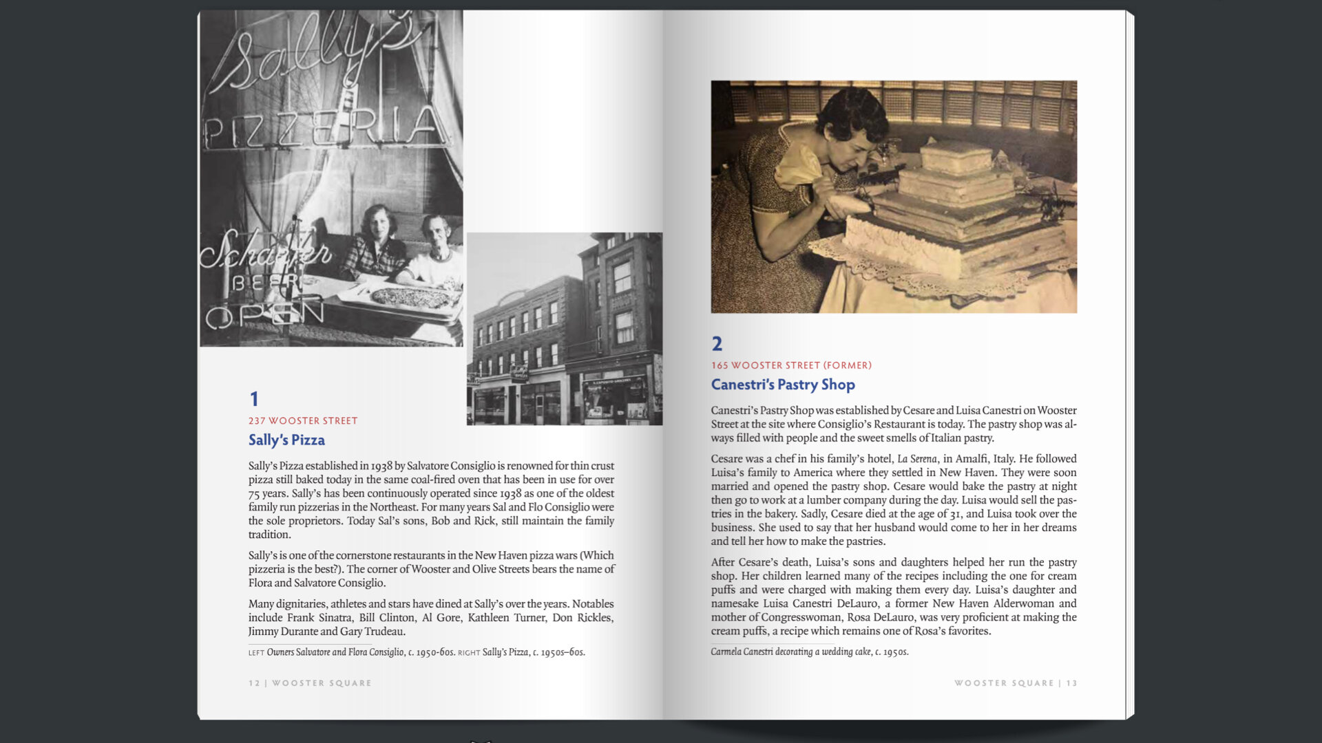
Around 2013, Rhoda Zahler, a member of the Jewish Historical Society, became interested in a heritage tourism product she had seen while on vacation called “The Museum in the Streets.” It’s a site-specific program that offers municipalities a way to showcase their local history through a system of outdoor information panels laid out as a walking tour. EHC had the content and the historic knowledge needed for such a collaborative project. Their collections include a wide range of pictures, books, phone books, city directories, magazines, newspapers, and video. They archive the personal papers of individuals and families, audio of oral histories and interviews, as well as many artifacts, some rare and unique, but most ordinary and local.
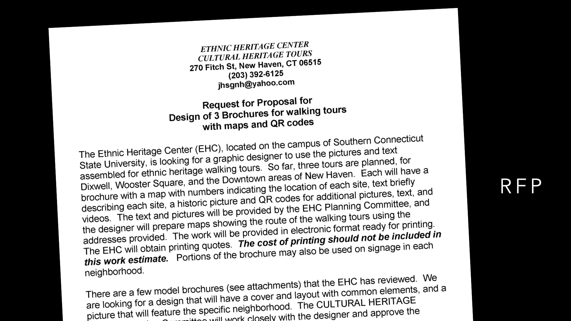
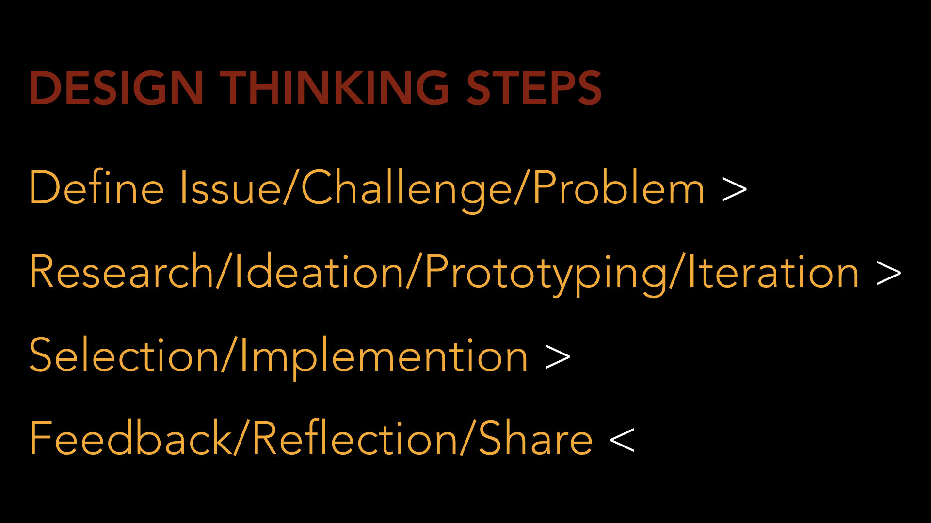
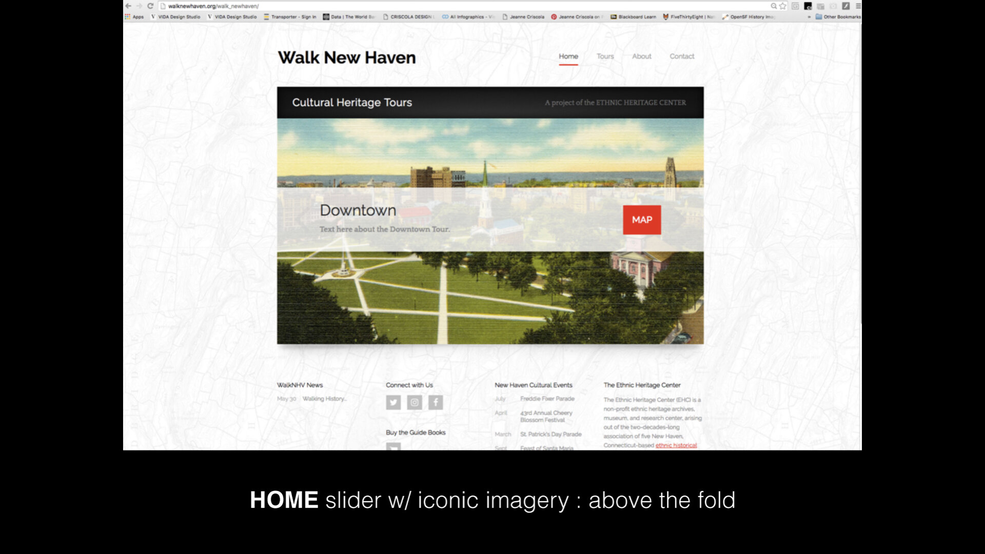
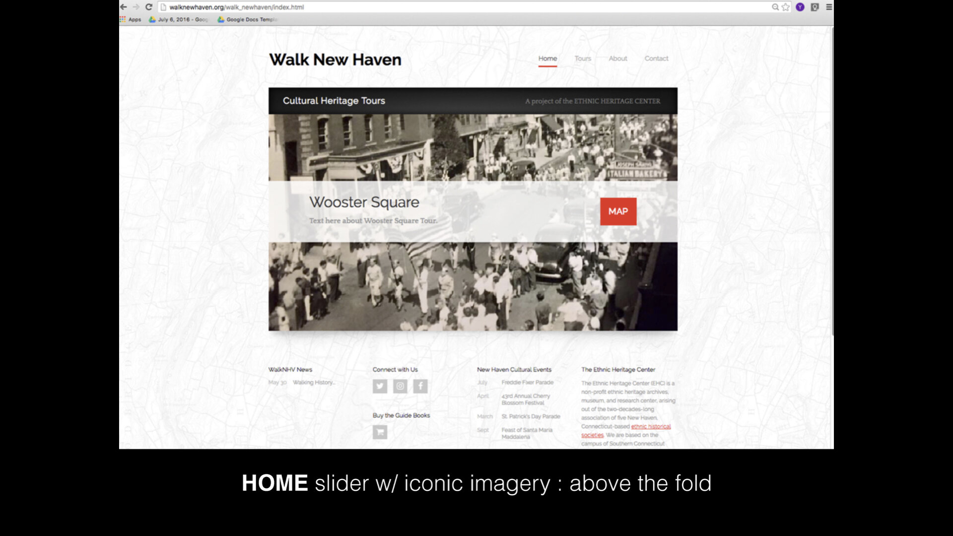
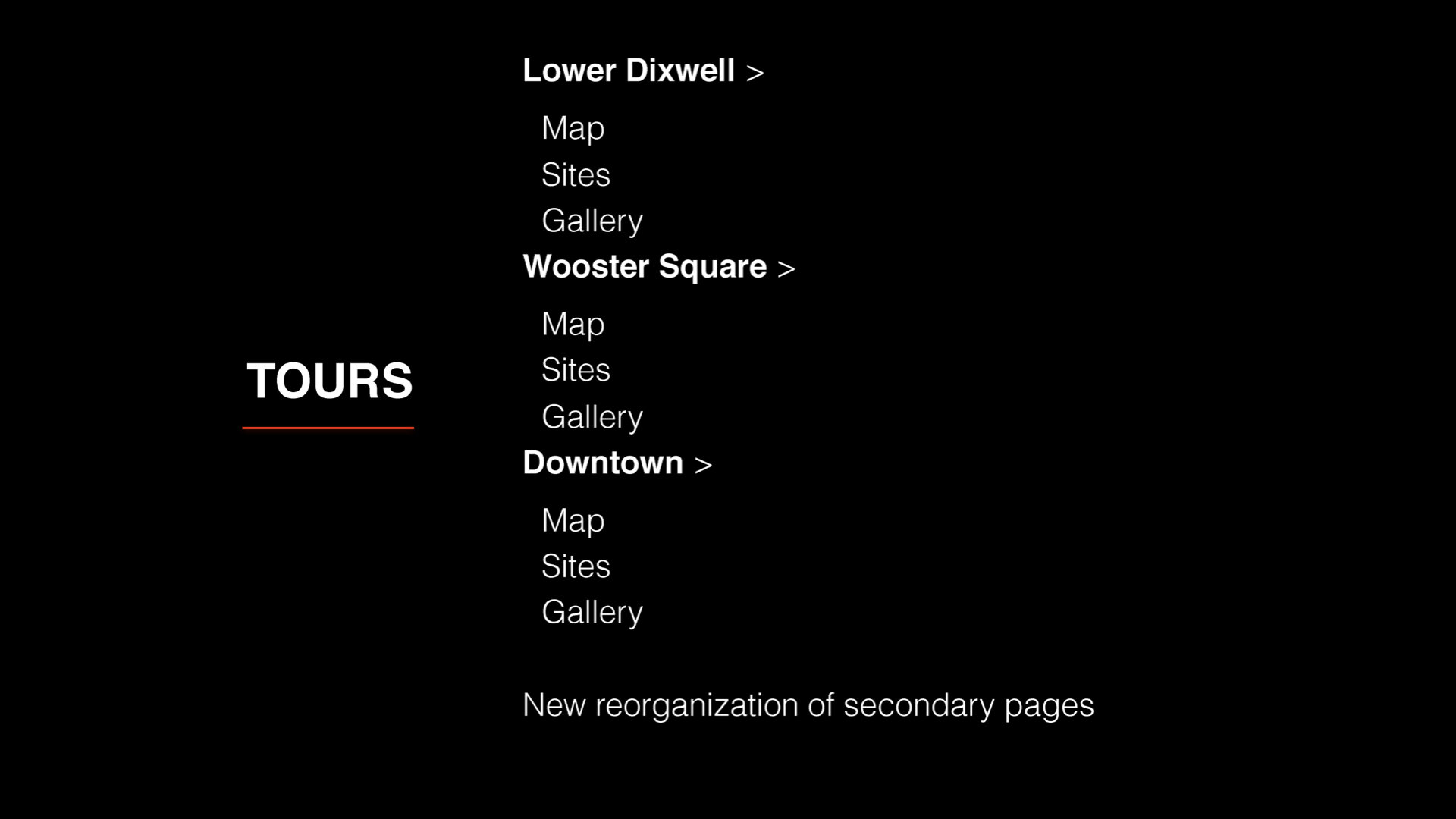
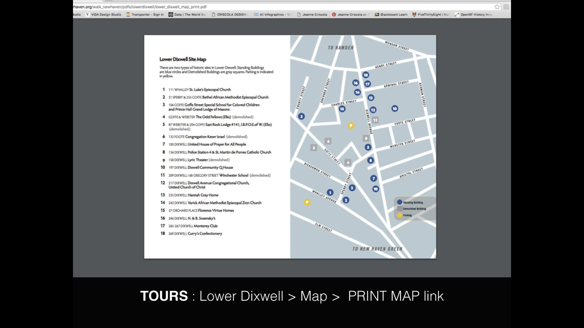
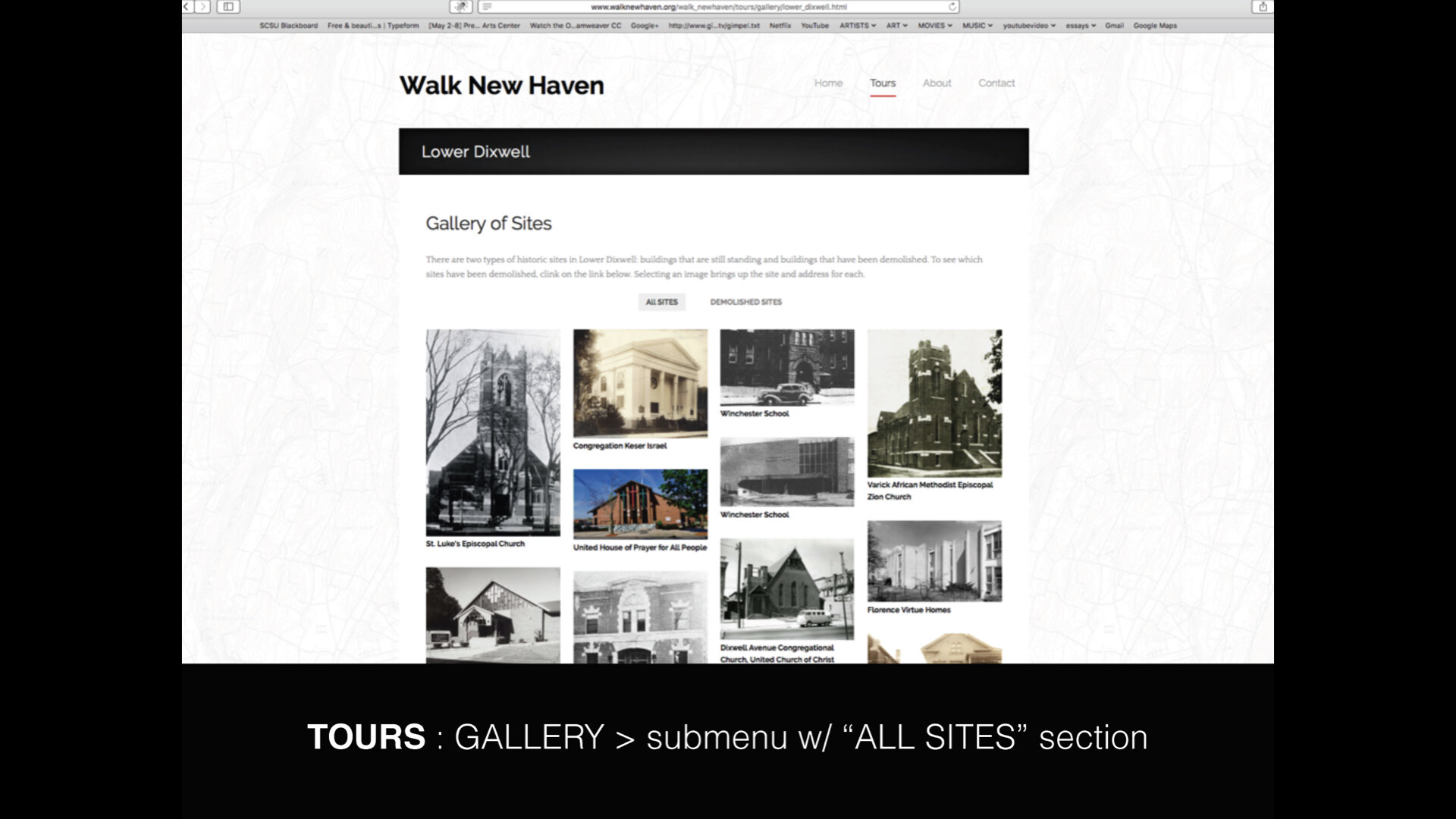
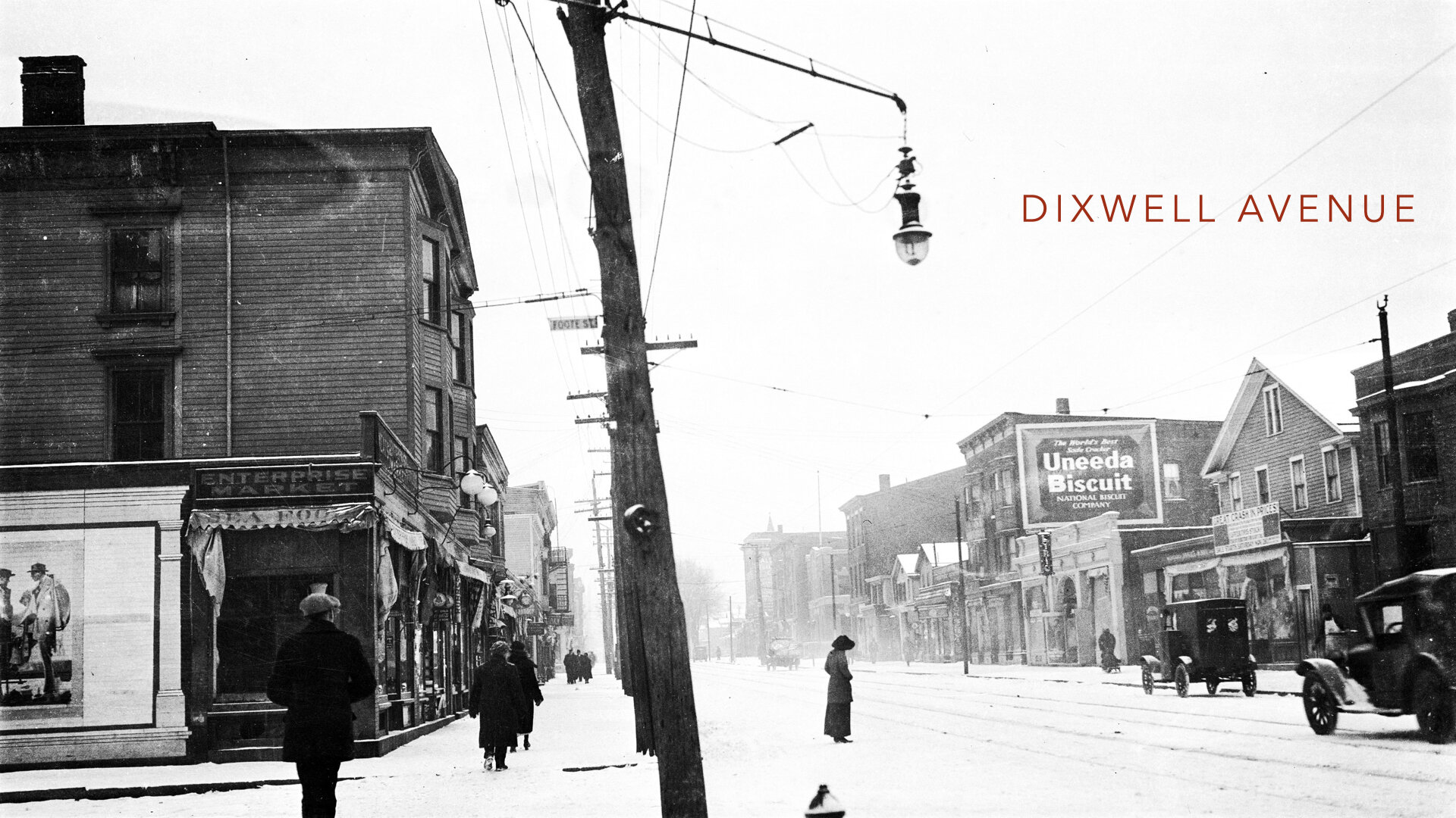
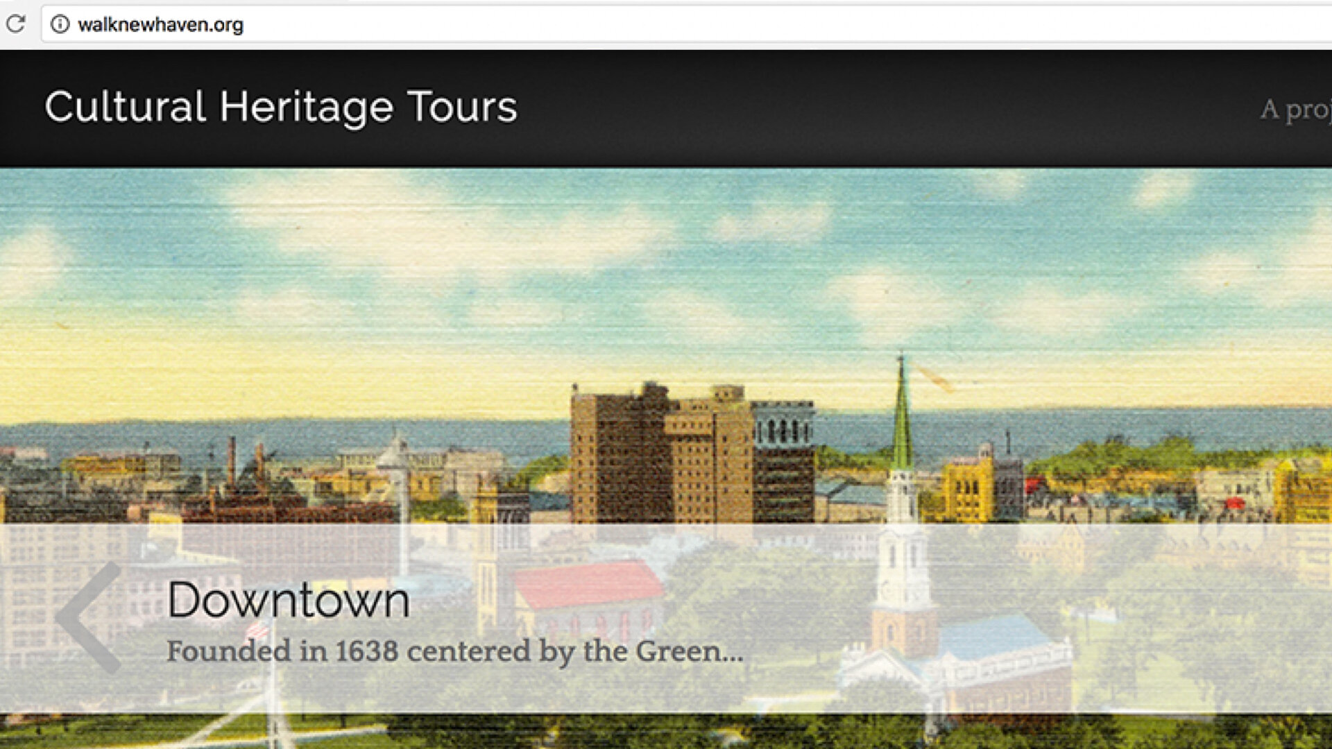
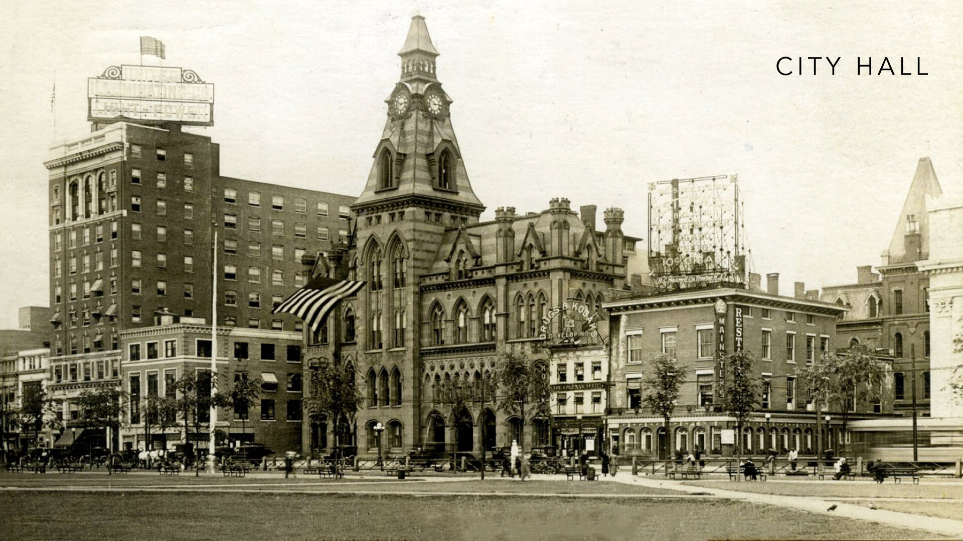
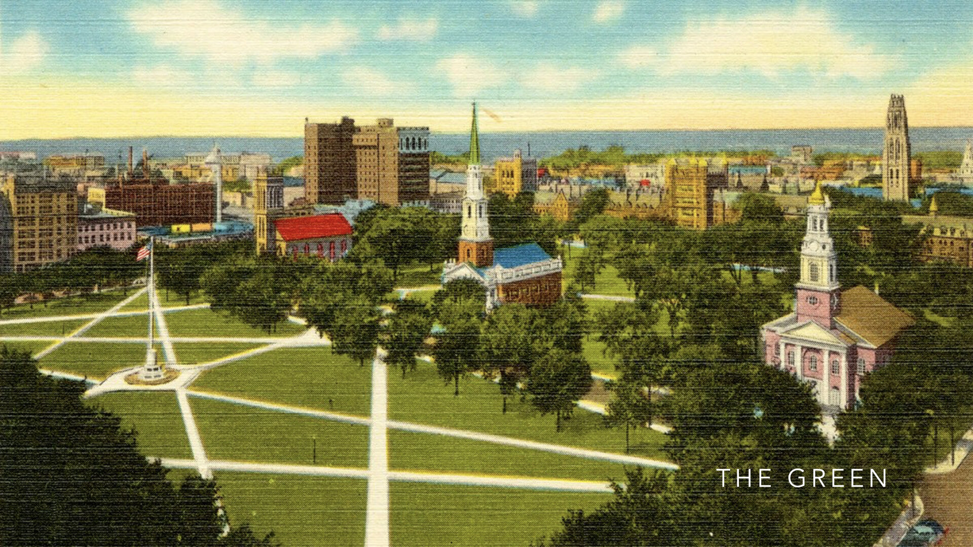
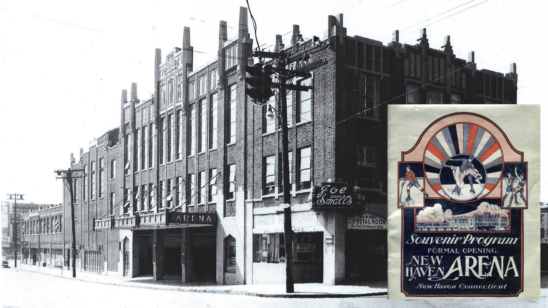
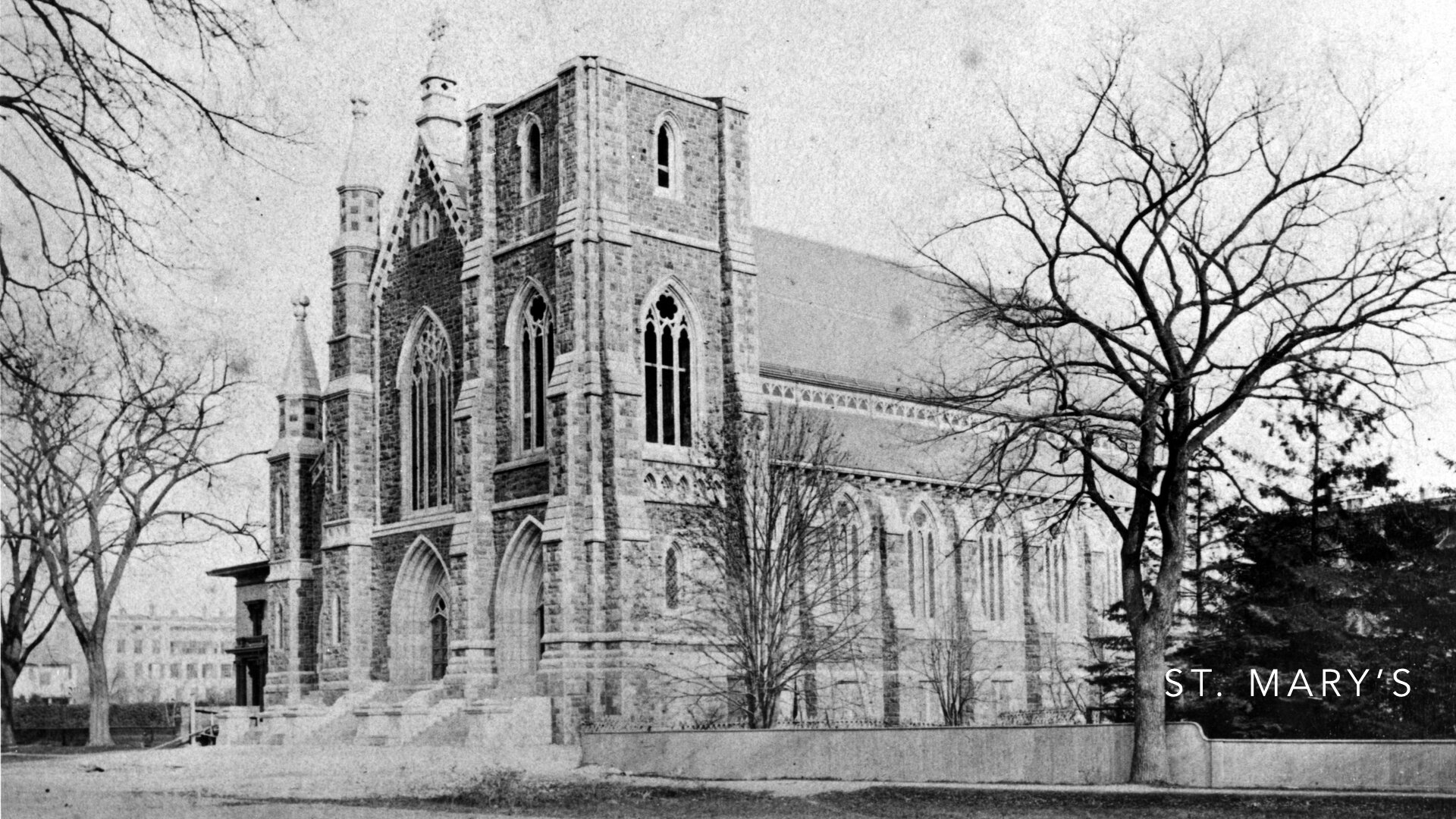
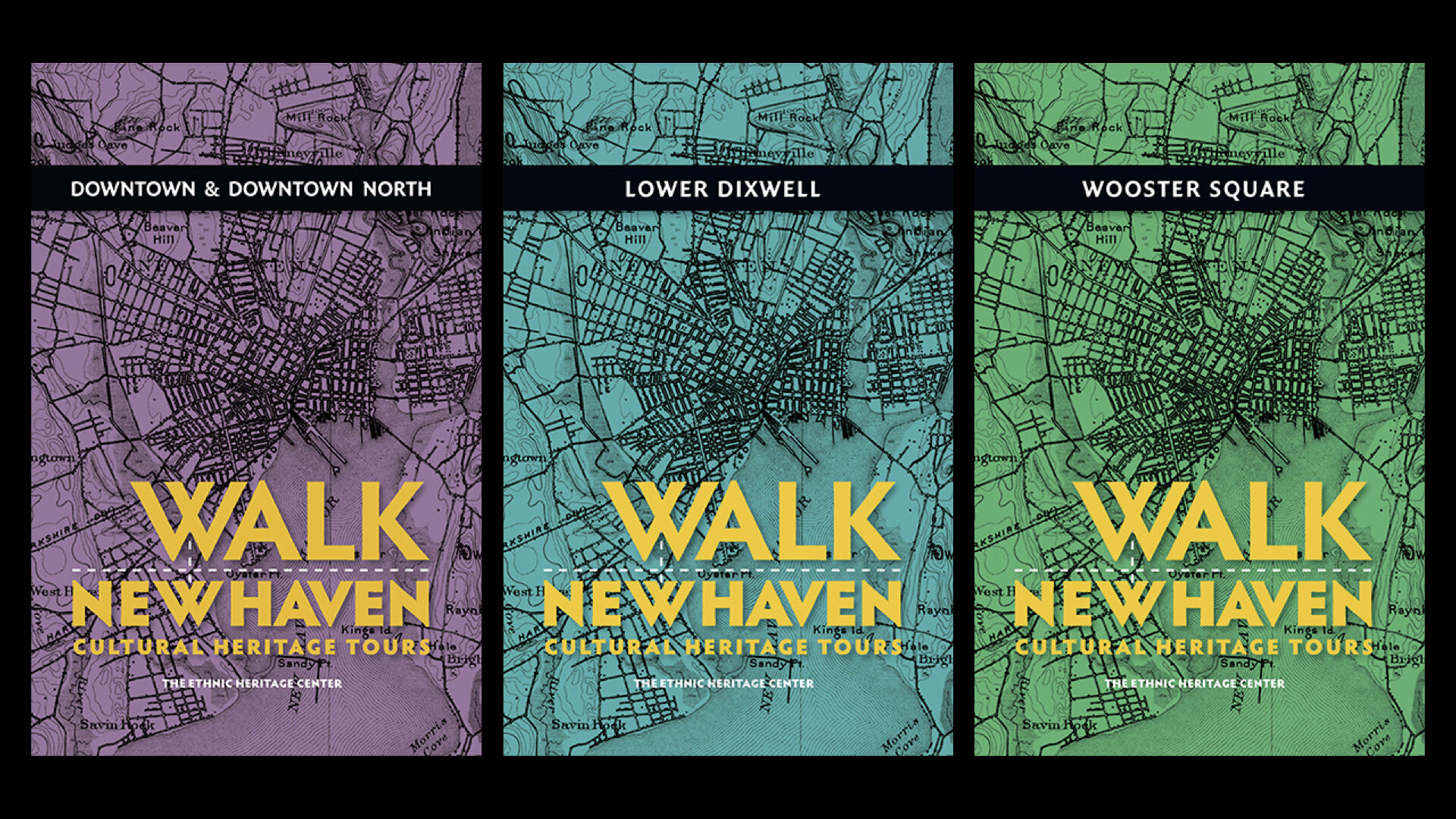
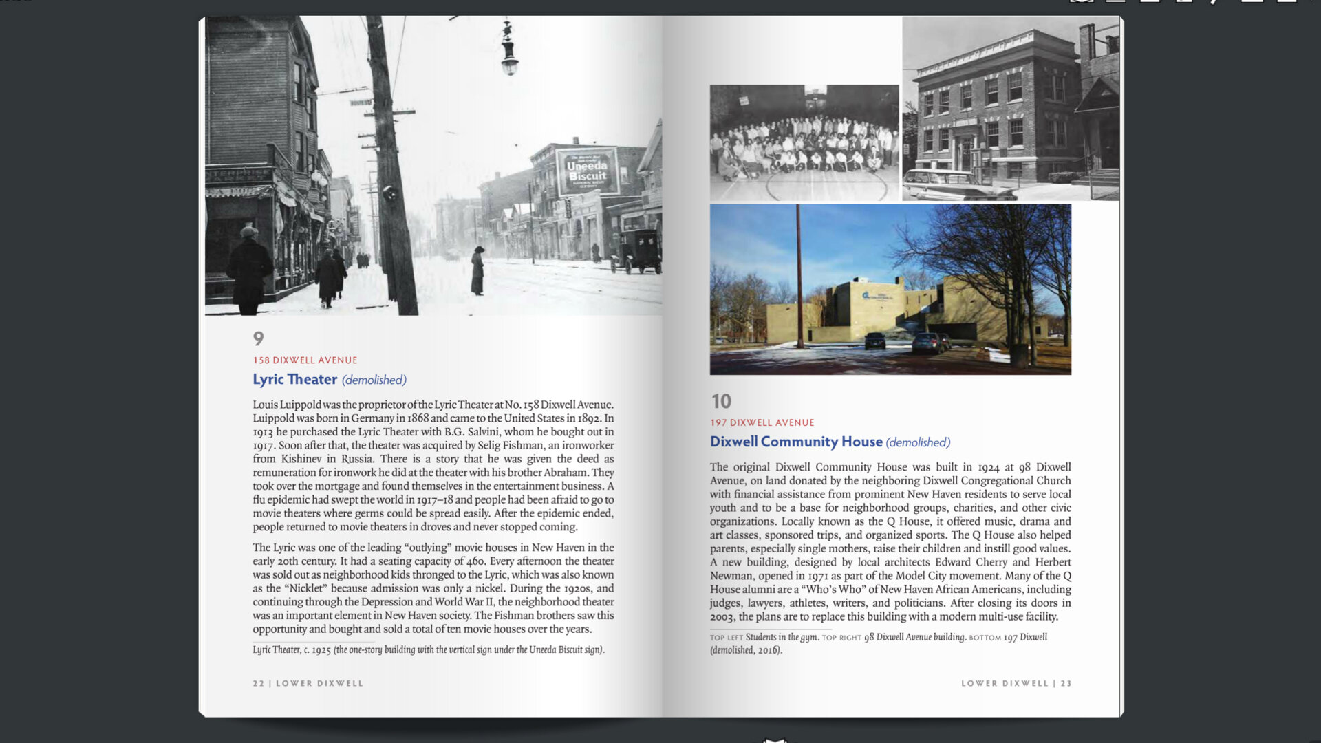
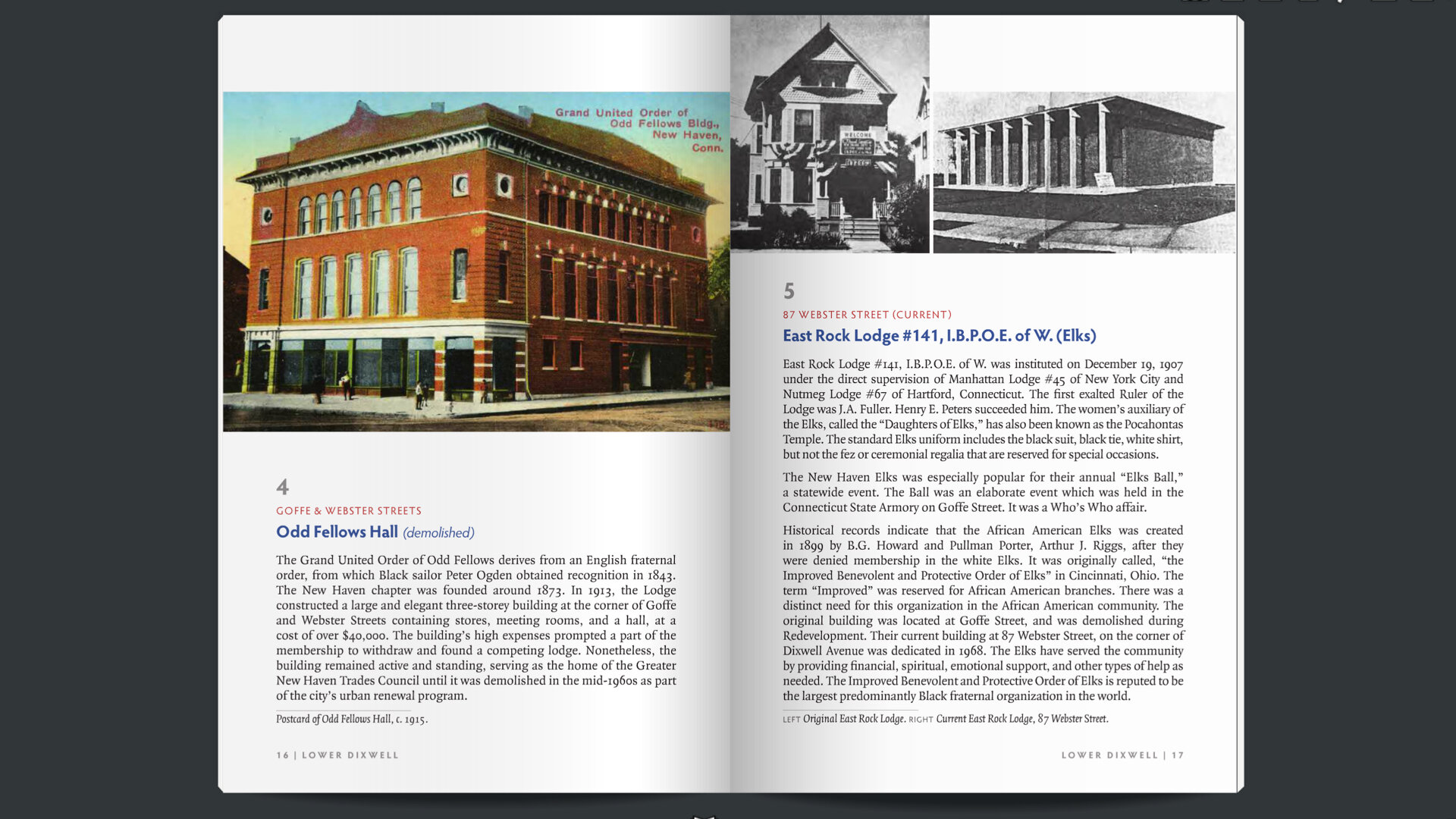
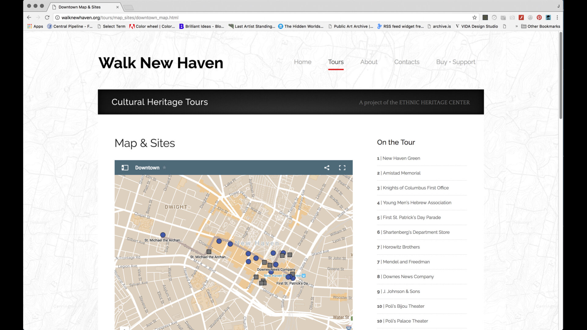
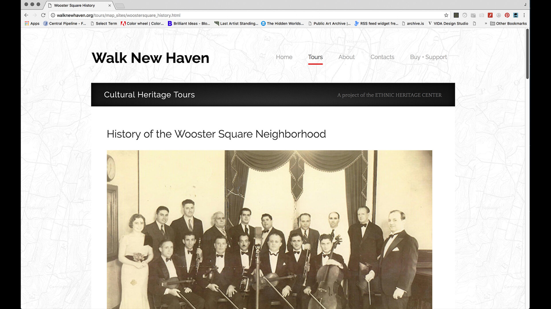
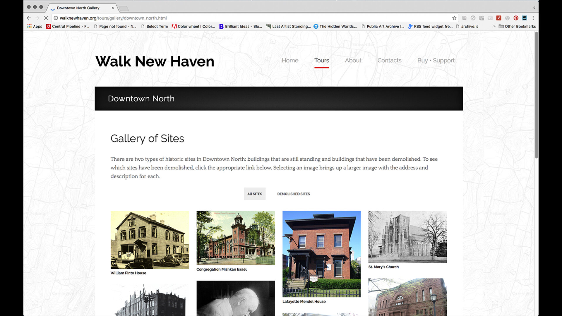
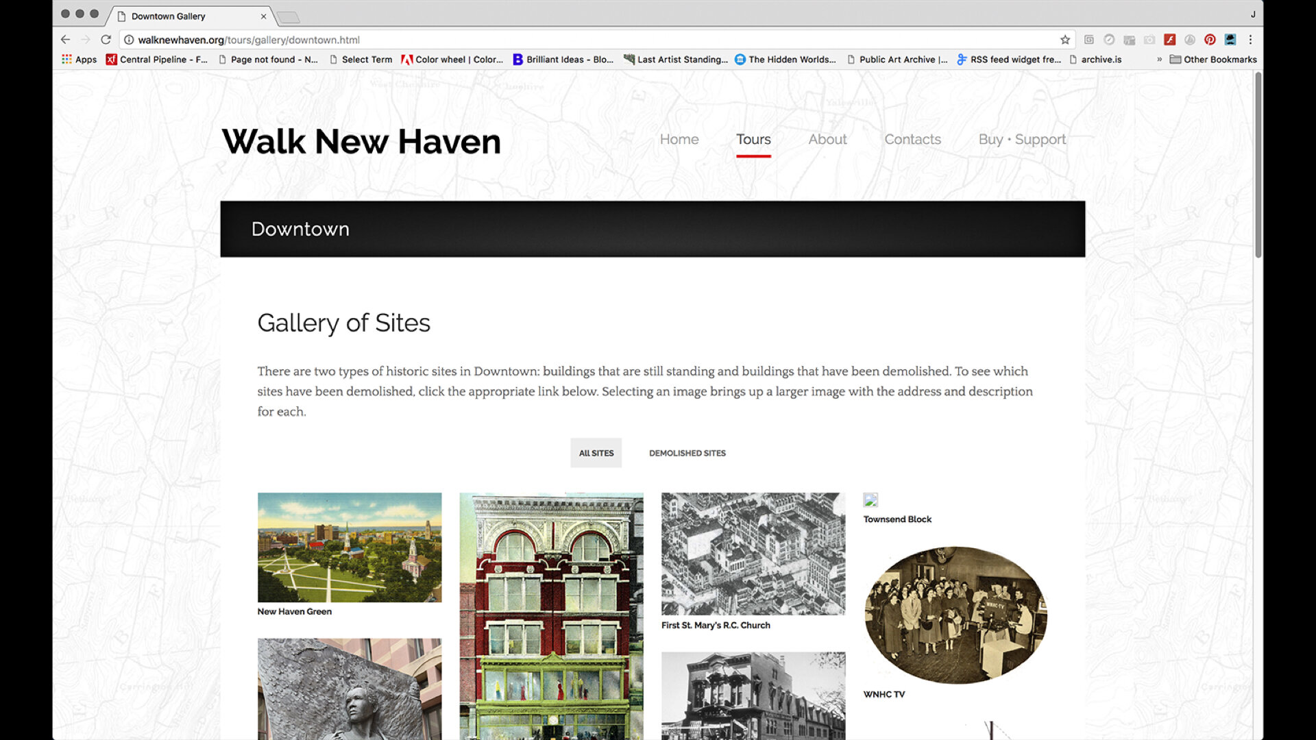
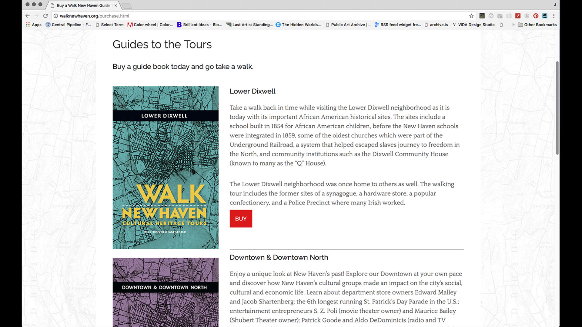
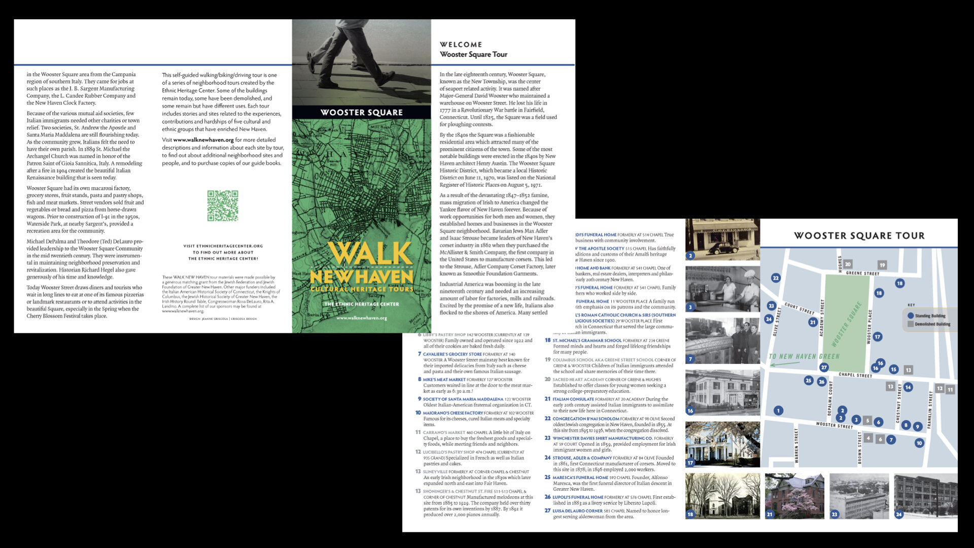
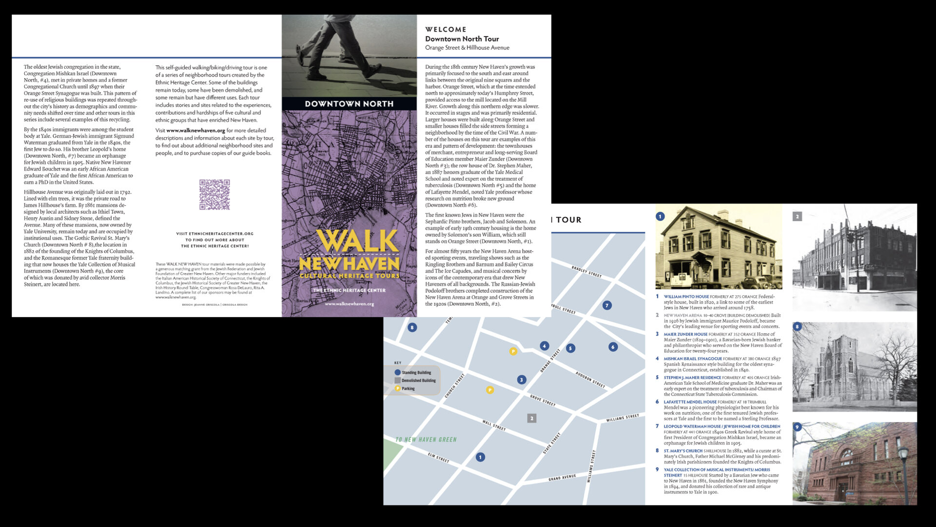
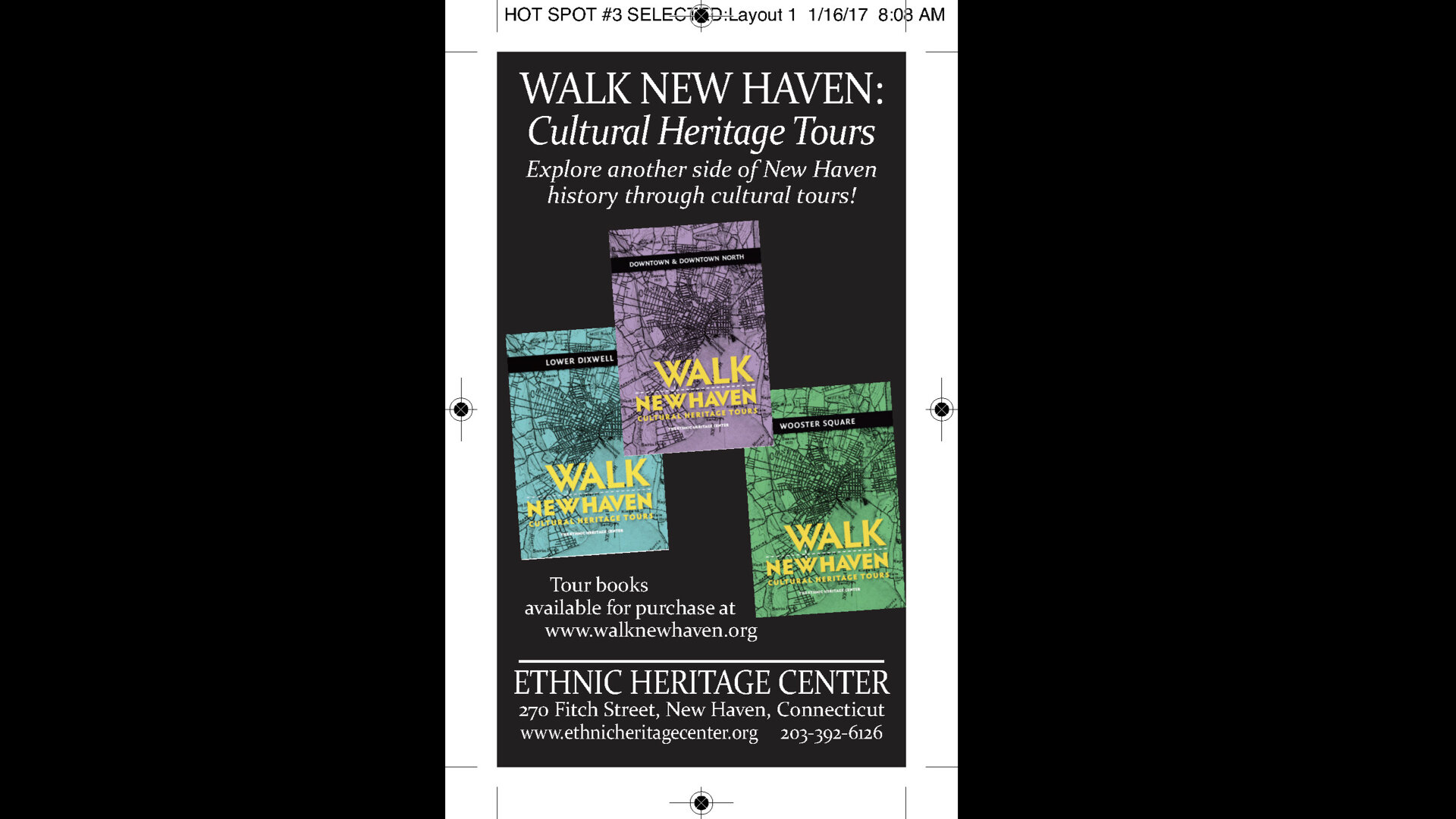
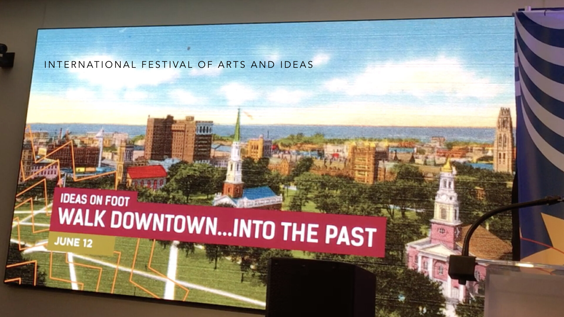
But as negotiations with City Hall became more complicated and the cost to install signage too expensive, EHC decided to pursue another direction that would not require buy-in and approvals from others. So, in late 2015, they sent out a Request for Proposal for graphic design and production services for three brochures that included text, maps, pictures, and QR codes for walking tours of the Downtown, Wooster Square, and Lower Dixwell neighborhoods. During an introductory design meeting, while listening to the projects’ parameters, it became apparent that, as envisioned, its scope would fall far short of the project’s objectives. With 13 in attendance, we began discovery with Design Thinking by first defining the purpose, challenges, and people we were creating the tours for. We asked about the impetus for the project—where had the idea germinated, what models had been researched, what would the best outcome be? Could the “Museum in the Streets” product be adapted and would it work without the signage component?
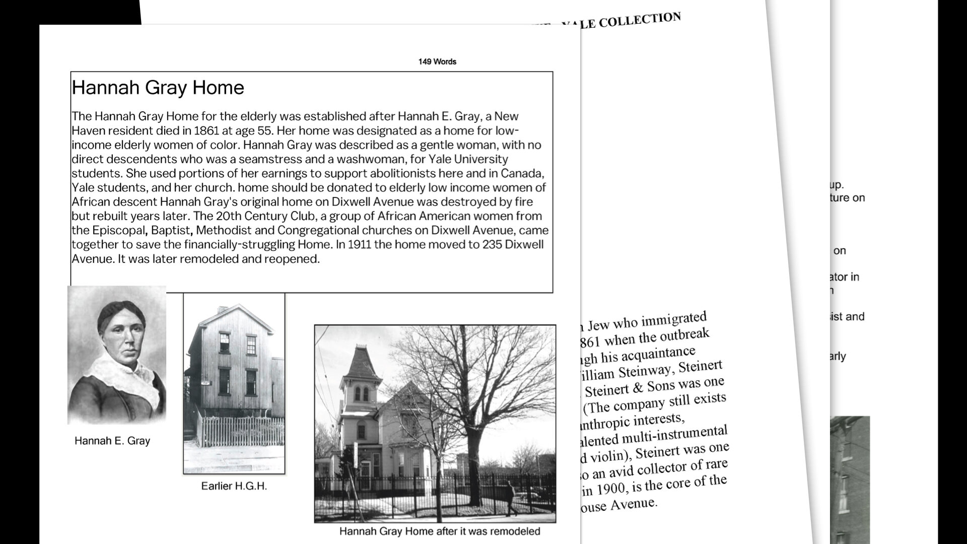
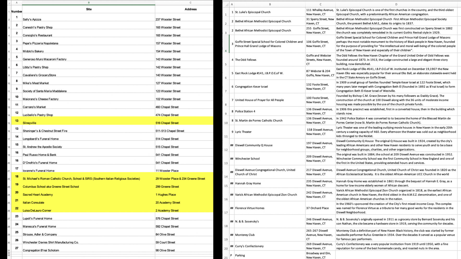
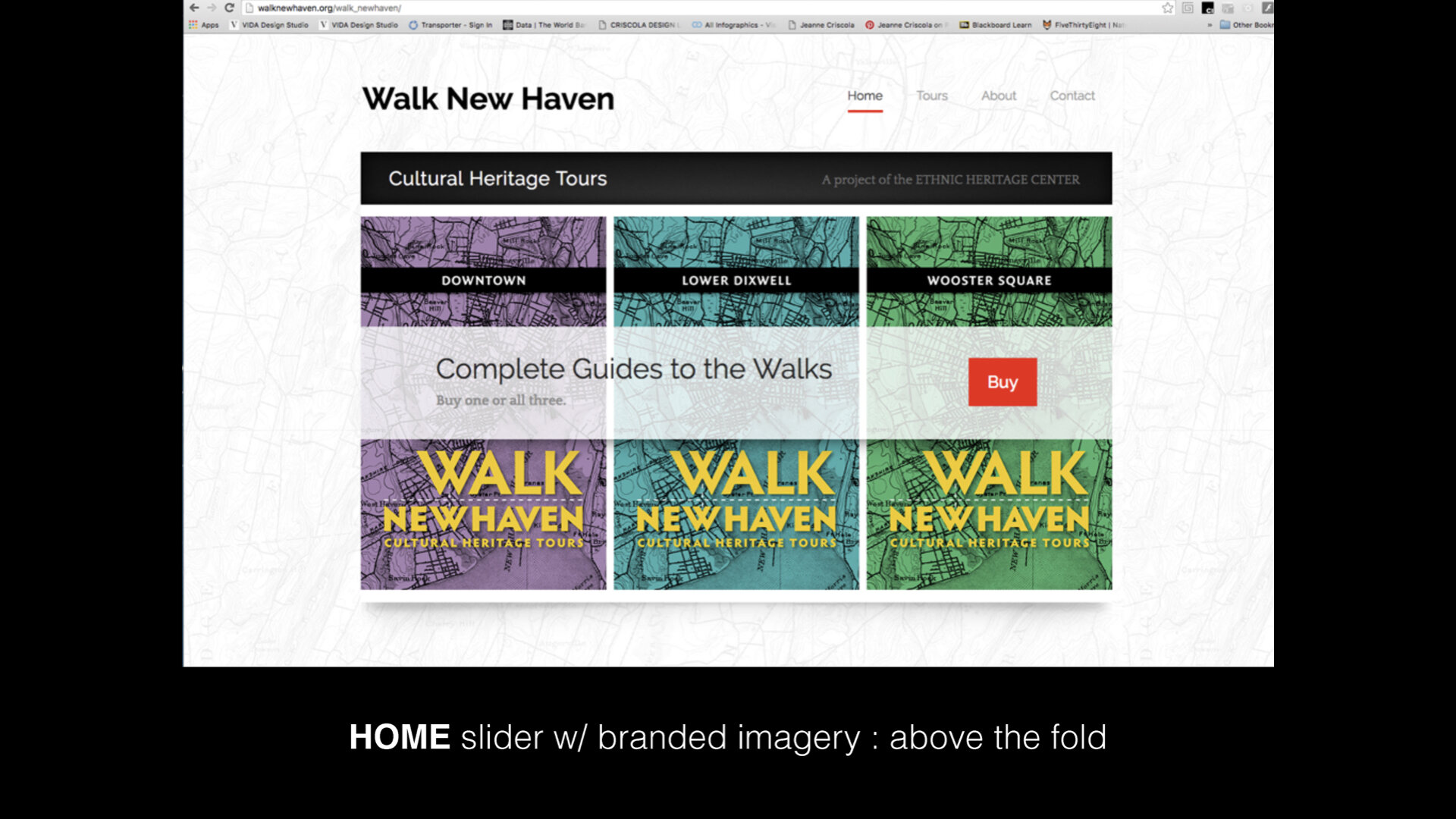
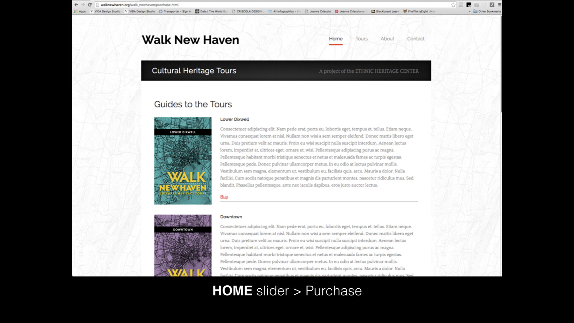
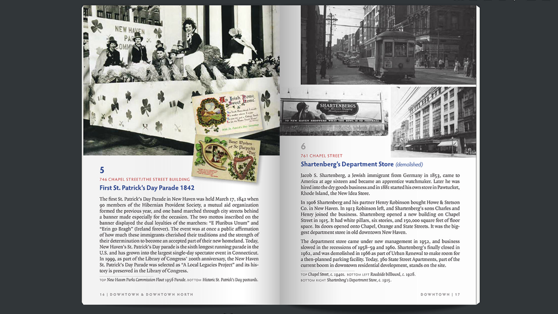
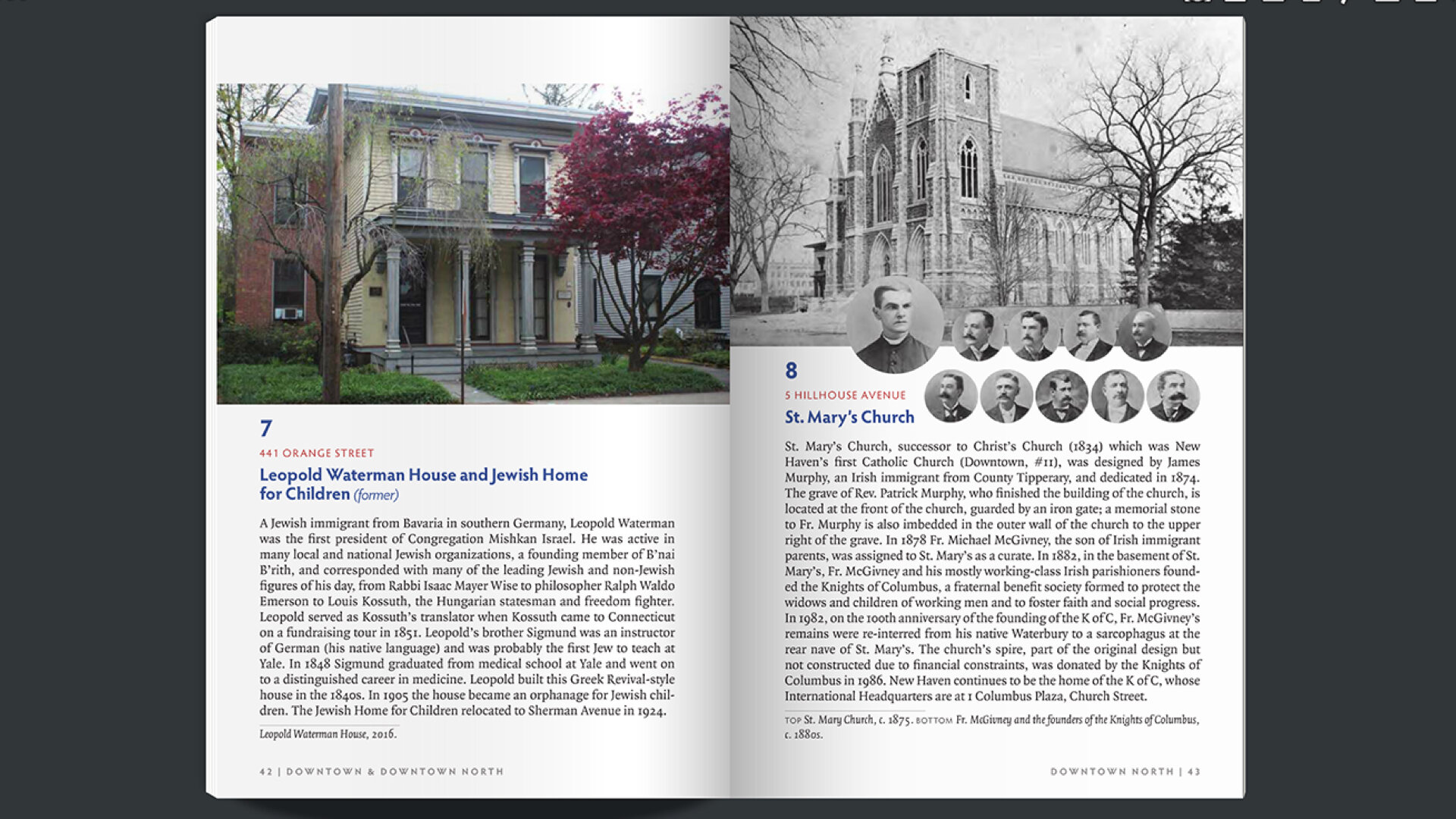
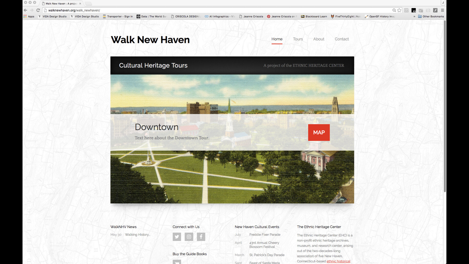
Each society had already spent years compiling, researching, and assembling evidence of the influences, intersections, and cross-overs their ethnic group had made in each of the three neighborhoods. They had long texts, multiple images of sites, and go-to people to reference about the sites they chose for the walks. People in the community who had contributed to the project were eager to be see their stories told. Significant editing would be needed in order to format the information and media into a brochure like the examples the EHC had supplied with the proposal. After an assessment of the work that had already been done by EHC to get the project started, it was unanimously agreed upon to enlarge the project to include books and a website in addition to the brochures. This way, the website would include all the text and media they had collected from numerous people and families, then edited for the books, and then further editing for the brochures.
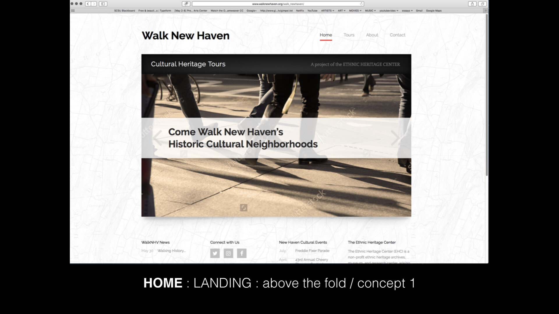
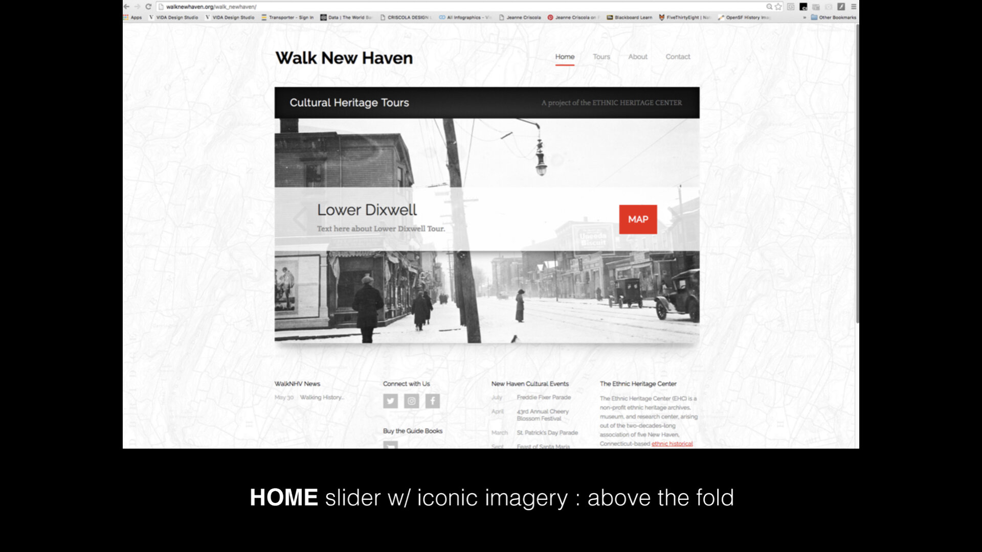
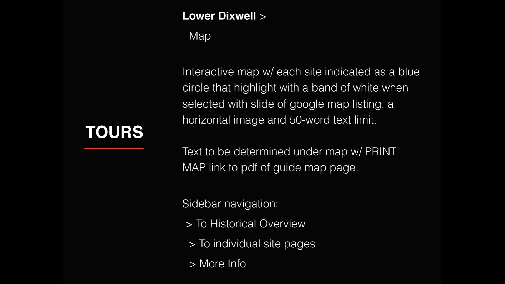
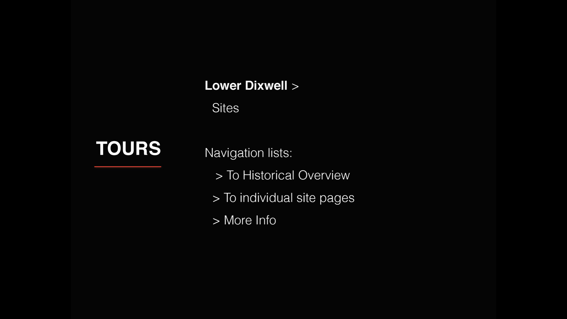
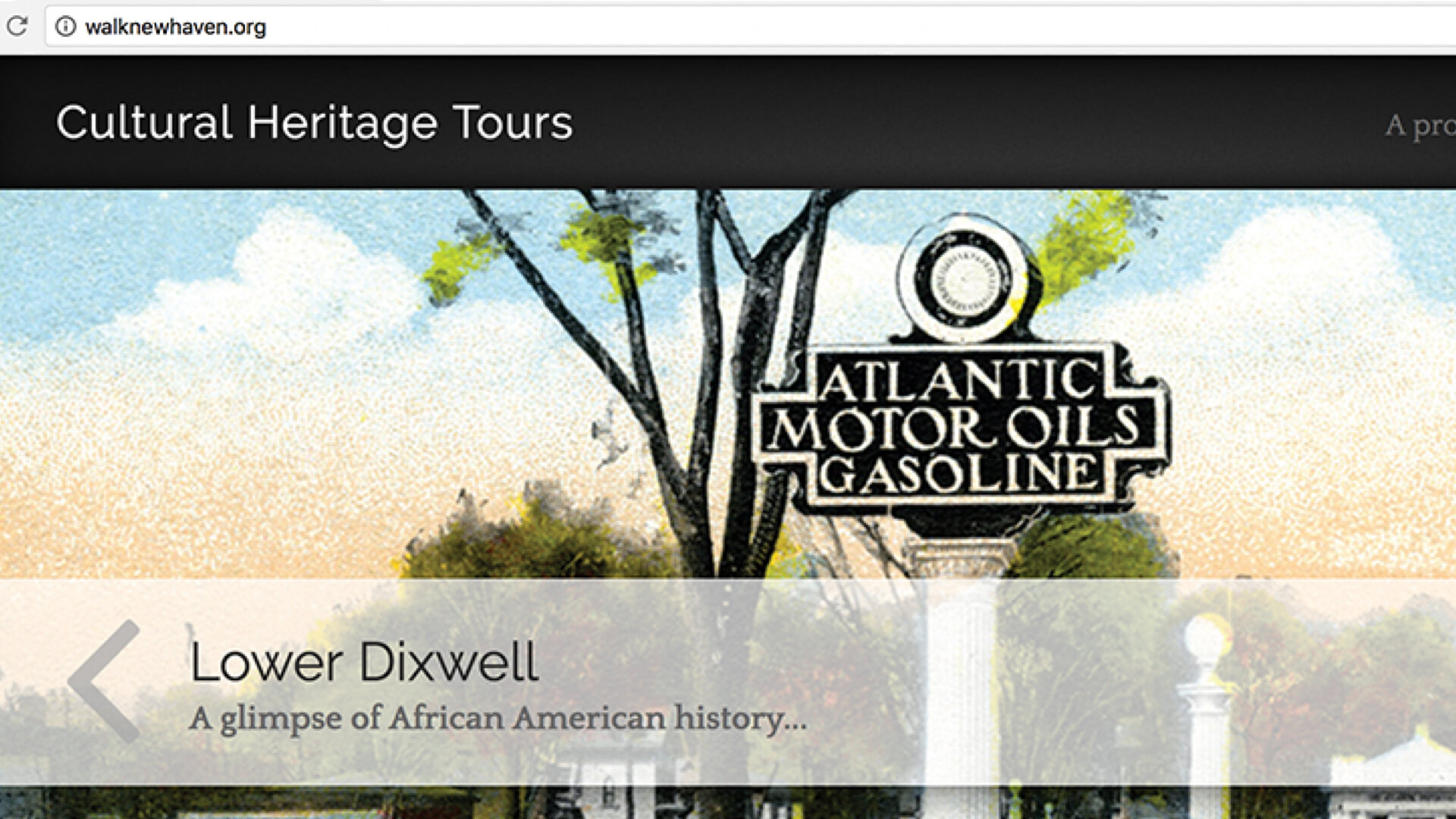
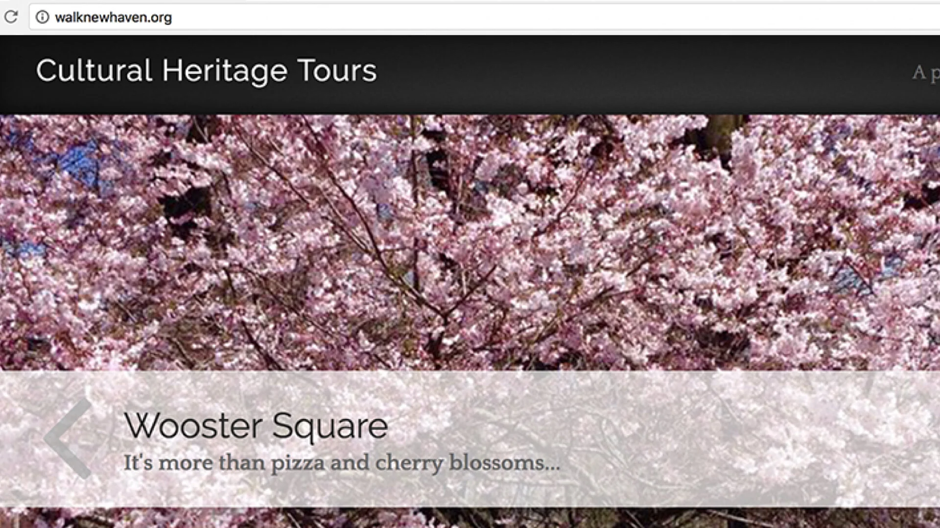
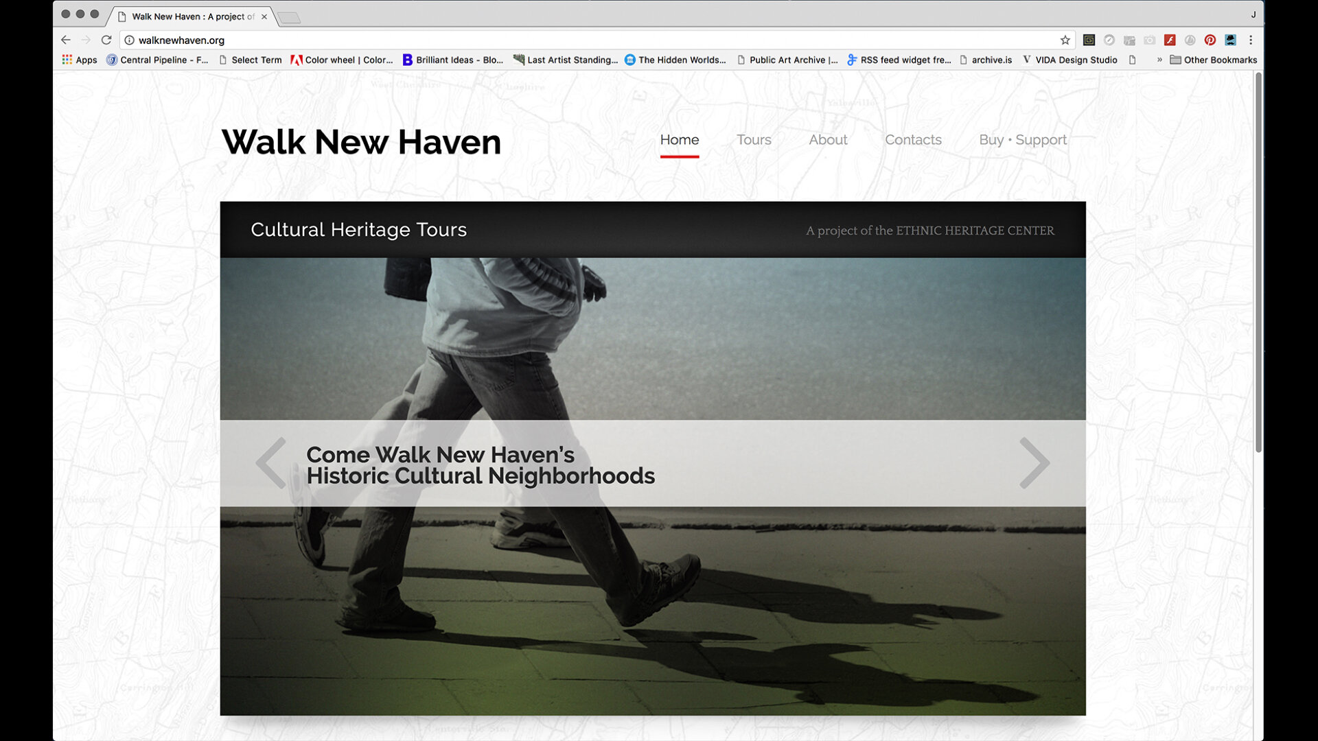
And so with the project parameters in place, design thinking entered its next phase of design research, ideation, and prototyping. A decision was made to implement the design process with Lower Dixwell which was the smaller and most complete compilation of the tours. At this point, brainstorming a name for the project began and soon ended with “Walk New Haven.” The “Cultural Heritage Tours” subtitle was added later. Students in my CCSU Spring 16 design classes at Central got to weigh in on the logo development and branding acting as critics and curators.
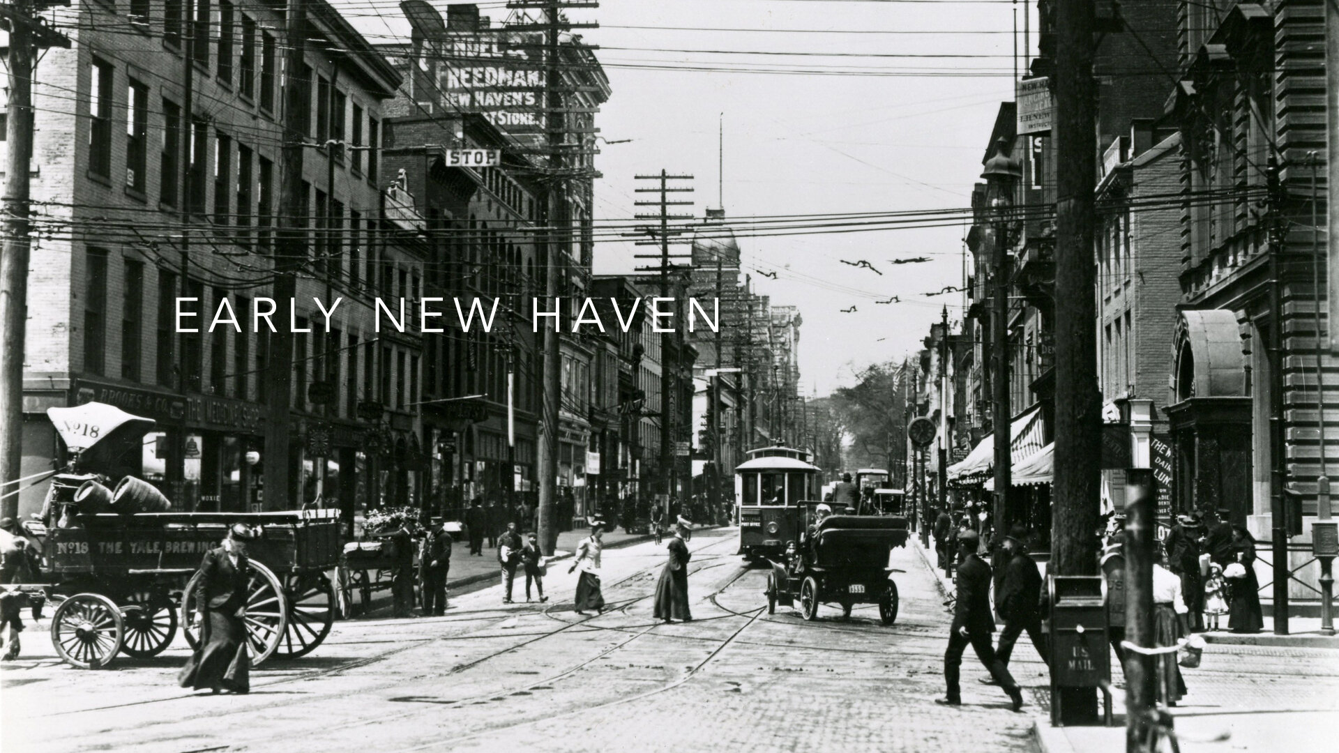
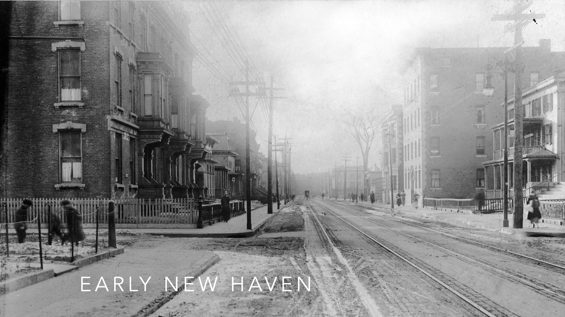
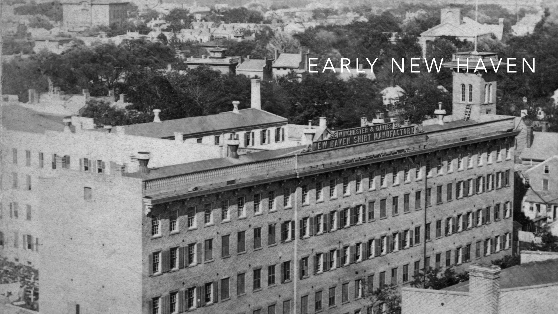
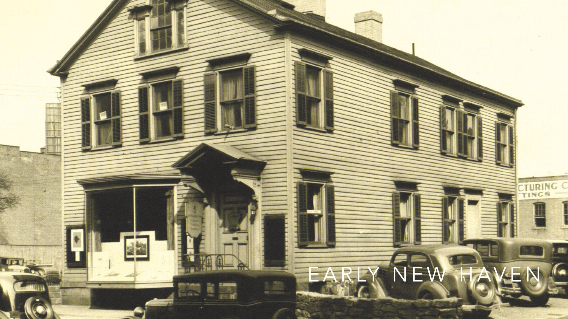
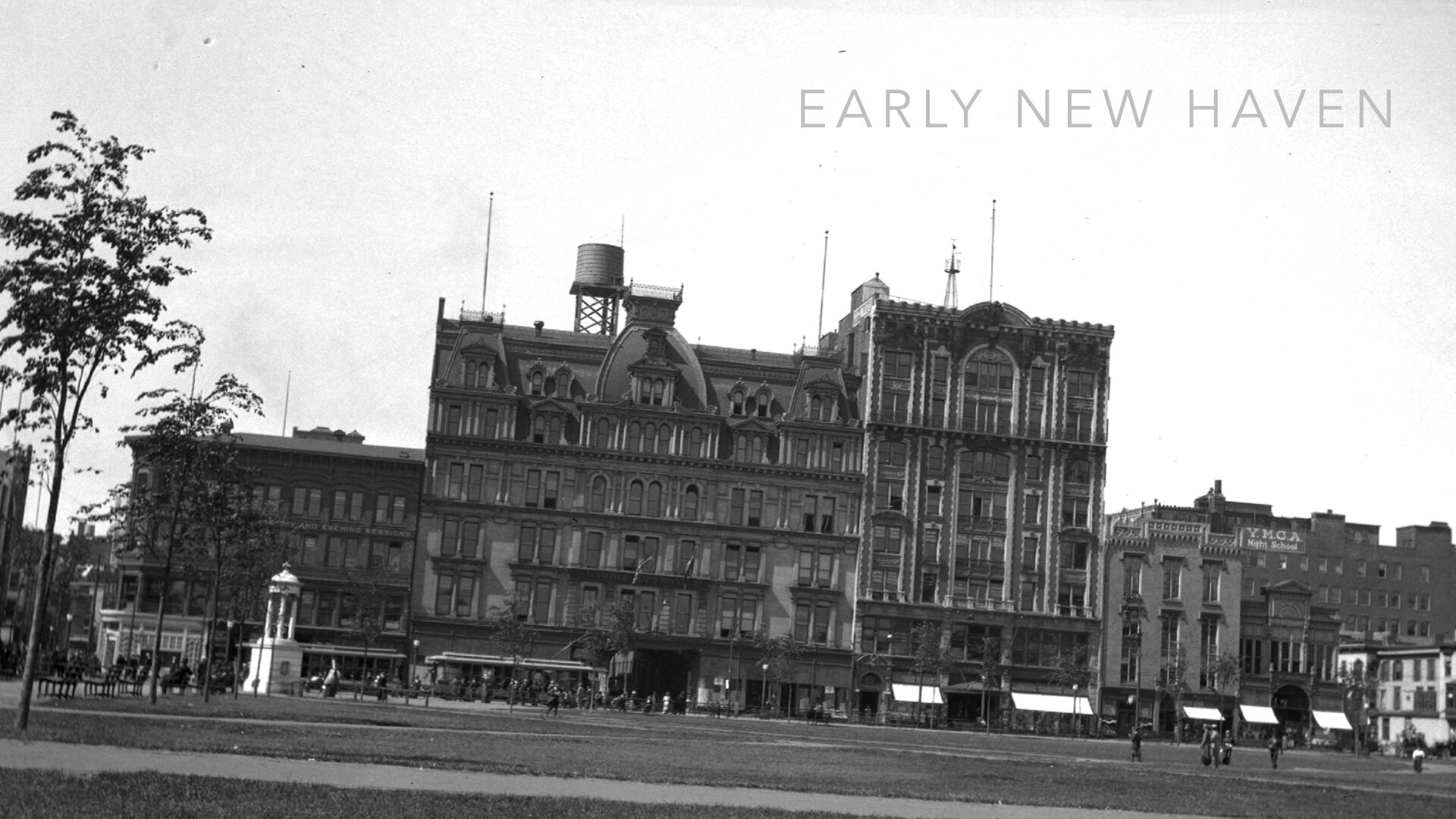
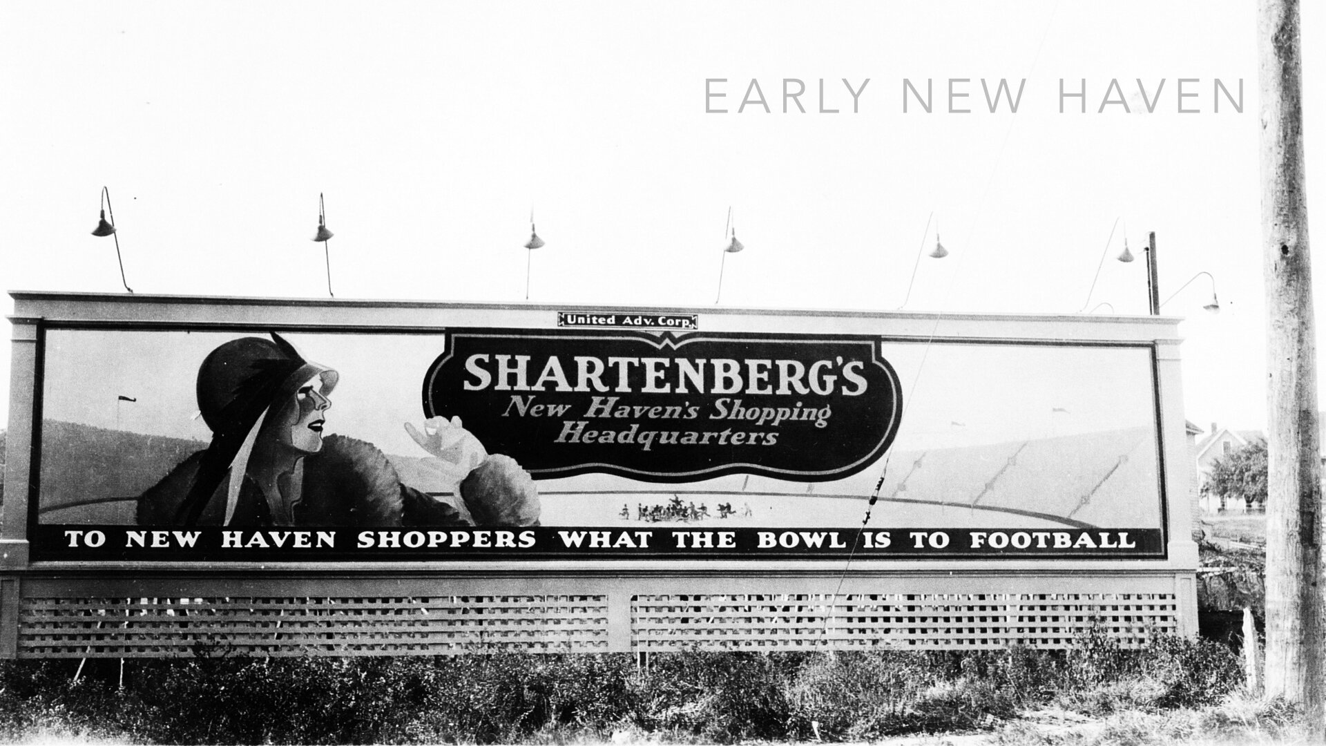
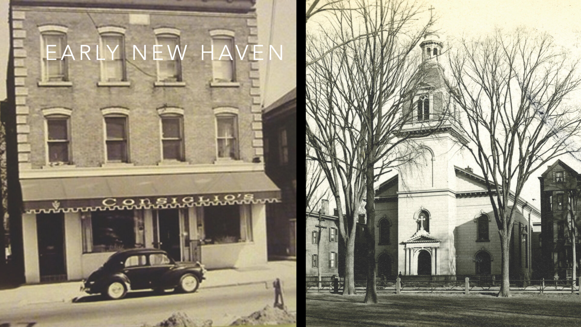
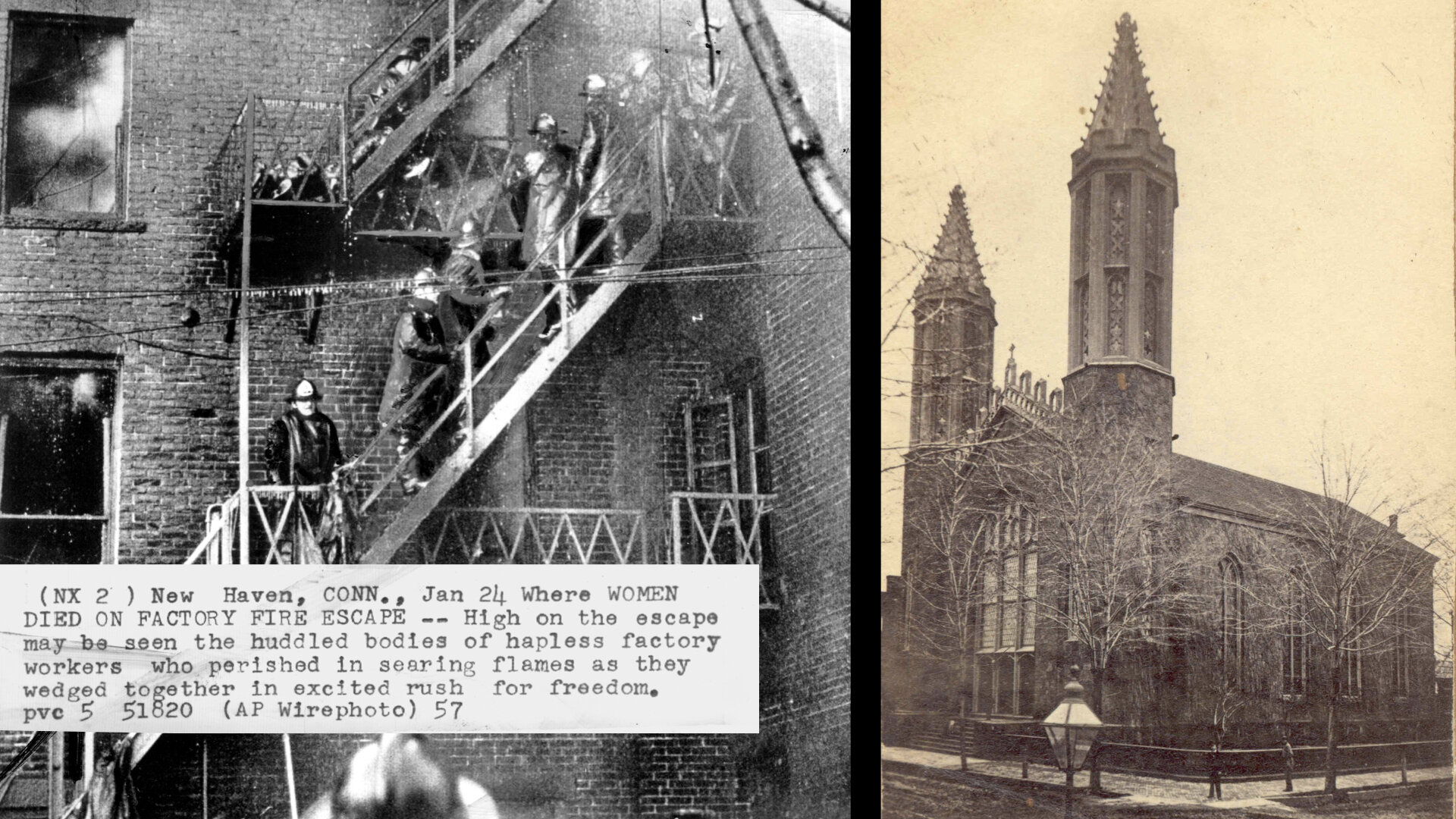
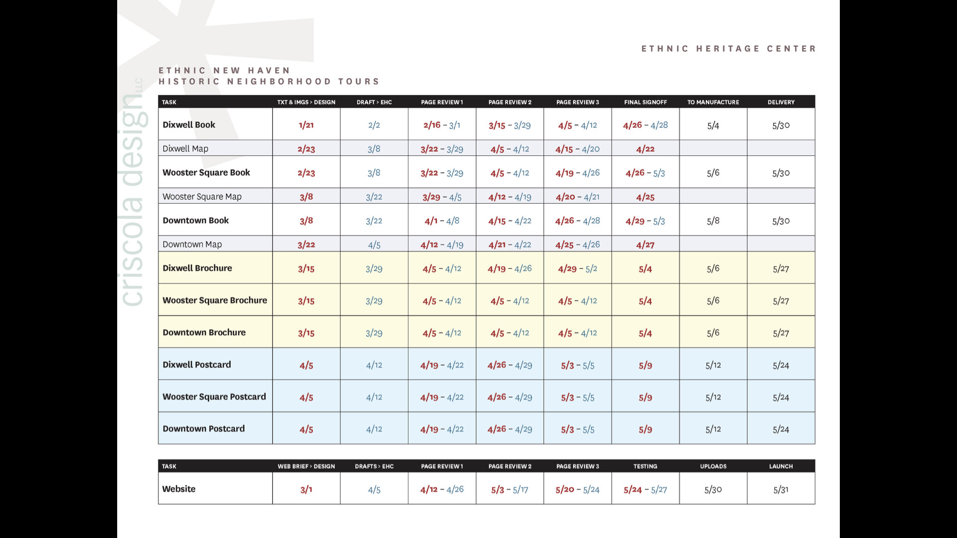
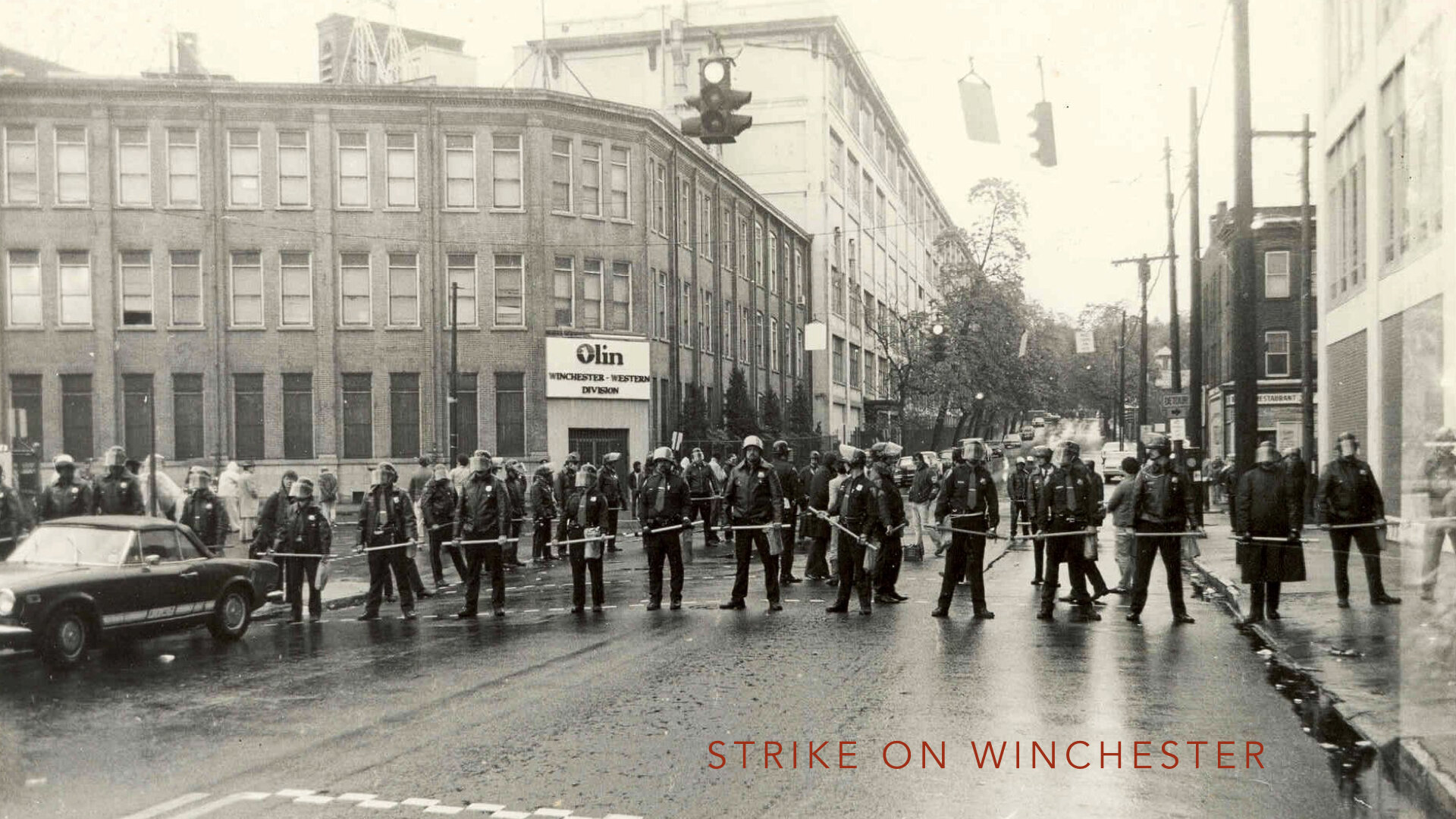
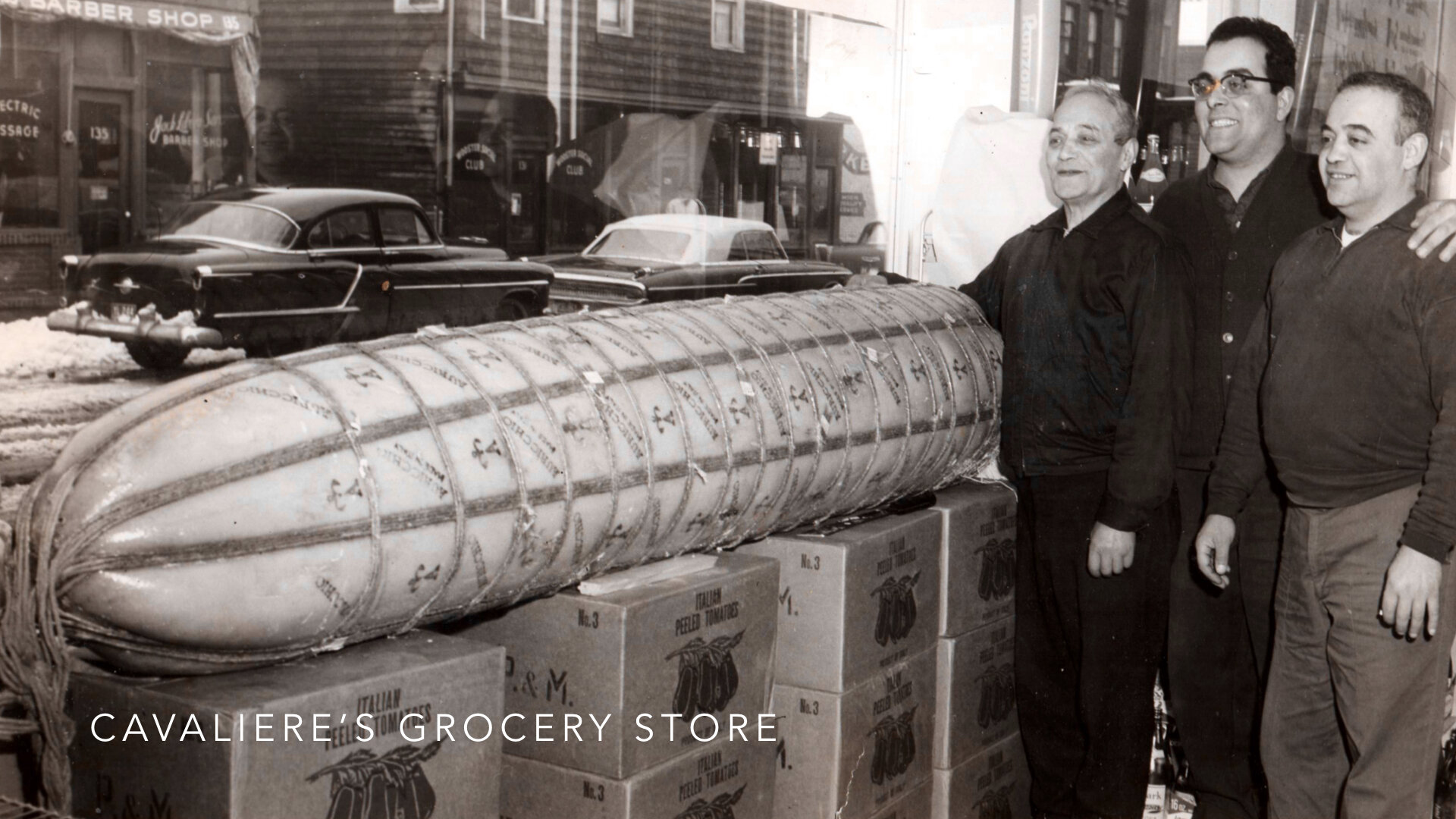
Next, we worked out a tight and ambitious design and production schedule for the expanded project. We had many animated discussions viewing and comparing pictures of the sites, the buildings, streets, and neighborhoods spanning decades from various angles and elevations. They revealed the myriad changes the cityscape has undergone and how great or poor our memories are today. When questions would arise about the provenance, importance, or factors of a person or site, strides were made to tell as complete and inclusive a story as possible about the neighborhoods, founders, stakeholders, industrialists, factories, workers, immigrants, developers, and businesses to illustrate how the City’s culture and diversity was deeply intertwined and to provide a framework for understanding its current landscape and identity. Each time a sensitive topic arose—and there were quite a few—insight and empathy emerged adding new layers to the depth of the project.
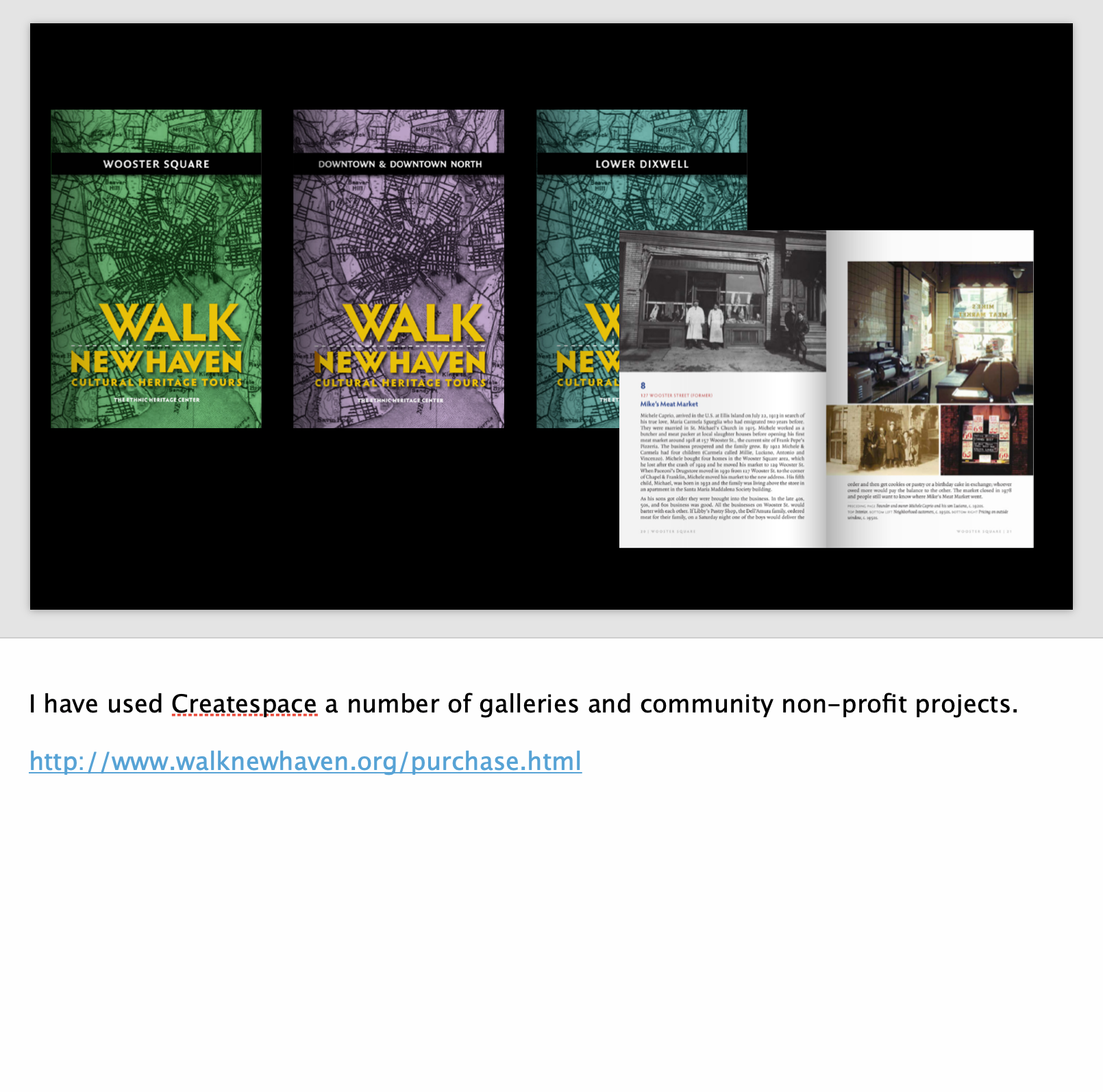
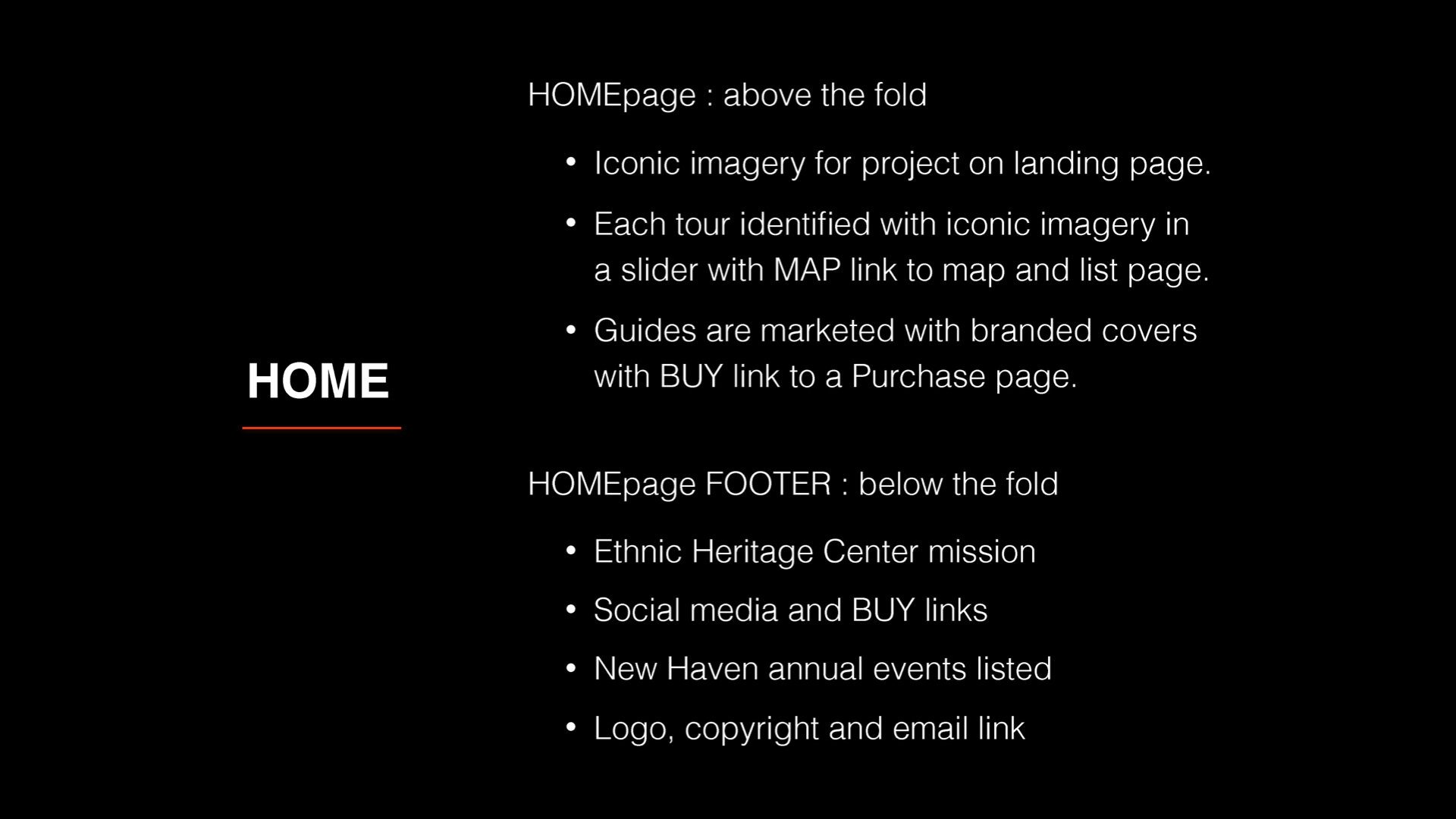
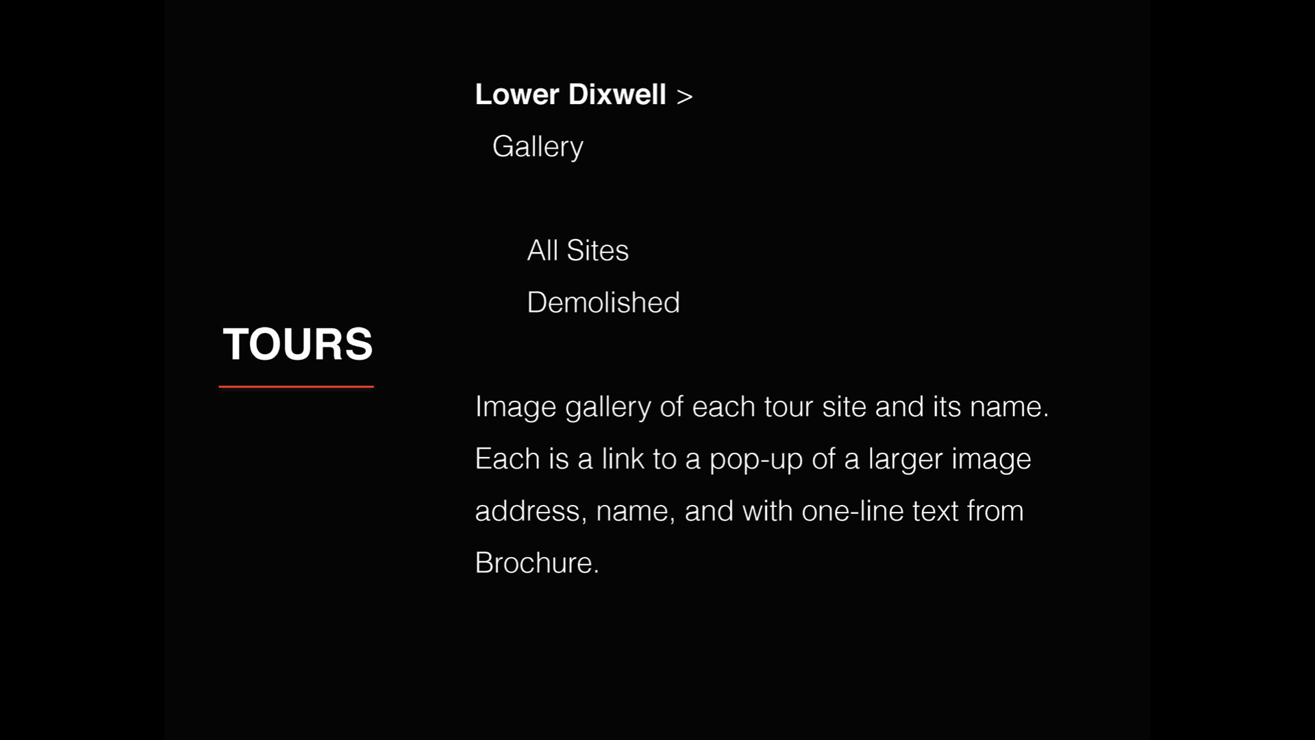
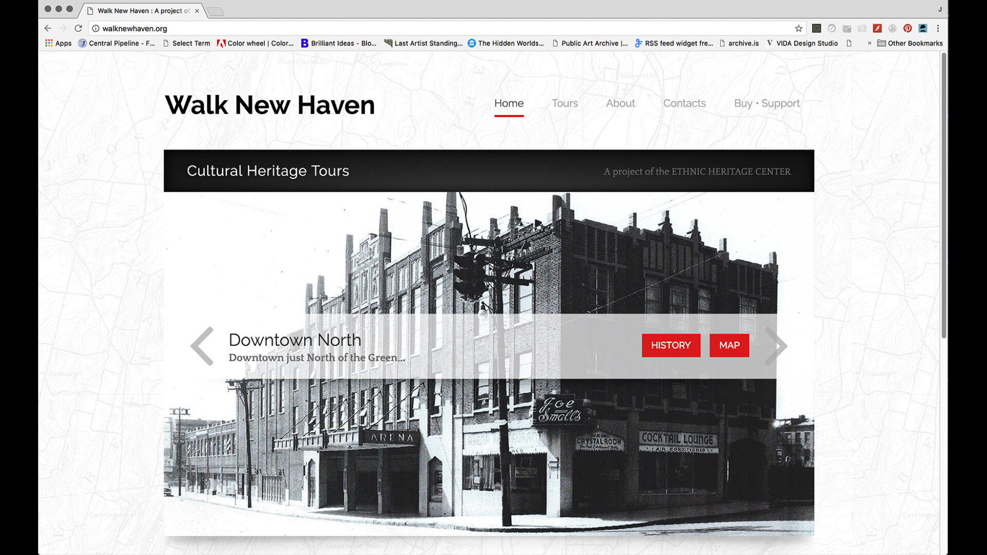
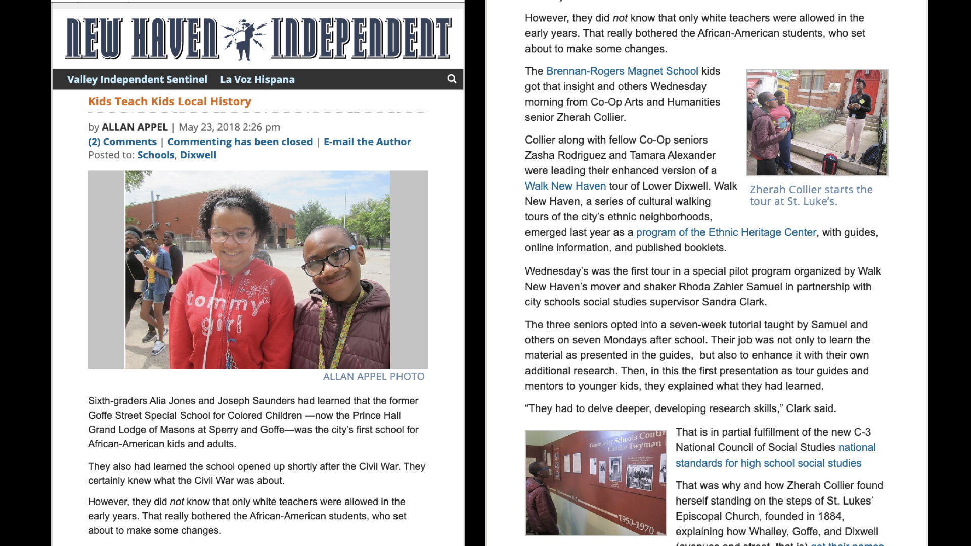
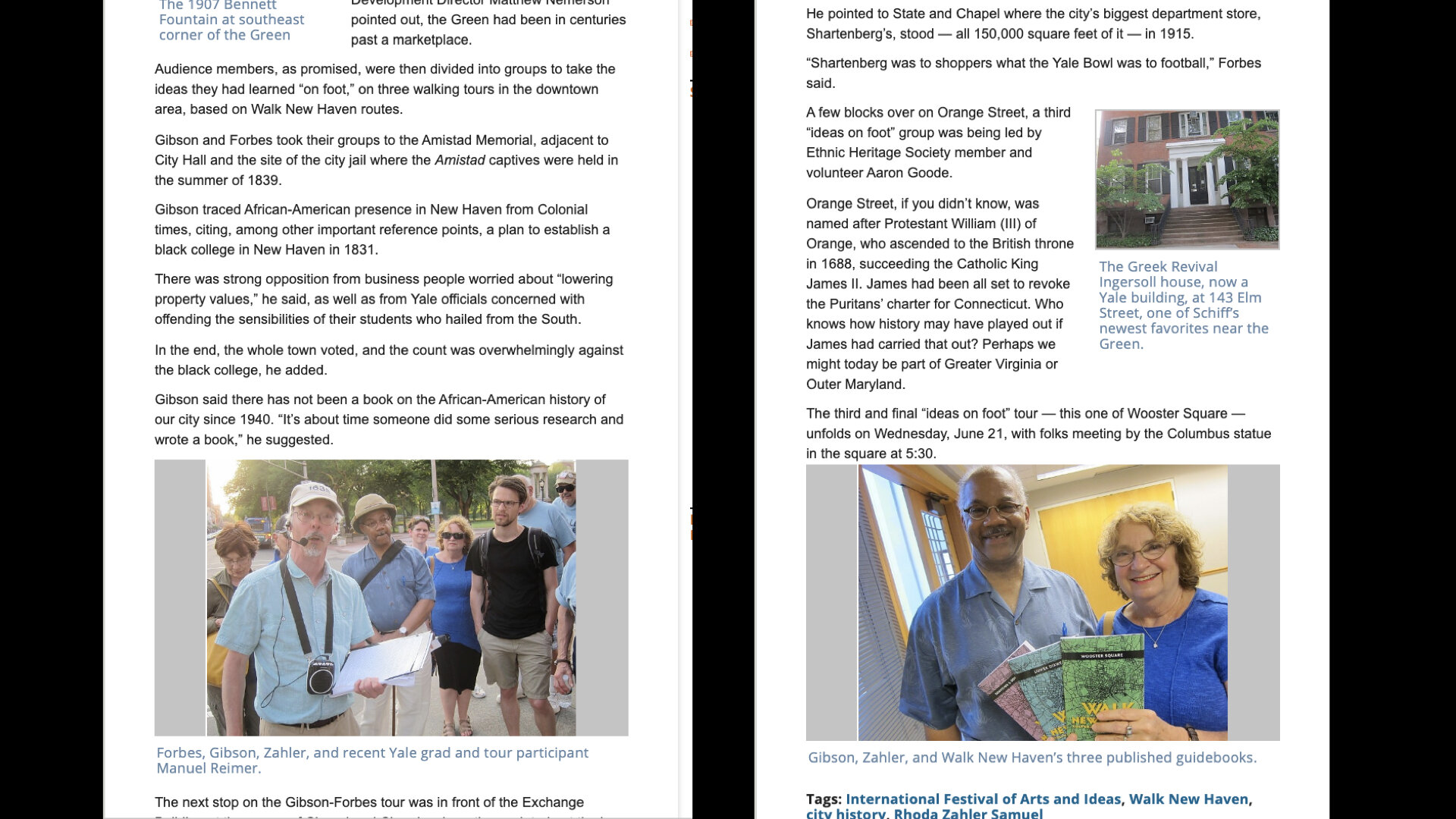
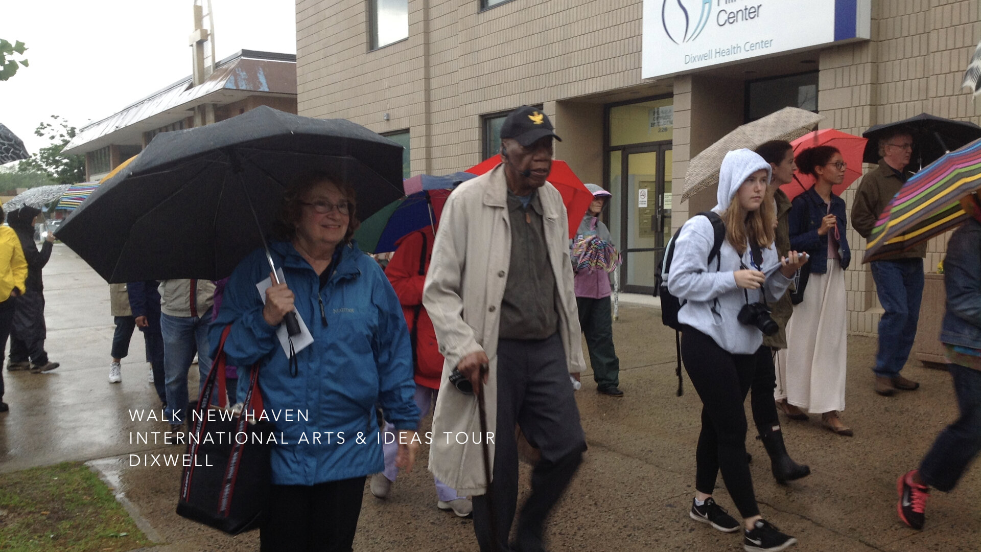
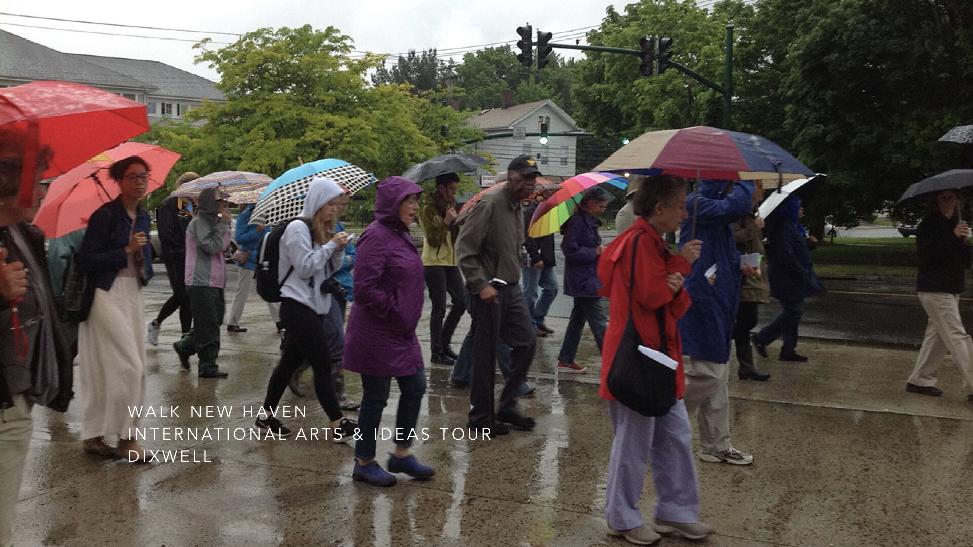
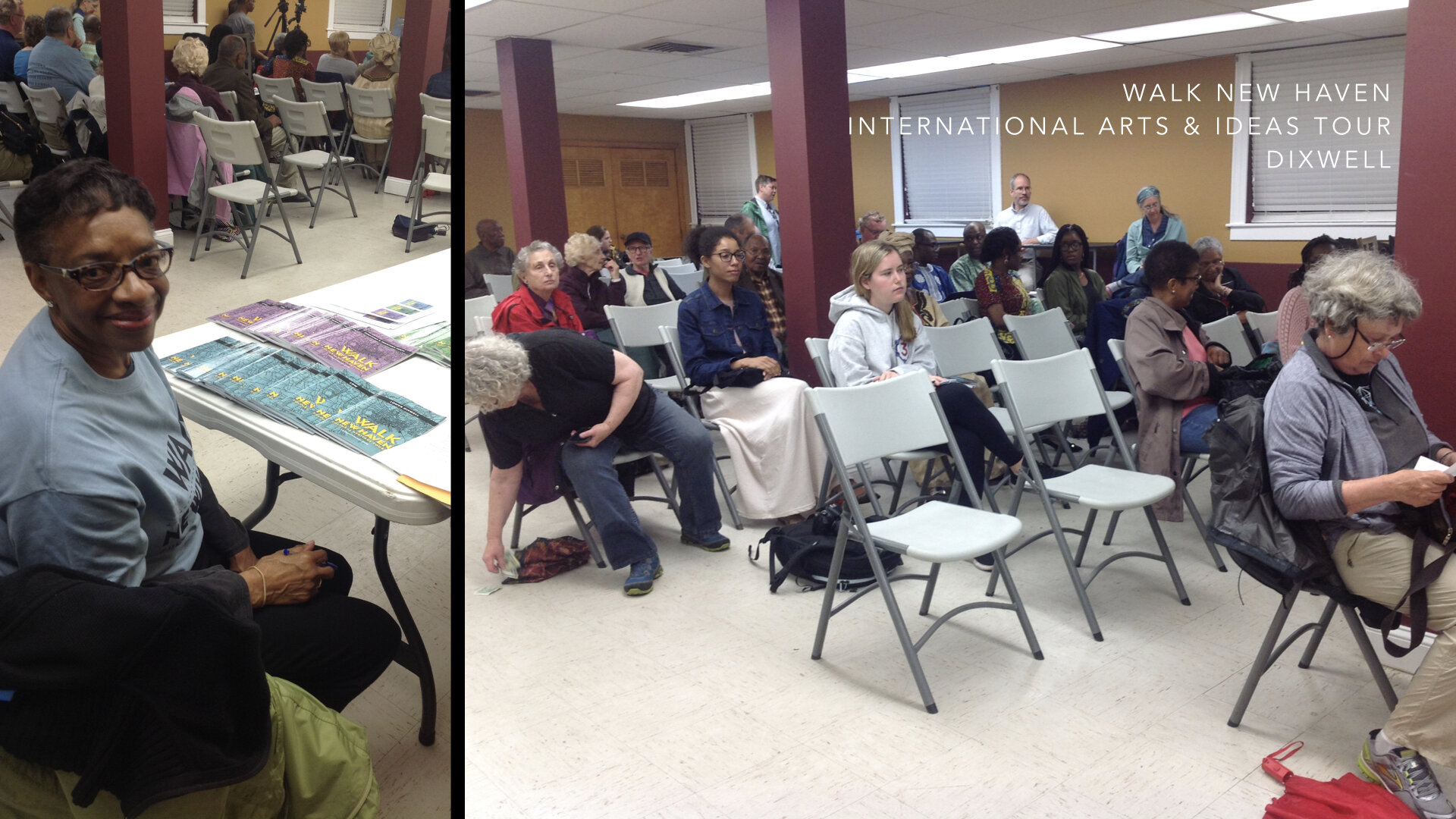
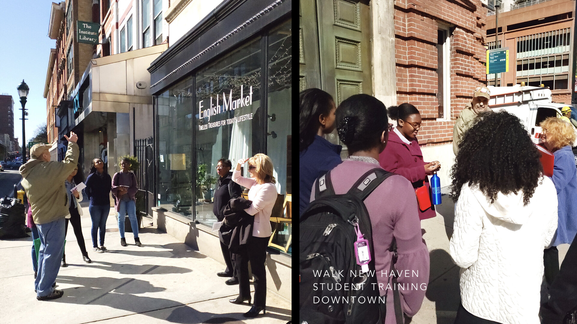
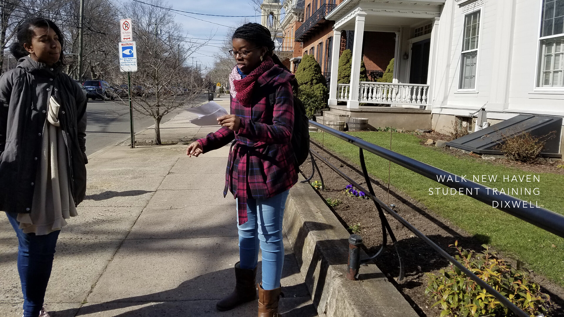
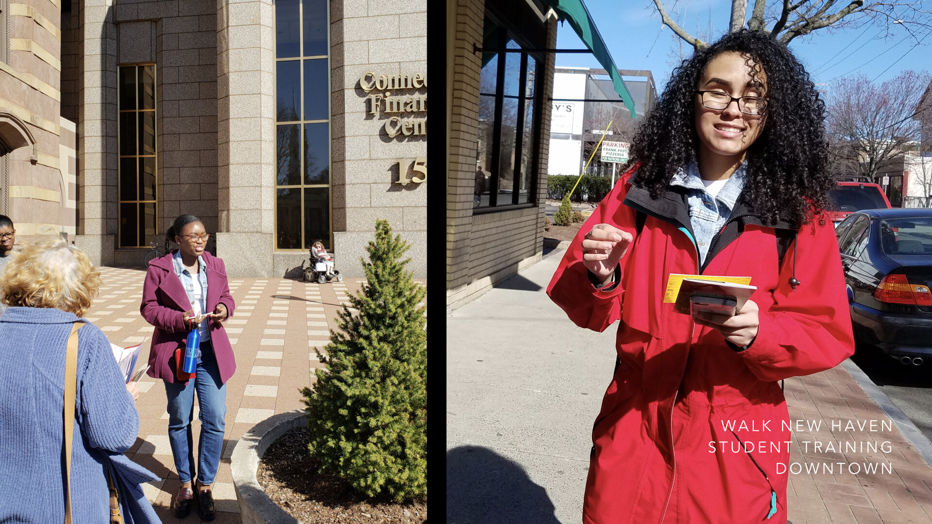
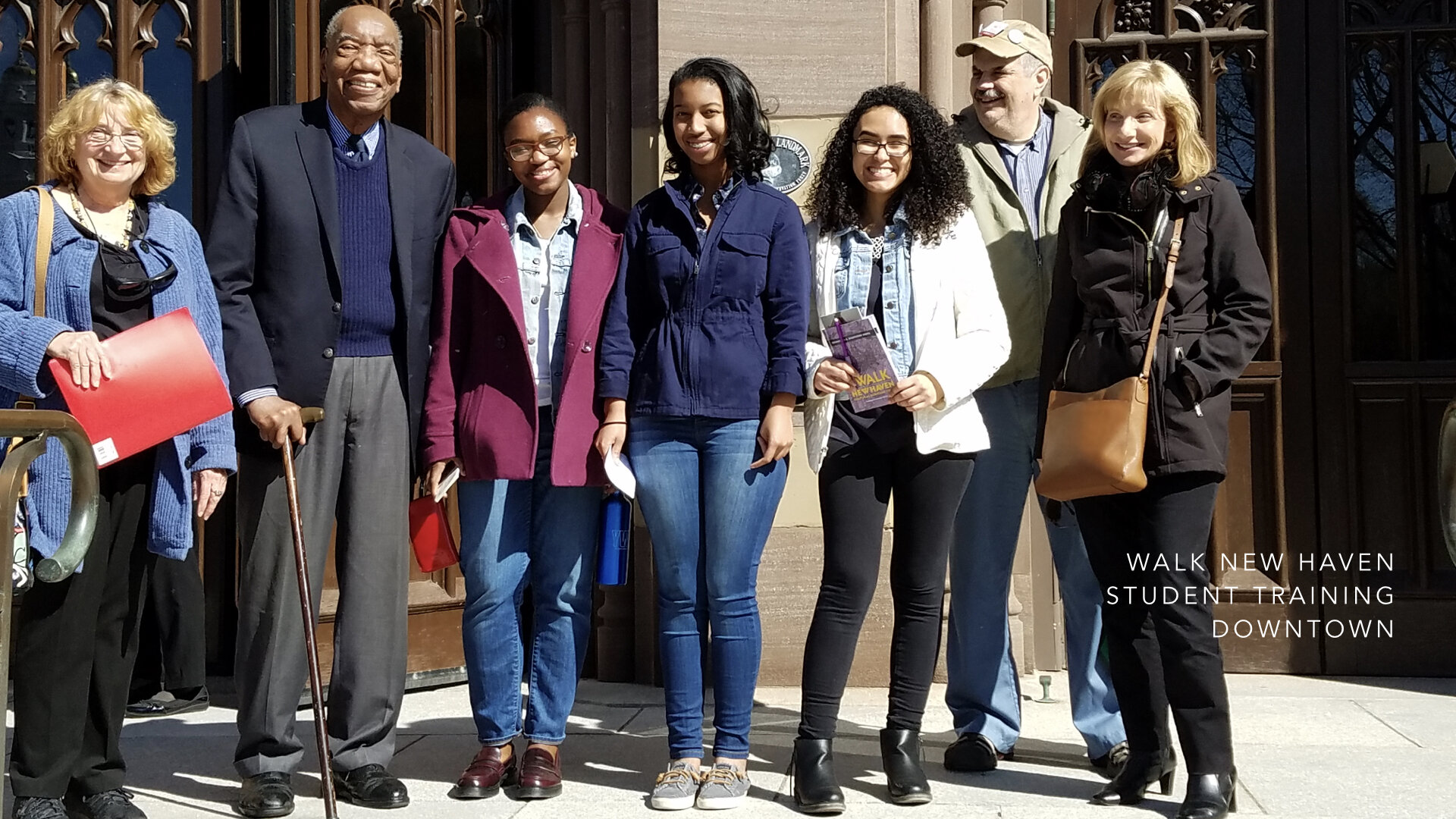
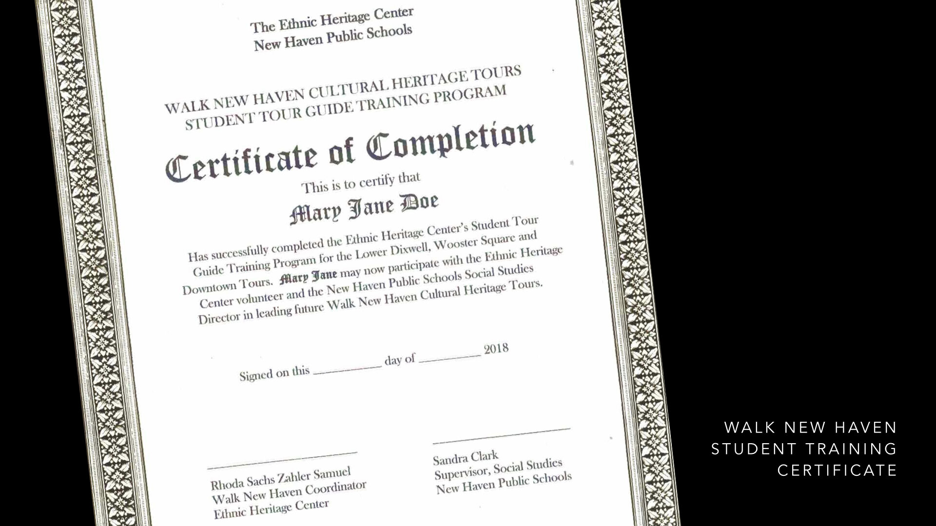
Walk New Haven: Cultural Heritage Tours is the now expanded project that continues with New Haven’s High School students learning the history of their neighborhoods, leading tours, and exploring and sharing stories of their and others heritage. Frequently, we hear them say they had no idea that the buildings they pass by everyday have historical significance and connect to a vibrant past.
Regardless of where we live, we are all well served by people serving organizations with missions such as the Ethnic Heritage Center who work tirelessly, volunteer their time, share their knowledge and archives in order to pass on the City’s extraordinary history to a new generation. Common Ground is a blueprint for creative research, direction, and design-thinking in service to community-organized projects to ensure they achieve their full and vital potential.
Collaborations are like gardening. You plant a seed, water it, weed it, and tending to it becomes a rewarding experience as it grows into what you imagined it could be and what it would look like at scale.
Collaborating with non-profit organizations can be the most rewarding project work for a designer or design team. It has been for the entirety of my career. Collaborations can yield—especially when the designer immerses themselves—possibilities that grow out of the knowledge the organization imparts. It becomes a synergistic undertaking as the designer feeds back their newly acquired knowledge through the lens of creative research. Committing to a project ensures its long-term success. Facilitating the collaboration is key.
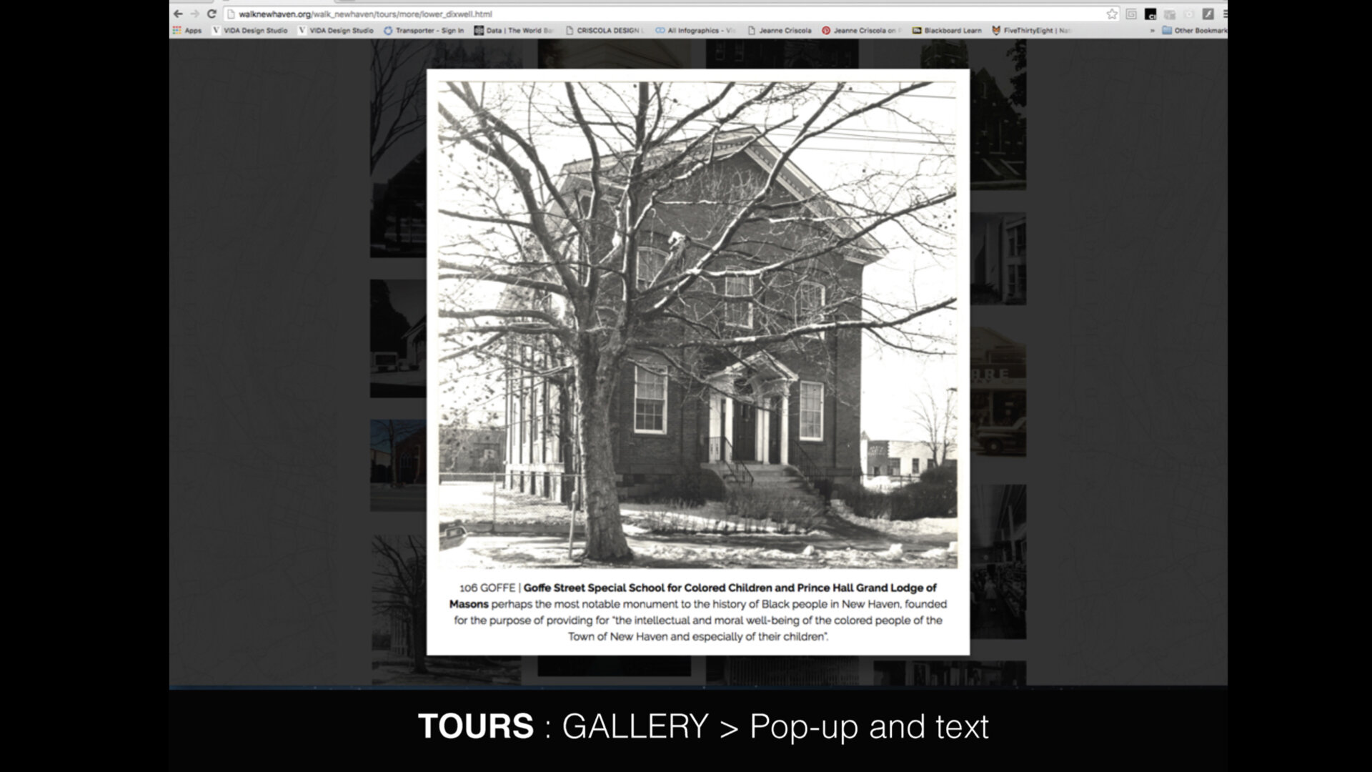
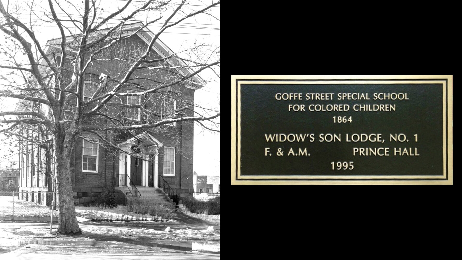
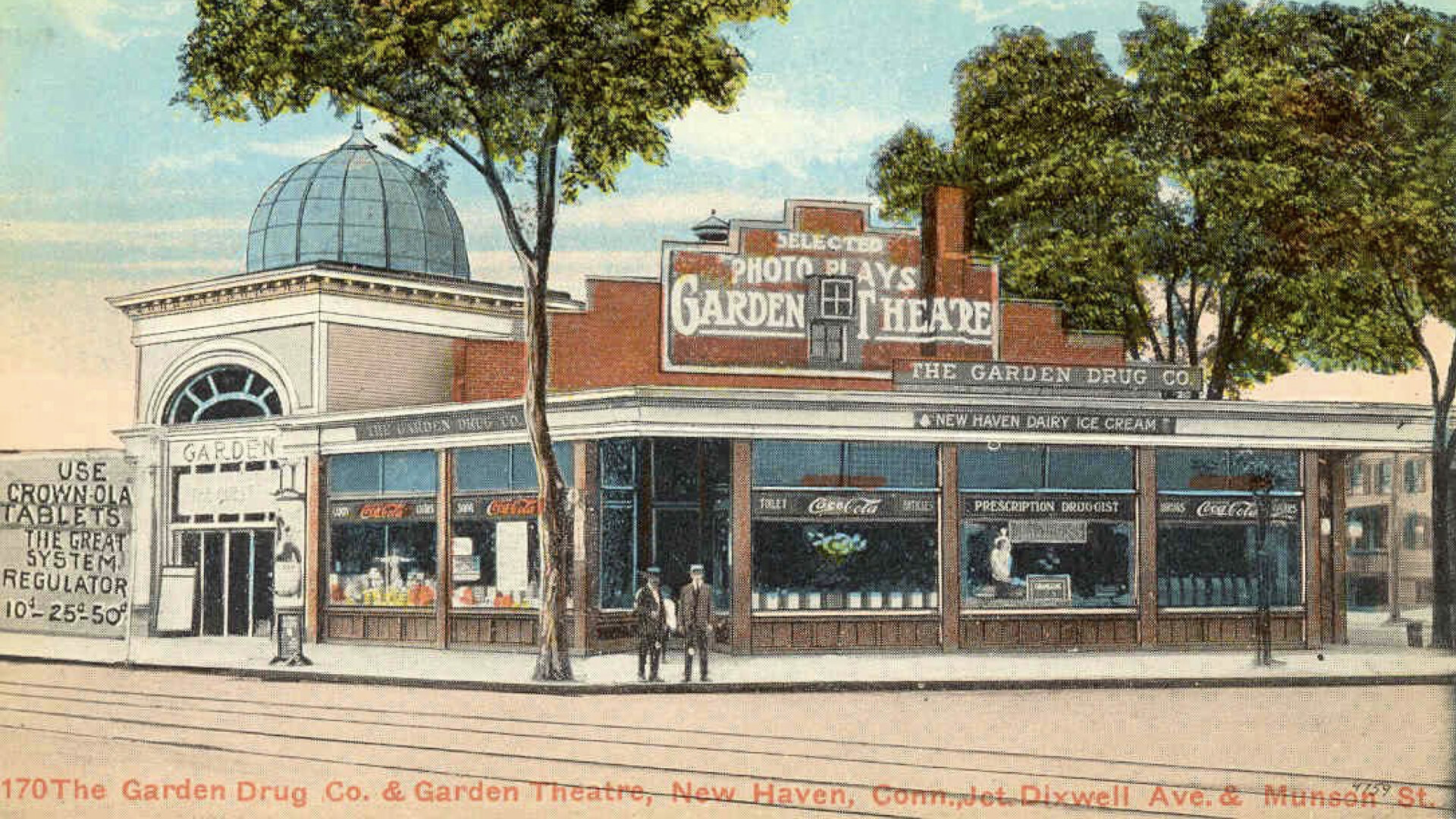
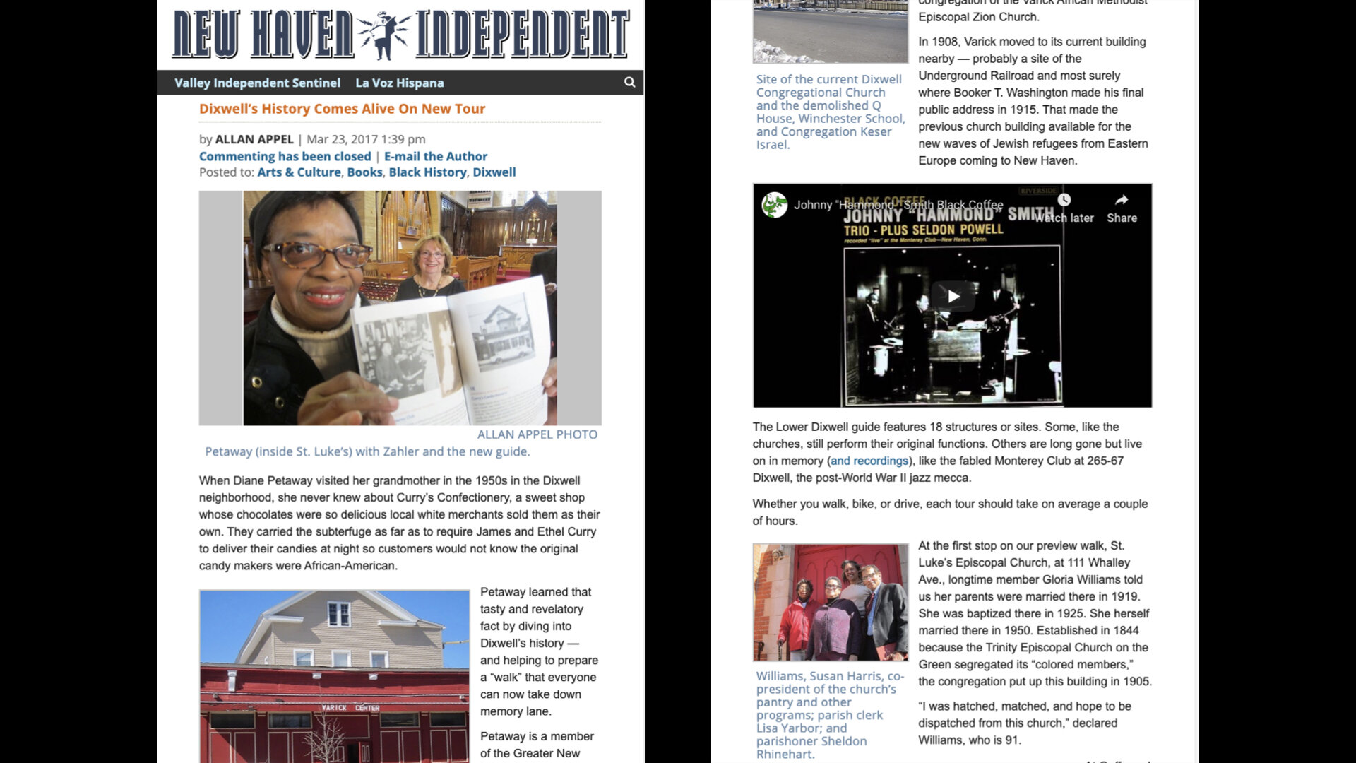
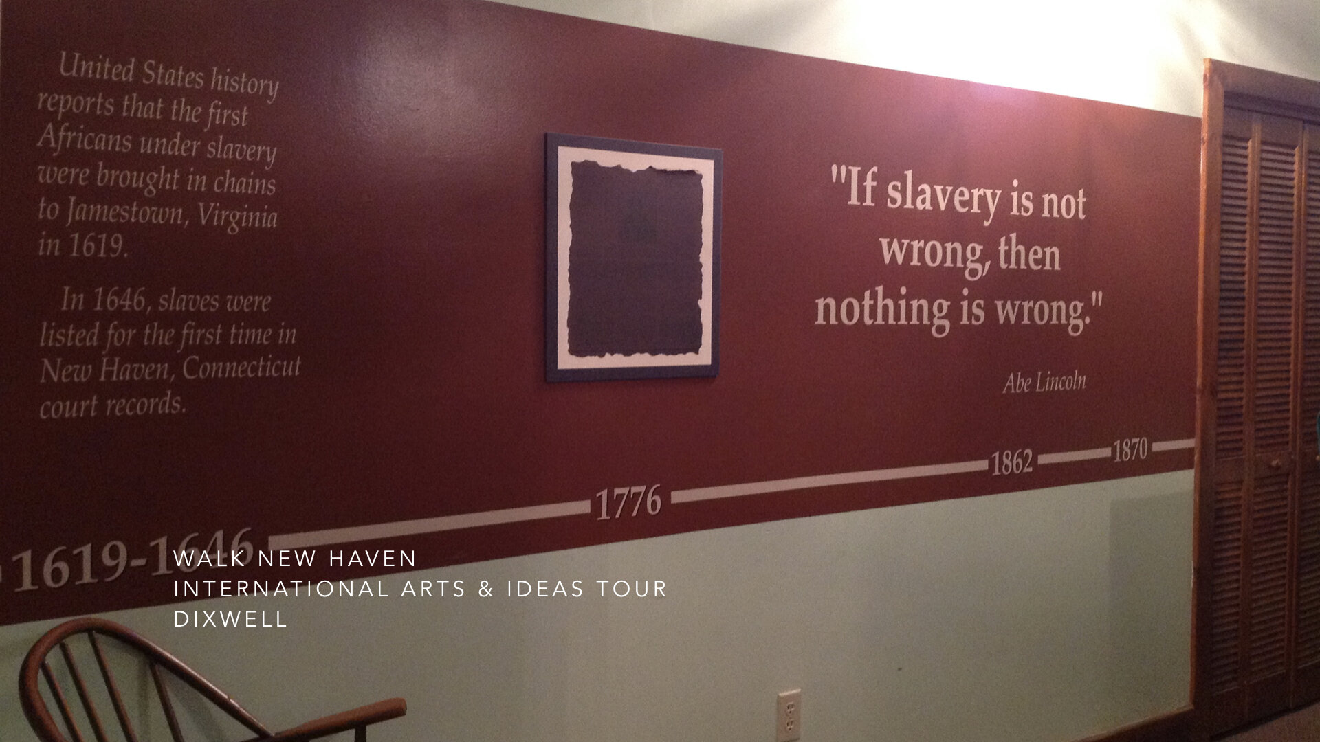
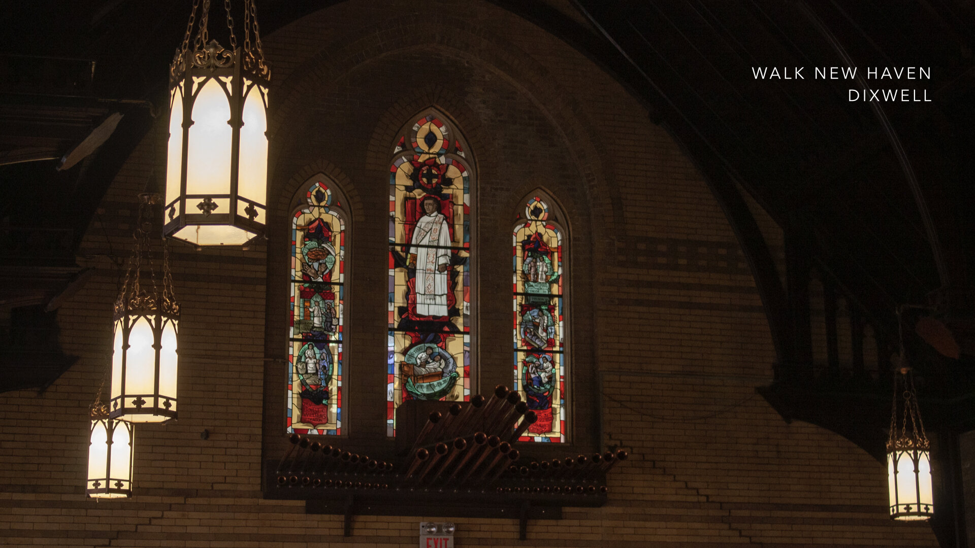
The New Haven High School students who were trained to lead “walkabout” tours of the four historic neighborhoods that the Ethnic Heritage Center initiated with “Walk New Haven: Cultural Heritage Tours” have found a new appreciation of the rich history of their City and want others to share this knowledge and sense of pride in their richly diverse community. They have been inside the former Goffe Street Special School for Colored Children, designed by Henry Austin and funded by local philanthropists and abolitionists in the 1860’s. They have seen African American History on Lower Dixwell Avenue, with sites of the Underground Railroad, and early churches for African Americans who did not want to be segregated in the back of white churches. They have learned of local heroes, such as Hannah Gray, a laundress who worked for Yale, who left her home in her will to provide a refuge for indigent African American women. They have also learned of the immigrant experiences of the Irish, Italians, Jews, and Ukrainians who came to New Haven to escape starvation and persecution. They find this information very relevant to New Haven today and want to talk about it.
The role of higher public education in Connecticut and elsewhere must be to partner with communities and their constituents to foster culture, understanding, and tolerance. The creative process can catalyze engagements with community and when design thinking is employed, strategies for creating new products and services can be innovated and maximized. This process can begin with the leadership and creative direction of design educators learned in the creative process and practice-based in the world of business to activate collaborative approaches and pathways focused on the narratives of our past to build new identities with potential for opportunities and possibilities.
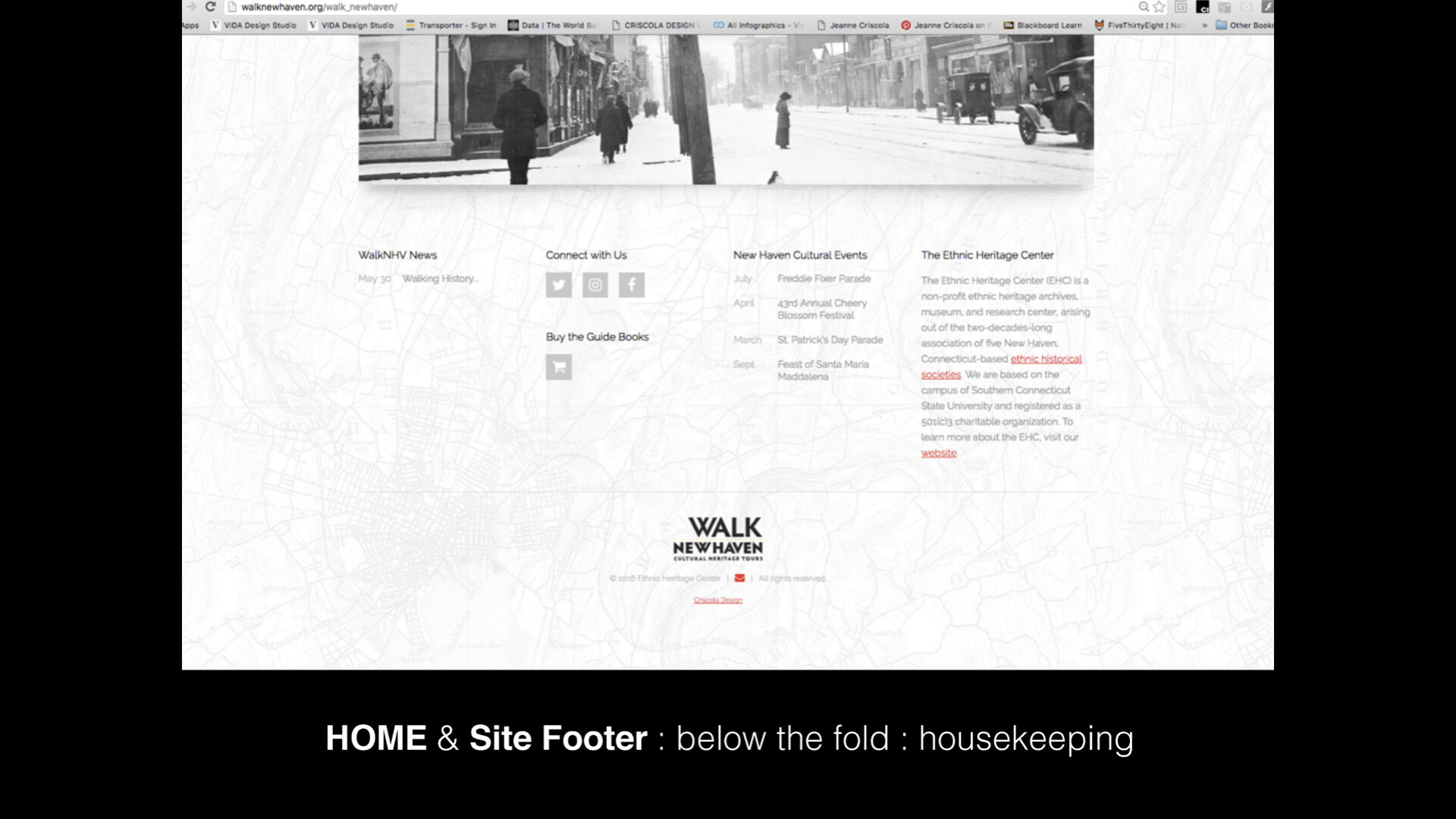
Please visit walknewhaven.org for more information about the people who made it possible and criscoladesign.com to see my studio’s portfolio.


