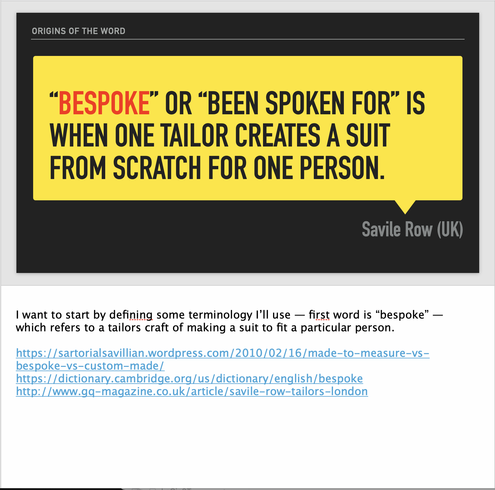
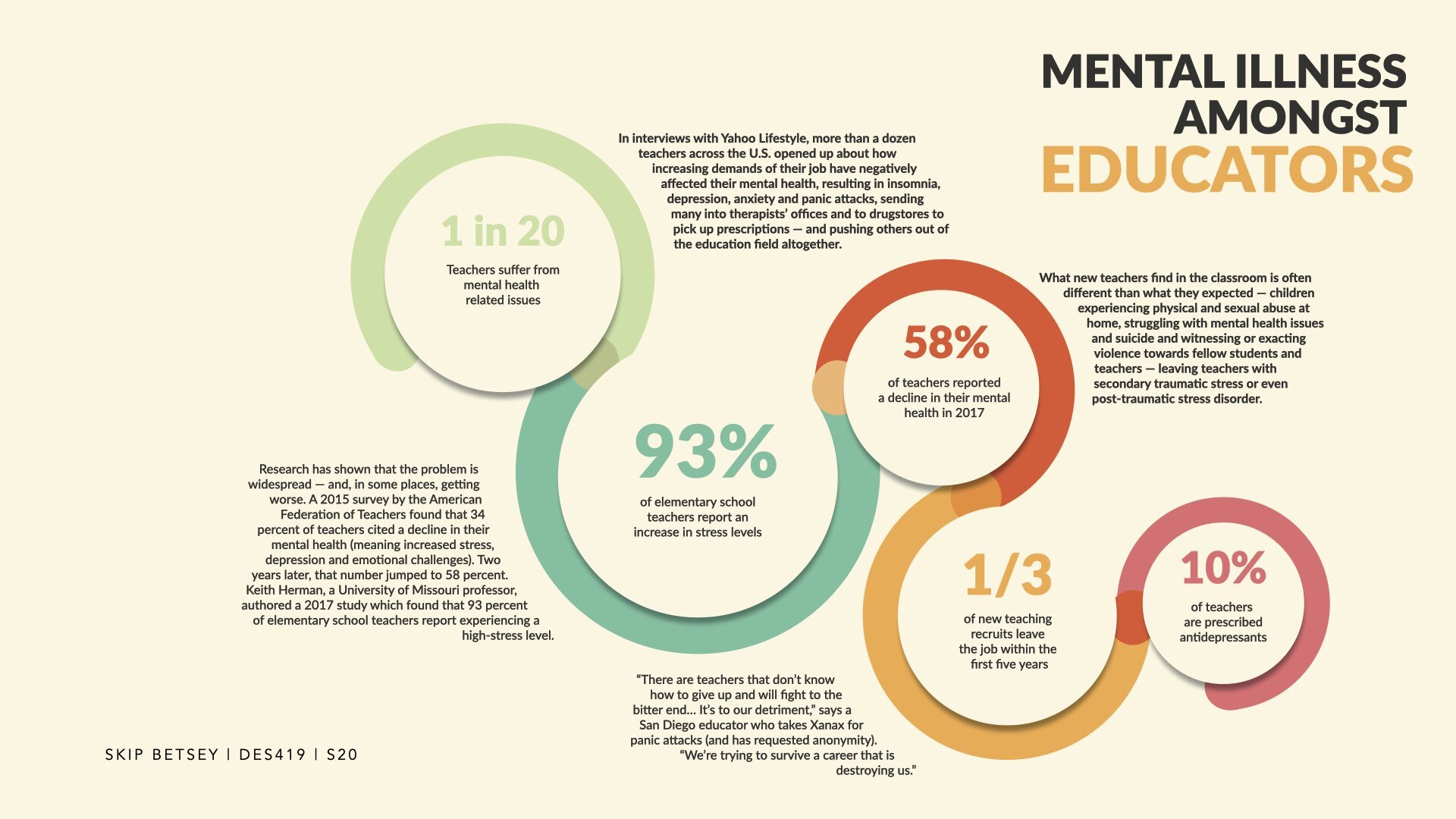
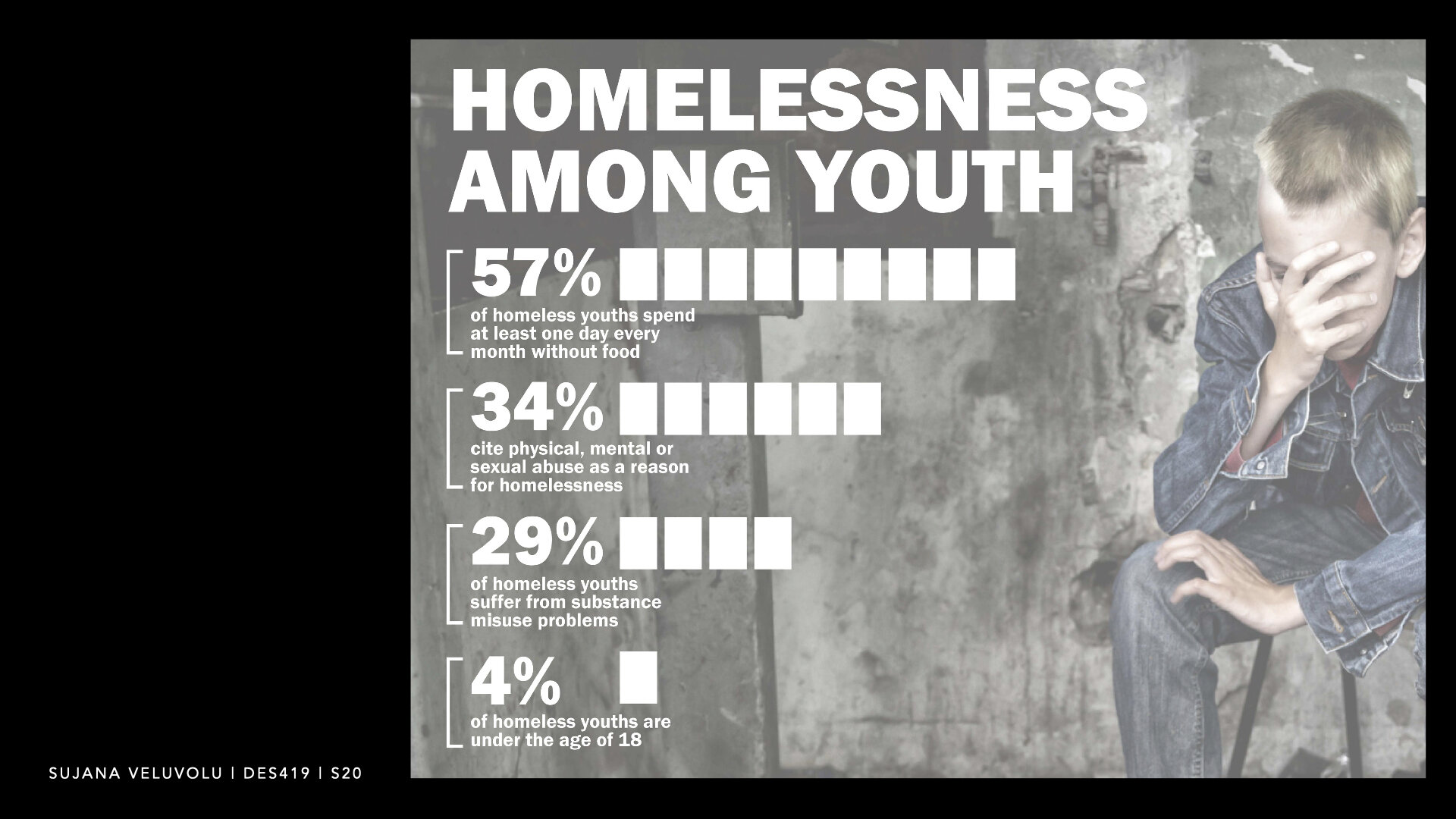
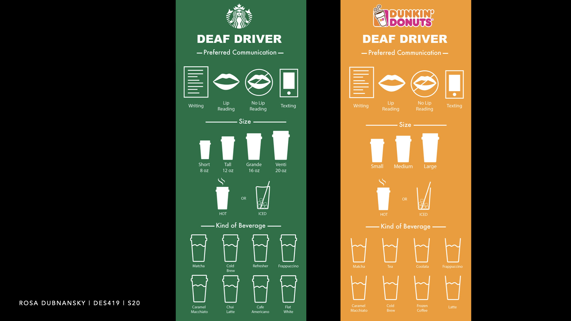
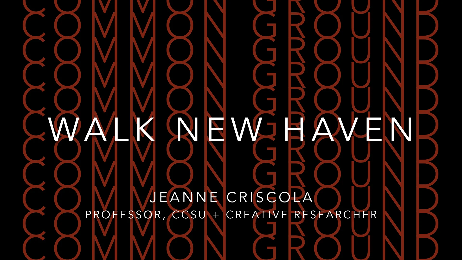
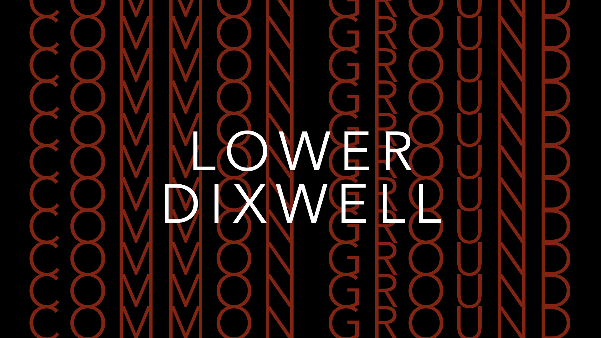
Common Ground : Walk New Haven
Good morning everyone, and thank you for coming to listen to my talk about Walk New Haven, a project that engages community with itself. I’m Jeanne Criscola, Assistant Professor at Central Connecticut State University teaching in the Design Department. It is a small one — about 150 students — and I teach Typography, Fundamentals of Graphic Design, and the History of Design.
The talk I am about to give focuses on a project my studio was commissioned to design and produce in 2015 that coincided with my hire as a full-time faculty member.
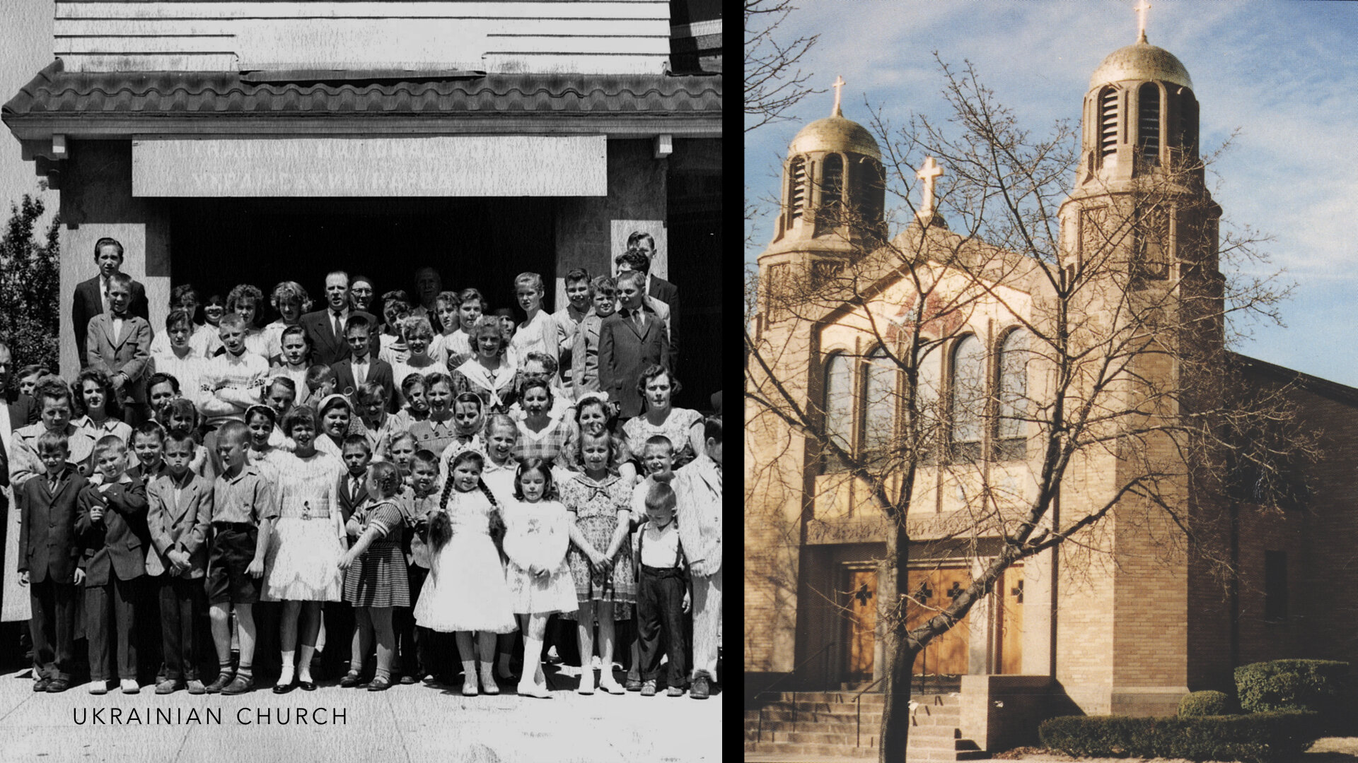
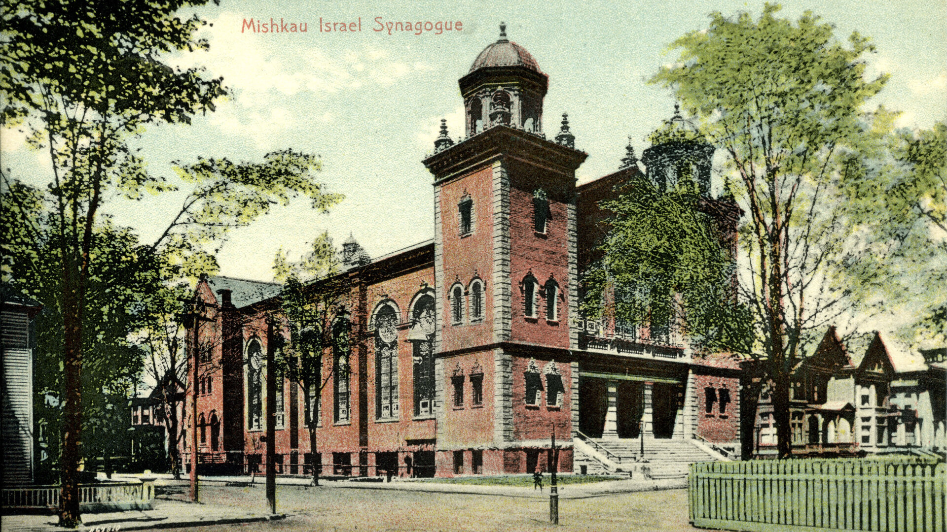
Community is a concept that needs grounding, literally. And it takes an entire community to tell its story, especially one that is rich, layered, and insightful about its past and about its future. One such community arose from the association of five ethnic societies as the Ethnic Historical Archives Center in 1988 in New Haven. They envisioned a place where the community would come to learn about the experiences and the ethnic histories of New Haven’s Jewish, Italian, Irish, African-American, and Ukrainian populations. They found common ground where they now house their archives, acquire donated artifacts, conduct research, and share their histories whenever the opportunity presents itself.
First, some background about New Haven and the Center:
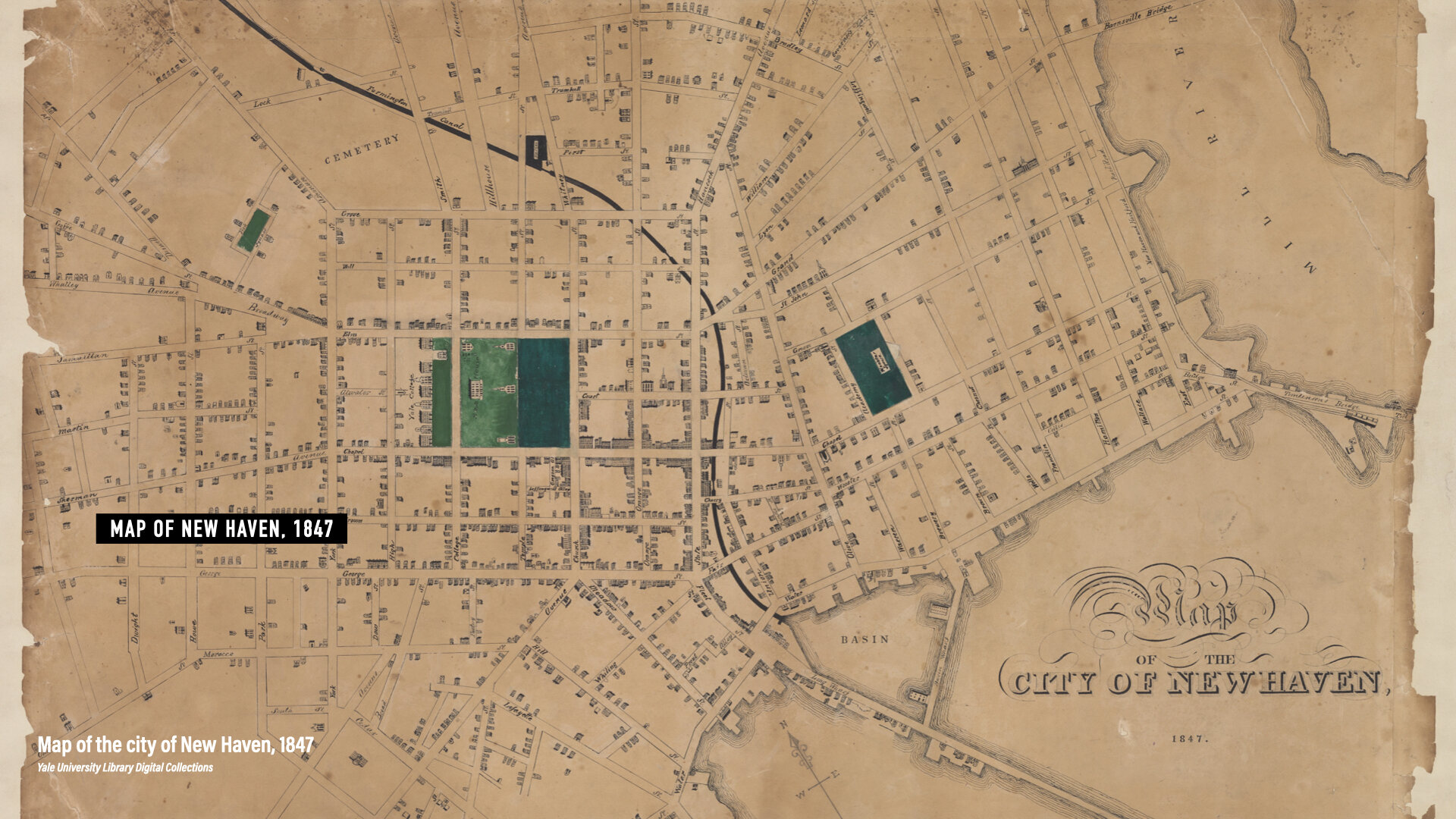
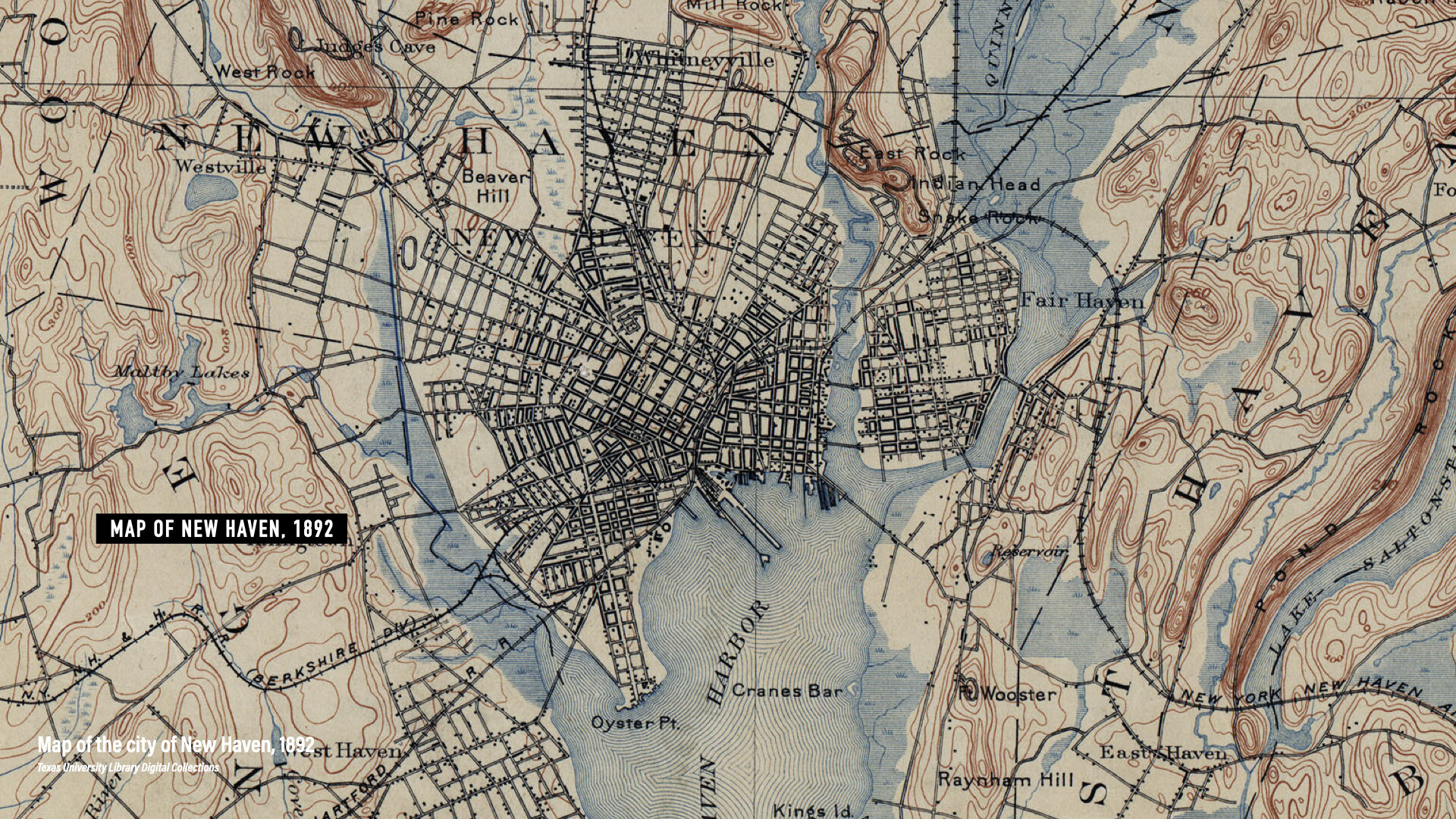
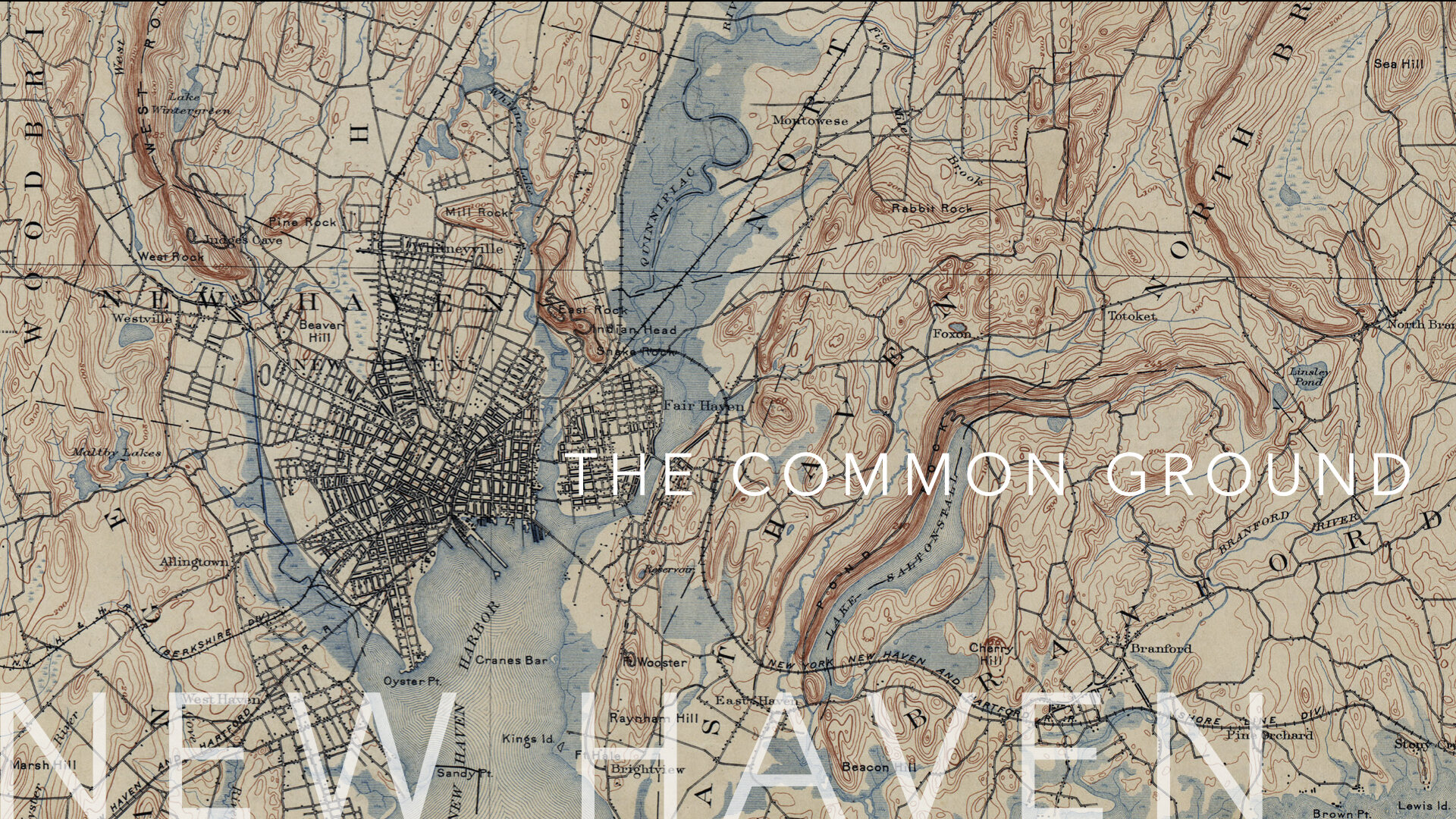
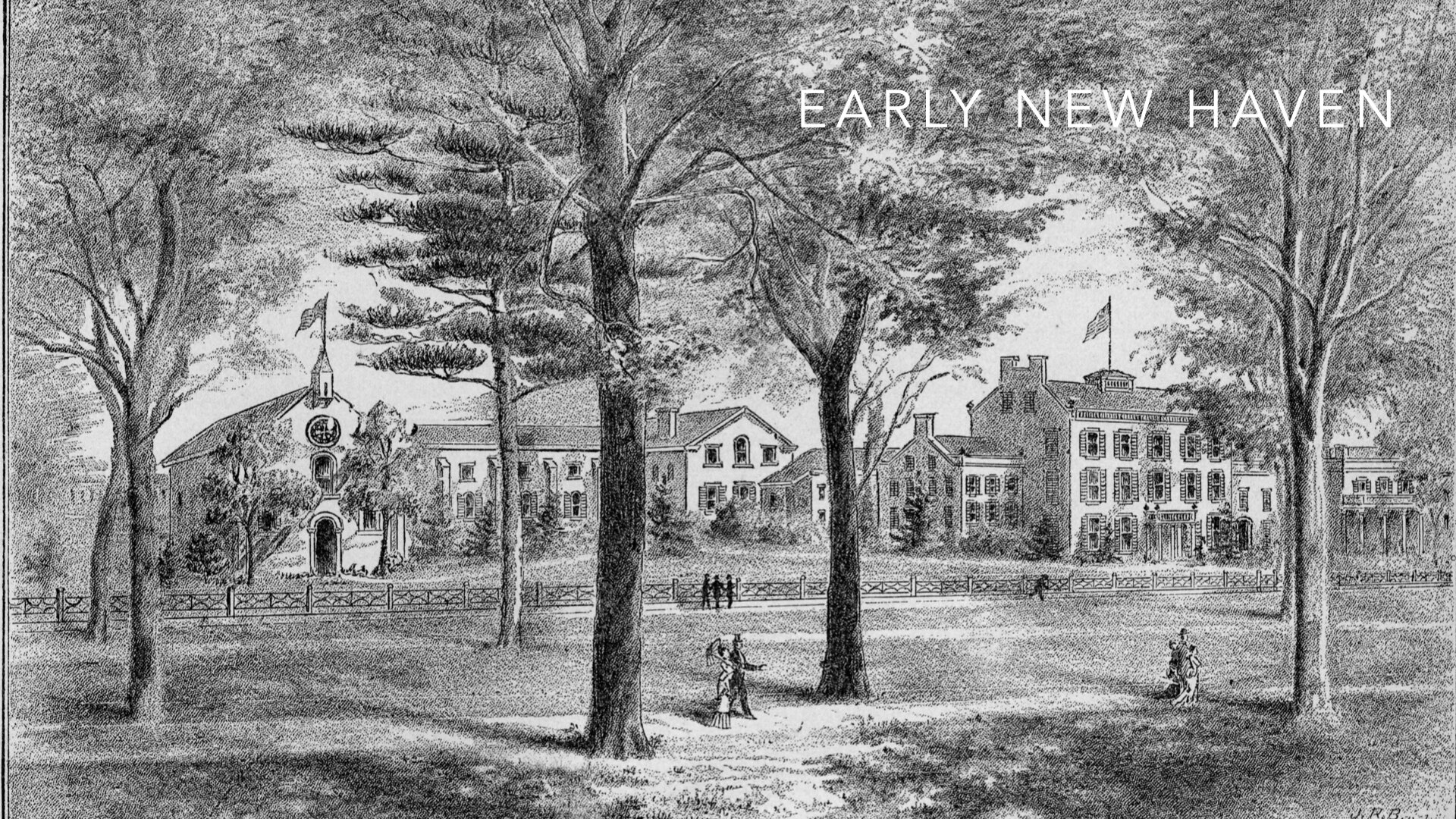
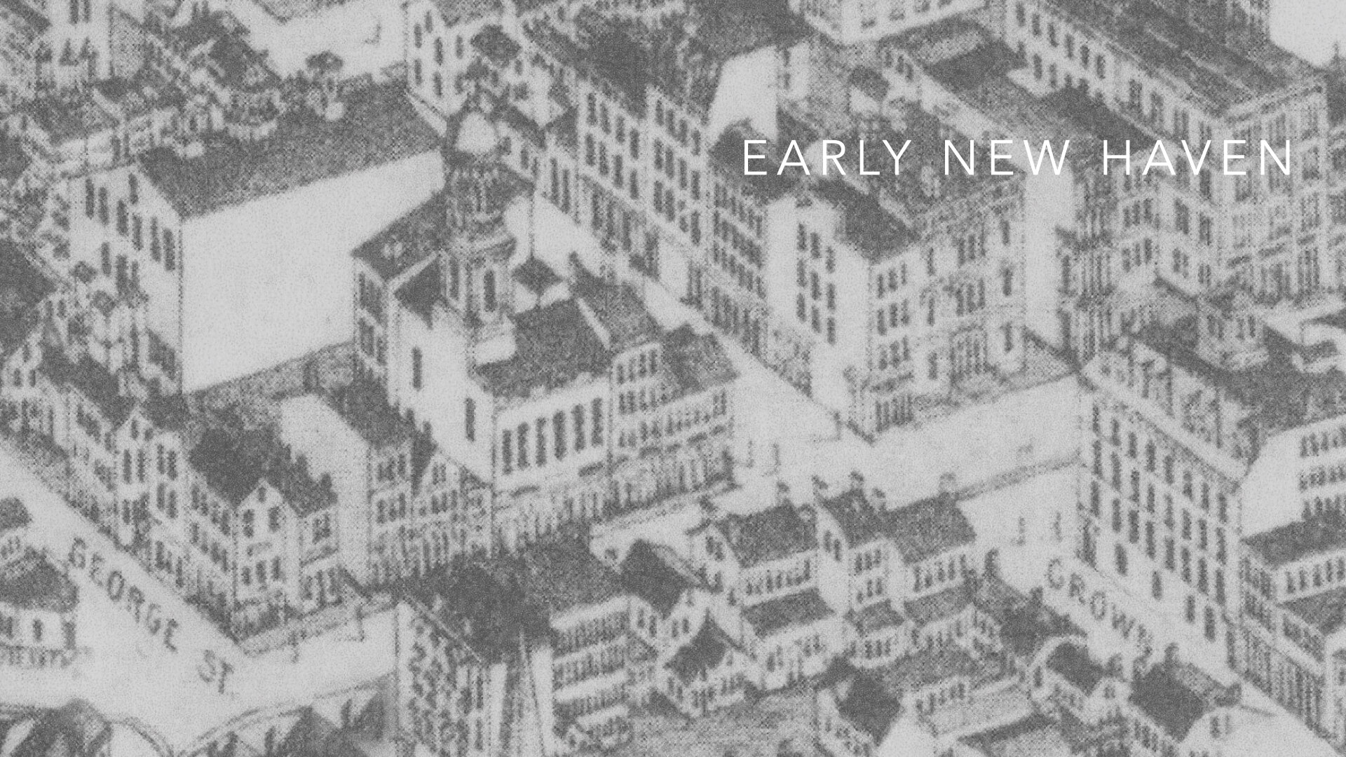
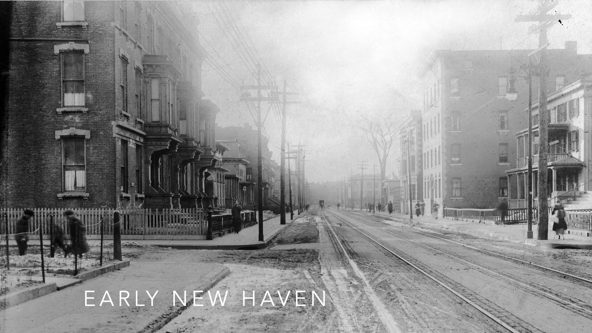
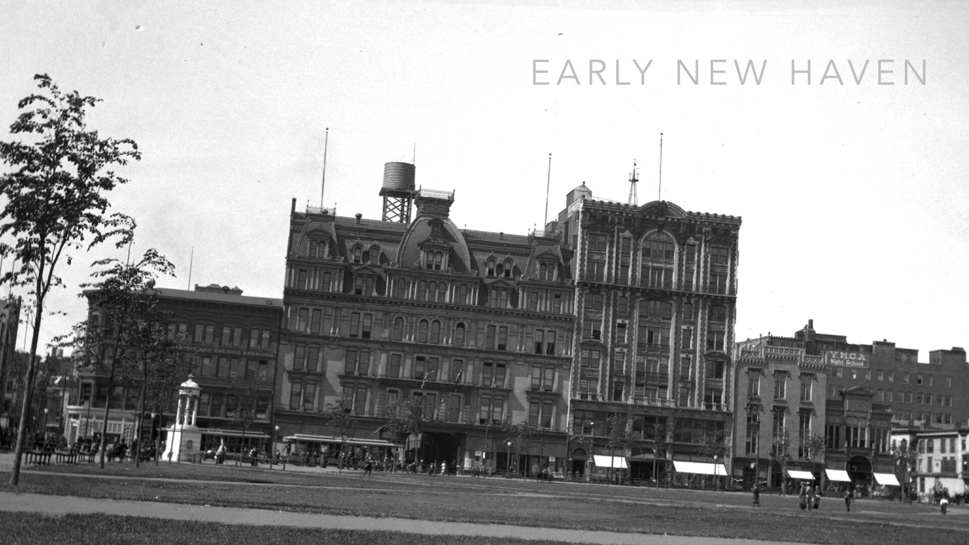
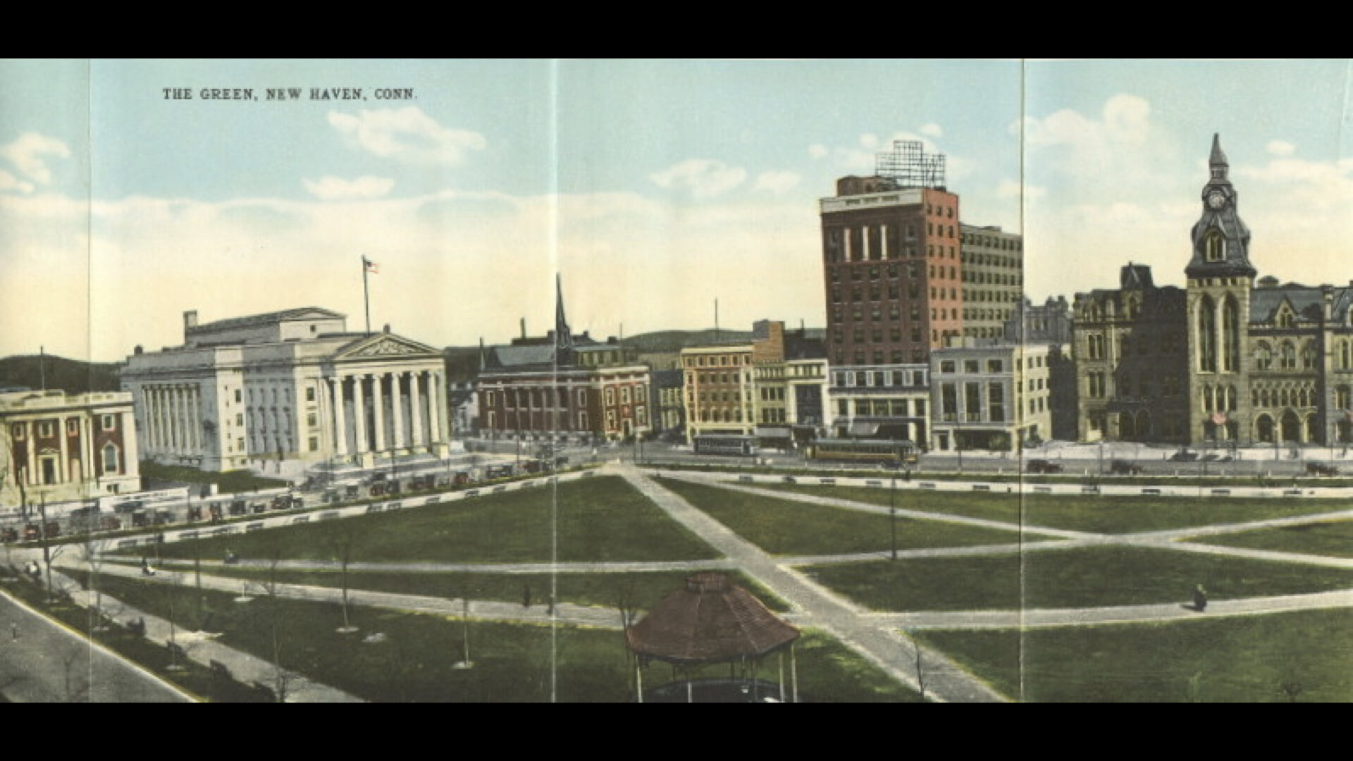
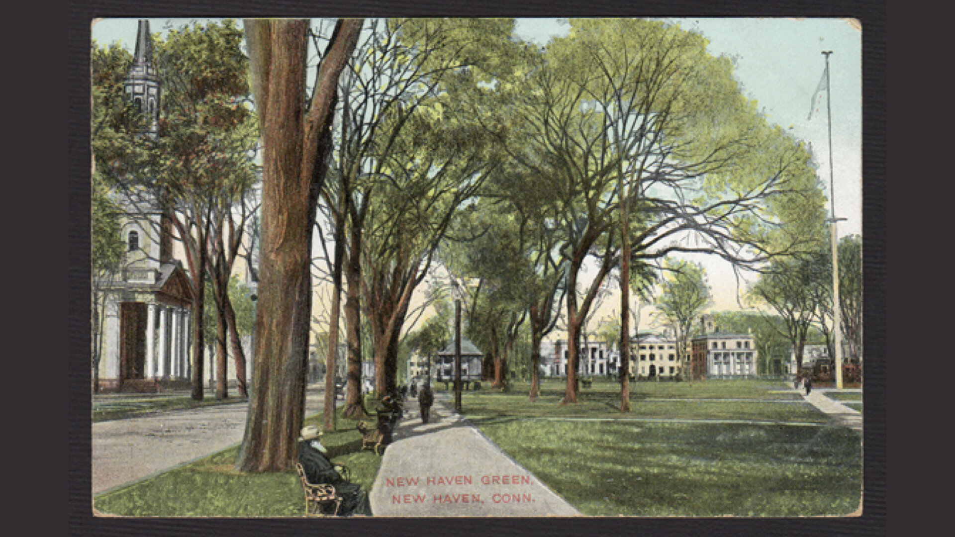
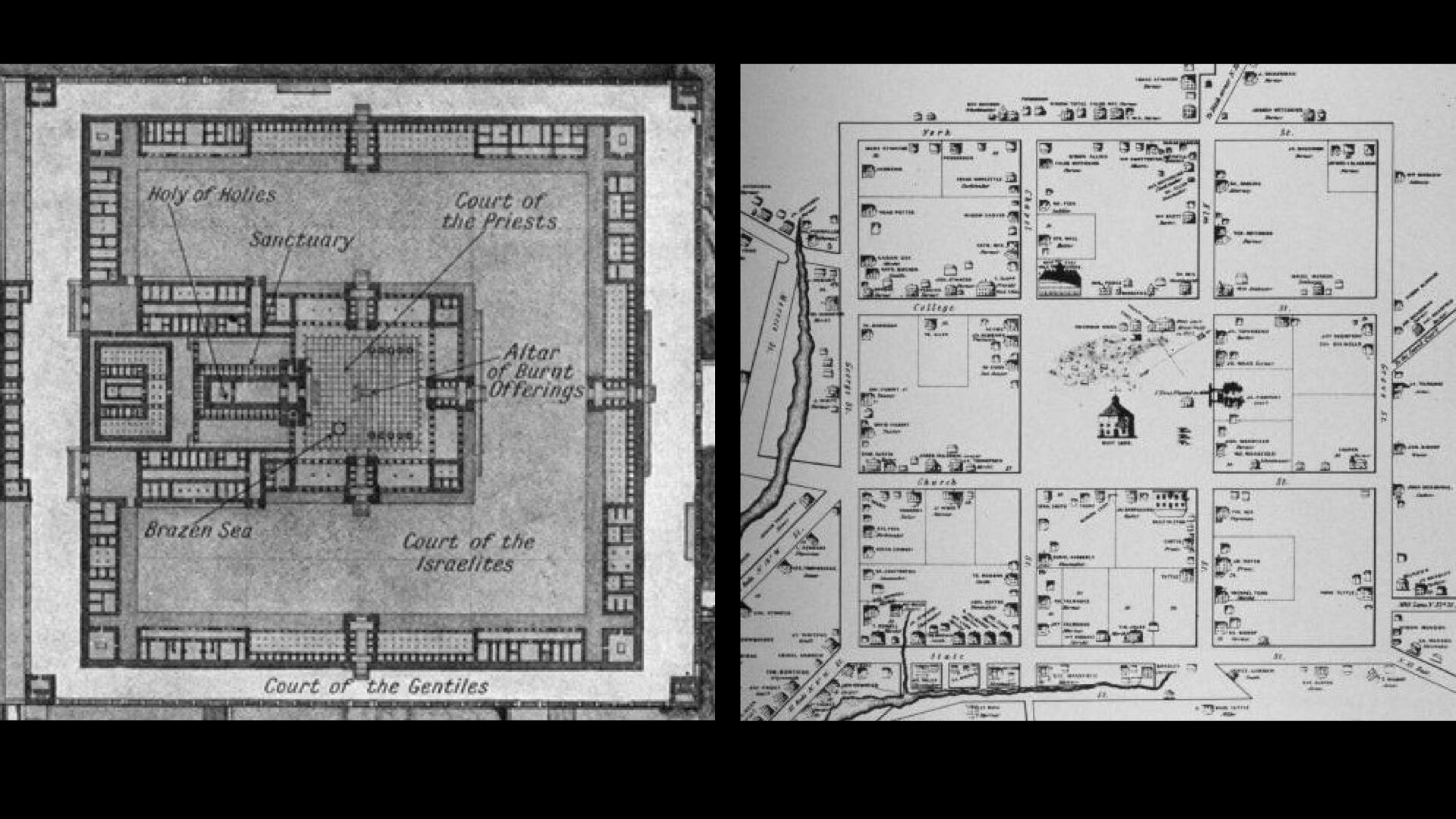
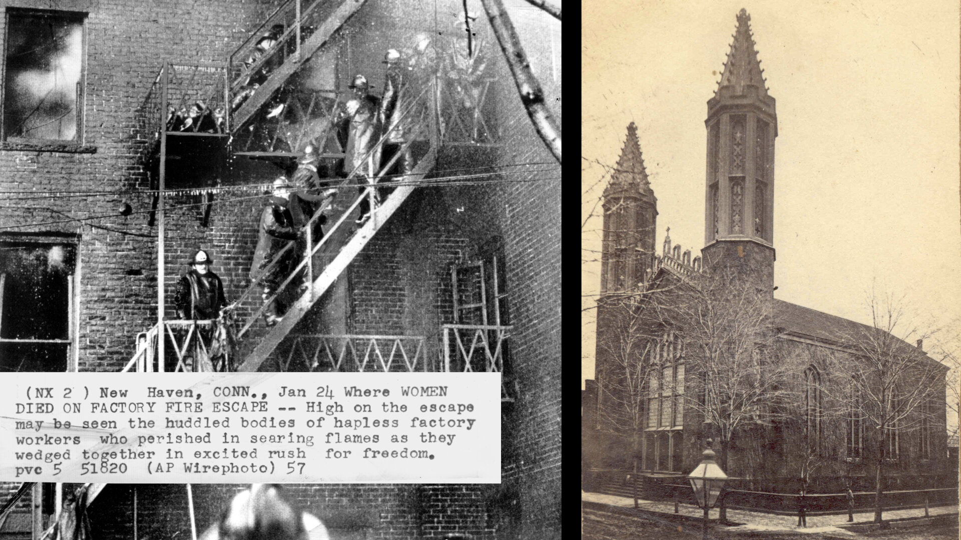
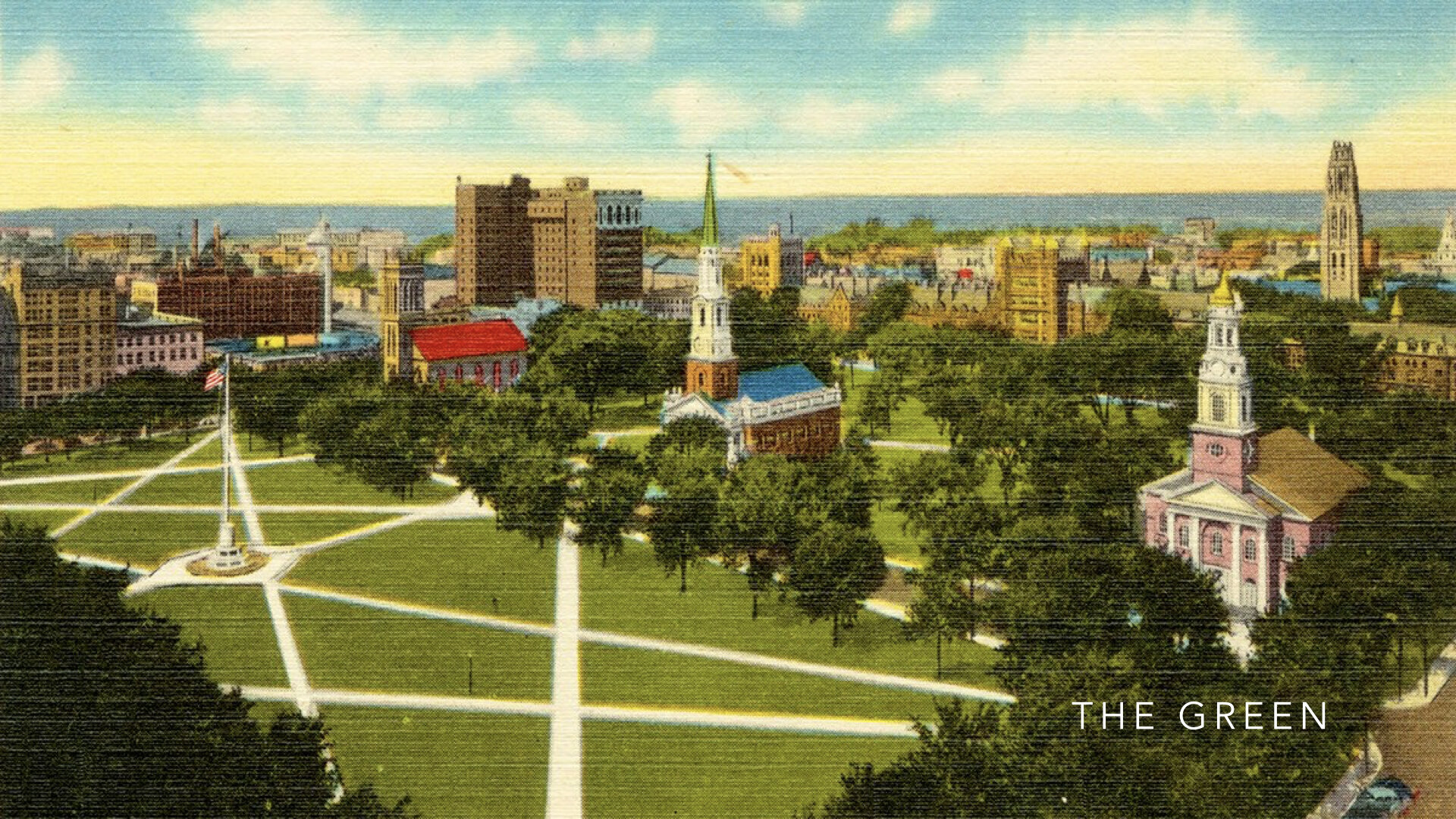
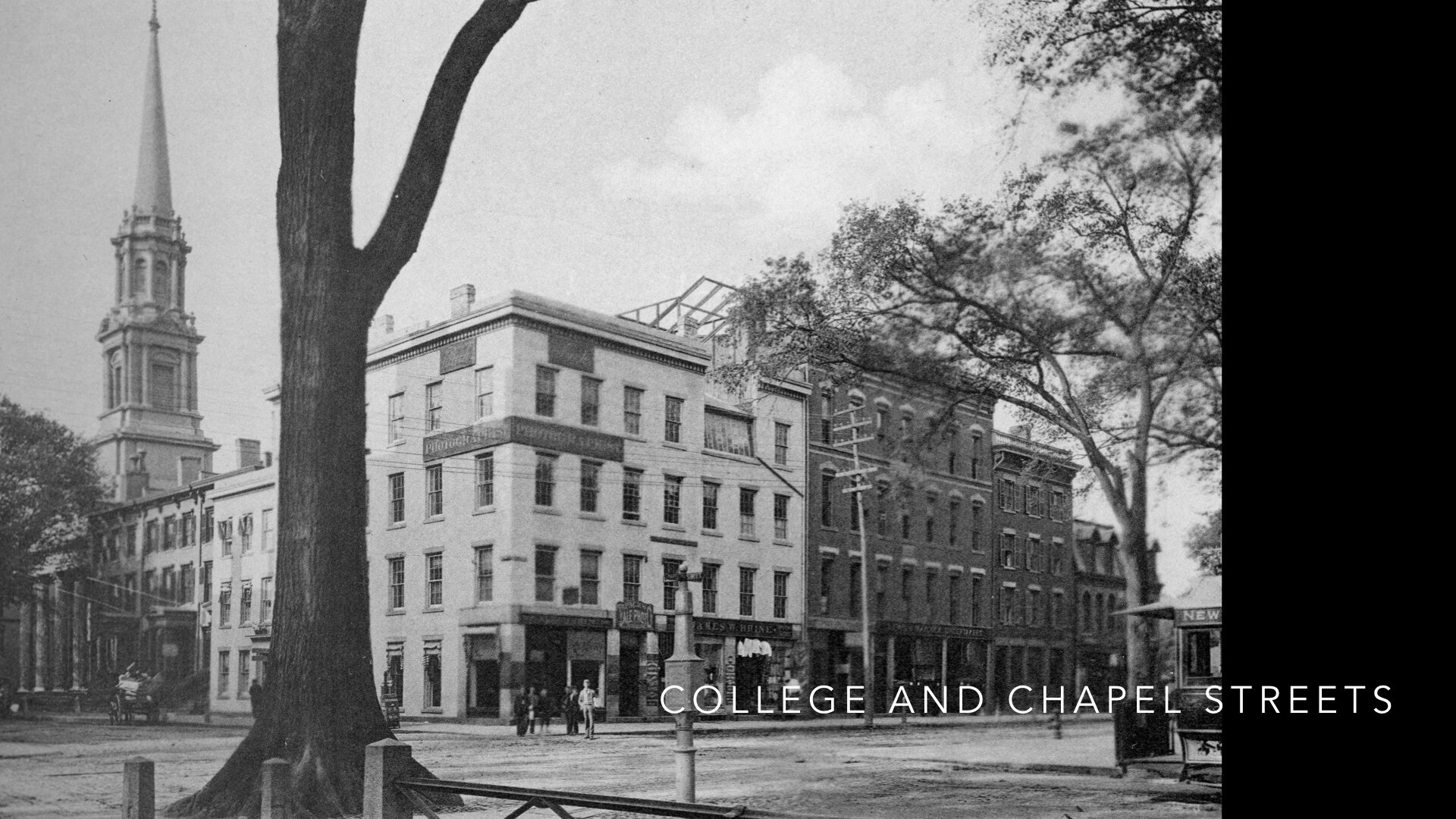
History buffs will know that the New Haven Colony was established in 1638 by Englishmen, Theophilus Eaton and the Reverend John Davenport. The two men set sail with their congregation to New Haven and laid out their town in a Nine Square Plan between two creeks as a garden in the wilderness. Bounded by hills and mountains, pierced by waterways, and having a harbor to the south, New Haven — in its form and landscape — fit the Biblical description of the Garden of Eden, the Israelite encampment in Exodus, the holy cities in Canaan, and John’s vision of the New Jerusalem from Revelations.
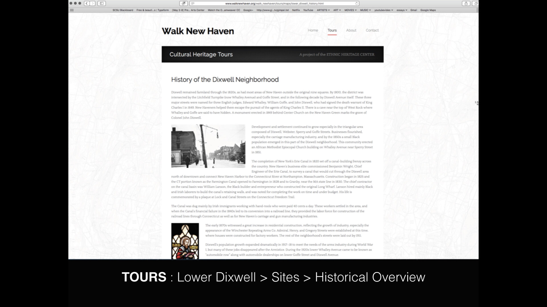
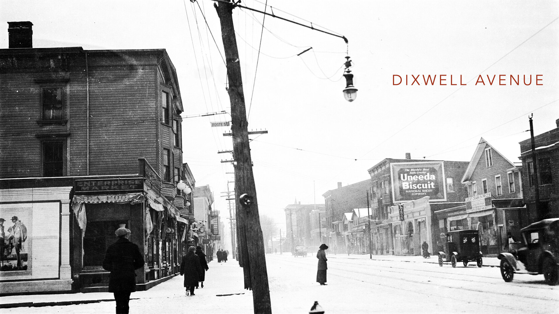
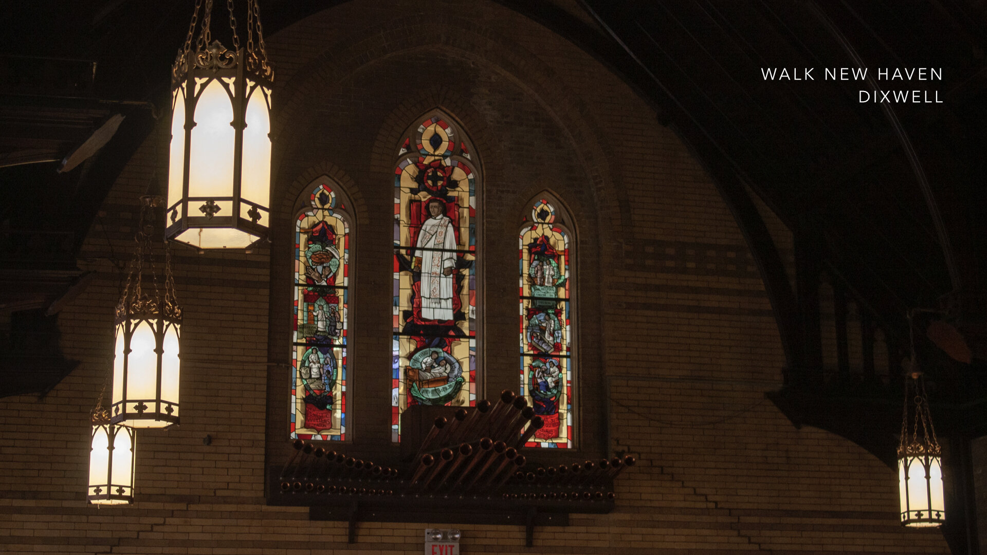
Other events and agreements had direct impact on New Haven none more important than when the two judges who ordered the execution of King Charles I, fled England for New England in 1661. Colonel Edward Whalley and Colonel William Goffe were secretly sheltered in the “Judges Cave” on West Rock. A third judge, named Colonel Dixwell later joined Whalley and Goffe.
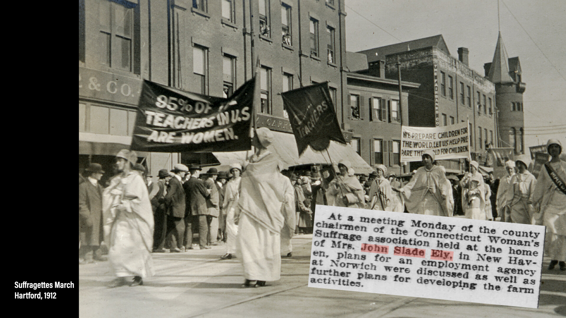
The five member-organized societies are known as the Ethnic Heritage Center today and include the Jewish Historical Society of Greater New Haven, founded in 1976; the Italian-American Historical Society of Connecticut, founded in 1979; the Connecticut Ukrainian-American Historical Society, founded in 1983; the Connecticut Irish-American Historical Society, founded in 1988; and finally the Greater New Haven African-American Historical Society, founded in 2003.
By 1999, the Ethnic Heritage Center had been located on Southern Connecticut State University’s campus for about 7 years when several representatives from Southern were selected by then President Michael Adanti to travel to San Antonio, Texas with EHC Board members to visit the Institute of Texan Culture where the Institute plays a role in the University of Texas at San Antonio’s community engagement initiatives to develop quality, accessible resources for educators and lifelong learners on topics of cultural heritage. The collaboration struck everyone as an approach they could learn from and perhaps use as a model for something similar in Connecticut. President Adanti was very supportive of the EHC and made arrangements with the University and Institute for tours and discussions with their administration and staff. For EHC, the Institute offered a lesson in diversity and inclusion showcasing the uniqueness and beauty of the many cultures that call Texas home and would serve as an example of the ways to celebrate the many populations who have defined New Haven’s character, traditions, and ways of life.
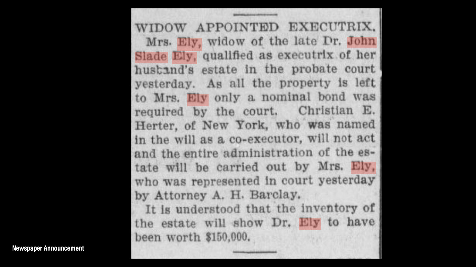
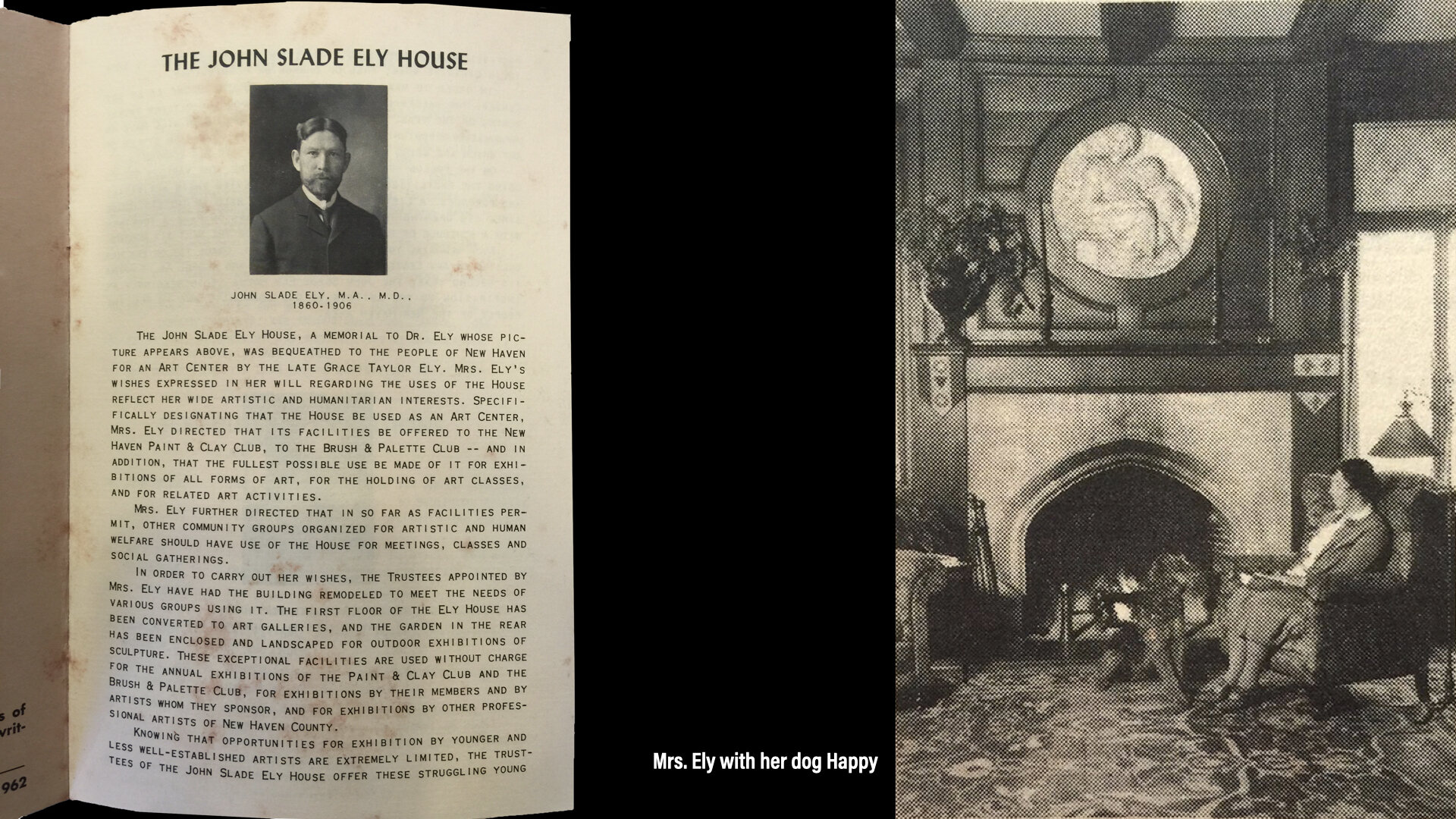
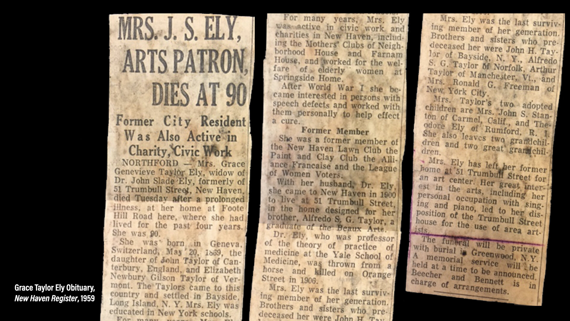
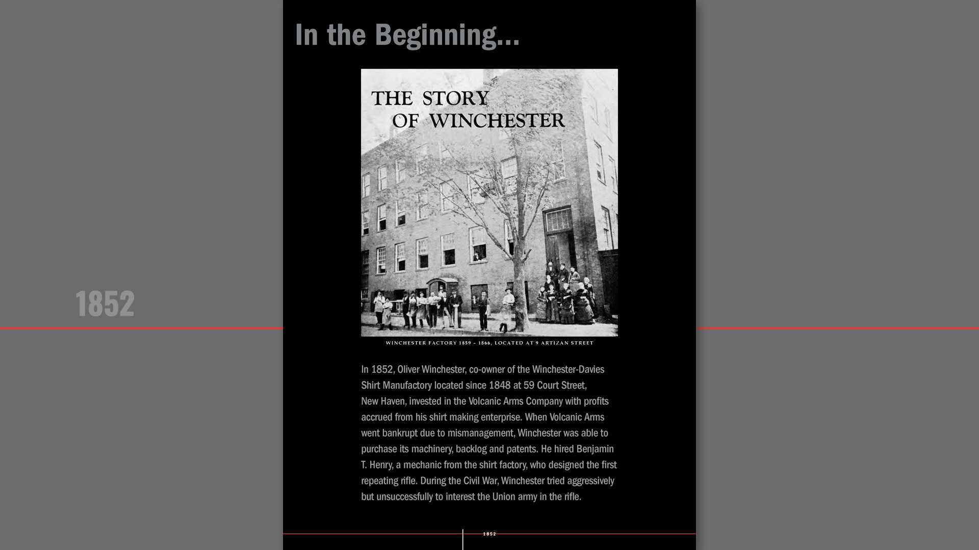
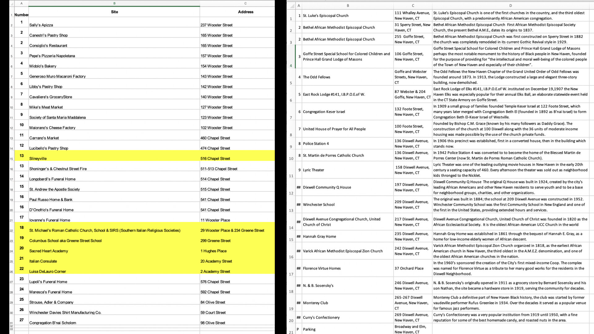
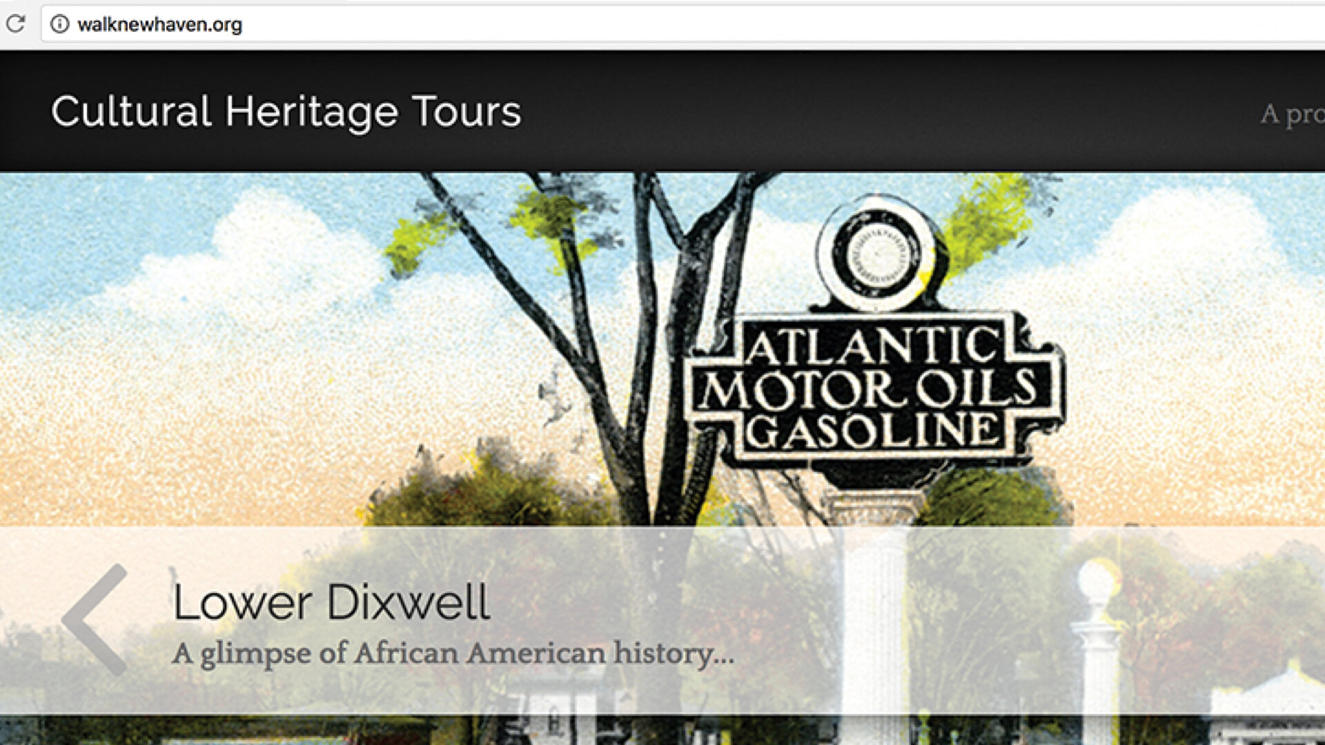
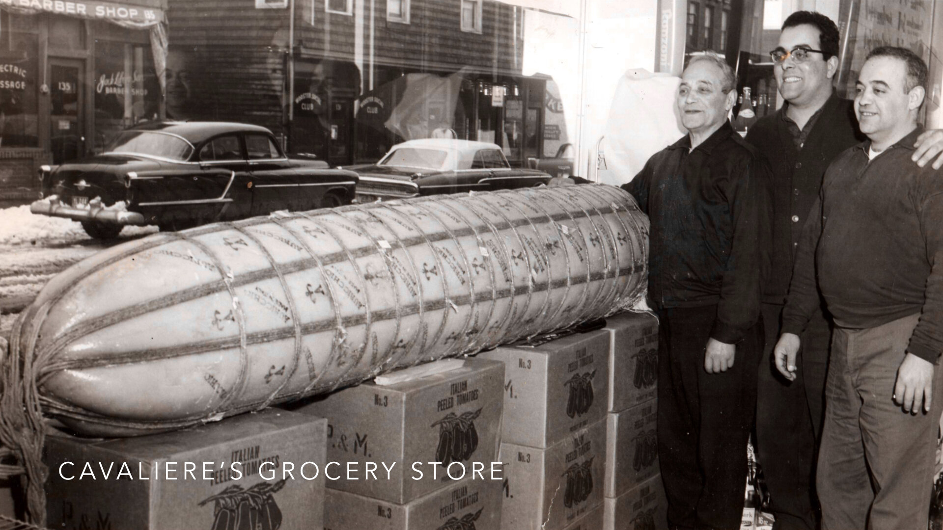
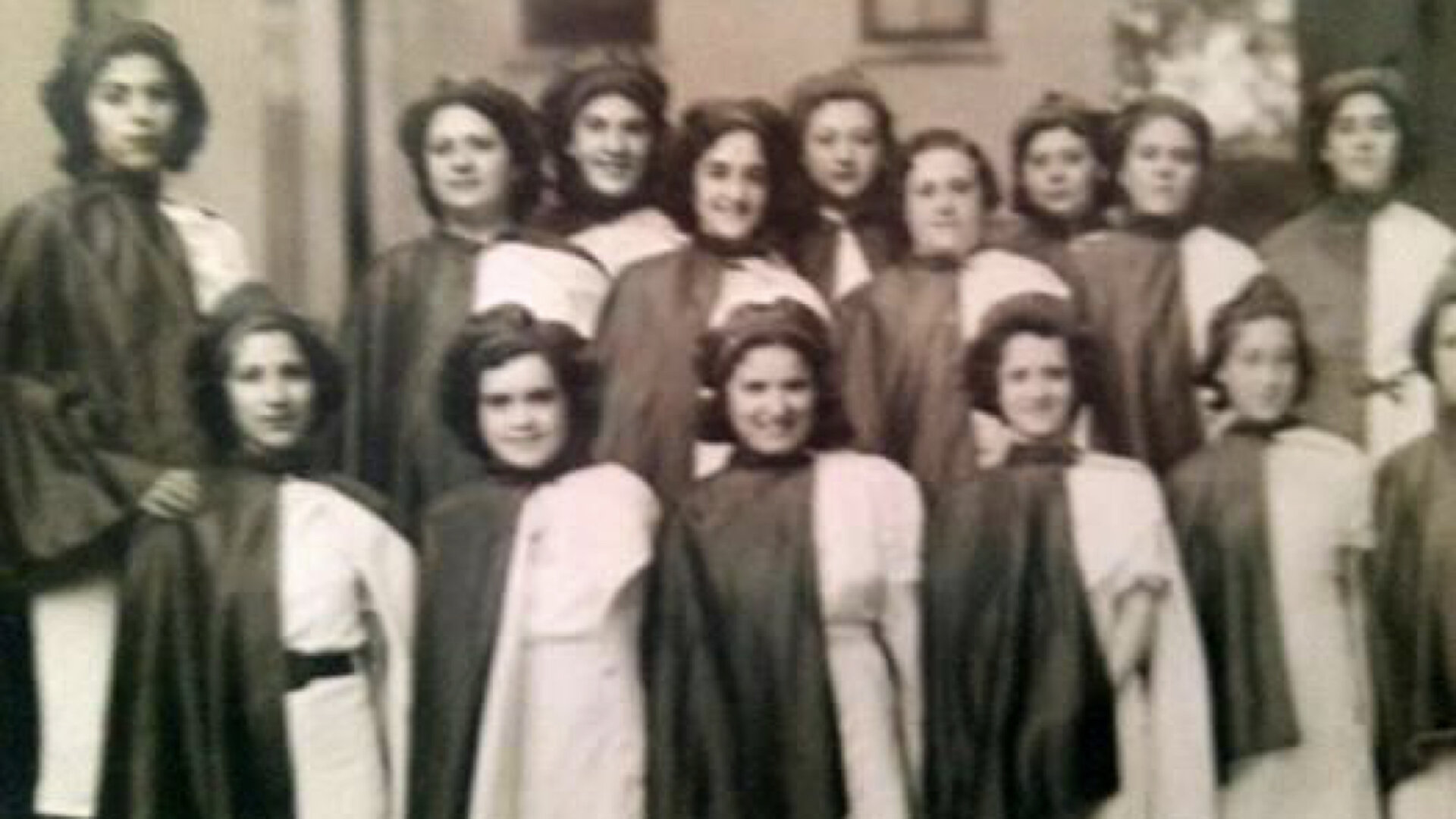
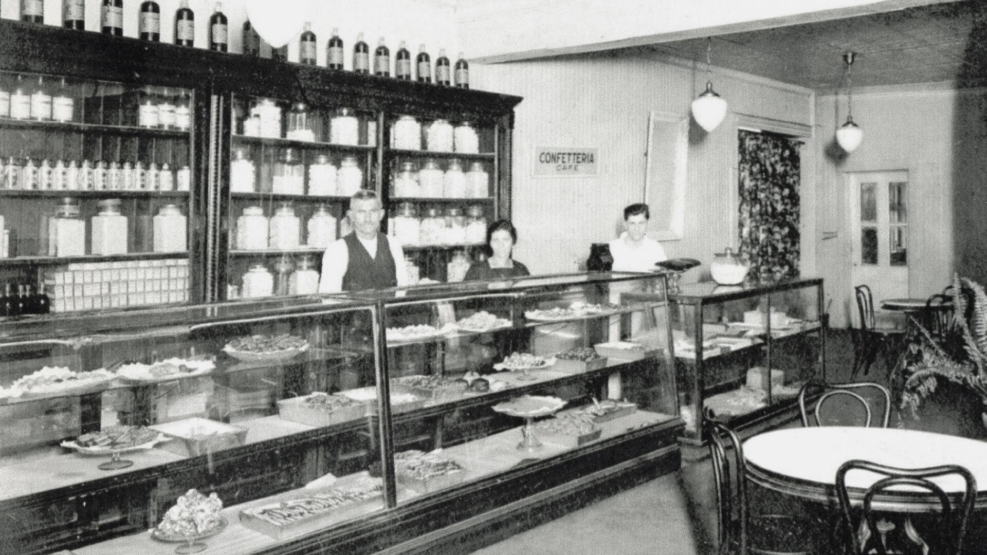
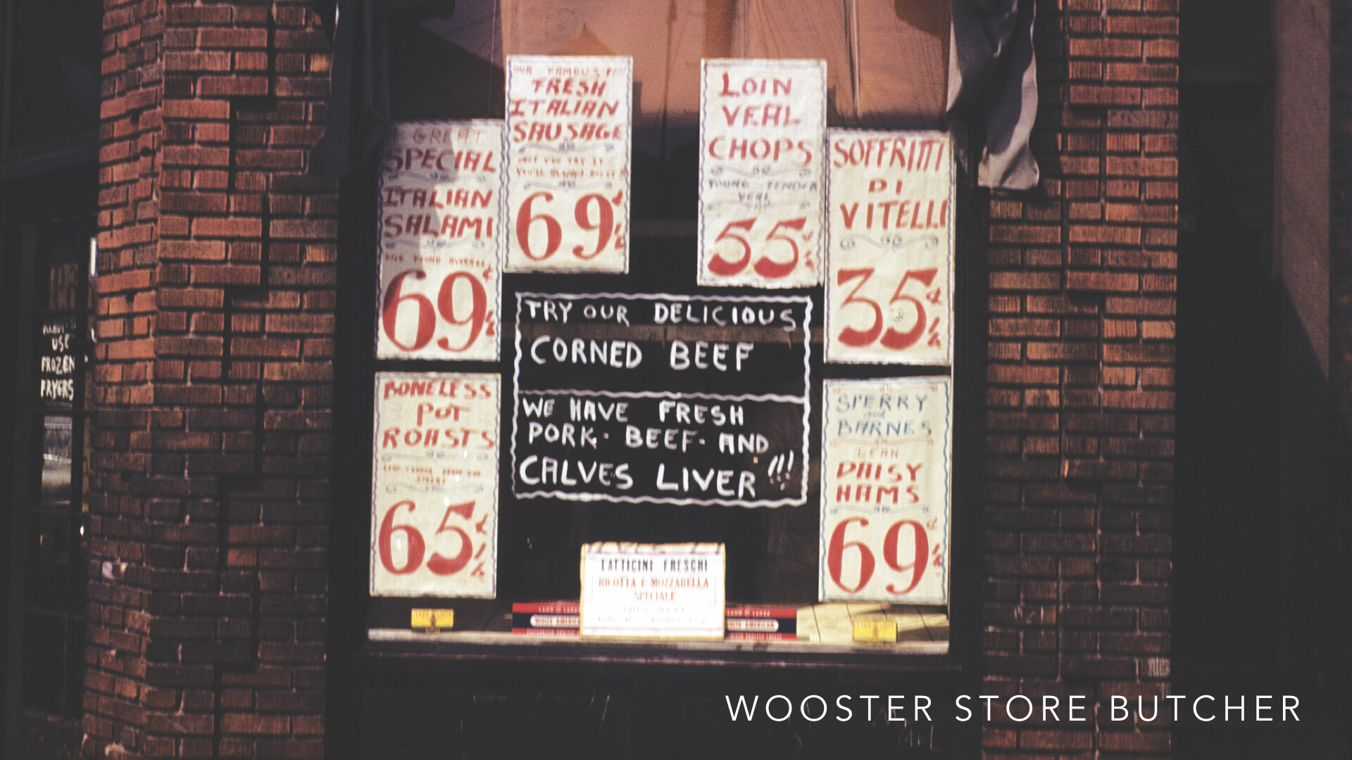
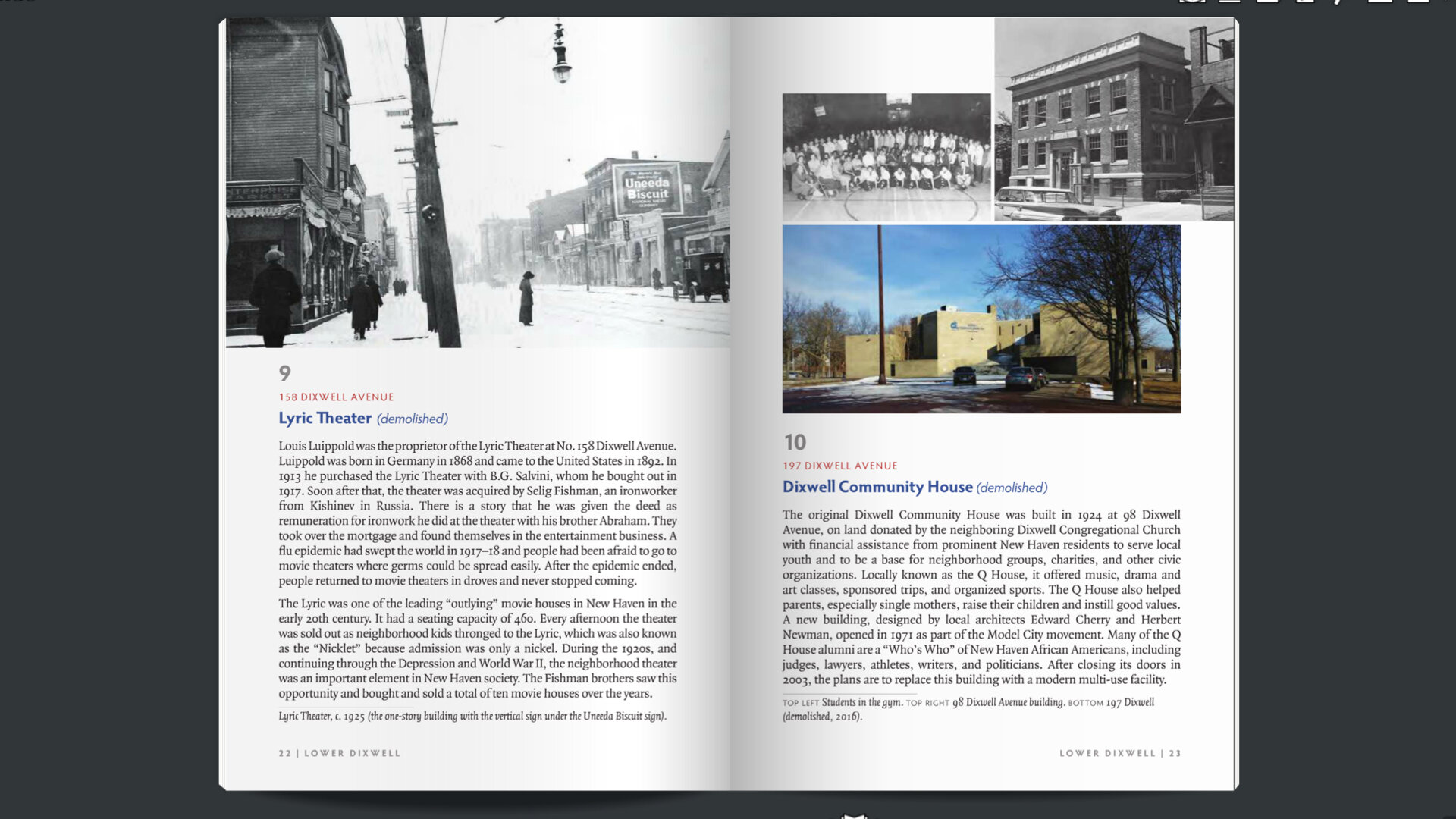
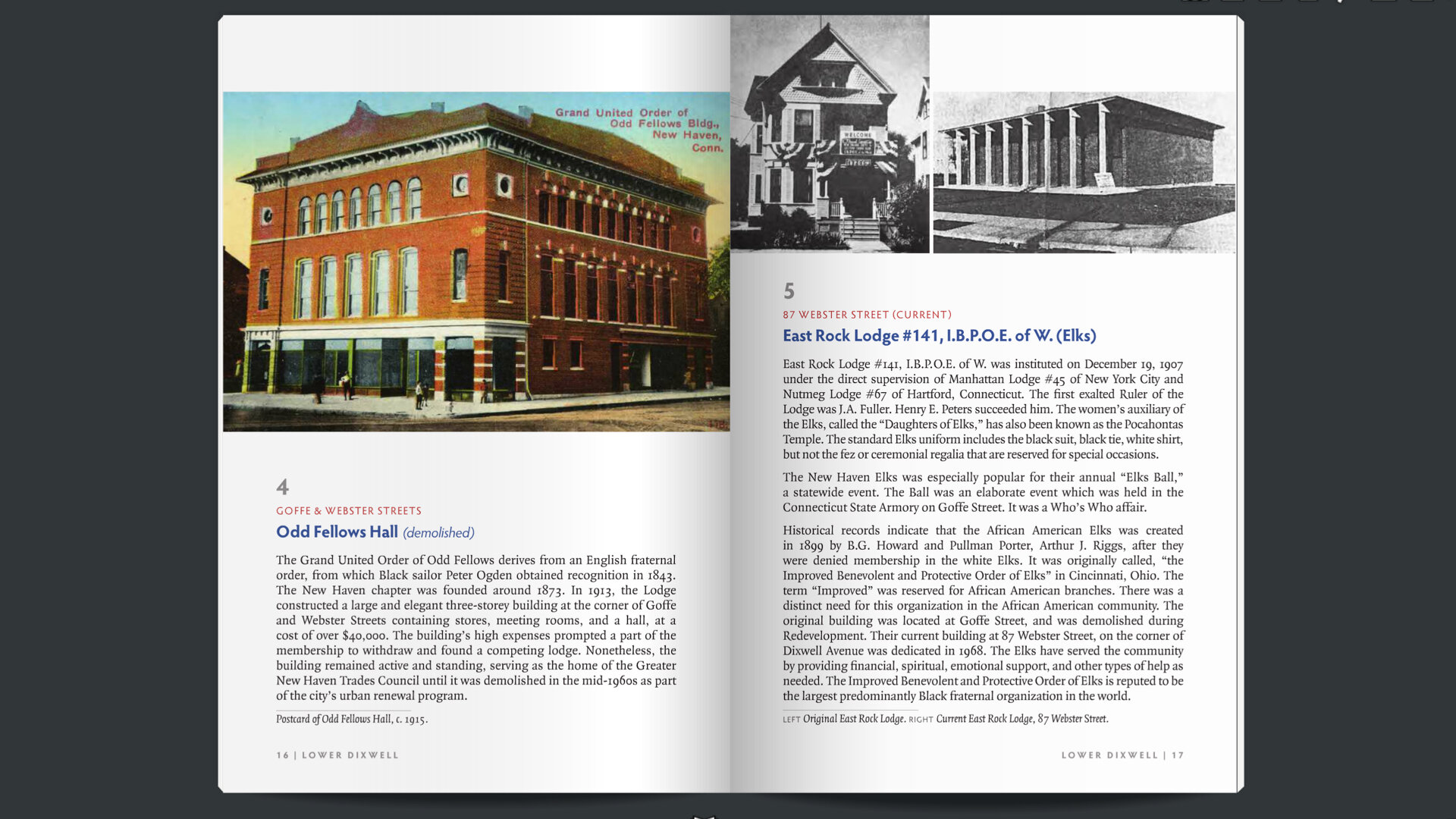
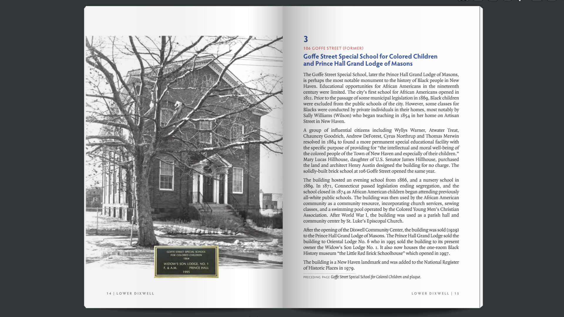
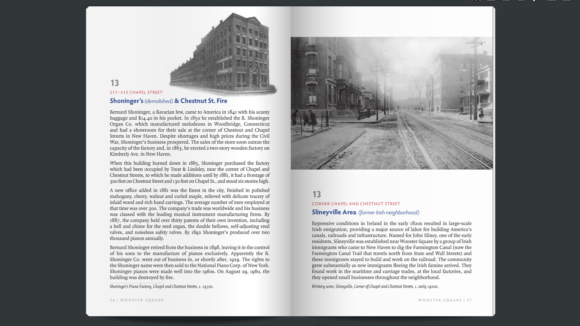
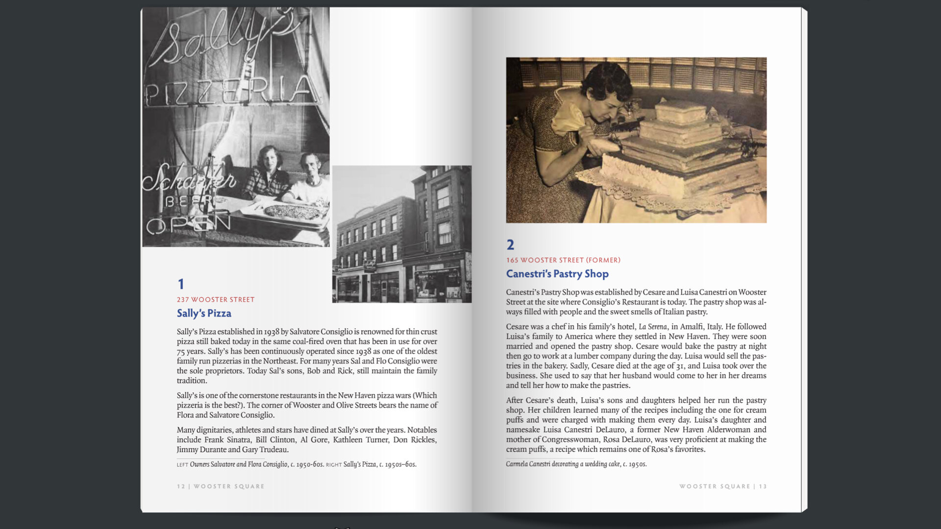
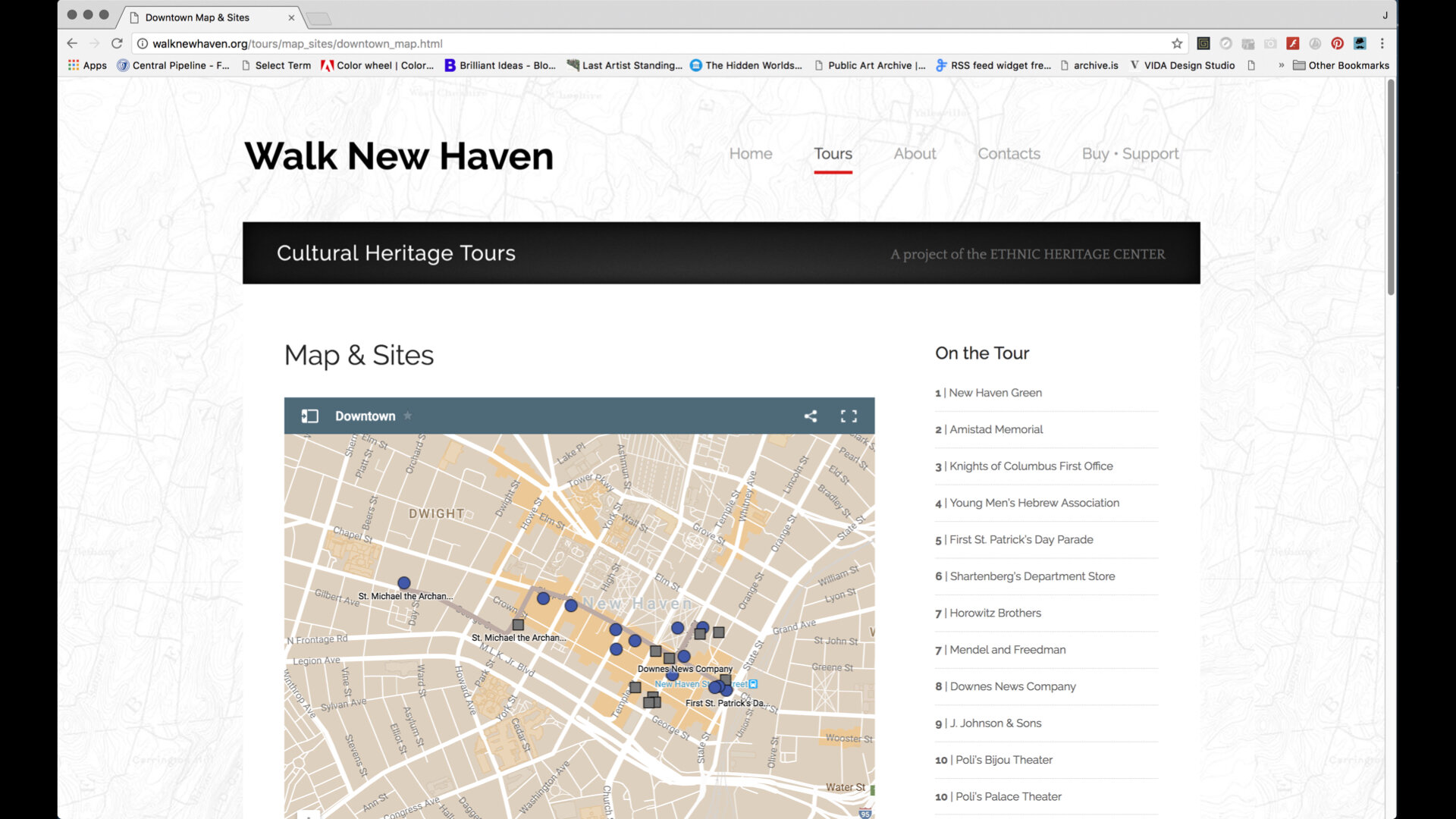
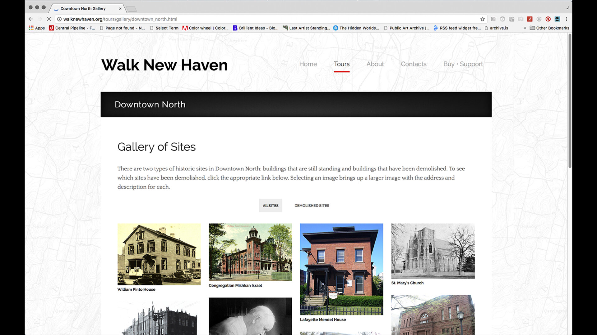
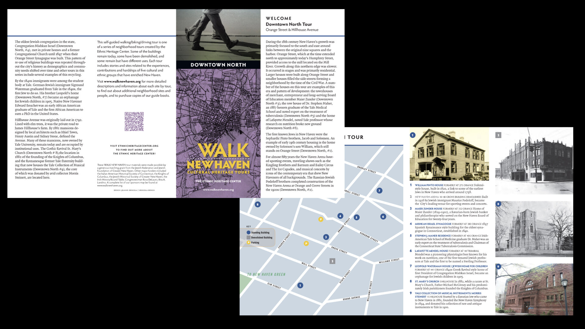
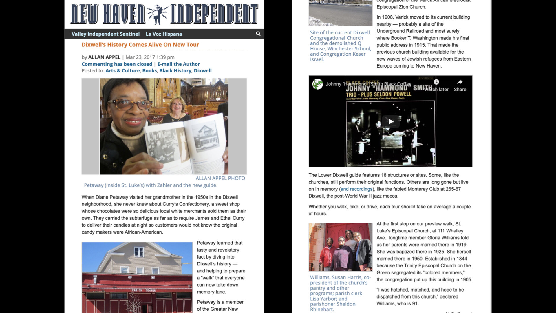
Around 2013, Rhoda Zahler, a member of the Jewish Historical Society, became interested in a heritage tourism product she had seen while on vacation called “The Museum in the Streets.” It’s a site-specific program that offers municipalities a way to showcase their local history through a system of outdoor information panels laid out as a walking tour. EHC had the content and the historic knowledge needed for such a collaborative project. Their collections include a wide range of pictures, books, phone books, city directories, magazines, newspapers, and video. They archive the personal papers of individuals and families, audio of oral histories and interviews, as well as many artifacts, some rare and unique, but most ordinary and local.
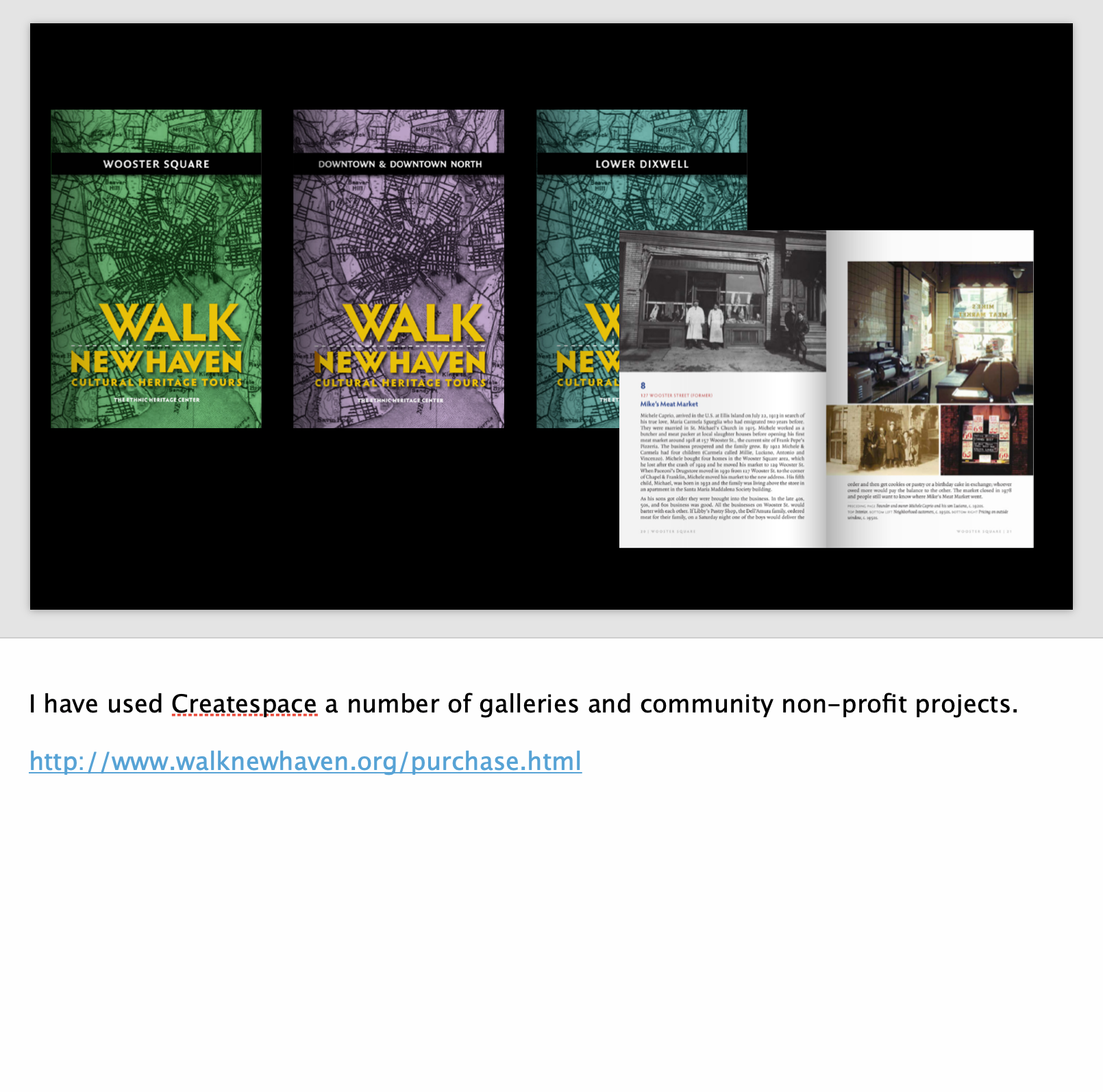
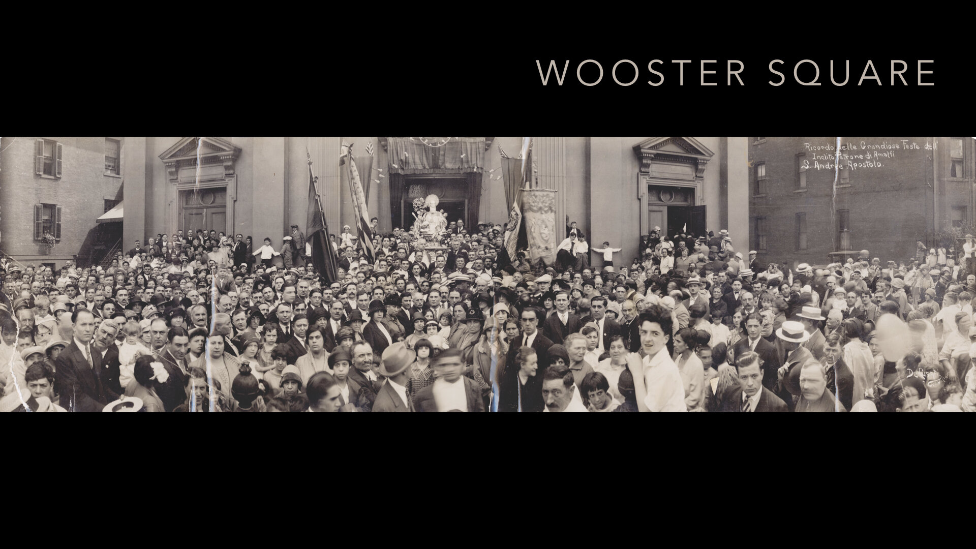
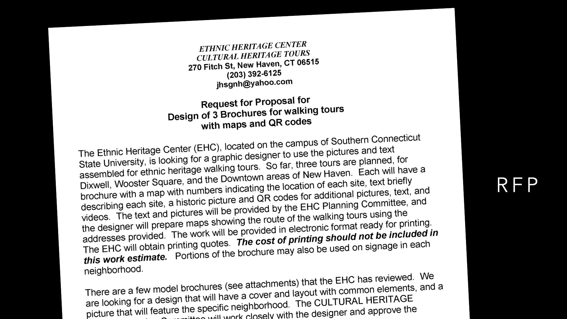
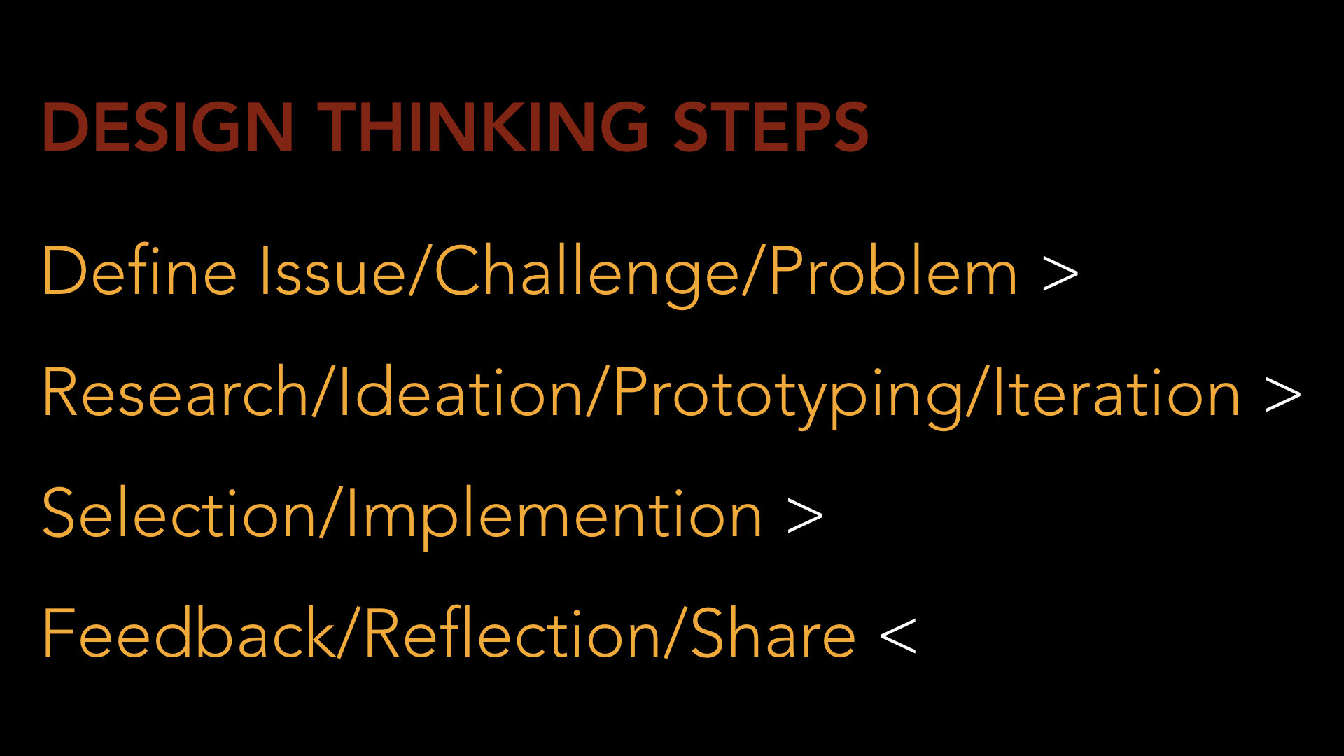
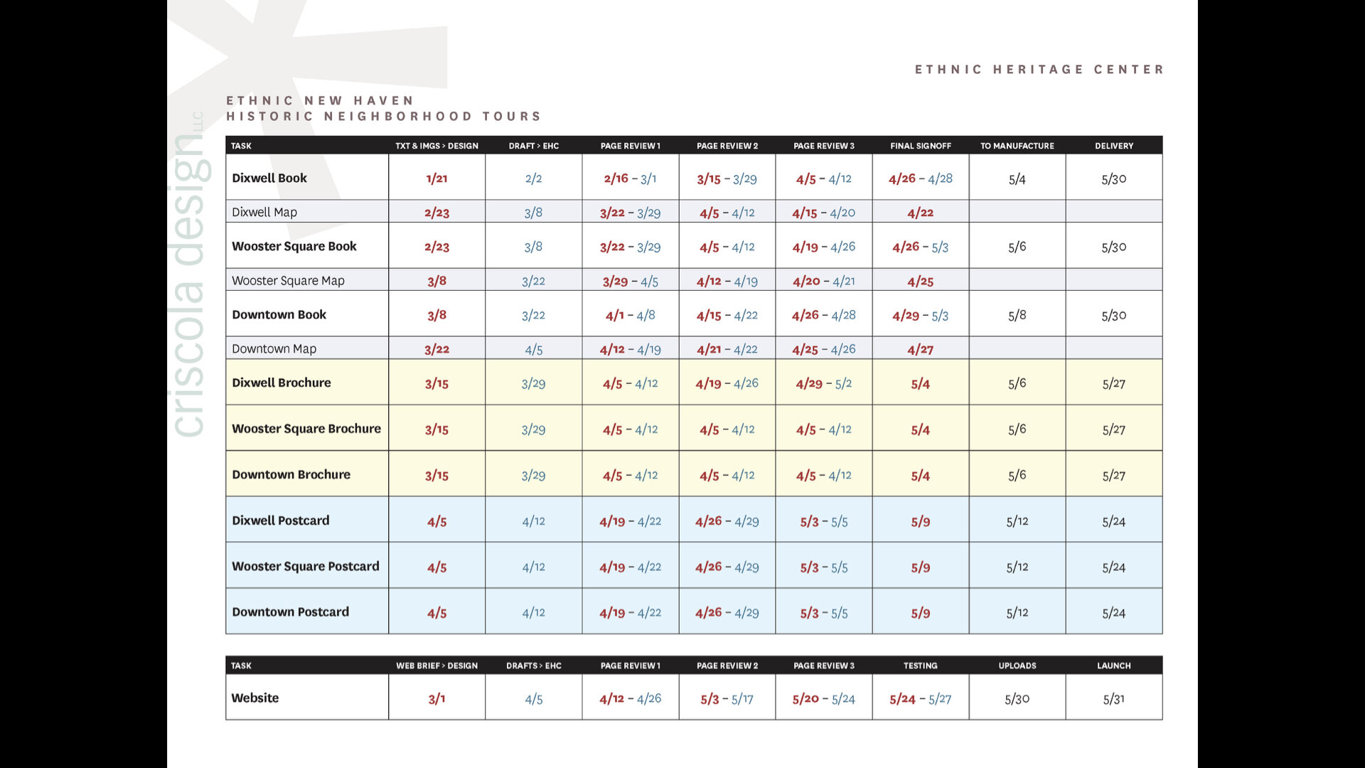
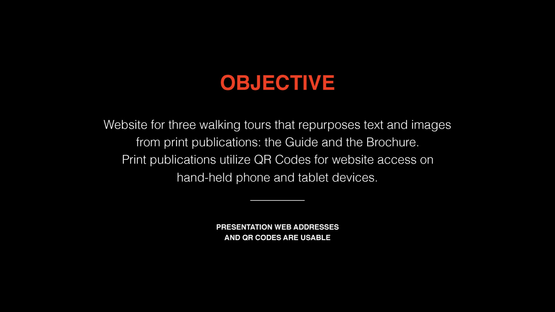
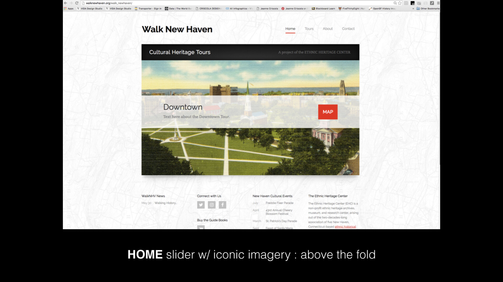
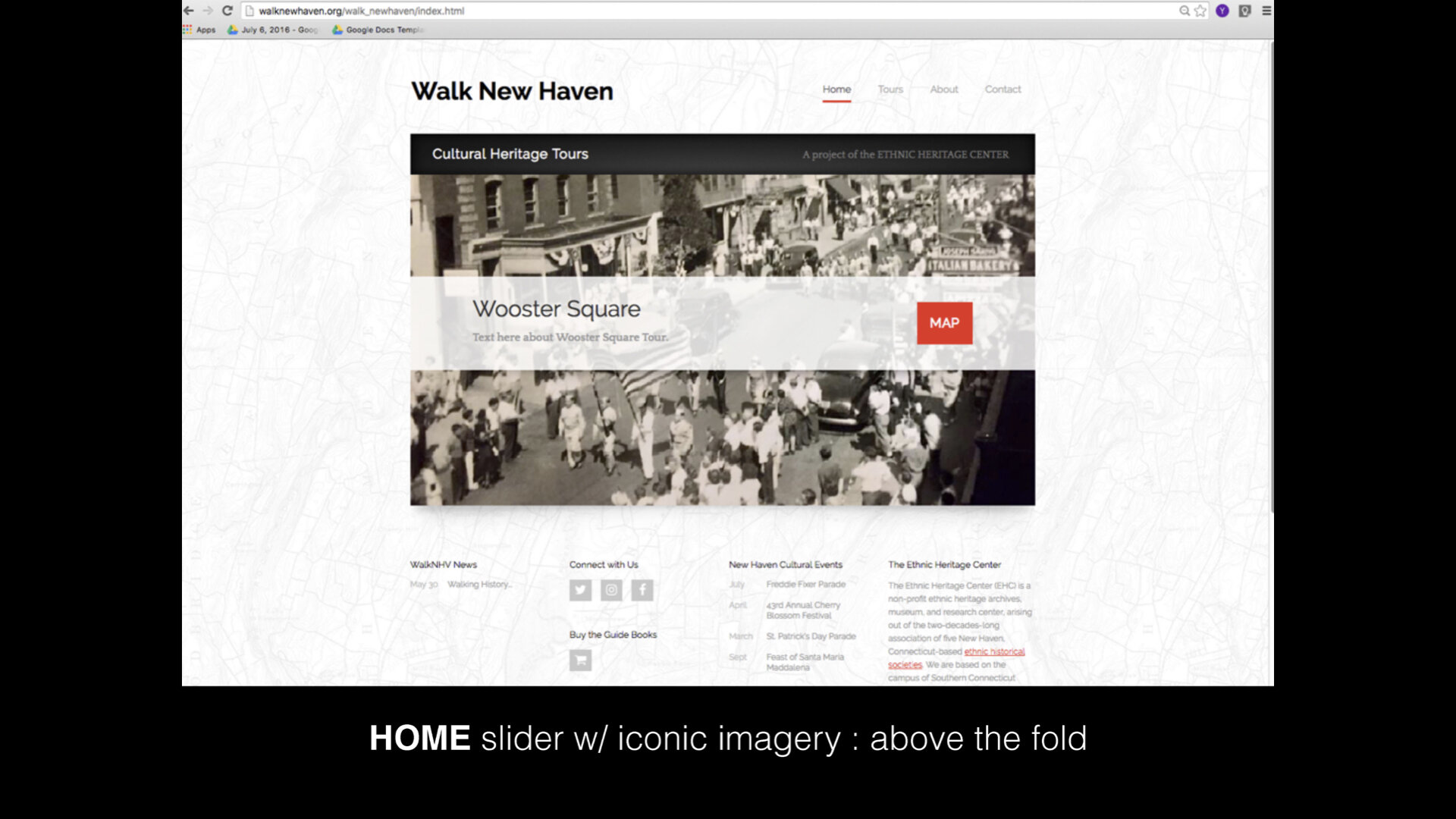
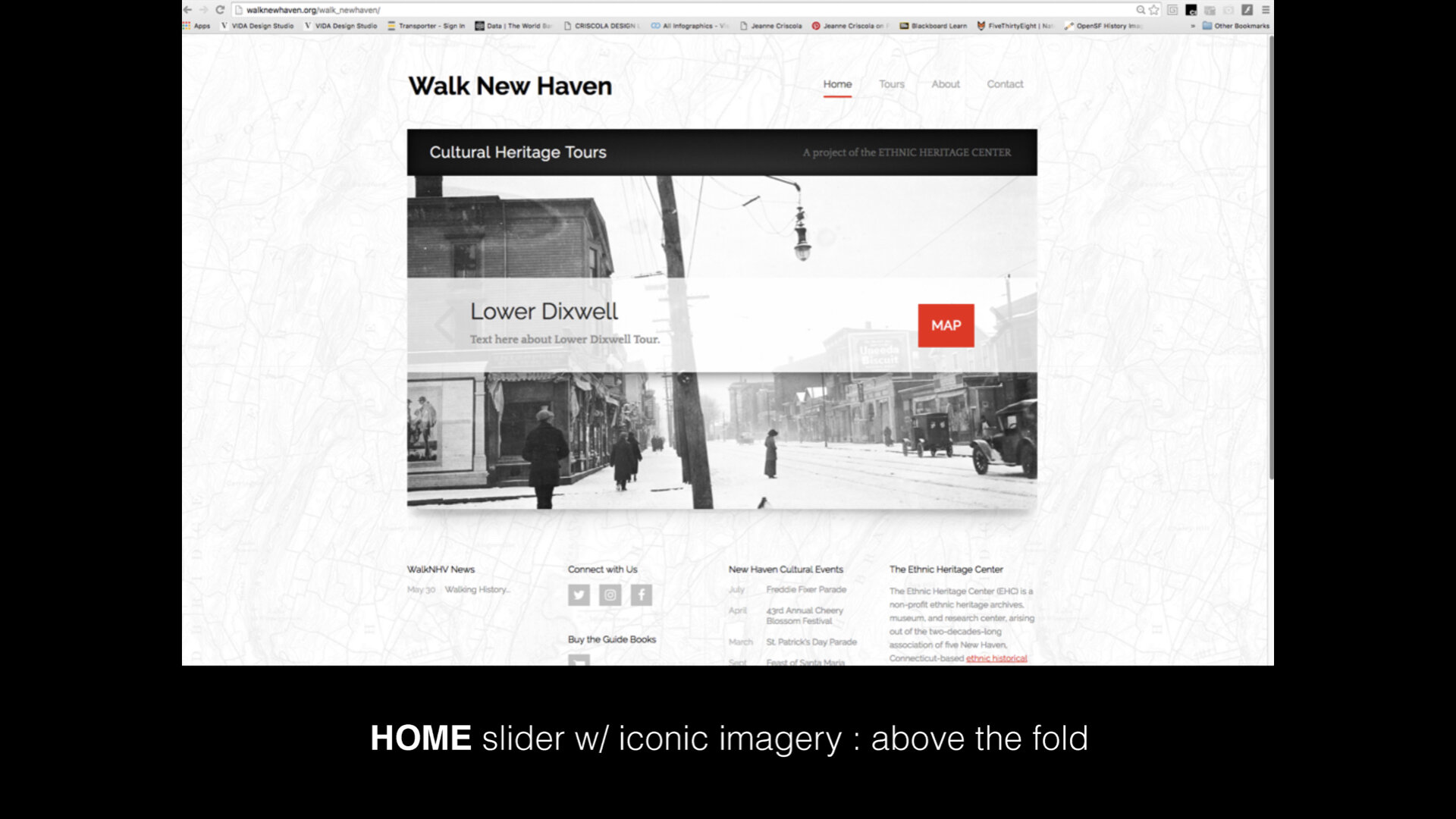
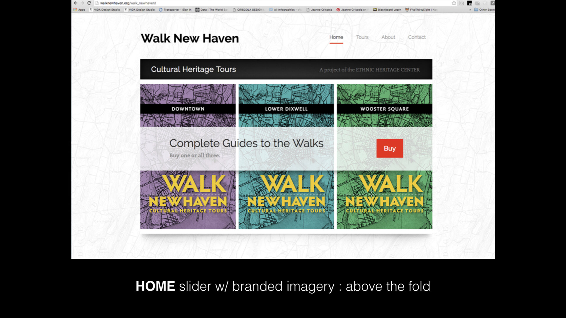
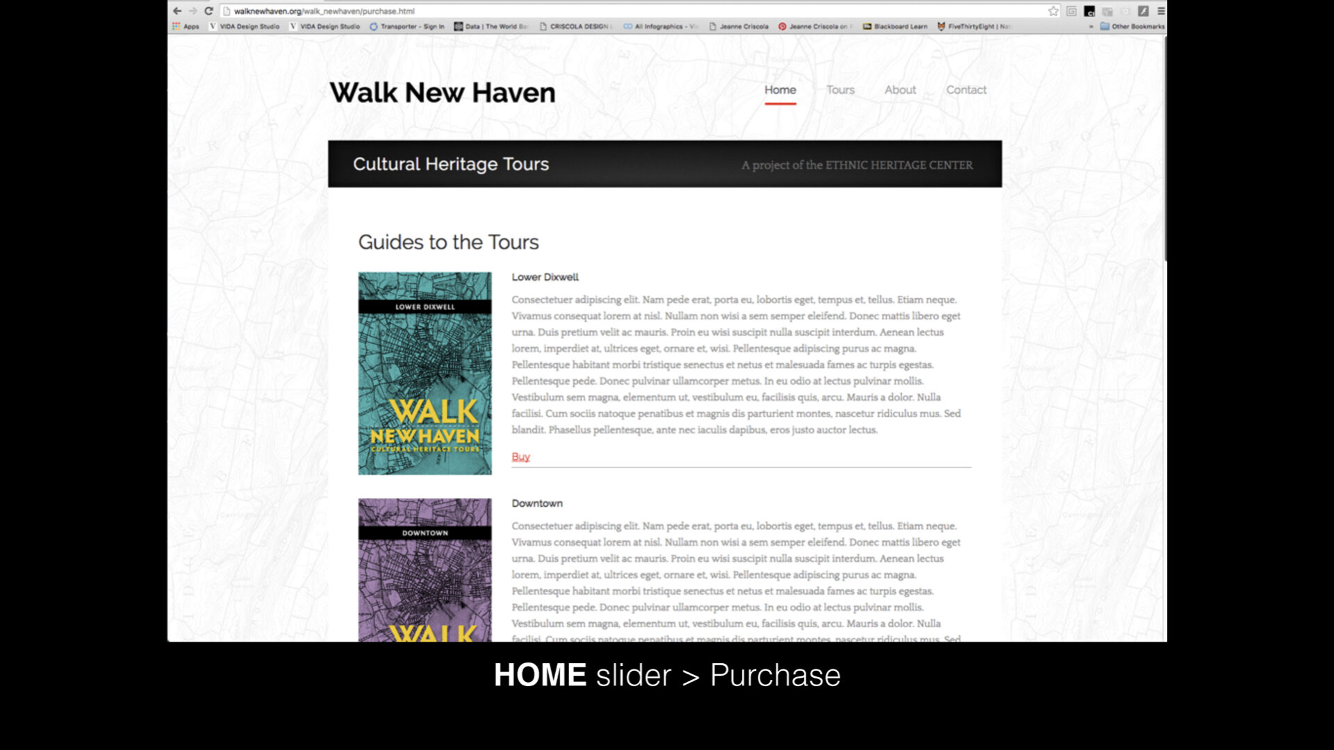
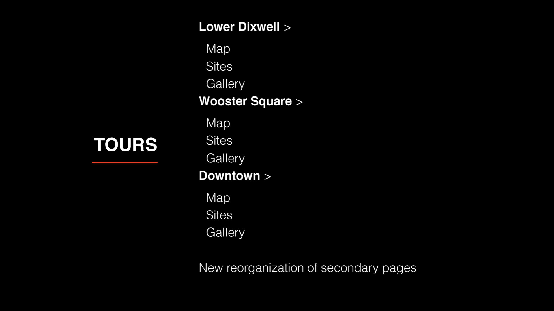
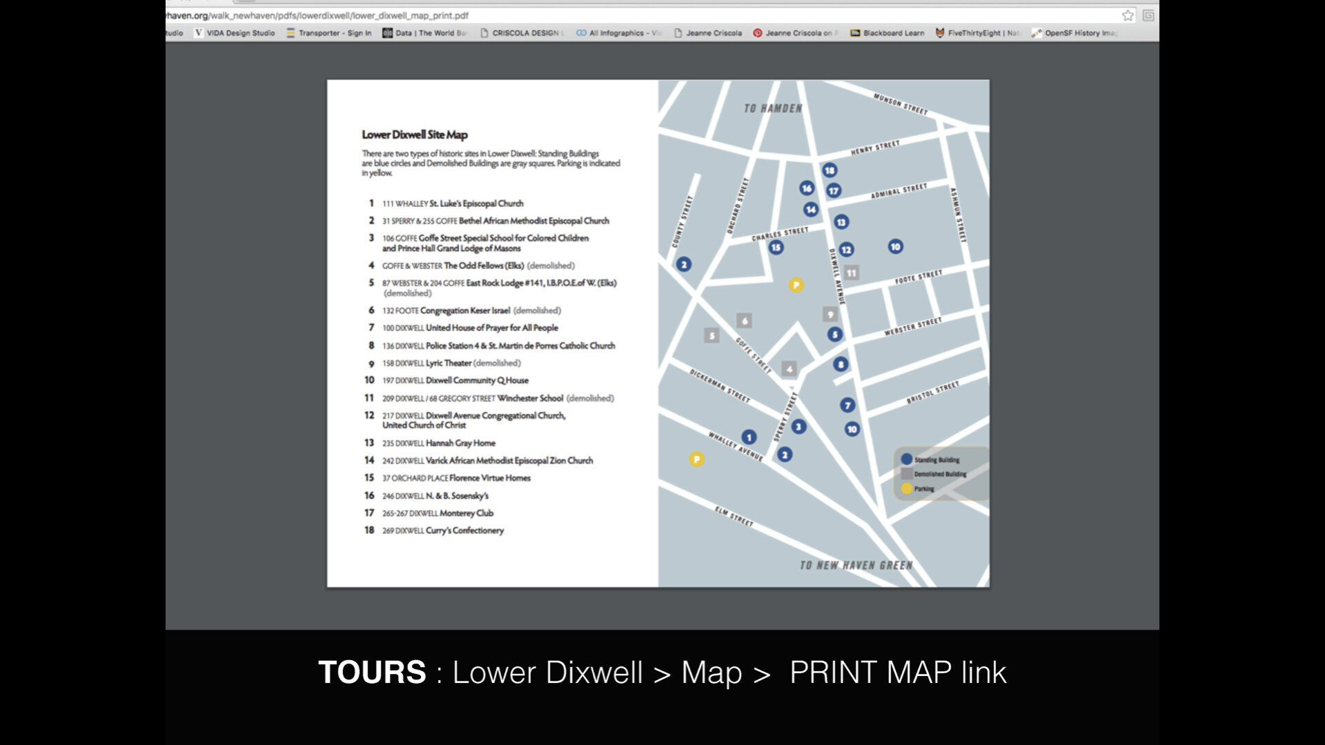
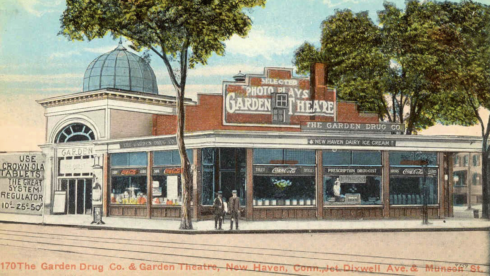
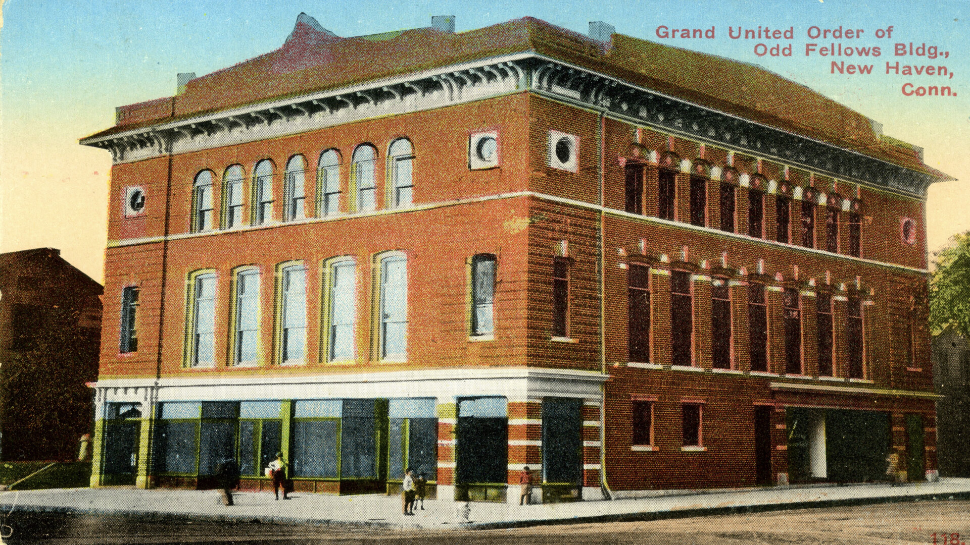
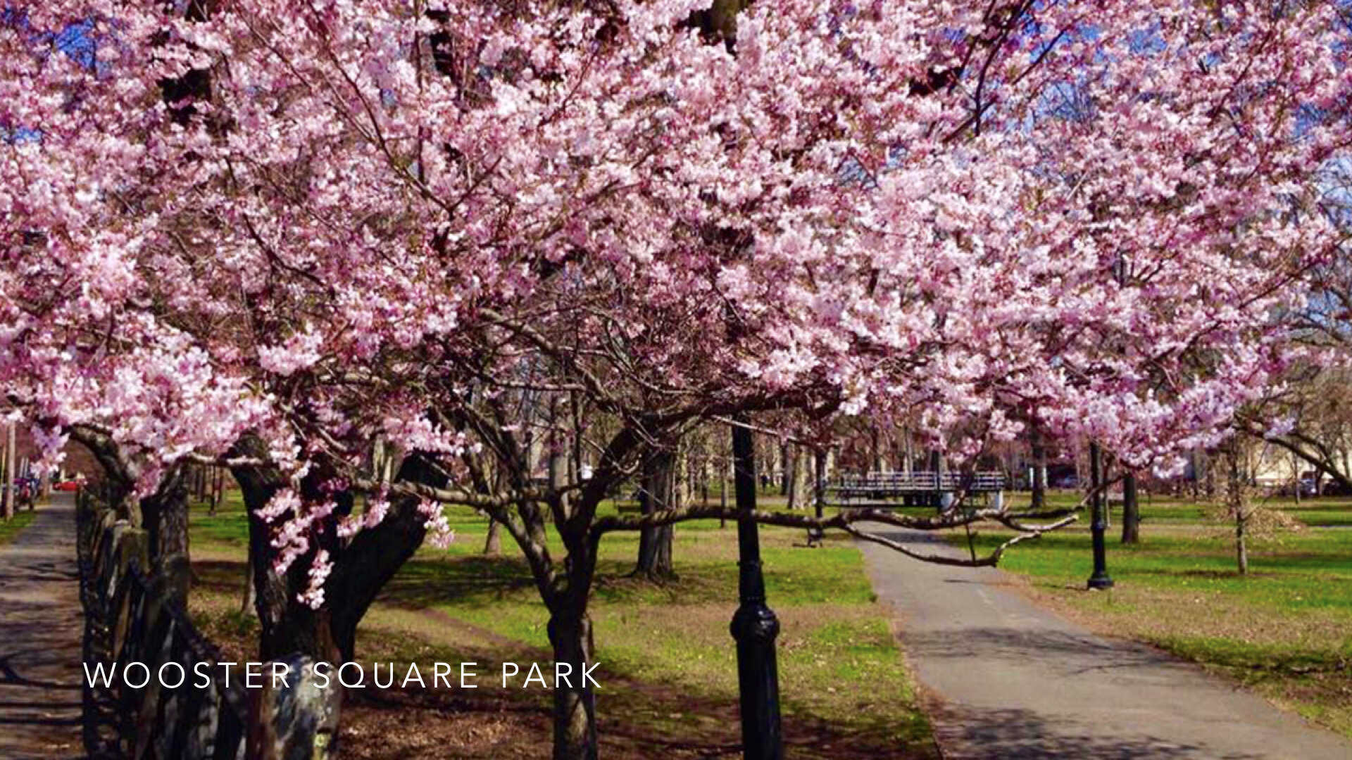
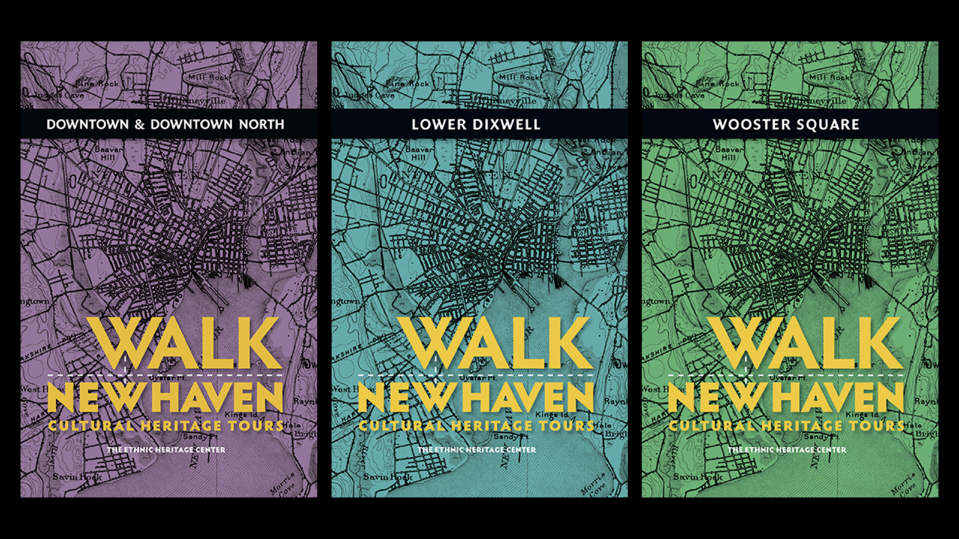
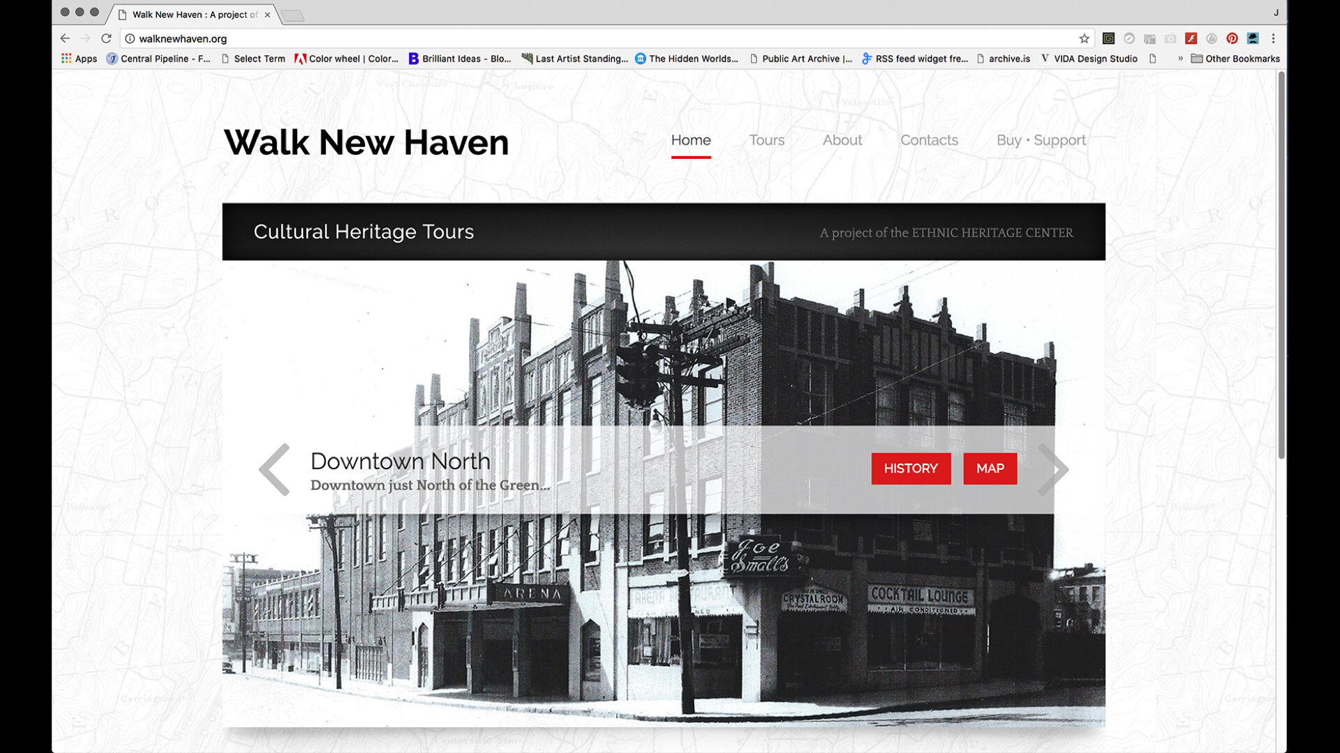
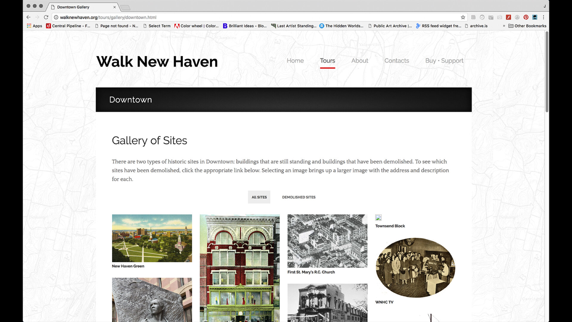
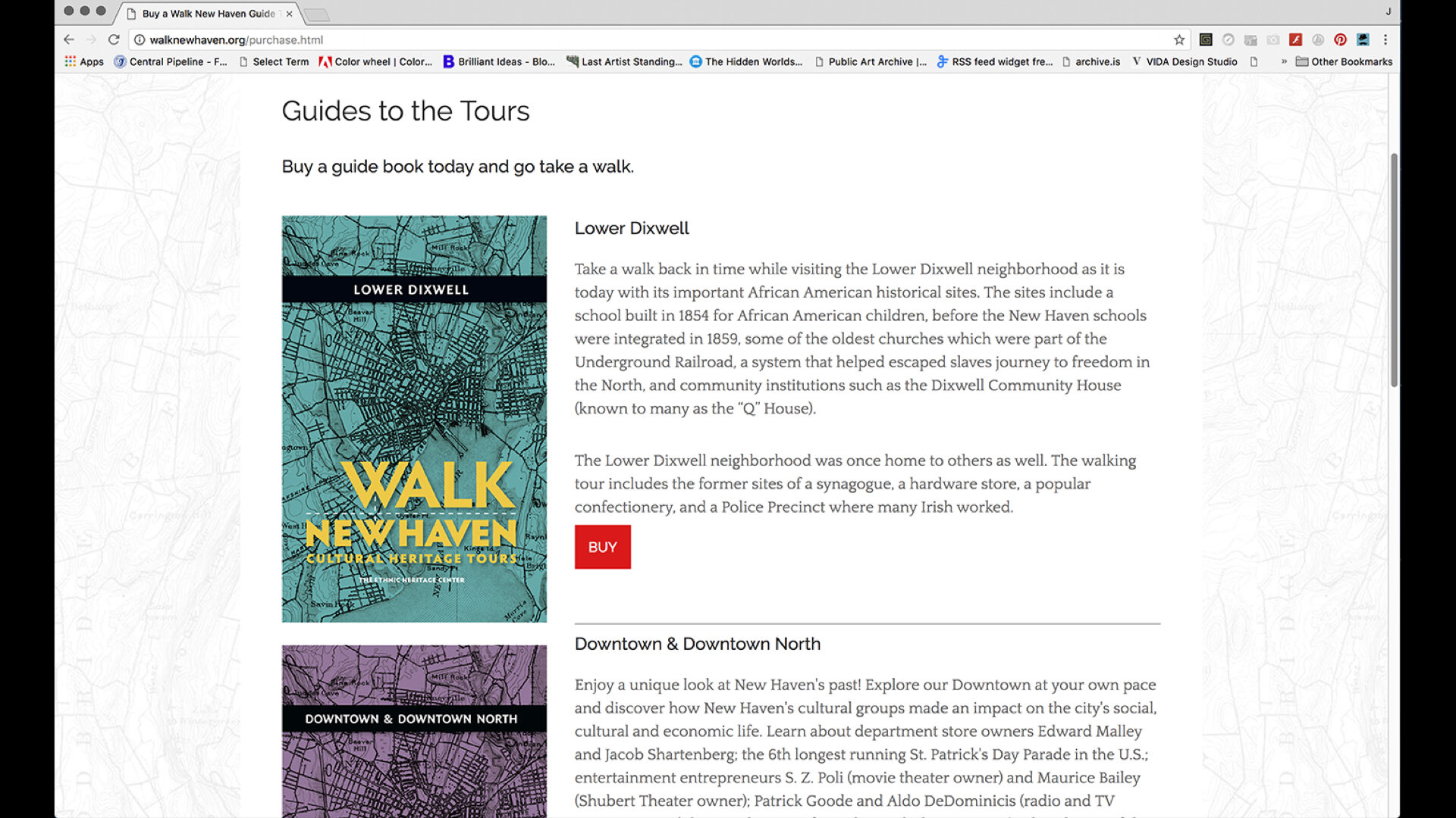
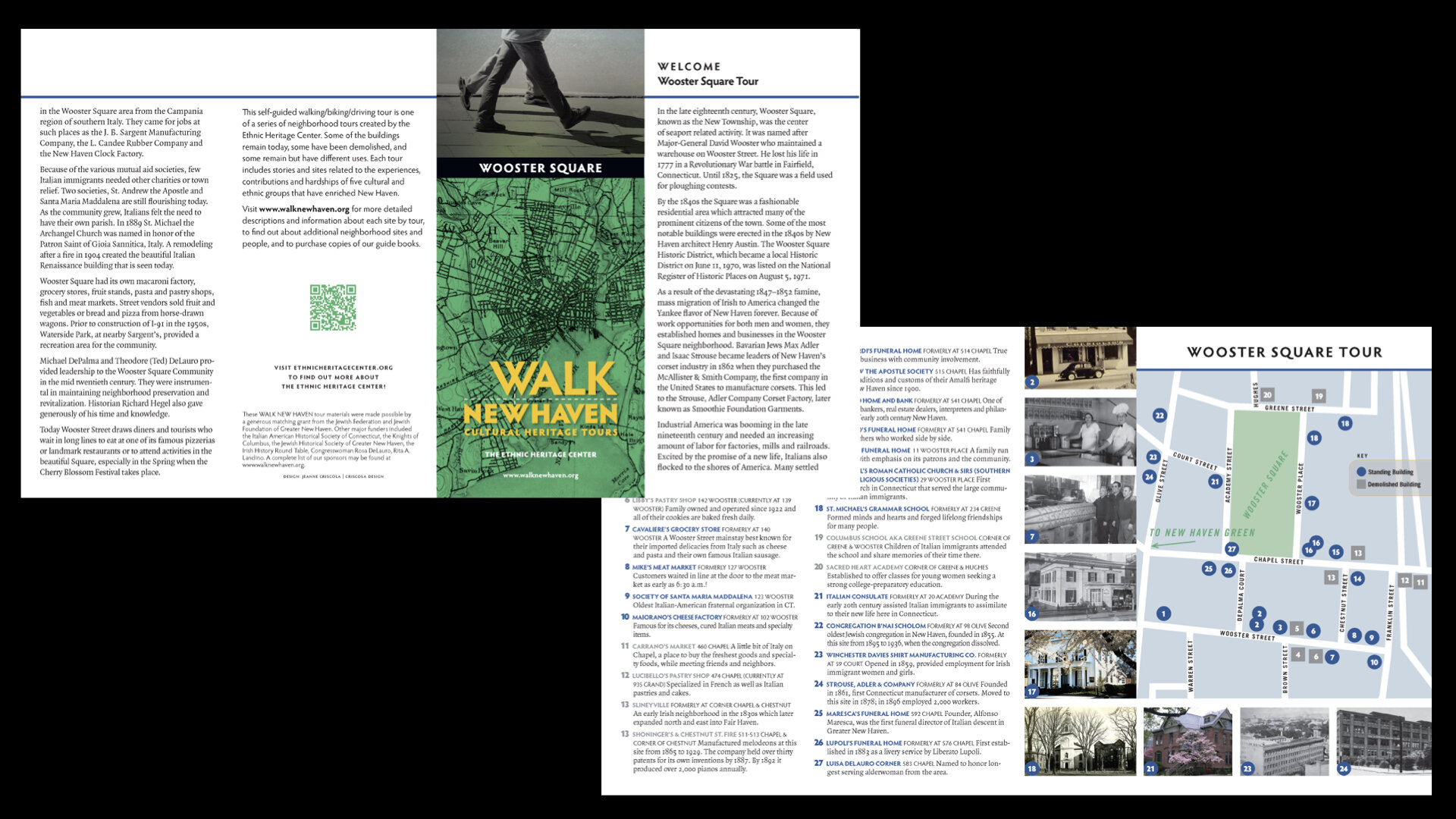
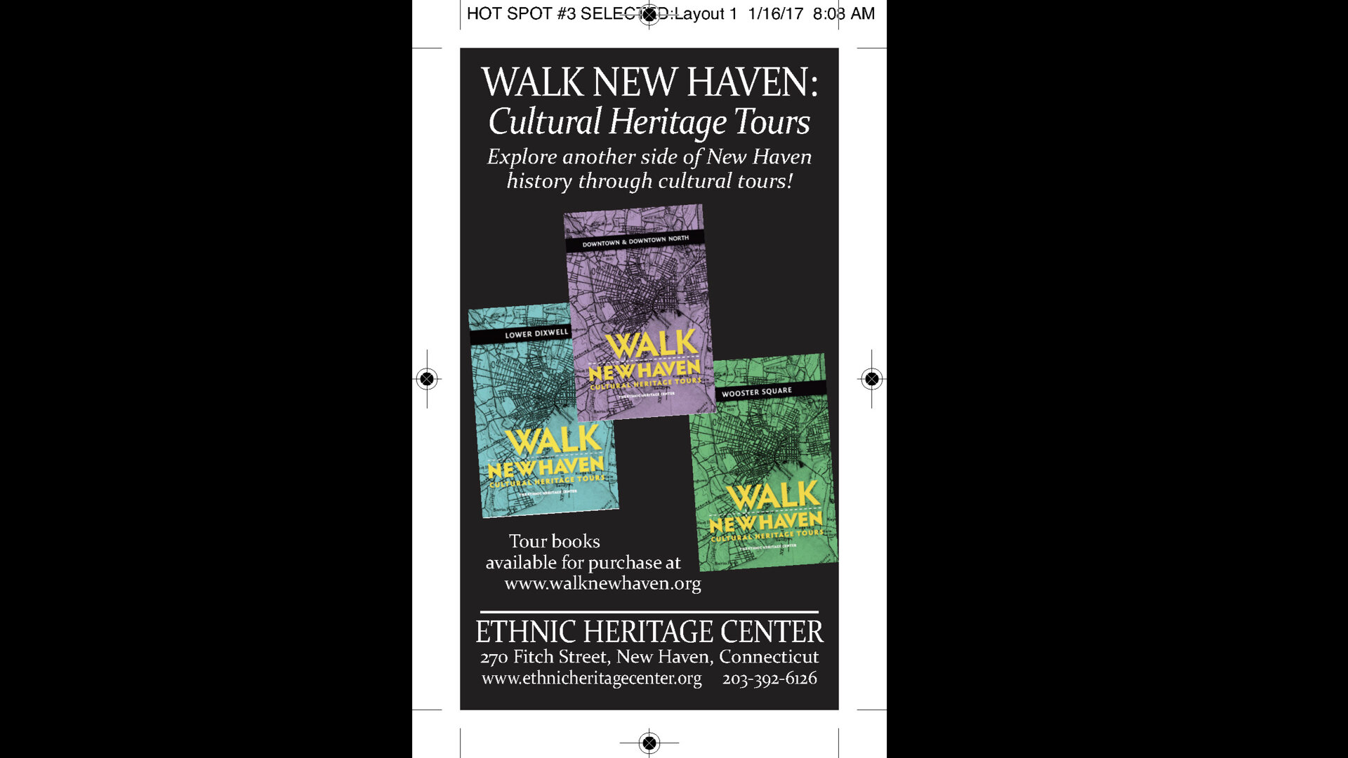
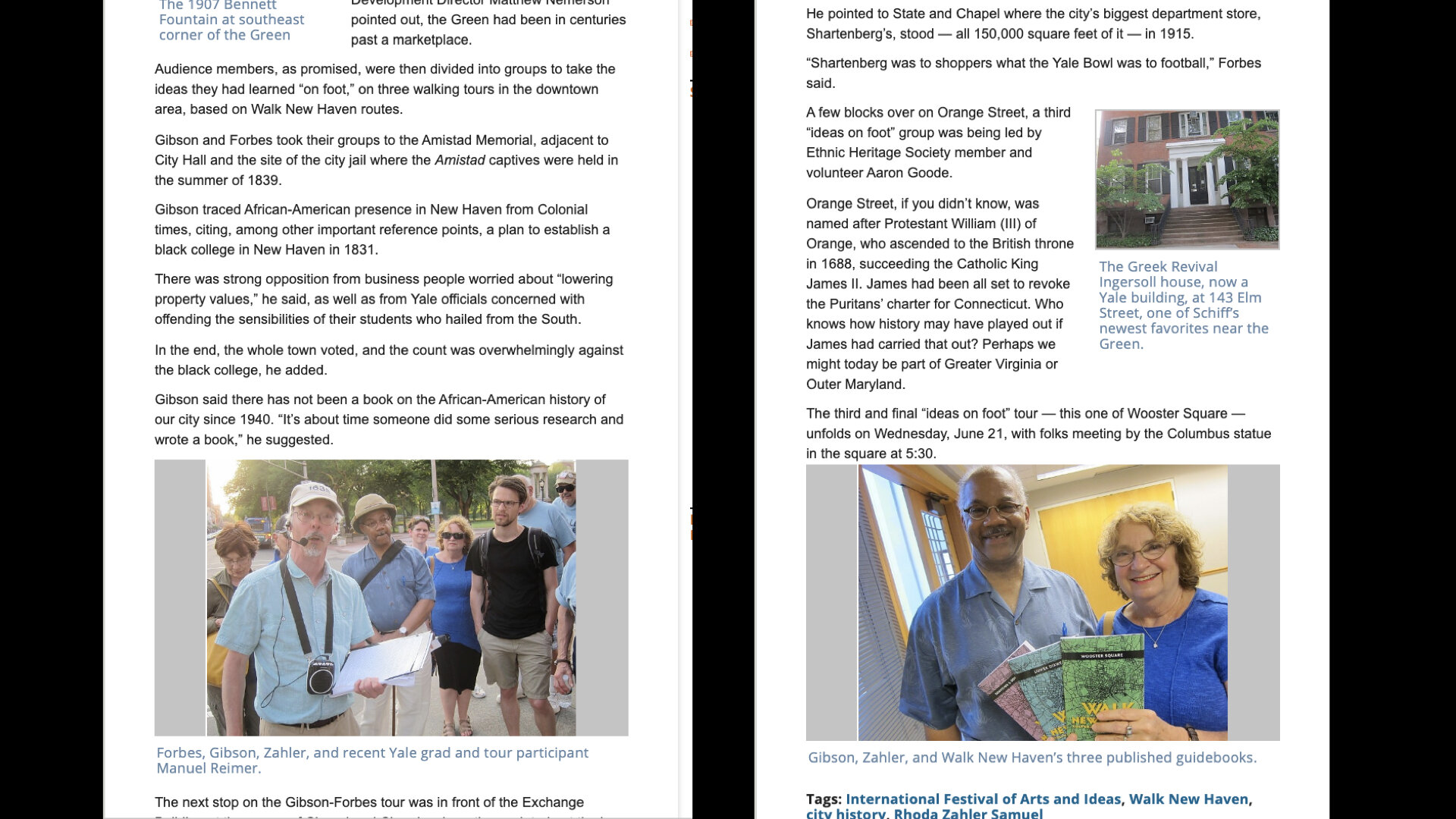
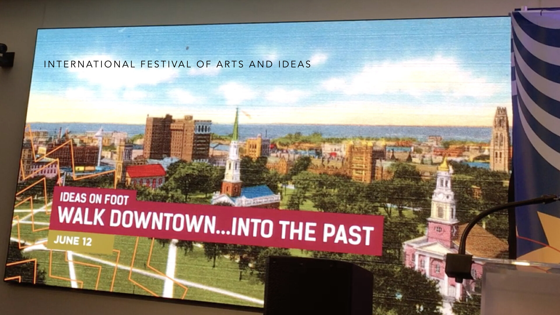
But as negotiations with City Hall became more complicated and the cost to install signage too expensive, EHC decided to pursue another direction that would not require buy-in and approvals from others. So, in late 2015, they sent out a Request for Proposal for graphic design and production services for three brochures that included text, maps, pictures, and QR codes for walking tours of the Downtown, Wooster Square, and Lower Dixwell neighborhoods. During an introductory design meeting, while listening to the projects’ parameters, it became apparent that, as envisioned, its scope would fall far short of the project’s objectives. With 13 in attendance, we began discovery with Design Thinking by first defining the purpose, challenges, and people we were creating the tours for. We asked about the impetus for the project—where had the idea germinated, what models had been researched, what would the best outcome be? Could the “Museum in the Streets” product be adapted and would it work without the signage component?
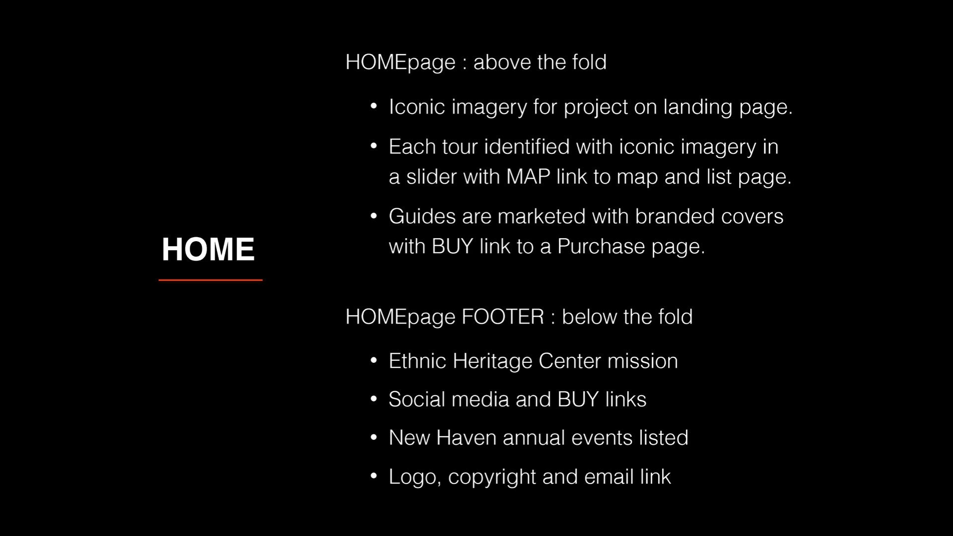
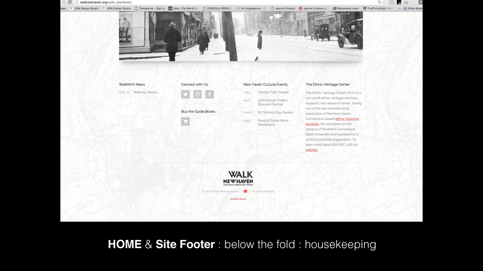
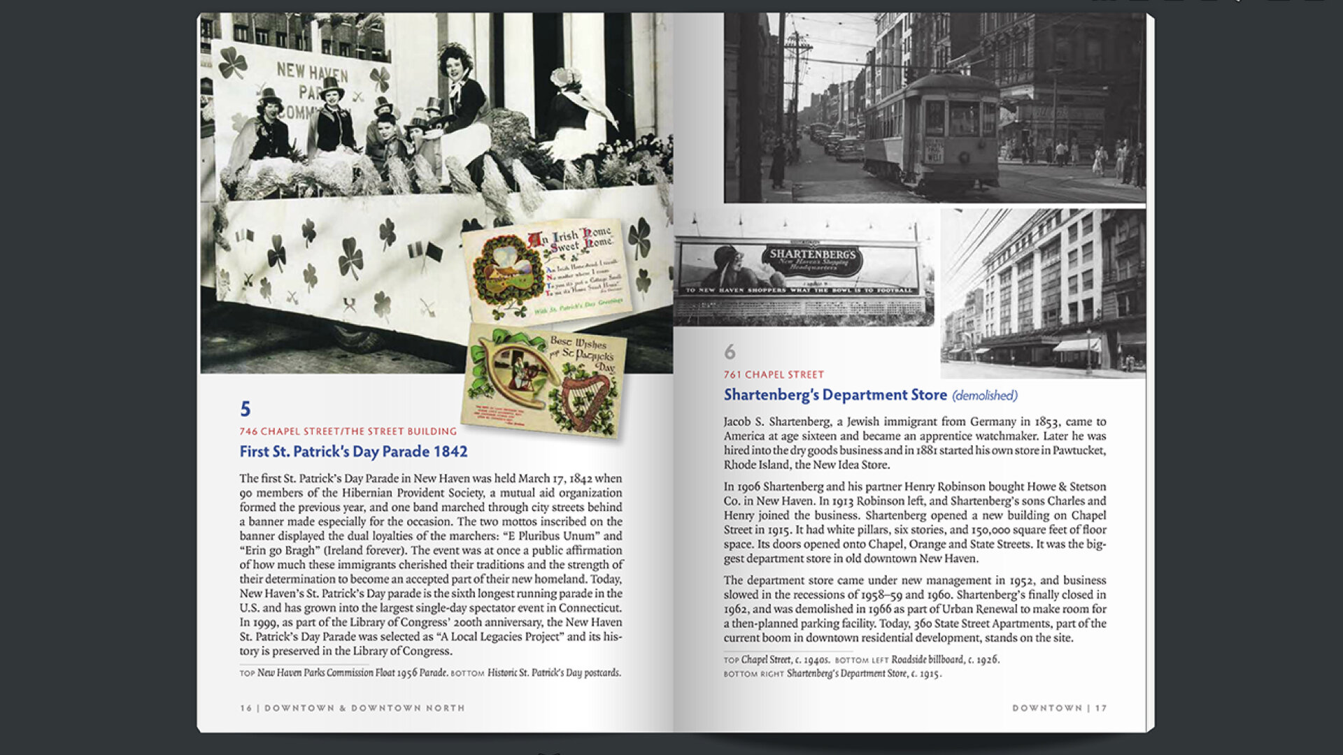
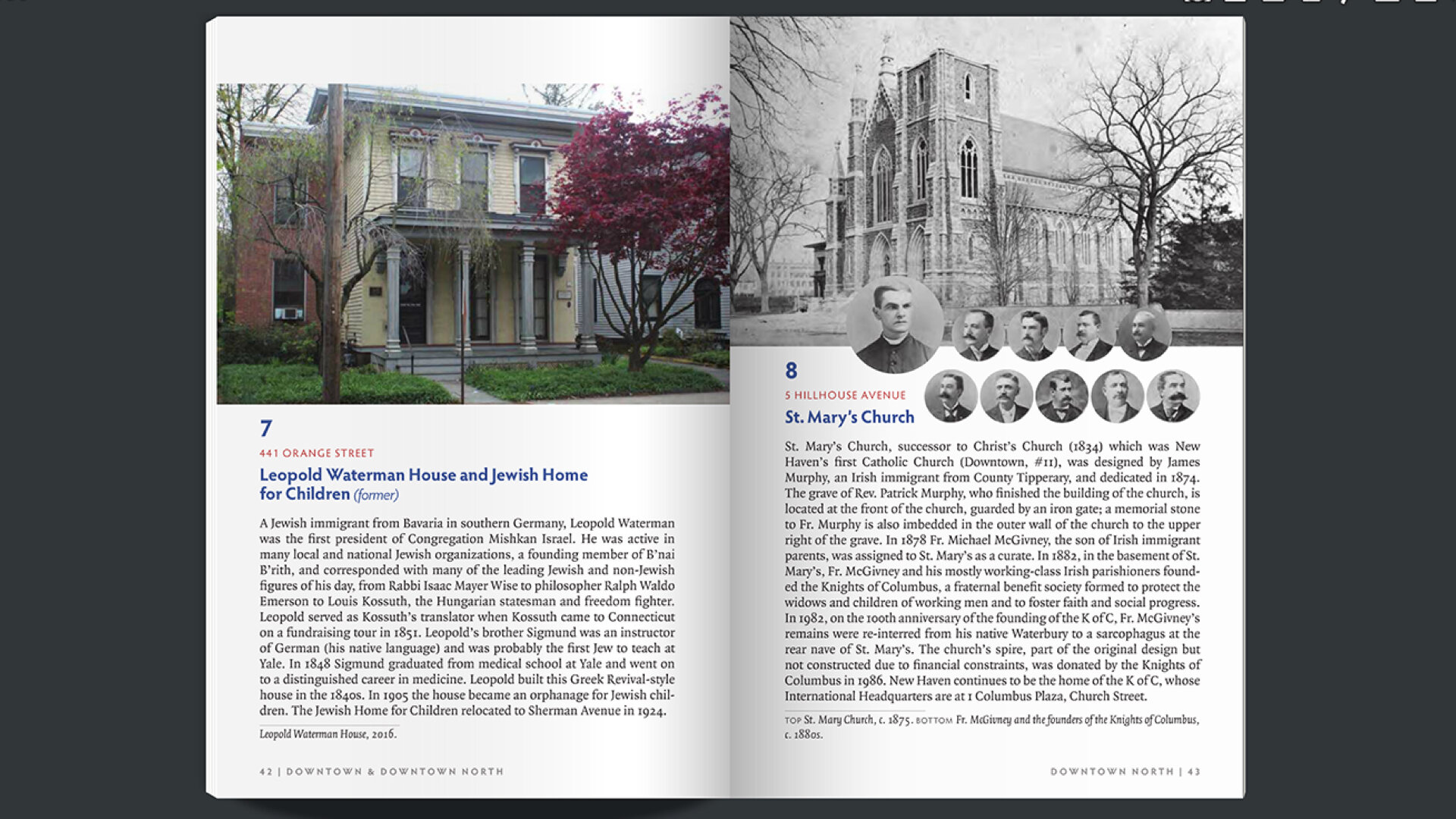
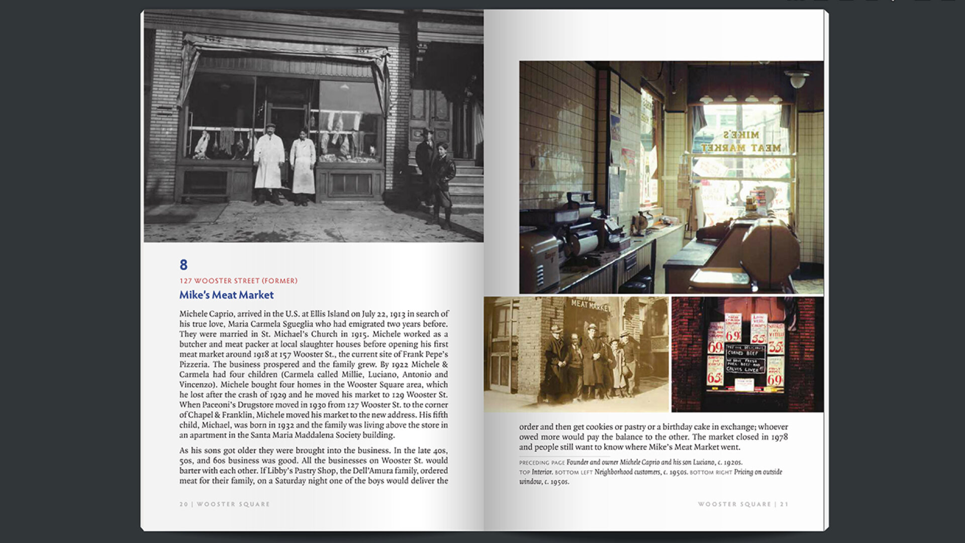
Each society had already spent years compiling, researching, and assembling evidence of the influences, intersections, and cross-overs their ethnic group had made in each of the three neighborhoods. They had long texts, multiple images of sites, and go-to people to reference about the sites they chose for the walks. People in the community who had contributed to the project were eager to be see their stories told. Significant editing would be needed in order to format the information and media into a brochure like the examples the EHC had supplied with the proposal. After an assessment of the work that had already been done by EHC to get the project started, it was unanimously agreed upon to enlarge the project to include books and a website in addition to the brochures. This way, the website would include all the text and media they had collected from numerous people and families, then edited for the books, and then further editing for the brochures.
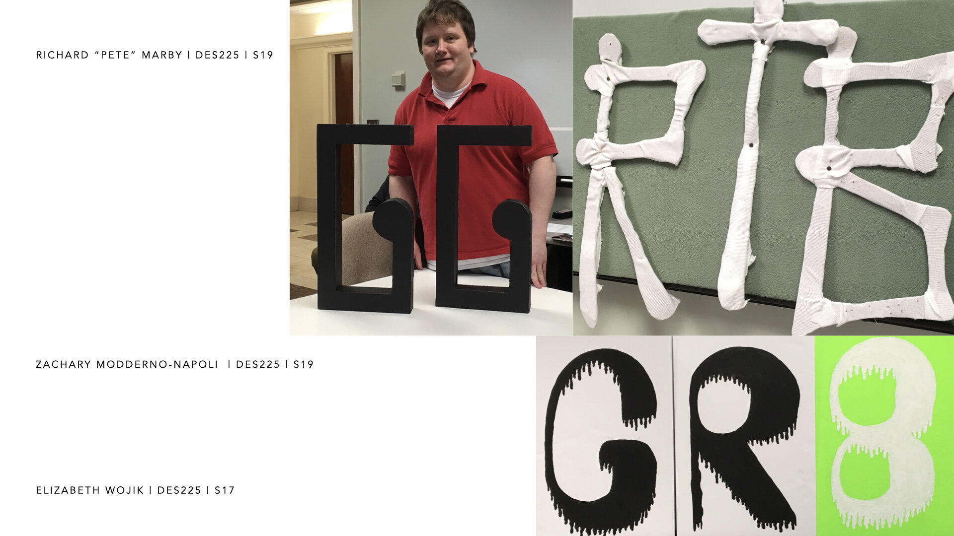
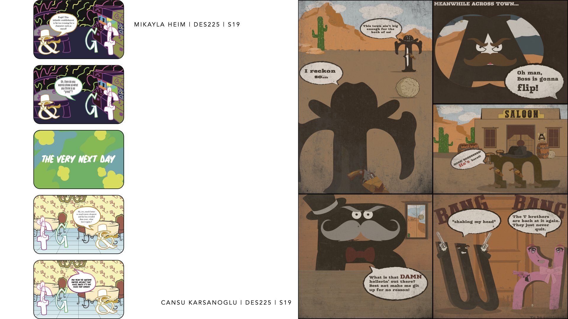
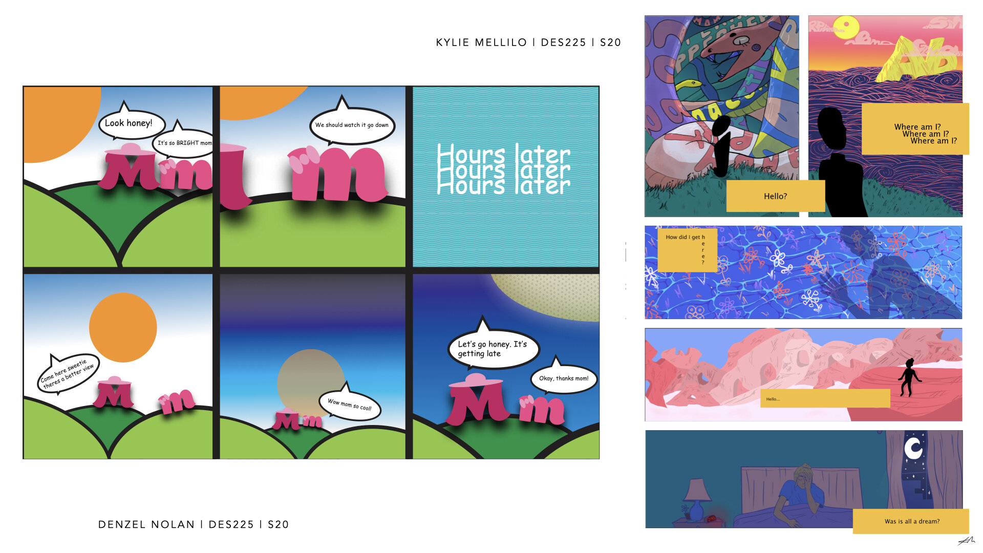
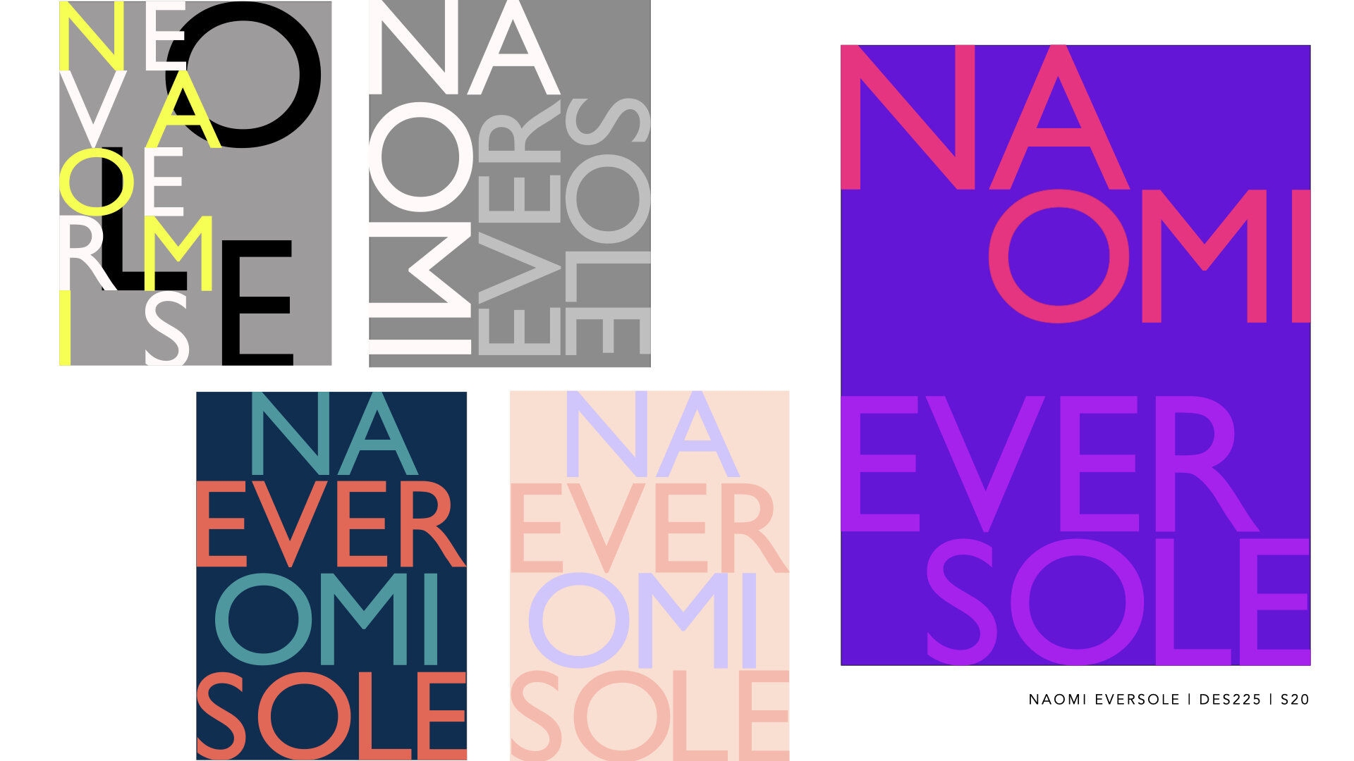
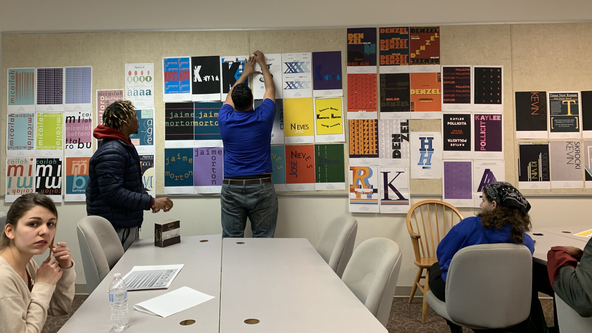
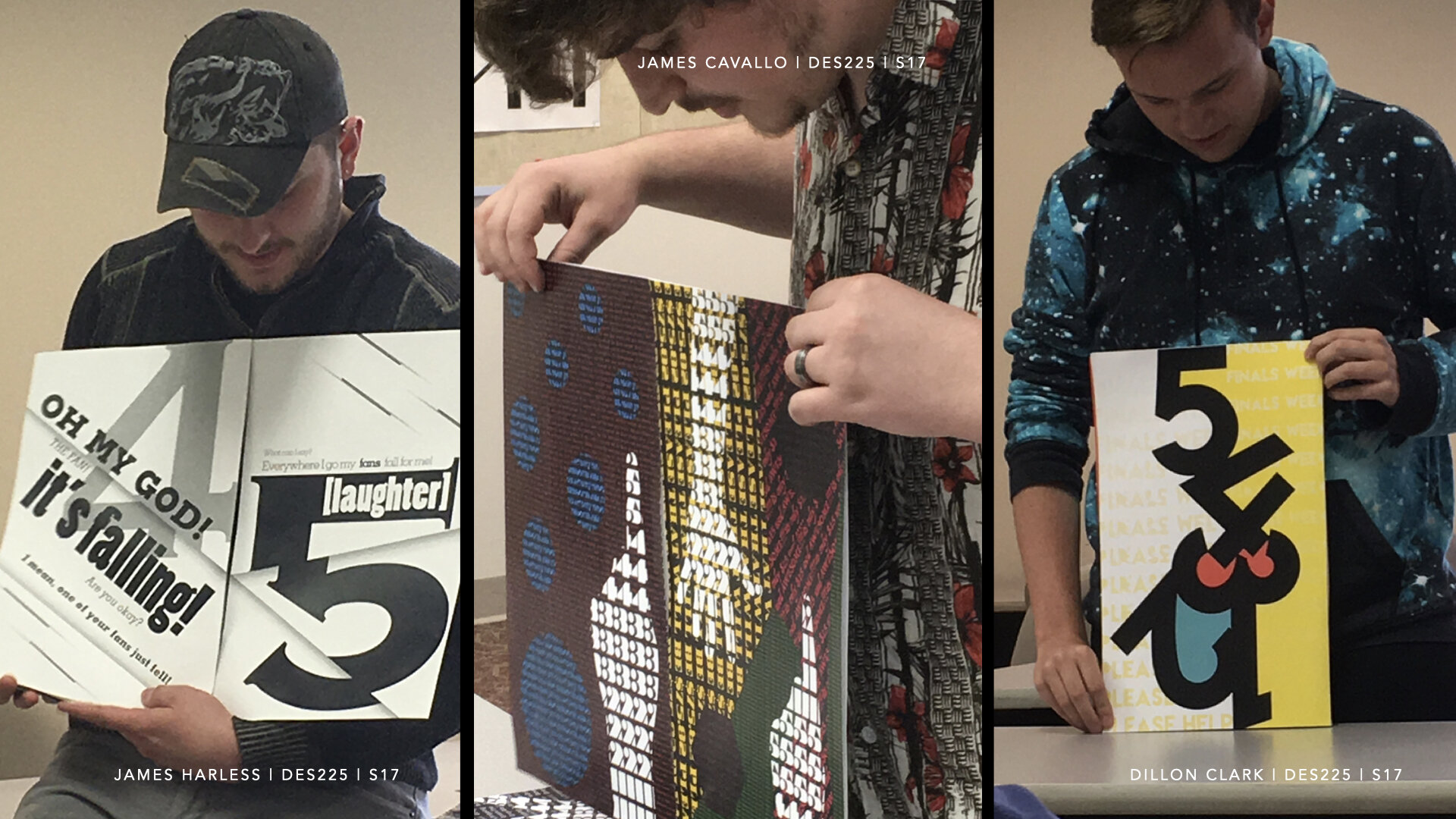
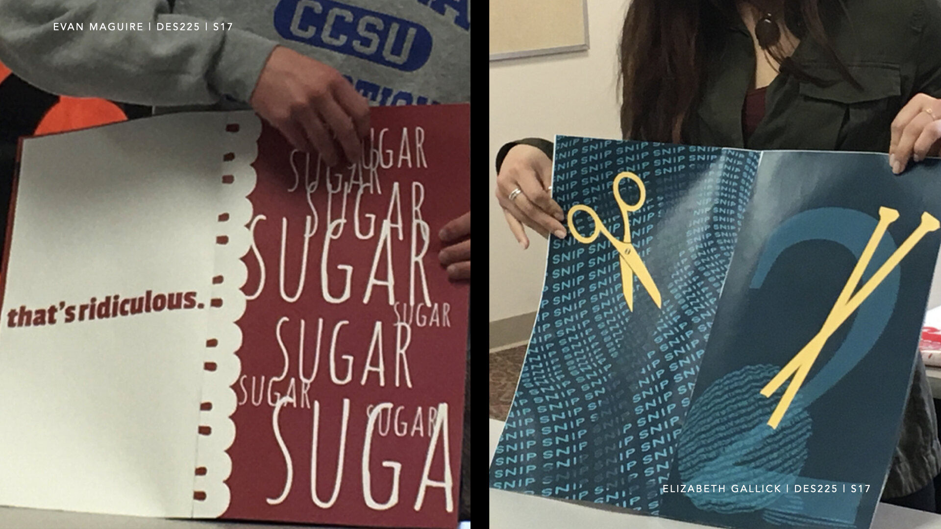
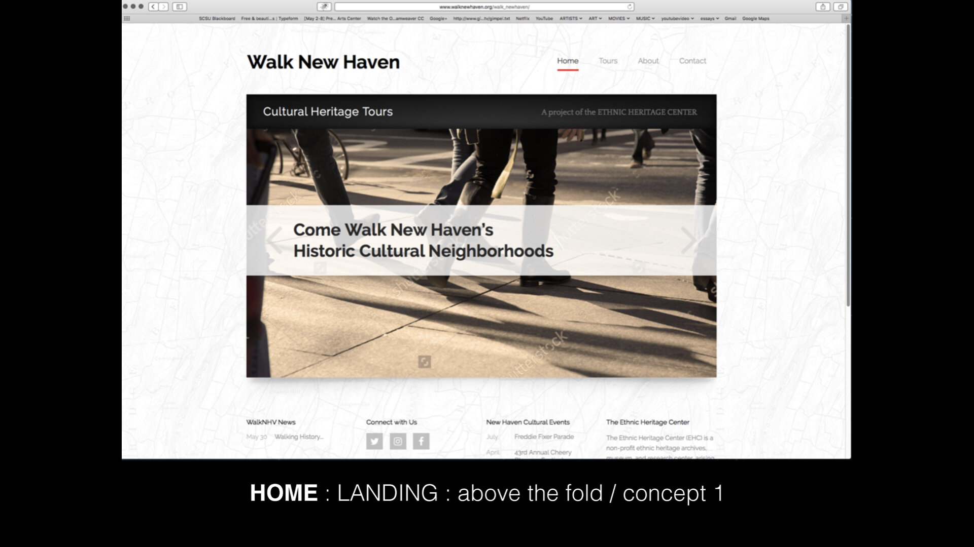
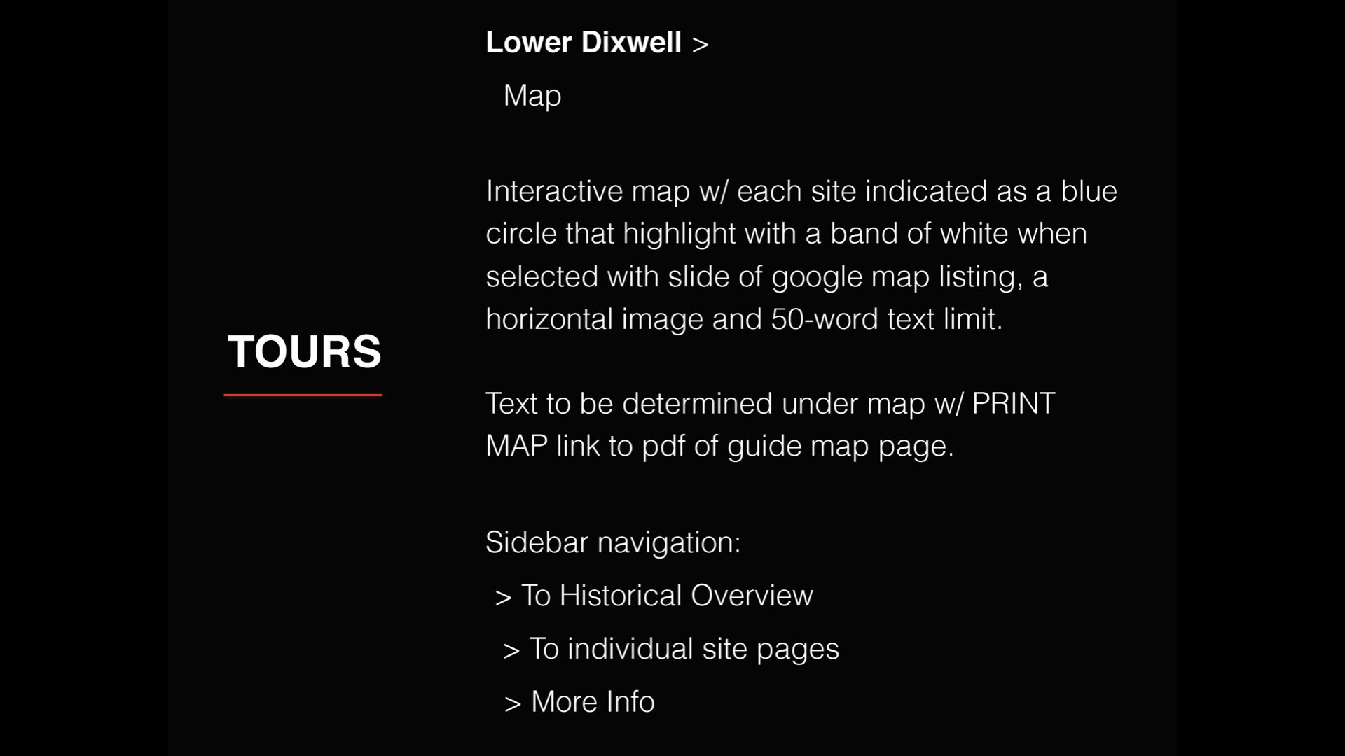
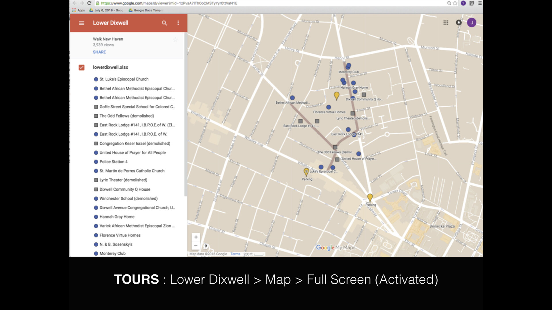
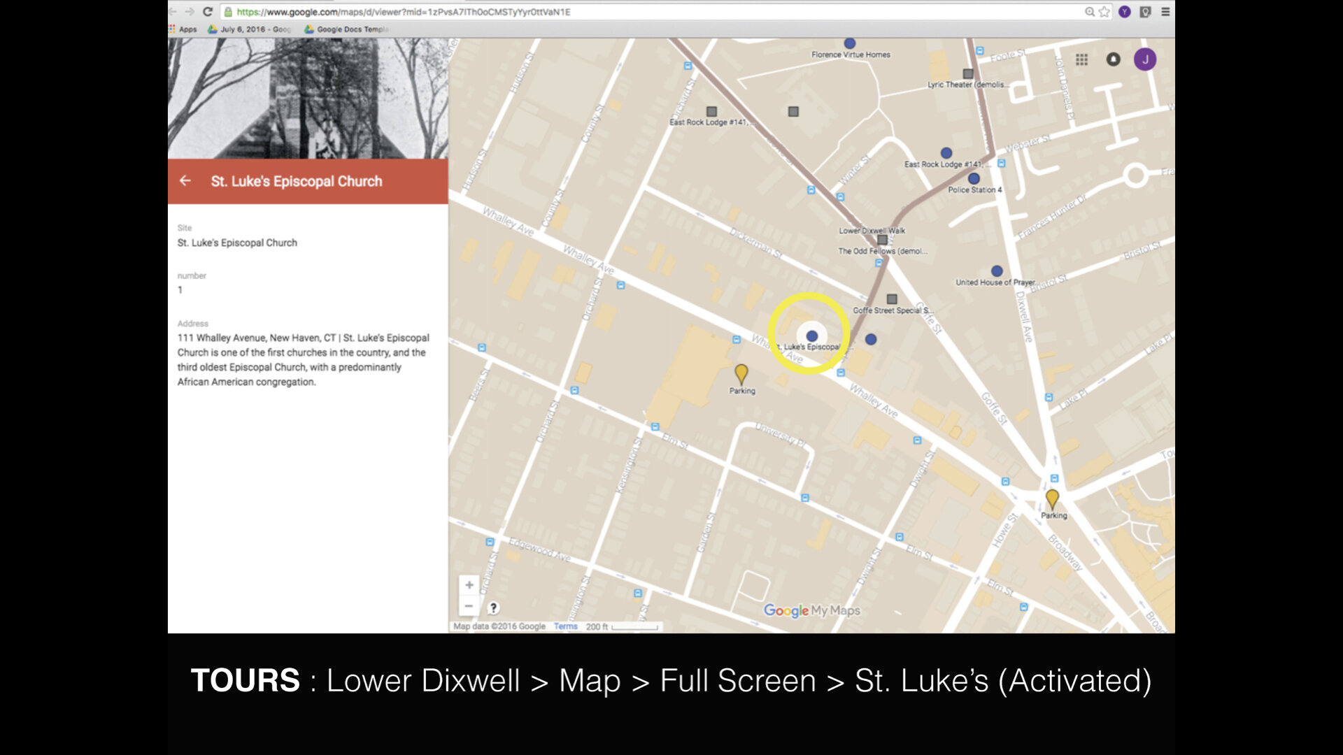
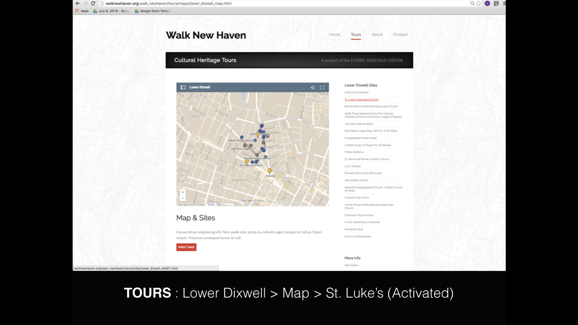
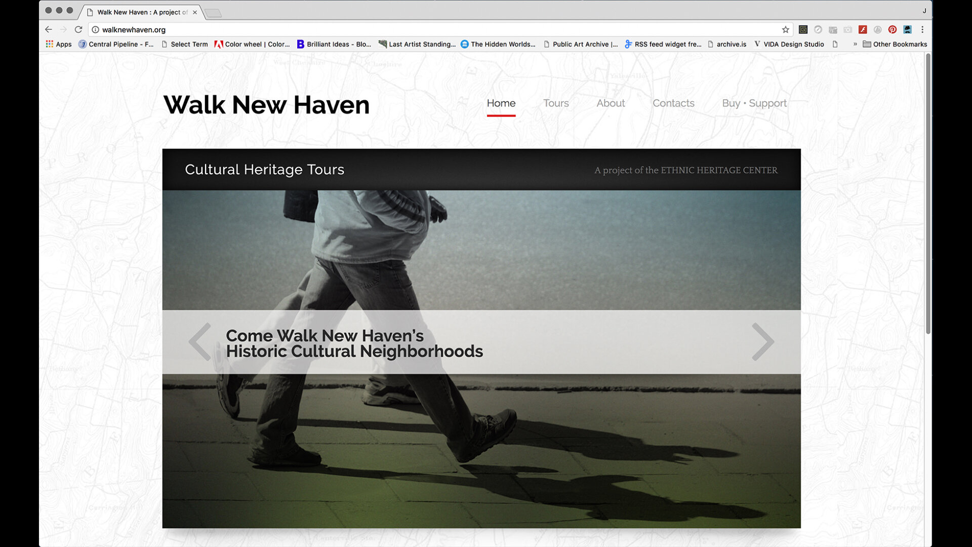
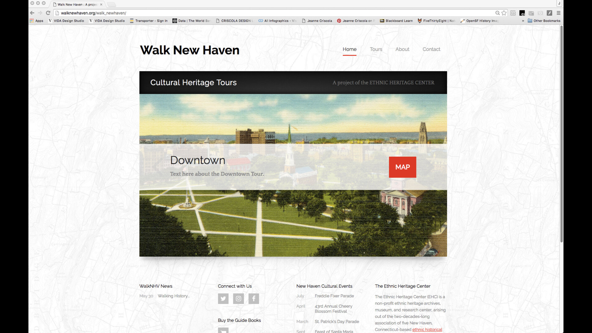
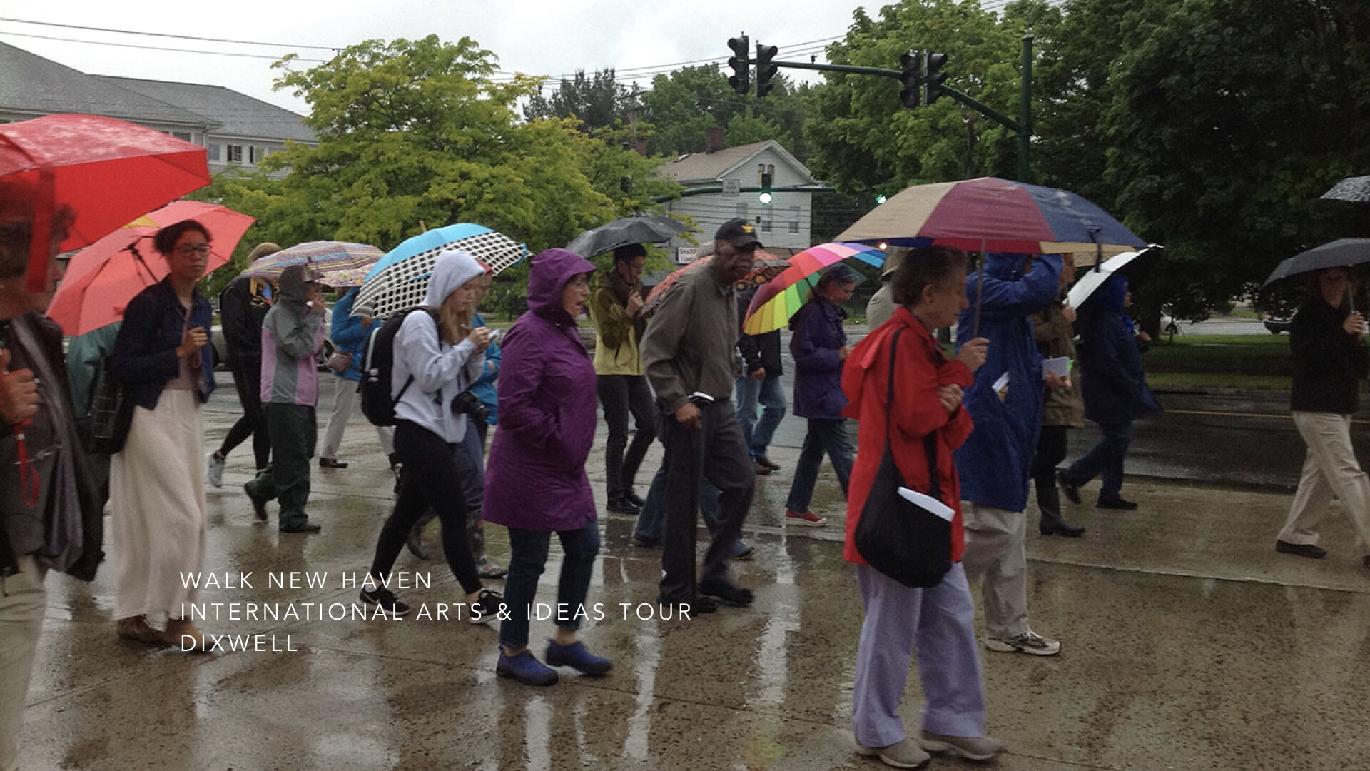
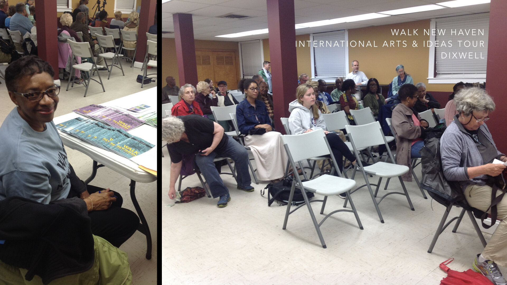
And so with the project parameters in place, design thinking entered its next phase of design research, ideation, and prototyping. A decision was made to implement the design process with Lower Dixwell which was the smaller and most complete compilation of the tours. At this point, brainstorming a name for the project began and soon ended with “Walk New Haven.” The “Cultural Heritage Tours” subtitle was added later. Students in my CCSU Spring 16 design classes at Central got to weigh in on the logo development and branding acting as critics and curators.
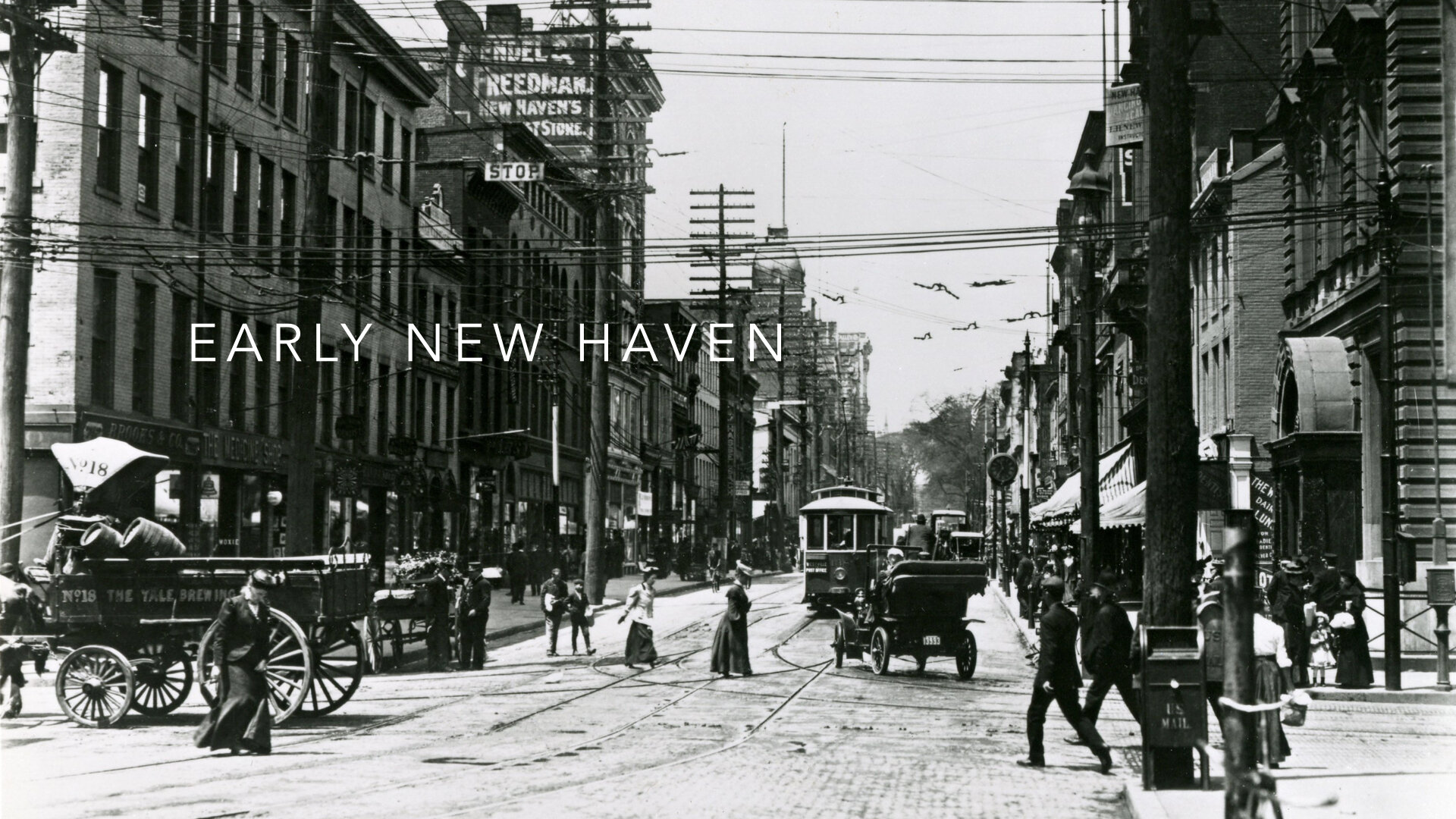
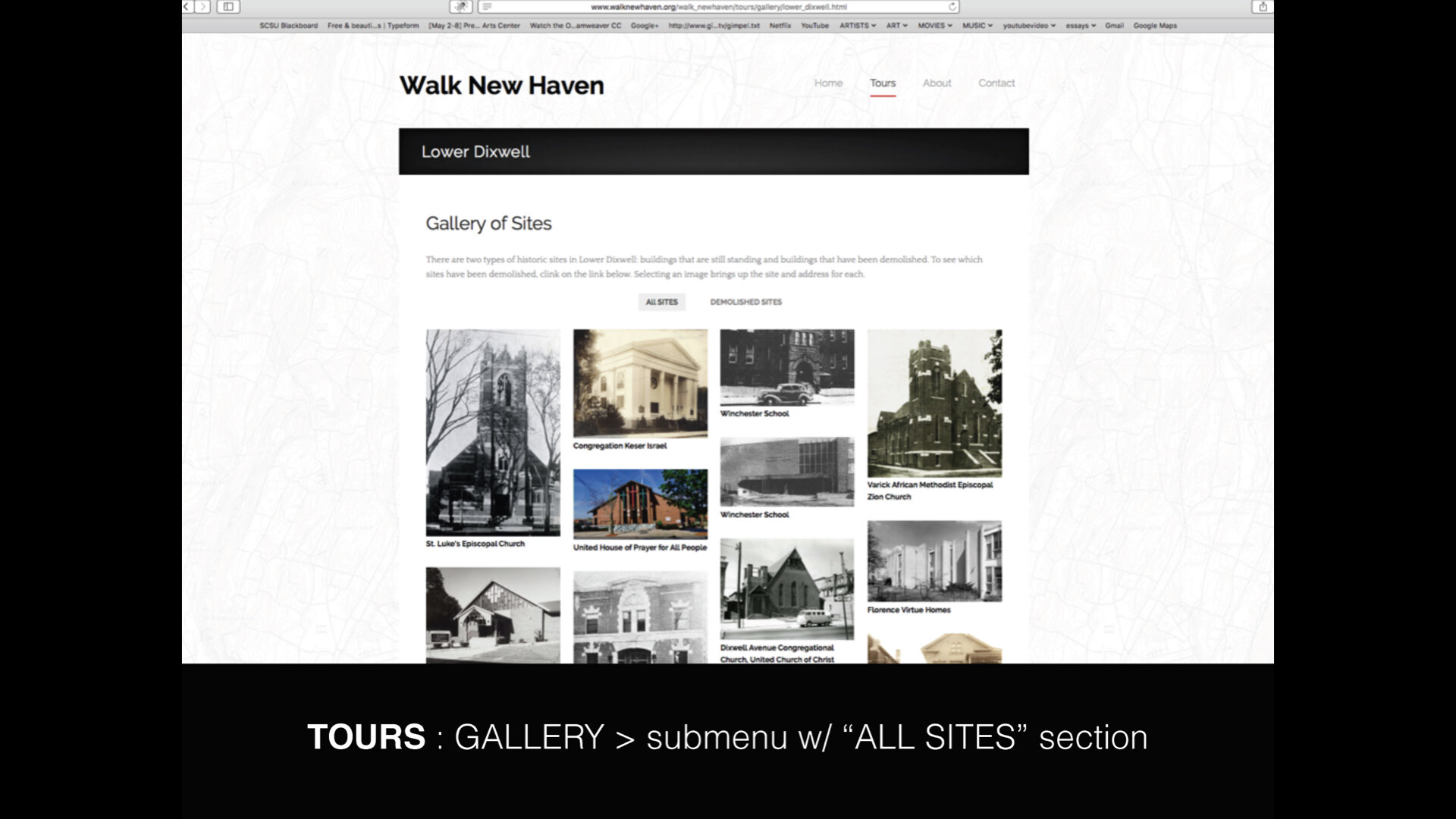
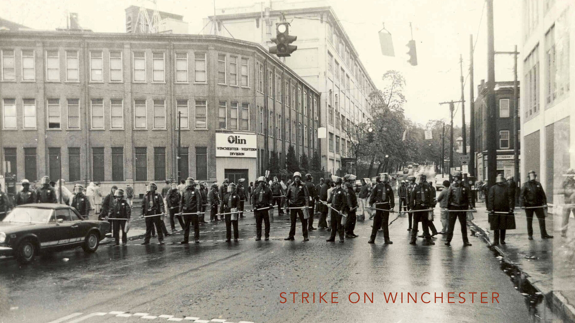
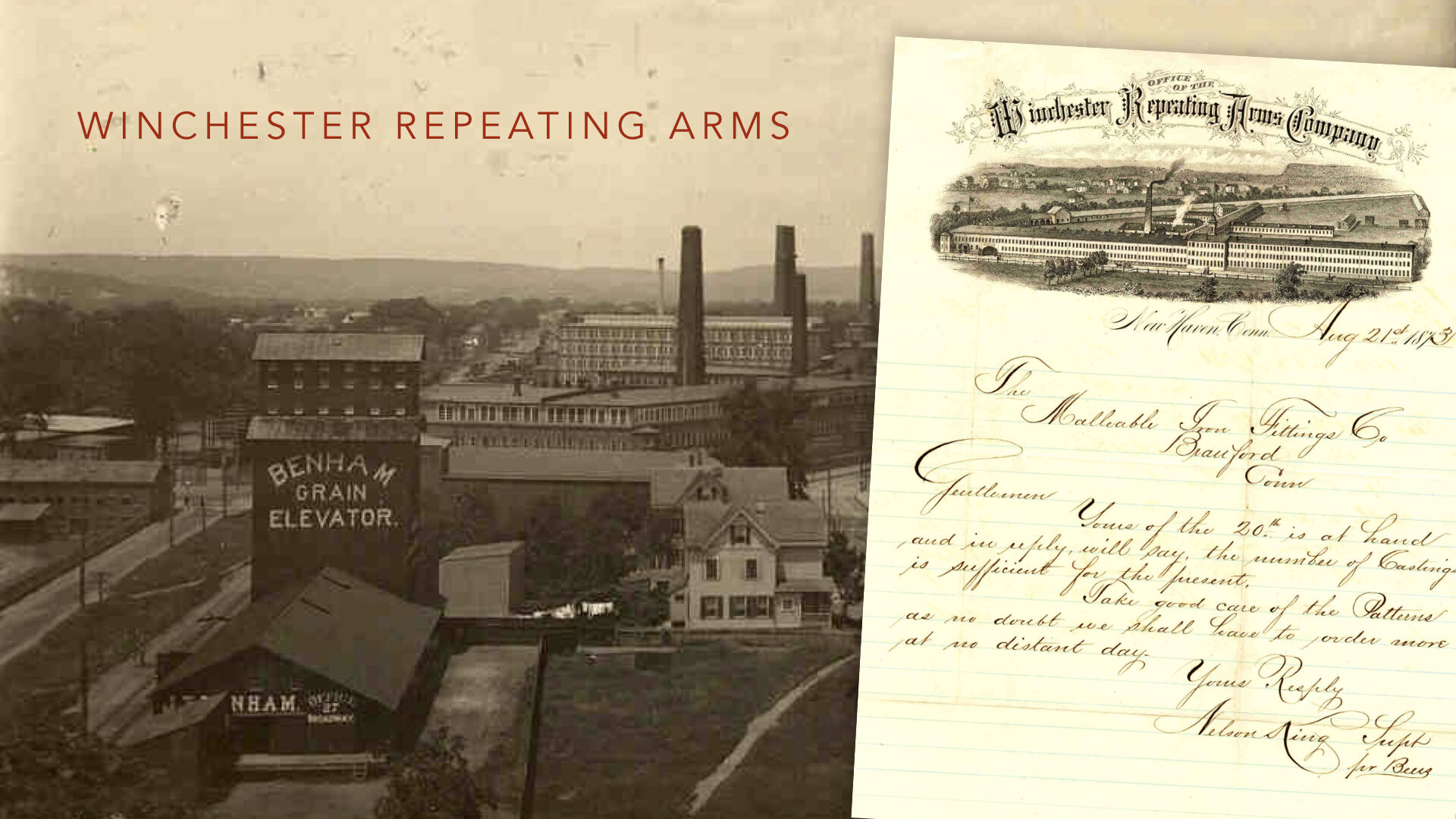
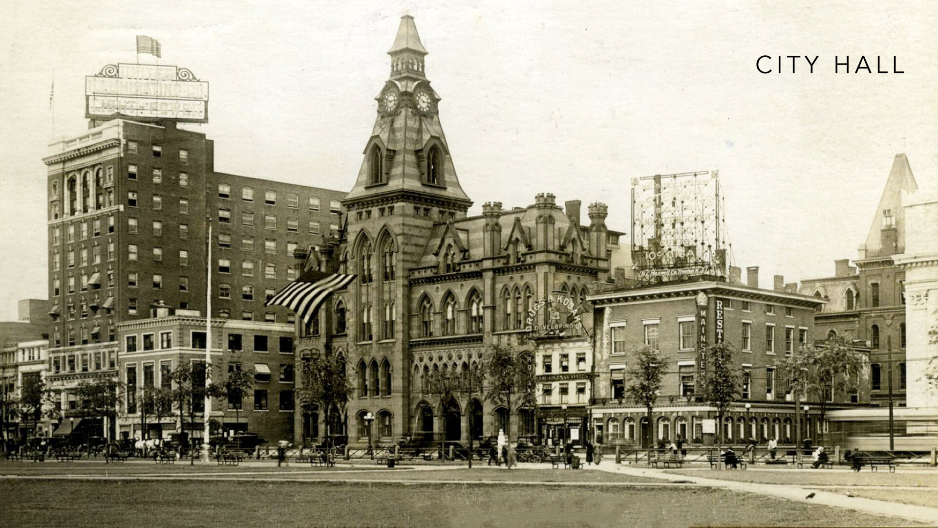
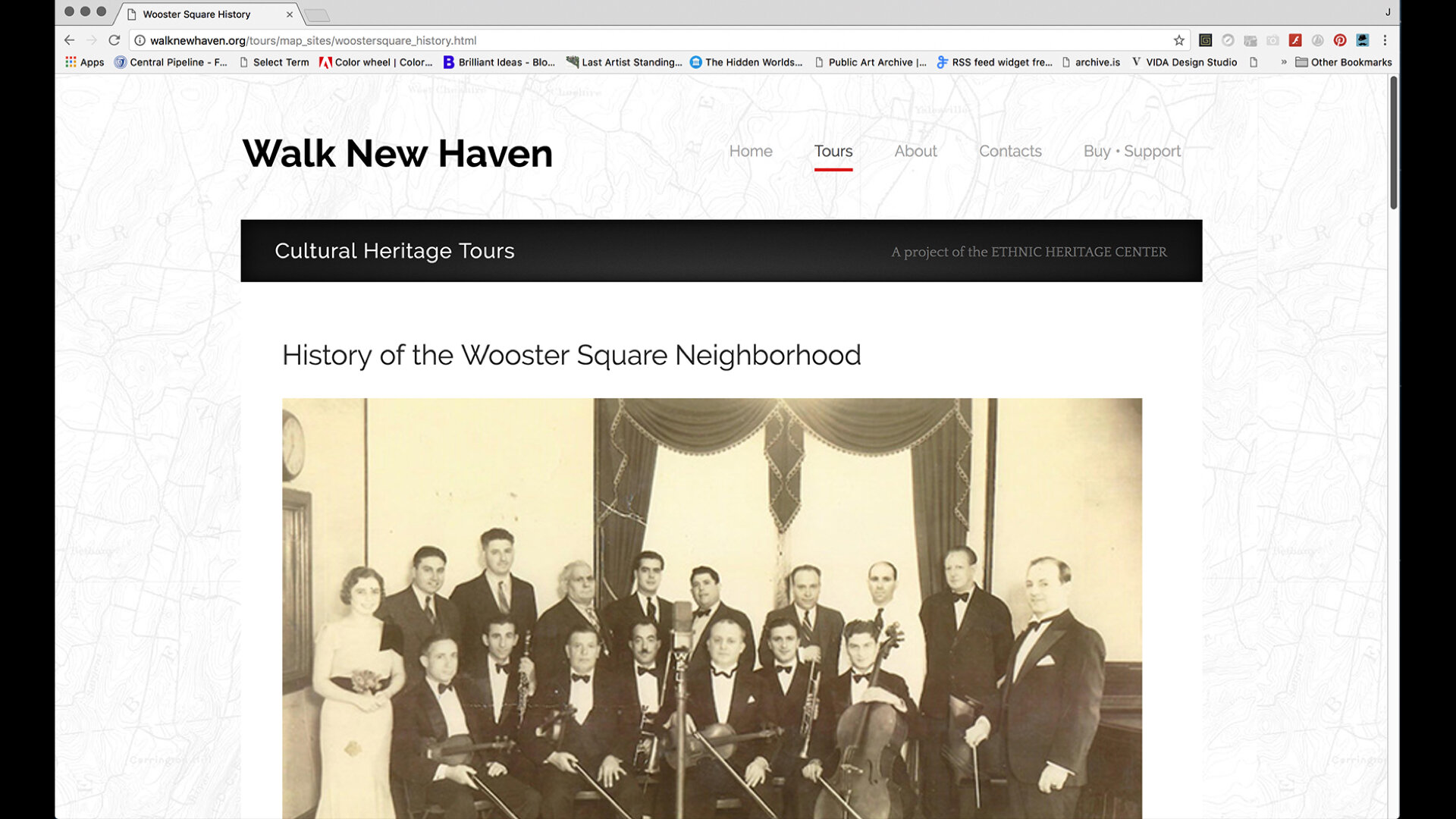
Next, we worked out a tight and ambitious design and production schedule for the expanded project. We had many animated discussions viewing and comparing pictures of the sites, the buildings, streets, and neighborhoods spanning decades from various angles and elevations. They revealed the myriad changes the cityscape has undergone and how great or poor our memories are today. When questions would arise about the provenance, importance, or factors of a person or site, strides were made to tell as complete and inclusive a story as possible about the neighborhoods, founders, stakeholders, industrialists, factories, workers, immigrants, developers, and businesses to illustrate how the City’s culture and diversity was deeply intertwined and to provide a framework for understanding its current landscape and identity. Each time a sensitive topic arose—and there were quite a few—insight and empathy emerged adding new layers to the depth of the project.
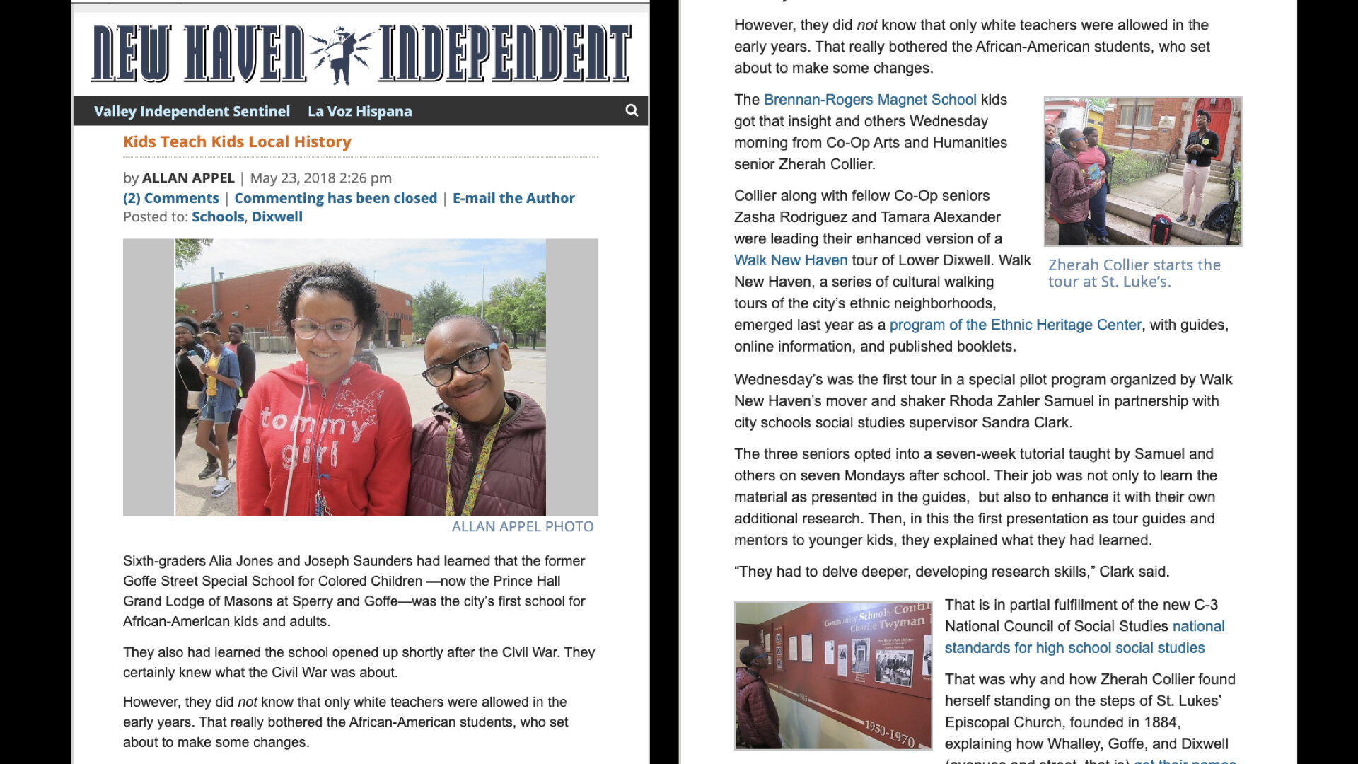
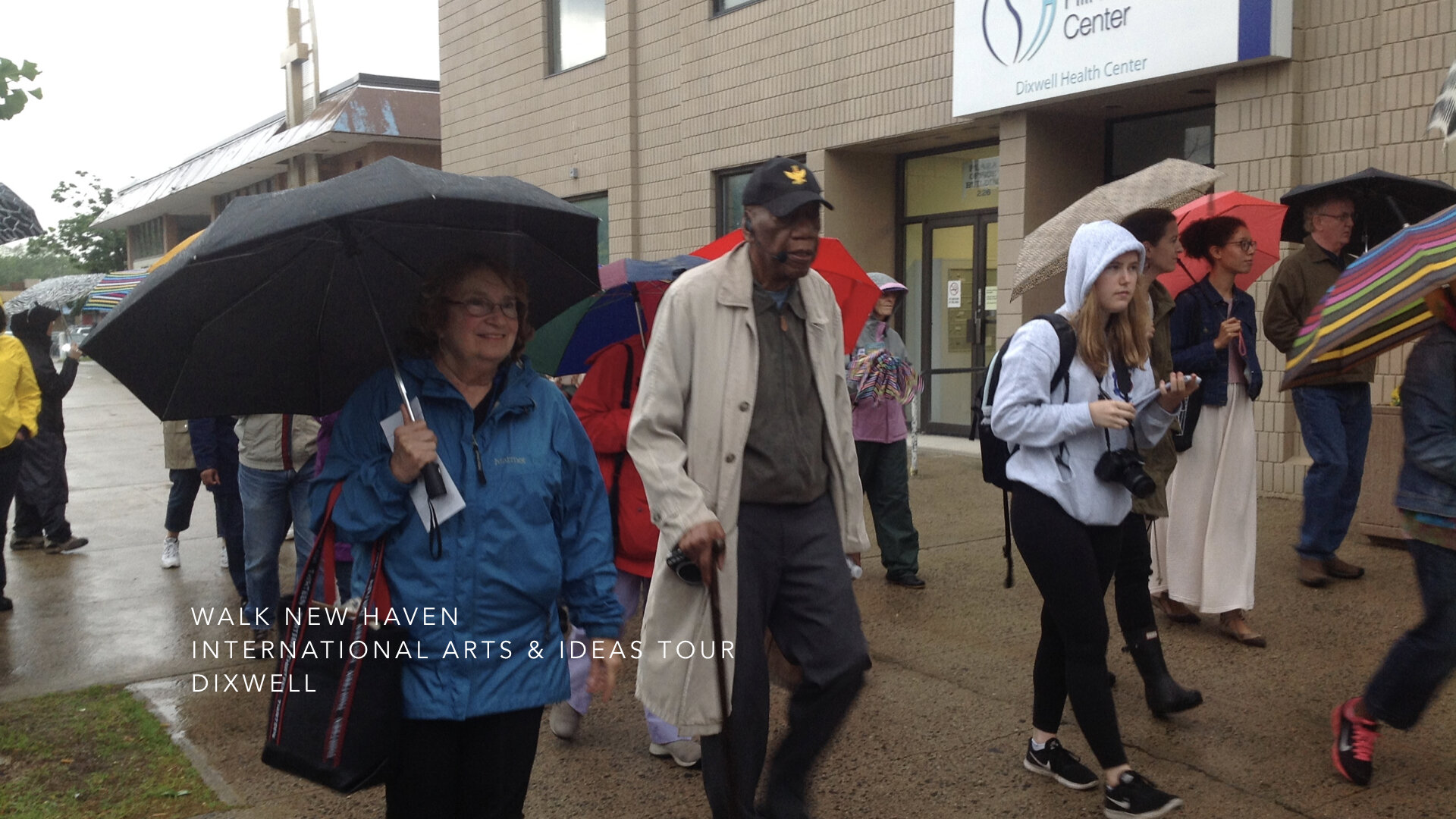
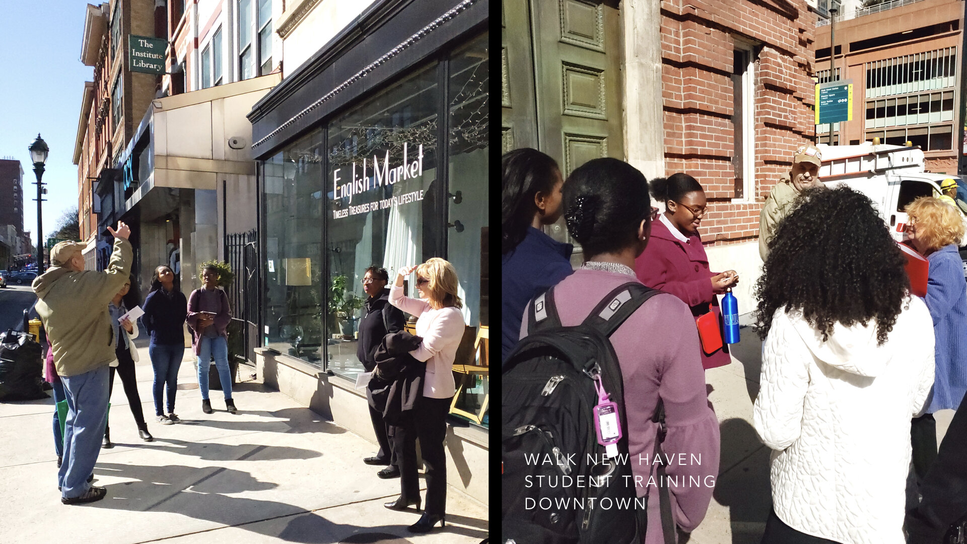
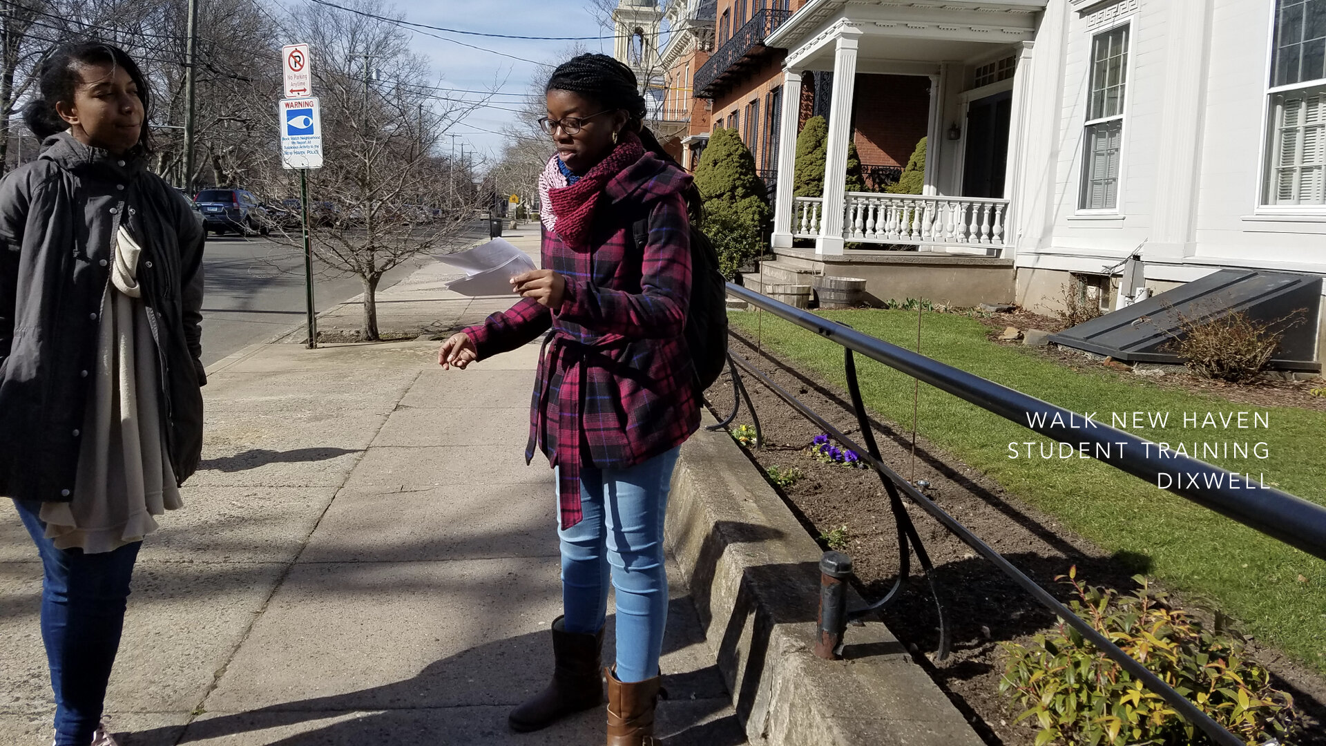
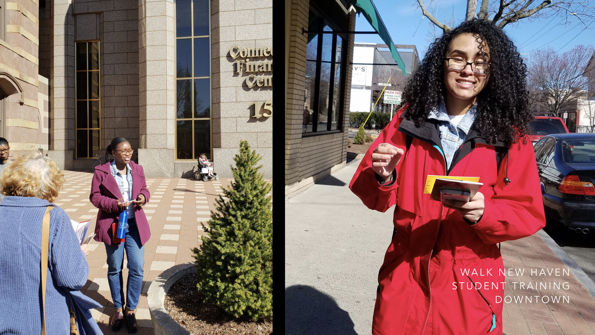
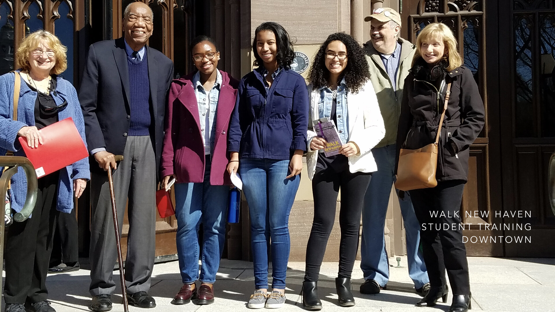
Walk New Haven: Cultural Heritage Tours is the now expanded project that continues with New Haven’s High School students learning the history of their neighborhoods, leading tours, and exploring and sharing stories of their and others heritage. Frequently, we hear them say they had no idea that the buildings they pass by everyday have historical significance and connect to a vibrant past.
Regardless of where we live, we are all well served by people serving organizations with missions such as the Ethnic Heritage Center who work tirelessly, volunteer their time, share their knowledge and archives in order to pass on the City’s extraordinary history to a new generation. Common Ground is a blueprint for creative research, direction, and design-thinking in service to community-organized projects to ensure they achieve their full and vital potential.
Collaborations are like gardening. You plant a seed, water it, weed it, and tending to it becomes a rewarding experience as it grows into what you imagined it could be and what it would look like at scale.
Collaborating with non-profit organizations can be the most rewarding project work for a designer or design team. It has been for the entirety of my career. Collaborations can yield—especially when the designer immerses themselves—possibilities that grow out of the knowledge the organization imparts. It becomes a synergistic undertaking as the designer feeds back their newly acquired knowledge through the lens of creative research. Committing to a project ensures its long-term success. Facilitating the collaboration is key.
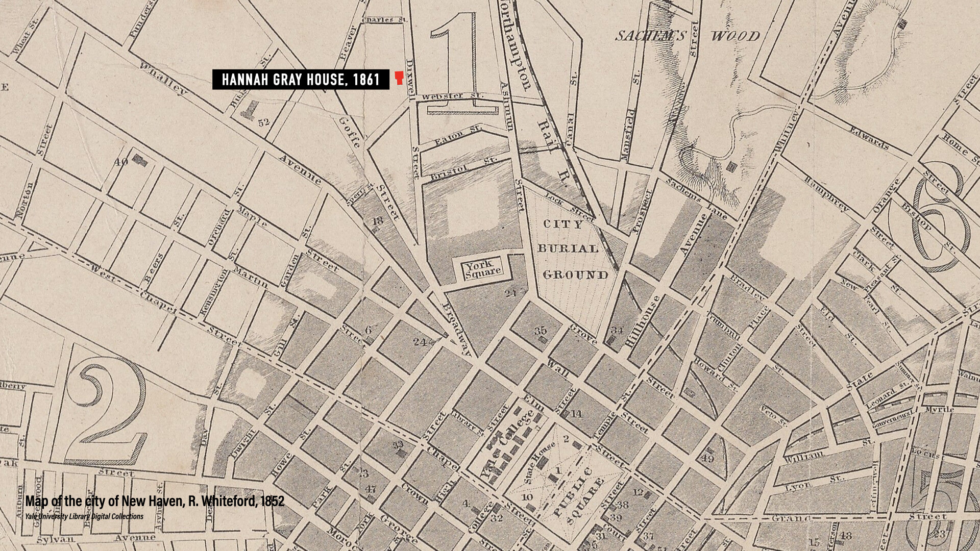
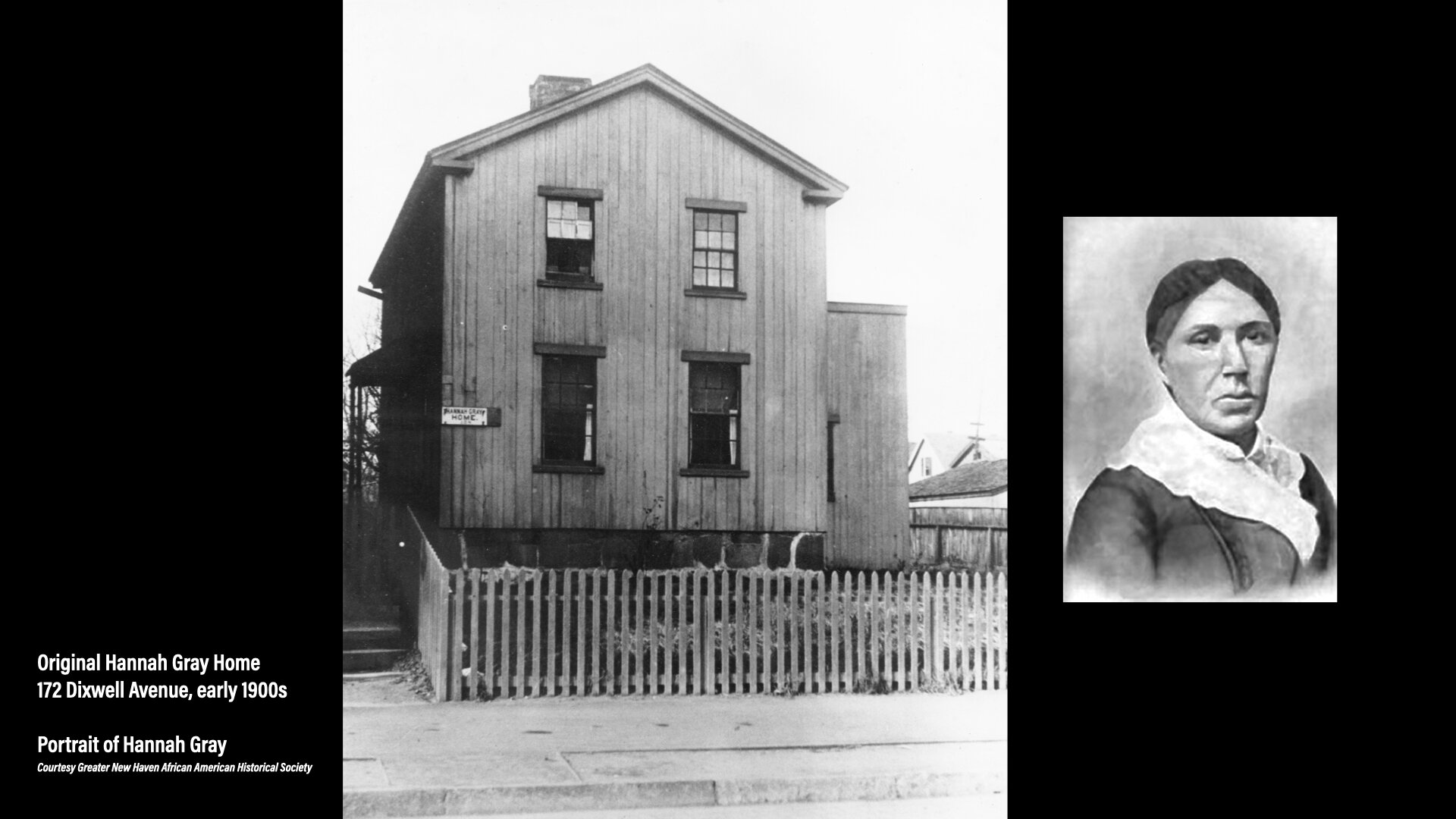
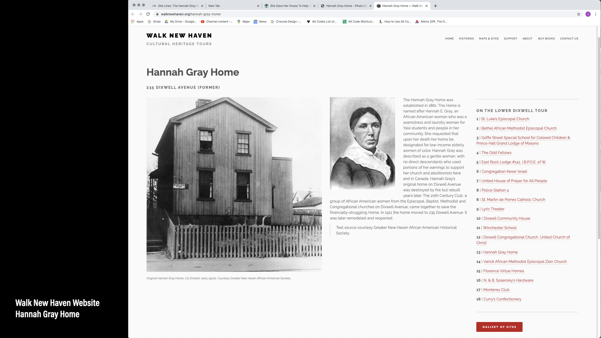
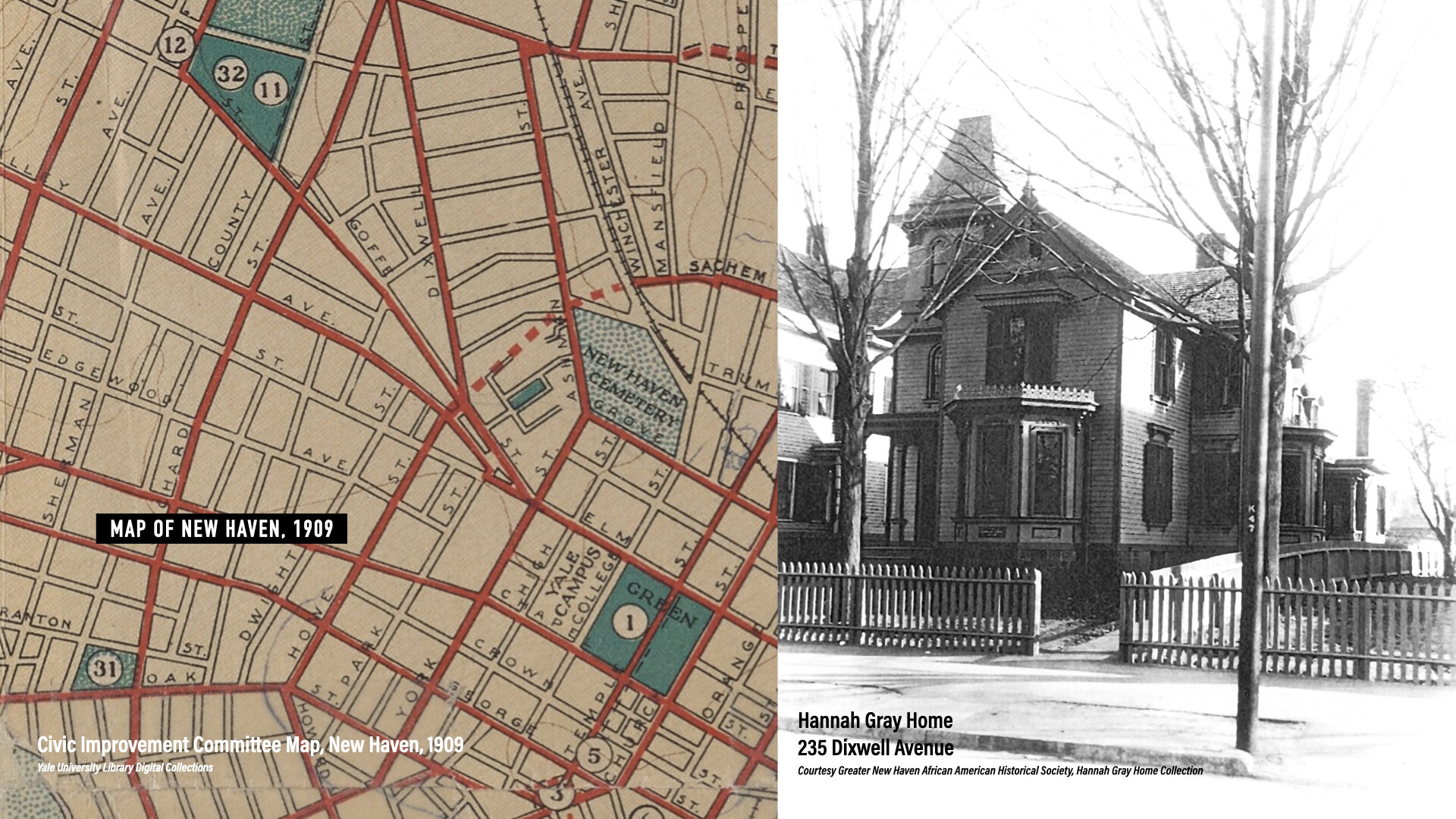
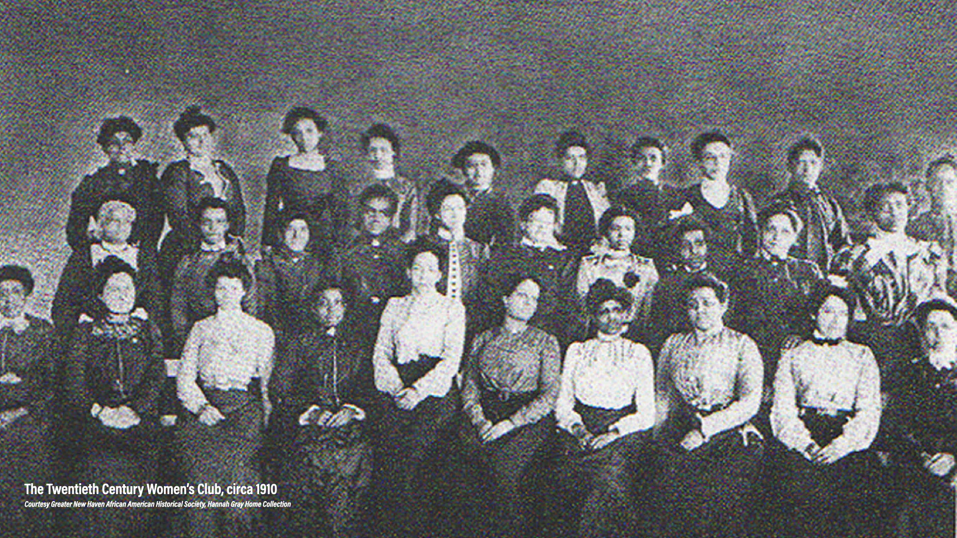
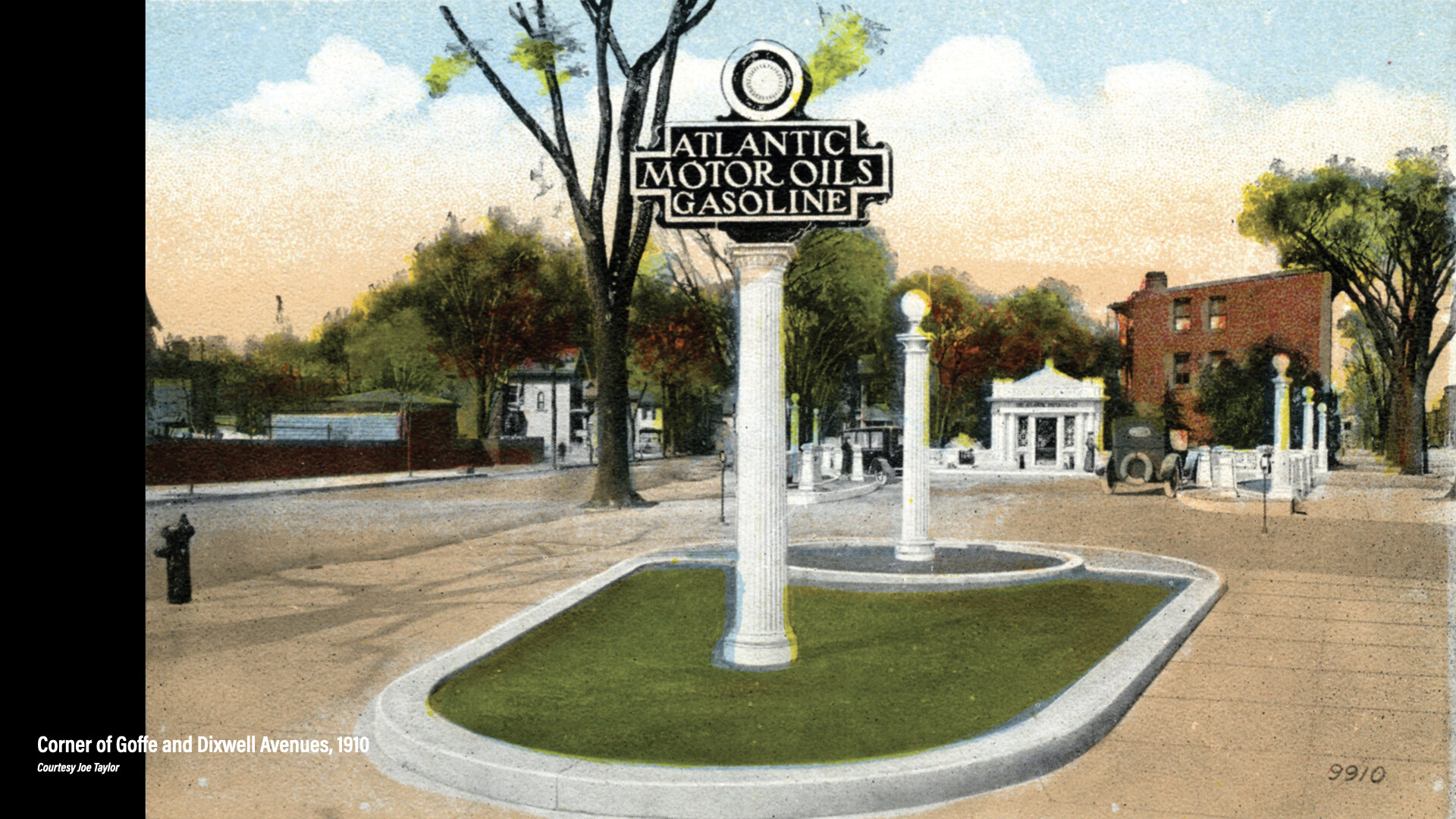
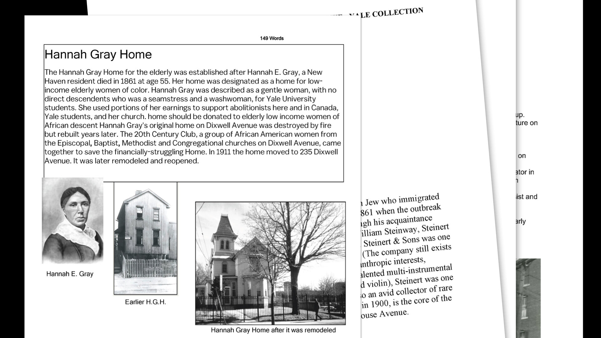
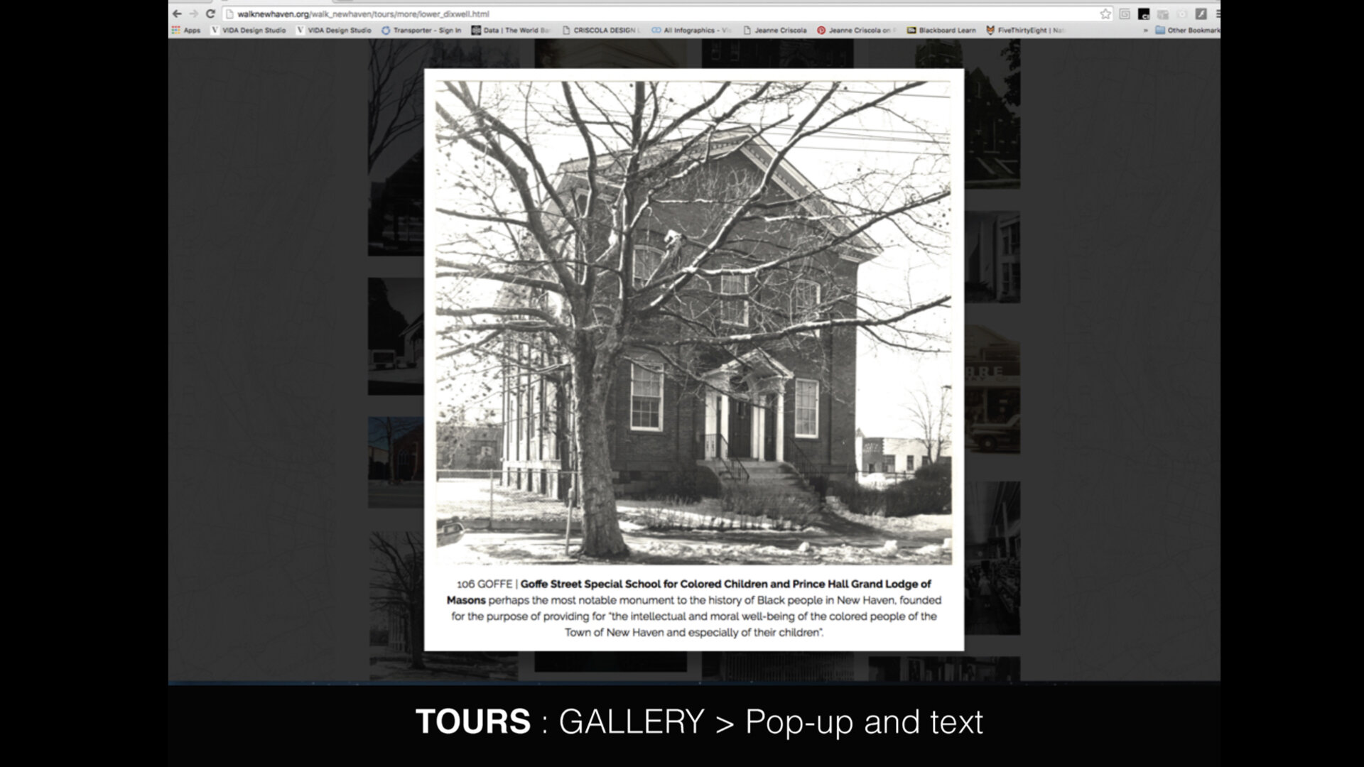
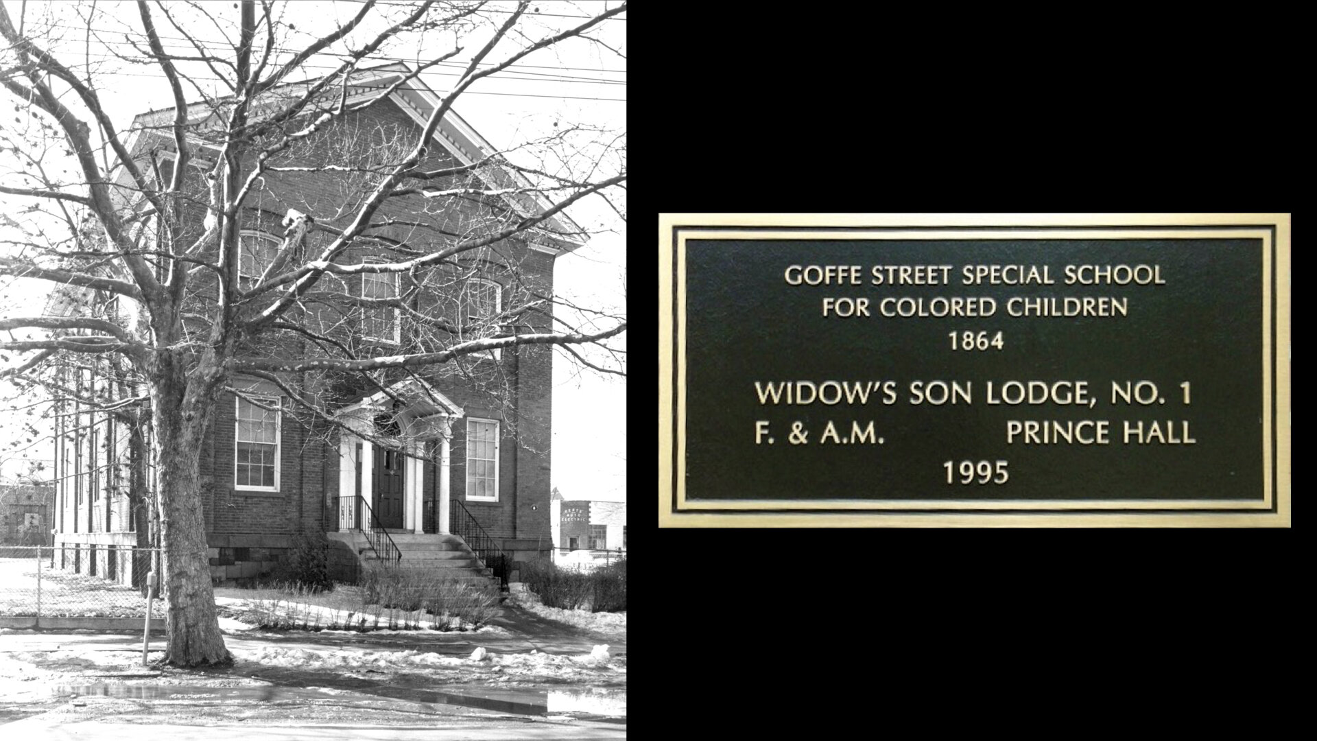
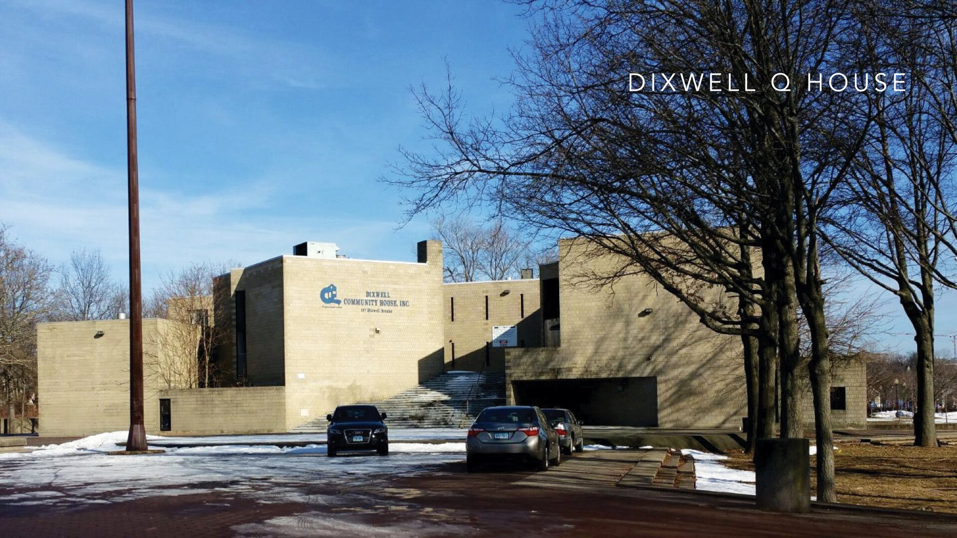
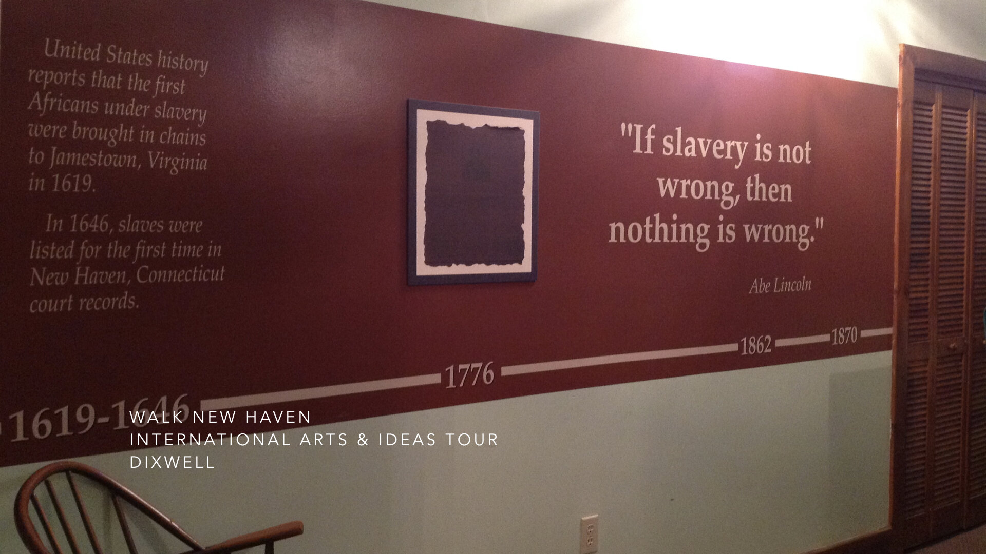
The New Haven High School students who were trained to lead “walkabout” tours of the four historic neighborhoods that the Ethnic Heritage Center initiated with “Walk New Haven: Cultural Heritage Tours” have found a new appreciation of the rich history of their City and want others to share this knowledge and sense of pride in their richly diverse community. They have been inside the former Goffe Street Special School for Colored Children, designed by Henry Austin and funded by local philanthropists and abolitionists in the 1860’s. They have seen African American History on Lower Dixwell Avenue, with sites of the Underground Railroad, and early churches for African Americans who did not want to be segregated in the back of white churches. They have learned of local heroes, such as Hannah Gray, a laundress who worked for Yale, who left her home in her will to provide a refuge for indigent African American women. They have also learned of the immigrant experiences of the Irish, Italians, Jews, and Ukrainians who came to New Haven to escape starvation and persecution. They find this information very relevant to New Haven today and want to talk about it.
The role of higher public education in Connecticut and elsewhere must be to partner with communities and their constituents to foster culture, understanding, and tolerance. The creative process can catalyze engagements with community and when design thinking is employed, strategies for creating new products and services can be innovated and maximized. This process can begin with the leadership and creative direction of design educators learned in the creative process and practice-based in the world of business to activate collaborative approaches and pathways focused on the narratives of our past to build new identities with potential for opportunities and possibilities.
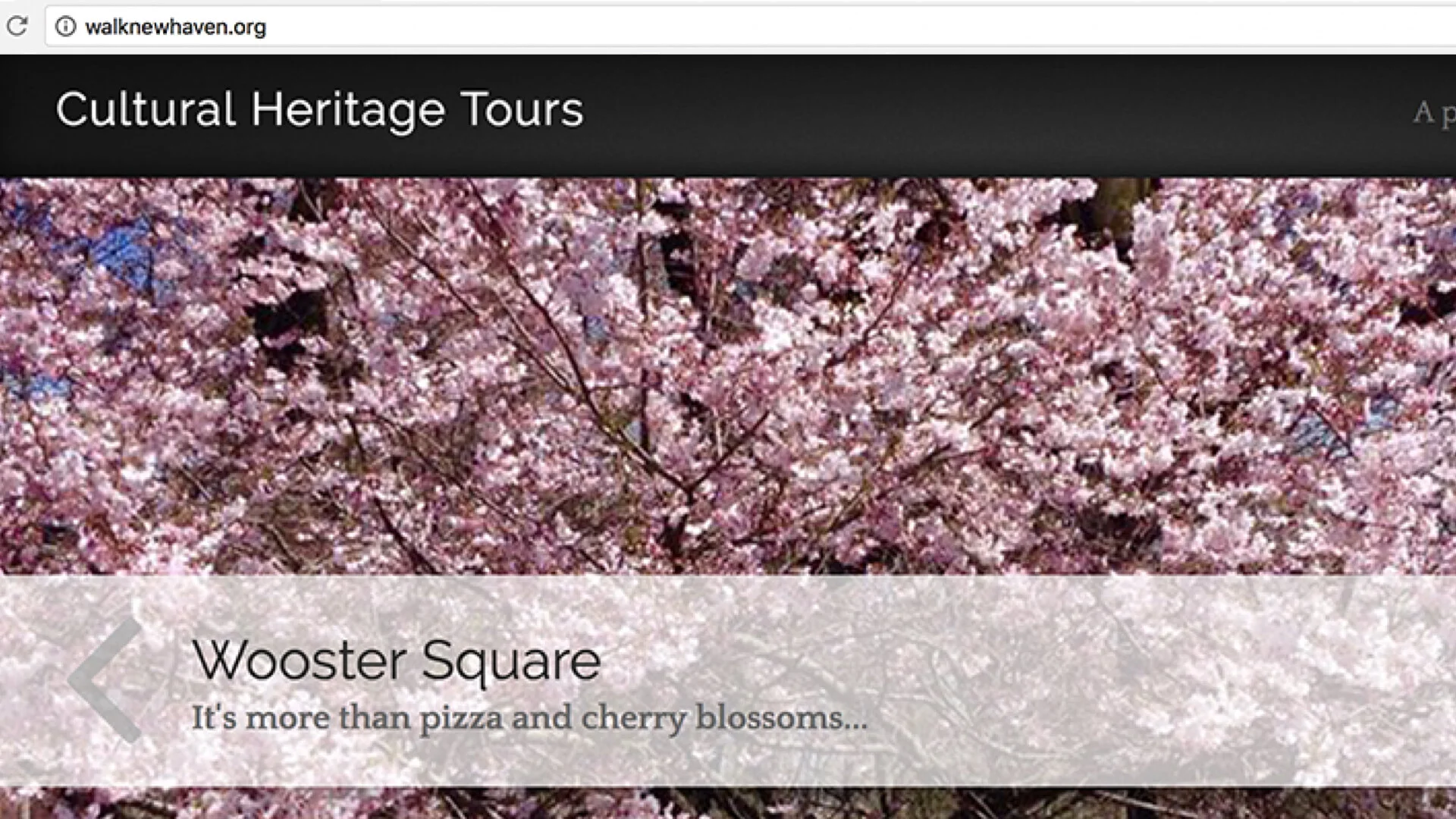
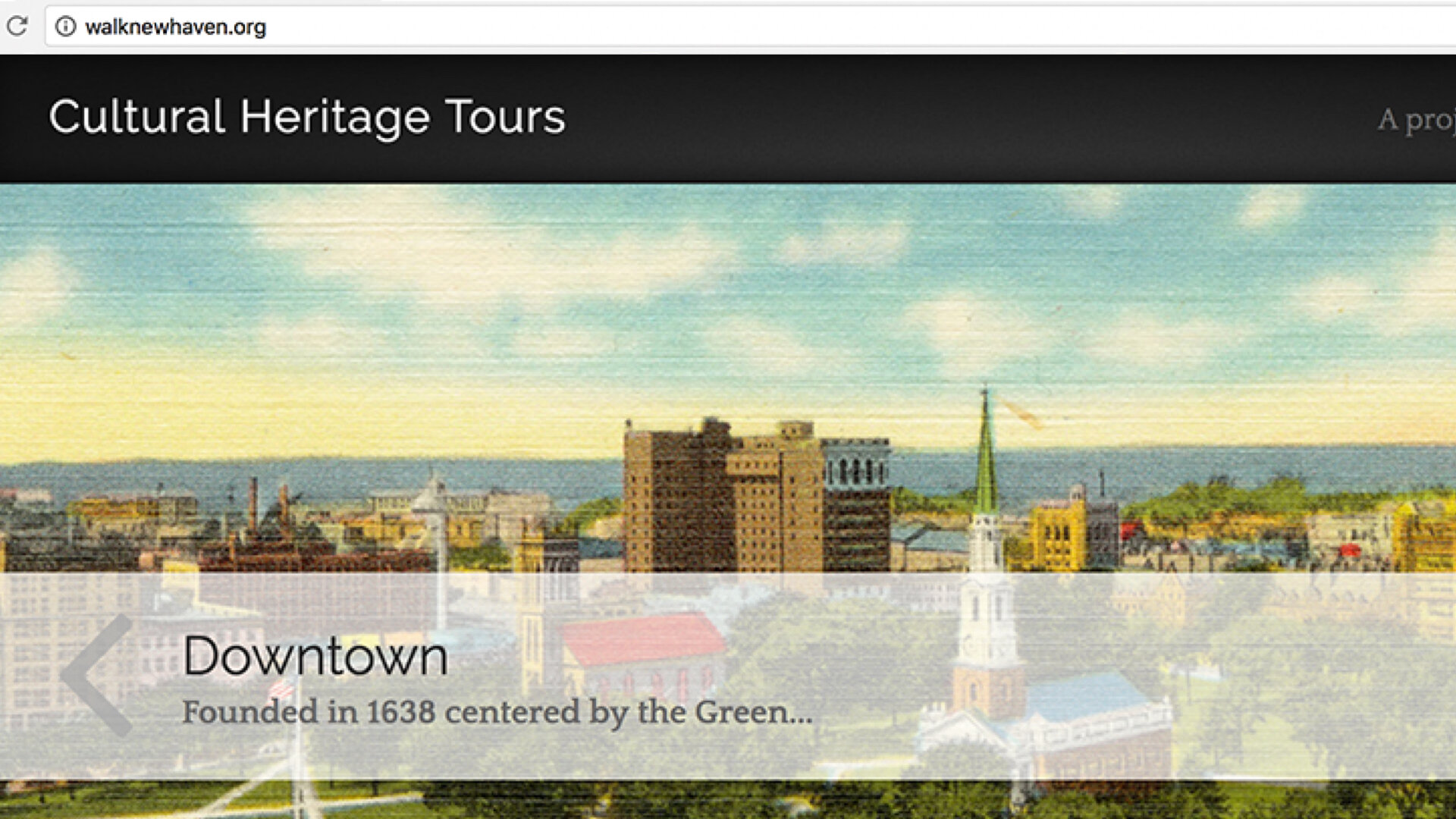
Please visit walknewhaven.org for more information about the people who made it possible and criscoladesign.com to see my studio’s portfolio.